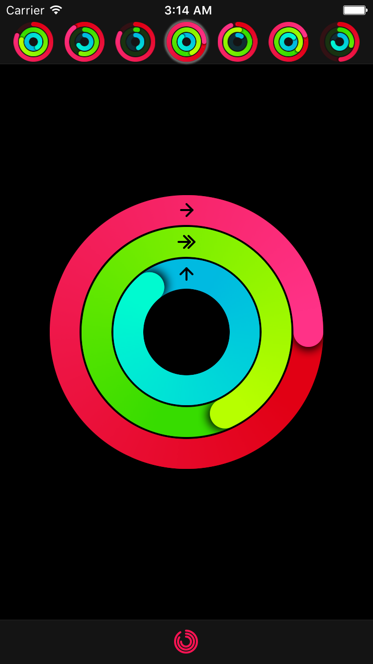
Ring progress view similar to Activity app on Apple Watch
- Progress animation
- Customizable start/end and backdrop ring colors
- Customizable ring width
- Customizable shadow under progress line end
- Progress values above 100% (or 360°) can also be displayed
MKRingProgressView is available through CocoaPods. To install
it, simply add the following line to your Podfile:
pod 'MKRingProgressView'Just add MKRingProgressView folder to your Xcode project.
See example Xcode project. It also contains additional classes for convenient grouping of 3 ring progress views replicating Activity app by Apple.
MKRingProgressView can be set up in Storyboard. Specify startColor, endColor, ringWidth and optional backgroundRingColor (if not set, defaults to startColor with 15% opacity).
let ringProgressView = MKRingProgressView(frame: CGRect(x: 0, y: 100, width: 100, height: 100))
ringProgressView.startColor = UIColor.redColor()
ringProgressView.endColor = UIColor.magentaColor()
ringProgressView.ringWidth = 25
ringProgressView.progress = 0.0
ringProgressView.allowsAntialiasing = true
view.addSubview(ringProgressView)
To adjust progress animation duration, use CATransaction:
CATransaction.begin()
CATransaction.setAnimationDuration(1.0)
ringProgressView.progress = 1.0
CATransaction.commit()Conical gradient image for progress ring is drawn using MKGradientGenerator. It is already included in the code, so just add MKGradientGenerator.swift along with MKRingProgressView.swift file to your project.
- iOS 7.0 (Cocoapods requires iOS 8 for Swift)
- Xcode 7, Swift 2.0
MKRingProgressView is available under the MIT license. See the LICENSE file for more info.


