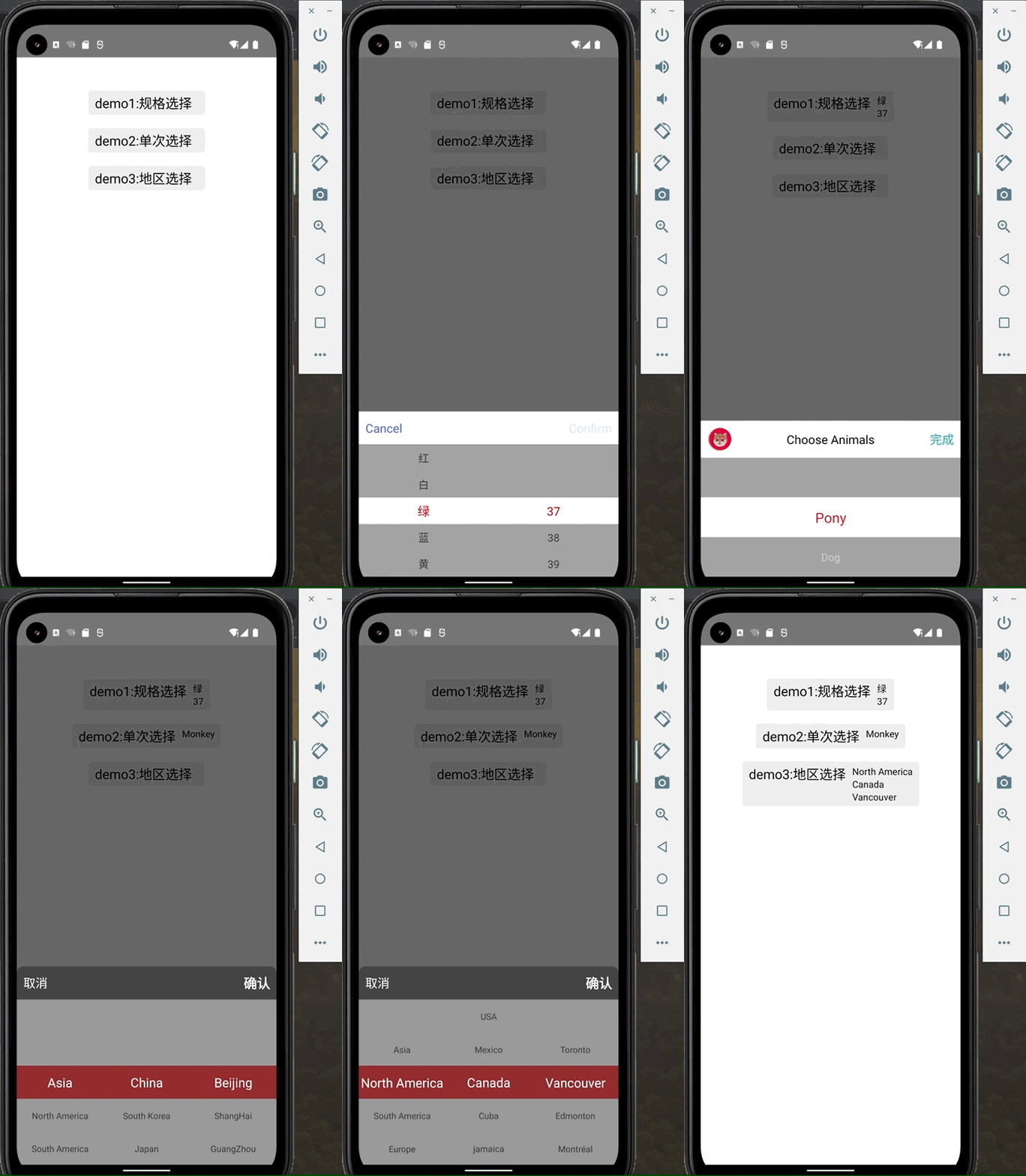
A react native picker component,used in address picker and other picker scenes.
why:
-
archived by JavaScript,run on Android and iOS.
-
custom height,backgroundColor,fontSize,fontColor,or even picker header.
-
support parallel data and cascade data.
-
can be used in modal or absolute position.
install:
npm install react-native-slidepicker react-native-gesture-handler -Sor with yarn :
yarn add react-native-slidepicker react-native-gesture-handlerimport:
//Cascade data
import { CascadePicker } from "react-native-slidepicker";

//Parallel data
import { ParallelPicker } from "react-native-slidepicker";import {ParallelPicker} from 'react-native-slidepicker';
import Modal from 'react-native-modal';
import ParaData from './one.json';
export default class PickerTest extends Component {
...
cancel = () => {
//...close modal
};
confirm = data => console.info('confirm', data);
render() {
return (
<View style={{flex: 1}}>
<Modal isVisible={this.state...} {...props}>
<ParallelPicker
dataSource={ParaData}
cancel={this.cancel}
confirm={this.confirm}
/>
</Modal>
</View>
);
}
}required. data source of the picker。
id ,name and list are keywords , id is necessary as the unique key, name will be shown in the picker, list should be a array.
only used in CascadePicker, the num of sub pickers, required.
if you won't use the customeHead, this function is required. called by confirm button, send the picker data back.
if you won't use the customeHead, this function is required. called by cancel button, you should close the picker in this function.
The selected result. You should set this value by data from confirm method callback.
a custom style for the picker content , receives these props:
| Key | Type | Default Value | Description |
|---|---|---|---|
| itemHeight | number | 40 | item's height |
| visibleNum | number | 5 | Number of rows |
| activeBgColor | string (color) | "#FFF" | Background color of selected item |
| activeBgOpacity | number | 1 | Background opacity of selected items |
| activeFontSize | Number | 18 | Font size of selected item |
| activeFontColor | string (color) | "#F00" | Font color of selected item |
| normalBgColor | string (color) | "#FFF" | Unselected item background color |
| normalBgOpacity | number (0-1) | 0.4 | Background opacity of unselected items |
| normalFontSize | number | 16 | Unselected item font color |
| normalFontColor | string:(color) | "#333" | Unselected item font color |
a custom style for the picker header , receives these props:
| key | Type | Default Value | Description |
|---|---|---|---|
| confirmText | string | Confirm | confirm button text |
| cancelText | string | Cancel | cancel button text |
| headHeight | number | 50 | height of header |
| borderTopRadius | number | 0 | borderTop(Left&Right)Radius |
| backgroundColor | string(color) | #FFF | backgroundcolor |
| confirmStyle | object (RN style) | {fontSize: 18, color: "#4169E1"} | confirm text style |
| cancelStyle | object (RN style) | {fontSize: 18, color: "#4169E1"} | cancel text style |
a rendered view, will replace the view that contains the [confirm]、[cancel] buttons.
you should provide the ref , and call getResult method to get the result of the picker.
getResult method
if you custom the head, then you have to call getResult method by ref to get result.
unless you use customed header,or you should use confirm method.
you can get the result by this function , just like the following:
export default class PickerTest extends Component {
  //...
  setPickerRef=(ref) => this.pickerRef = ref;
  getData=()=>{
    const data = this.pickerRef.getResult();
    console.info('data',data)
  }
  render() {
    const CustomHead = <View><Button onPress={this.getData}></Button></View>;
    return (
      <View style={{flex: 1}}>
        <ParallelPicker
          ref={this.setPickerRef}
          dataSource={ParaData}
          ...
        />
      </View>
    );
  }
}This component does not deal with the logic of pop-up boxes, because the scheme of the pop-up layer may be different from the scheme adopted by each person. At present, it is difficult to find a solution that most people agree with. Therefore, the logic of this layer is left to the user. If there is a better scheme, issue and PR are welcome.
If you need to use it in the pop-up layer, you can use absolute position and z-Index or Modal component.
example:
  //used in view with state and used in modal
  {this.state.isPickerShow &&
    <View>
      <CascadePicker {...props}>
    </View>
  }

  <Modal isVisible={this.state.isShow}>
    <CascadePicker {...props}>
</Modal>once change the picker, it will be called and send current result back.
format of dataSource prop:
for cascade data:
[
  {
    "name": "Asia",
    "id": 1,
    "list": [
      {
        "name": "China",
        "id": 100,
        "list": [
          {
            "name": "Beijing",
            "id": 1101
          }
        ]
      },
      {
        "name": "South Korea",
        "id": 200,
        "list": []
      }
    ]
  }
]
for parallel data ( a two-dimensional array ):
[
  [
    {
      "name": "2015",
      "id": 11
    }
  ],
  [
    {
      "name": "july",
      "id": 201
    },
    {
      "name": "August",
      "id": 202
    }
  ],
  [
    {
      "name": "1st",
      "id": 2101
    }
  ]
]