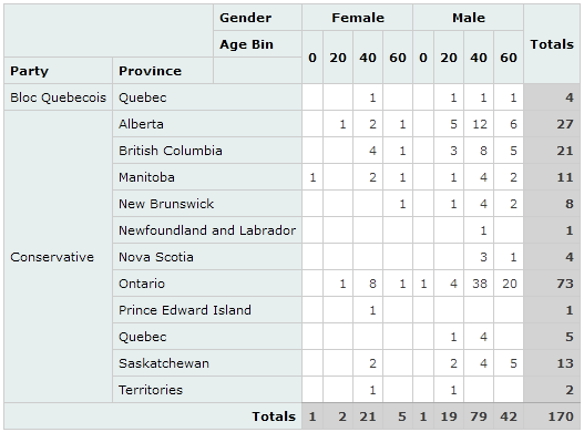
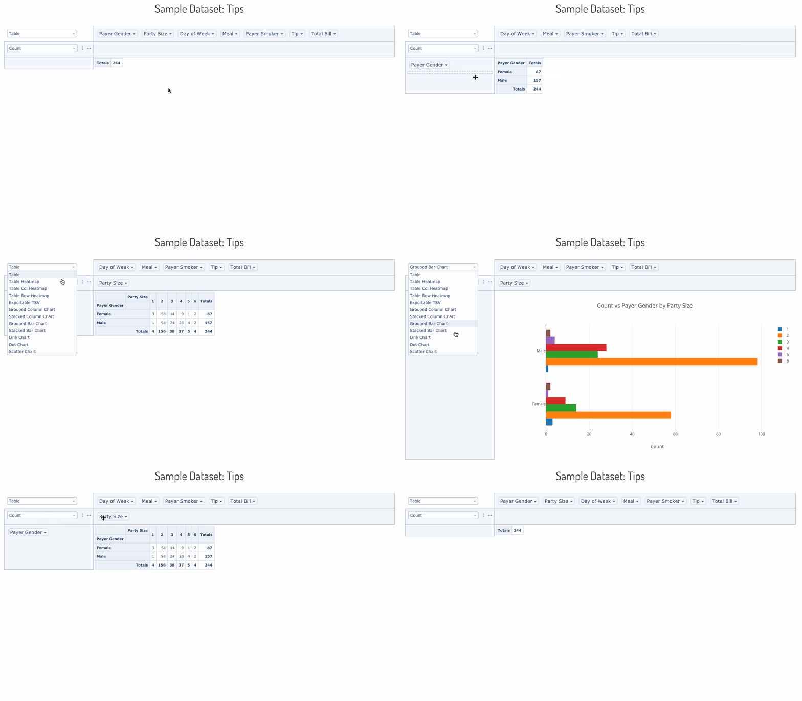
This is a fork of react-pivottable with added capacity of grouping and displaying subtotals.
It adds an option grouping: true to the possible options. The rest of the API remains unchaged.
See the working demo here.
Left image is the default react-pivottable rendering, while right images shows react-pivottable-grouping with the default grouping:true enabled.
Original react-pivottable README.md
react-pivottable is a React-based pivot table library with drag'n'drop
functionality. It is a React port of the jQuery-based
PivotTable.js by the same author.
react-pivottable is part of Plotly's React Component Suite for building data visualization Web apps and products.
react-pivottable's function is to enable data exploration and analysis by
summarizing a data set into table or Plotly.js
chart with a true 2-d drag'n'drop UI, very similar to the one found in older
versions of Microsoft Excel.
A live demo can be found here.
Installation is via NPM and has a peer dependency on React:
npm install --save react-pivottable react react-dom
Basic usage is as follows. Note that PivotTableUI is a "dumb component" that
maintains essentially no state of its own.
import React from 'react';
import ReactDOM from 'react-dom';
import PivotTableUI from 'react-pivottable/PivotTableUI';
import 'react-pivottable/pivottable.css';
import 'react-pivottable/grouping.css';

// see documentation for supported input formats
const data = [
  ['attribute', 'attribute2'],
  ['value1', 'value2'],
];

class App extends React.Component {
  constructor(props) {
    super(props);
    this.state = props;
  }

  render() {
    return (
      <PivotTableUI
        data={data}
        onChange={s => this.setState(s)}
        {...this.state}
      />
    );
  }
}

ReactDOM.render(<App />, document.body);The Plotly react-plotly.js component can be passed in via dependency
injection. It has a peer dependency on plotly.js.
Important: If you build your project using webpack, you'll have to follow
these instructions
in order to successfully bundle plotly.js. See below for how to avoid having
to bundle plotly.js.
npm install --save react-pivottable react-plotly.js plotly.js react react-dom
To add the Plotly renderers to your app, you can use the following pattern:
import React from 'react';
import PivotTableUI from 'react-pivottable/PivotTableUI';
import 'react-pivottable/pivottable.css';
import 'react-pivottable/grouping.css';
import TableRenderers from 'react-pivottable/TableRenderers';
import Plot from 'react-plotly.js';
import createPlotlyRenderers from 'react-pivottable/PlotlyRenderers';

// create Plotly renderers via dependency injection
const PlotlyRenderers = createPlotlyRenderers(Plot);

// see documentation for supported input formats
const data = [
  ['attribute', 'attribute2'],
  ['value1', 'value2'],
];

class App extends React.Component {
  constructor(props) {
    super(props);
    this.state = props;
  }

  render() {
    return (
      <PivotTableUI
        data={data}
        onChange={s => this.setState(s)}
        renderers={Object.assign({}, TableRenderers, PlotlyRenderers)}
        {...this.state}
      />
    );
  }
}

ReactDOM.render(<App />, document.body);If you would rather not install and bundle plotly.js but rather get it into
your app via something like <script> tag, you can ignore react-plotly.js'
peer-dependcy warning and handle the dependency injection like this:
import React from 'react';
import PivotTableUI from 'react-pivottable/PivotTableUI';
import 'react-pivottable/pivottable.css';
import 'react-pivottable/grouping.css';
import TableRenderers from 'react-pivottable/TableRenderers';
import createPlotlyComponent from 'react-plotly.js/factory';
import createPlotlyRenderers from 'react-pivottable/PlotlyRenderers';

// create Plotly React component via dependency injection
const Plot = createPlotlyComponent(window.Plotly);

// create Plotly renderers via dependency injection
const PlotlyRenderers = createPlotlyRenderers(Plot);

// see documentation for supported input formats
const data = [
  ['attribute', 'attribute2'],
  ['value1', 'value2'],
];

class App extends React.Component {
  constructor(props) {
    super(props);
    this.state = props;
  }

  render() {
    return (
      <PivotTableUI
        data={data}
        onChange={s => this.setState(s)}
        renderers={Object.assign({}, TableRenderers, PlotlyRenderers)}
        {...this.state}
      />
    );
  }
}

ReactDOM.render(<App />, document.body);<PivotTableUI {...props} /><PivotTable {...props} /><Renderer {...props} />PivotData(props)
The interactive component provided by react-pivottable is PivotTableUI, but
output rendering is delegated to the non-interactive PivotTable component,
which accepts a subset of its properties. PivotTable can be invoked directly
and is useful for outputting non-interactive saved snapshots of PivotTableUI
configurations. PivotTable in turn delegates to a specific renderer component,
such as the default TableRenderer, which accepts a subset of the same
properties. Finally, most renderers will create non-React PivotData object to
handle the actual computations, which also accepts a subset of the same props as
the rest of the stack.
Here is a table of the properties accepted by this stack, including an indication of which layer consumes each, from the bottom up:
| Layer | Key & Type | Default Value | Description |
|---|---|---|---|
PivotData |
data see below for formats |
(none, required) | data to be summarized |
PivotData |
rows array of strings |
[] |
attribute names to prepopulate in row area |
PivotData |
cols array of strings |
[] |
attribute names to prepopulate in cols area |
PivotData |
vals array of strings |
[] |
attribute names used as arguments to aggregator (gets passed to aggregator generating function) |
PivotData |
aggregators object of functions |
aggregators from Utilites |
dictionary of generators for aggregation functions in dropdown (see original PivotTable.js documentation) |
PivotData |
aggregatorName string |
first key in aggregators |
key to aggregators object specifying the aggregator to use for computations |
PivotData |
valueFilter object of arrays of strings |
{} |
object whose keys are attribute names and values are objects of attribute value-boolean pairs which denote records to include or exclude from computation and rendering; used to prepopulate the filter menus that appear on double-click |
PivotData |
sorters object or function |
{} |
accessed or called with an attribute name and can return a function which can be used as an argument to array.sort for output purposes. If no function is returned, the default sorting mechanism is a built-in "natural sort" implementation. Useful for sorting attributes like month names, see original PivotTable.js example 1 and original PivotTable.js example 2. |
PivotData |
rowOrder string |
"key_a_to_z" |
the order in which row data is provided to the renderer, must be one of "key_a_to_z", "value_a_to_z", "value_z_to_a", ordering by value orders by row total |
PivotData |
colOrder string |
"key_a_to_z" |
the order in which column data is provided to the renderer, must be one of "key_a_to_z", "value_a_to_z", "value_z_to_a", ordering by value orders by column total |
PivotData |
derivedAttributes object of functions |
{} |
defines derived attributes (see original PivotTable.js documentation) |
Renderer |
<any> |
(none, optional) | Renderers may accept any additional properties |
PivotTable |
renderers object of functions |
TableRenderers |
dictionary of renderer components |
PivotTable |
rendererName string |
first key in renderers |
key to renderers object specifying the renderer to use |
PivotTableUI |
onChange function |
(none, required) | function called every time anything changes in the UI, with the new value of the properties needed to render the new state. This function must be hooked into a state-management system in order for the "dumb" PivotTableUI component to work. |
PivotTableUI |
hiddenAttributes array of strings |
[] |
contains attribute names to omit from the UI |
PivotTableUI |
hiddenFromAggregators array of strings |
[] |
contains attribute names to omit from the aggregator arguments dropdowns |
PivotTableUI |
hiddenFromDragDrop array of strings |
[] |
contains attribute names to omit from the drag'n'drop portion of the UI |
PivotTableUI |
menuLimit integer |
500 | maximum number of values to list in the double-click menu |
PivotTableUI |
unusedOrientationCutoff integer |
85 | If the attributes' names' combined length in characters exceeds this value then the unused attributes area will be shown vertically to the left of the UI instead of horizontally above it. 0 therefore means 'always vertical', and Infinity means 'always horizontal'. |
One object per record, the object's keys are the attribute names.
Note: missing attributes or attributes with a value of null are treated as
if the value was the string "null".
const data = [
  {
    attr1: 'value1_attr1',
    attr2: 'value1_attr2',
    //...
  },
  {
    attr1: 'value2_attr1',
    attr2: 'value2_attr2',
    //...
  },
  //...
];One sub-array per record, the first sub-array contains the attribute names. If
subsequent sub-arrays are shorter than the first one, the trailing values are
treated as if they contained the string value "null". If subsequent sub-arrays
are longer than the first one, excess values are ignored. This format is
compatible with the output of CSV parsing libraries like PapaParse.
const data = [
  ['attr1', 'attr2'],
  ['value1_attr1', 'value1_attr2'],
  ['value2_attr1', 'value2_attr2'],
  //...
];The function will be called with a callback that takes an object as a parameter.
Note: missing attributes or attributes with a value of null are treated as
if the value was the string "null".
const data = function(callback) {
    callback({
        "attr1": "value1_attr1",
        "attr2": "value1_attr2",
        //...
    });
    callback({
        "attr1": "value2_attr1",
        "attr2": "value2_attr2",
        //...
    };
    //...
};

