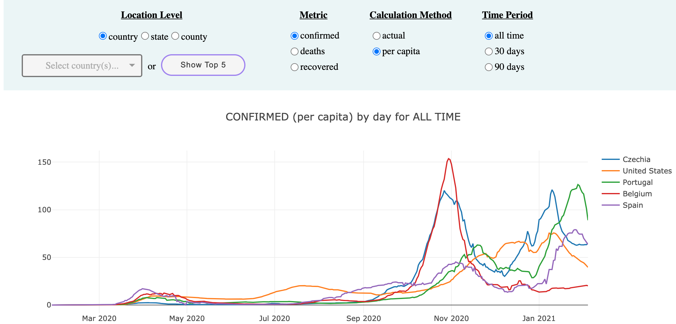
A covid location comparison dashboard pulling data from an automated data pipeline.
Table of Contents
The main purpose of this data engineering project is to create an end to end automated data pipeline that will allow the end user to be able to easily query on three different covid fact metrics - confirmed, deaths, and recovered- across a number of different dimensions such as location and time.
In order to showcase my work, I have also created a live covid dashboard that allows for regional comparisons across the aforementioned metrics, you can access it here.
Notable dashboard features:
- Allows comparisons across thes same location level, i.e
Beijing, ChinavsMontana, United States - Offers
per capitaandabsolutenumbers Top 5most affected locations
- John Hopkins data -> S3 using Python pandas
- The John Hopkins repo organizes its time series files by metric (confirmed, deaths, recovered) and by location (global, and US).
- Each of these 5 files are cleaned using pandas and then staged to S3 using Python s3fs library.
- SQL scripts that:
- extract the data from S3 to RDS.
- transform the data into a star schema.
- fact table contains the 3 metrics (confirmed, deaths, recovered).
- the dimension tables are location, date, and coordinates.
- From the fact tables, create final bi tables (county, state, and country) that our end application will query from.
- The end user can now access the updated data through the Dash app- deployed using Heroku and AWS Route 53.
- Docker
- docker-compose
- AWS account for S3 and RDS
- Connection to RDS database set-up from data pipeline
- Python and all the Python libraries in requirements.txt
- All local prereqs
- Heroku account
- Need to install the requirements.txt file in a virtual environment (more instructions below)
-
If first time running, add credentials to
pipeline/dags/config/aws_config.json. An example file is provided for reference. -
To build project run
docker-compose up -d- After the airflow servers are up
- go to http://localhost:8080/
- username:
admin - pw:
password
- username:
- go to http://localhost:8080/
- To turn off airflow servers and delete Docker containers
docker-compose downIf first time running, copy the example file, and enter your credentials:
cd covid_compared/
cp dash_app/config/dash_credentials_example.json dash_app/config/dash_credentials.json
vi dash_app/config/dash_credentials.json
To deploy dash app locally run:
python app_dash.pyIf first time deploying, create a new app in Heroku, and add the environment variables from the example file and their corresponding values into Heroku Dashboard -> Settings tab. More detailed instructions on adding env variables to Heroku here.
To actually deploy, follow these instructions. The only difference is that this Dash app is in a sub-folder, so when pushing, run this instead:
cd covid_compared/
git subtree push --prefix dash_app/ heroku masterThis app was originally deployed on AWS Lambda using zappa. Lambda's one flaw was significant initial website load times (up to 15s) due to cold starts.
Switching to Heroku ended up being really easy thankfully, but I left the 'zappa' branch up in case someone wants to refer to it as there aren't many examples of Dash + zappa deployments.
I chose this specific topic because when I went on a trip in Fall 2020 from Southern California- where I live- to Dallas, I remember being curious about which location I was more likely to get covid in. Getting the per capita number of cases for both locations manually was a pain, and as such this project was borne.
From a data engineering project perspective, I was inspired by this Meetup Analytics DE project.


