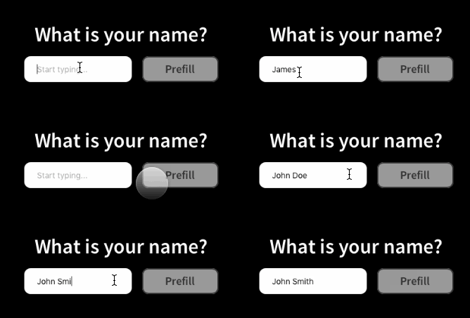
Yet another package for input components in Framer X, but this time they behave like traditional React Controlled Components.
Install this package from the Framer X store.
Important: You have to do this for these inputs to work!
Override the inputs value and onValueChange props so you are controlling the input's state with a value stored in a Data object.
const data = Data({ text: "" });

export const controlText: Override = foo => {
  return {
    value: data.text,
    onValueChange: (value: string) => {
      console.log(value);
      data.text = value;
    }
  };
};
This will allow you to easily change the value of the input at runtime by changing the value in the the Data object.
export const prefillText: Override = () => {
  return {
    onTap: () => {
      data.text = "John Doe";
    }
  };
};| Name | Type | Description |
|---|---|---|
value |
string |
The current value of the input. |
onValueChange |
(value: string) => void |
Event for input value changing. |
| Name | Type | Description |
|---|---|---|
stlying |
`"standard" | "transparent" |
className |
string |
If styling is set to css, the css class name for the input. |
Note: To use CSS in Framer X create a file named styles.css in your project's code/ directory and write all your styles in there.
placeholderdisbaledreadOnly
numberMinnumberMaxnumberStep
selectOptions
onBluronFocusonMouseEnteronMouseLeave
You can download an example project showing how to use this component here.
