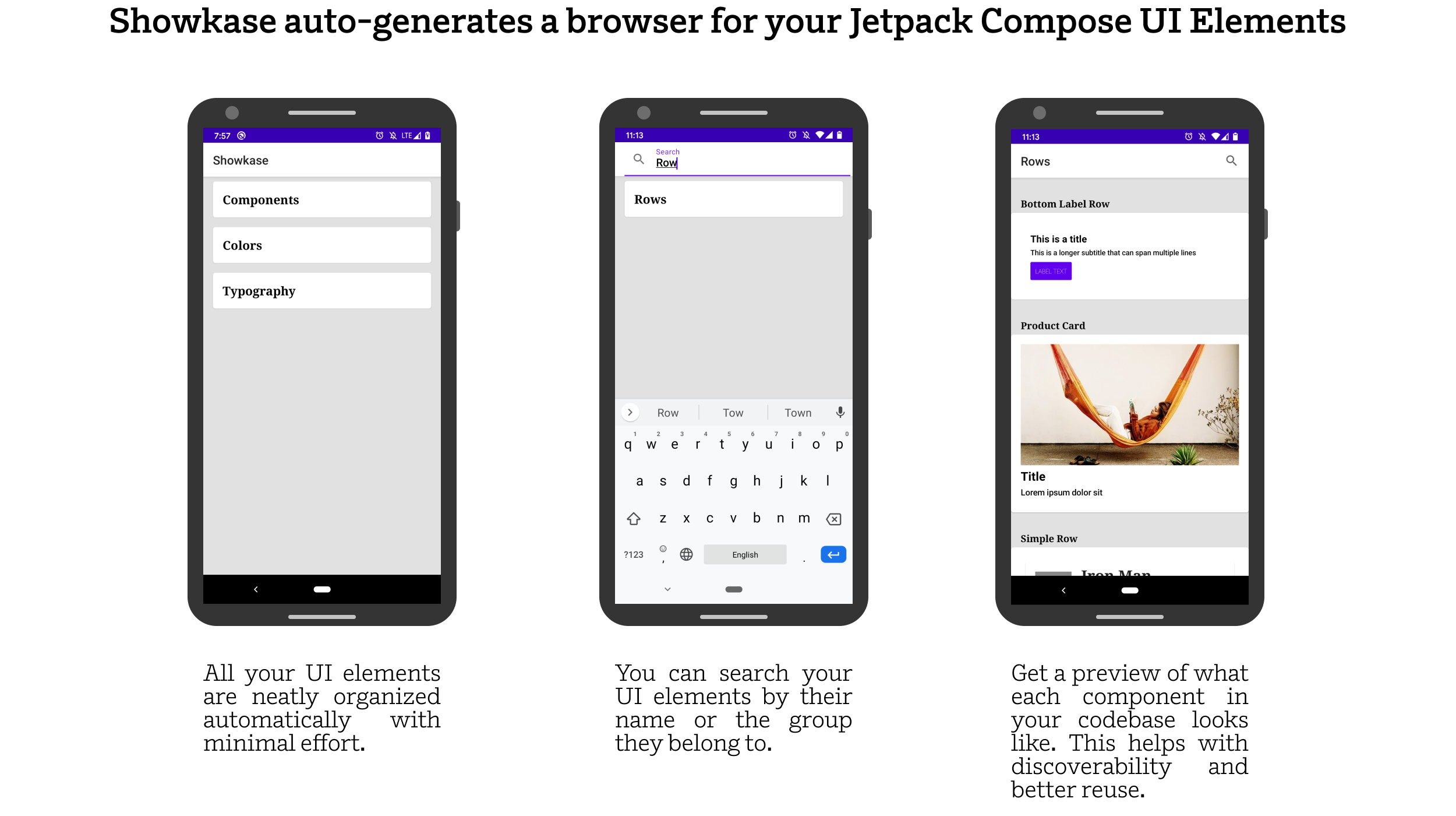
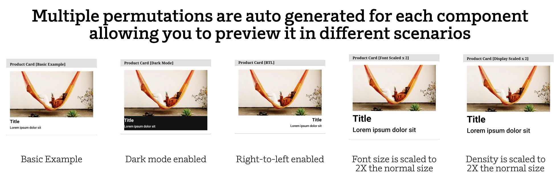
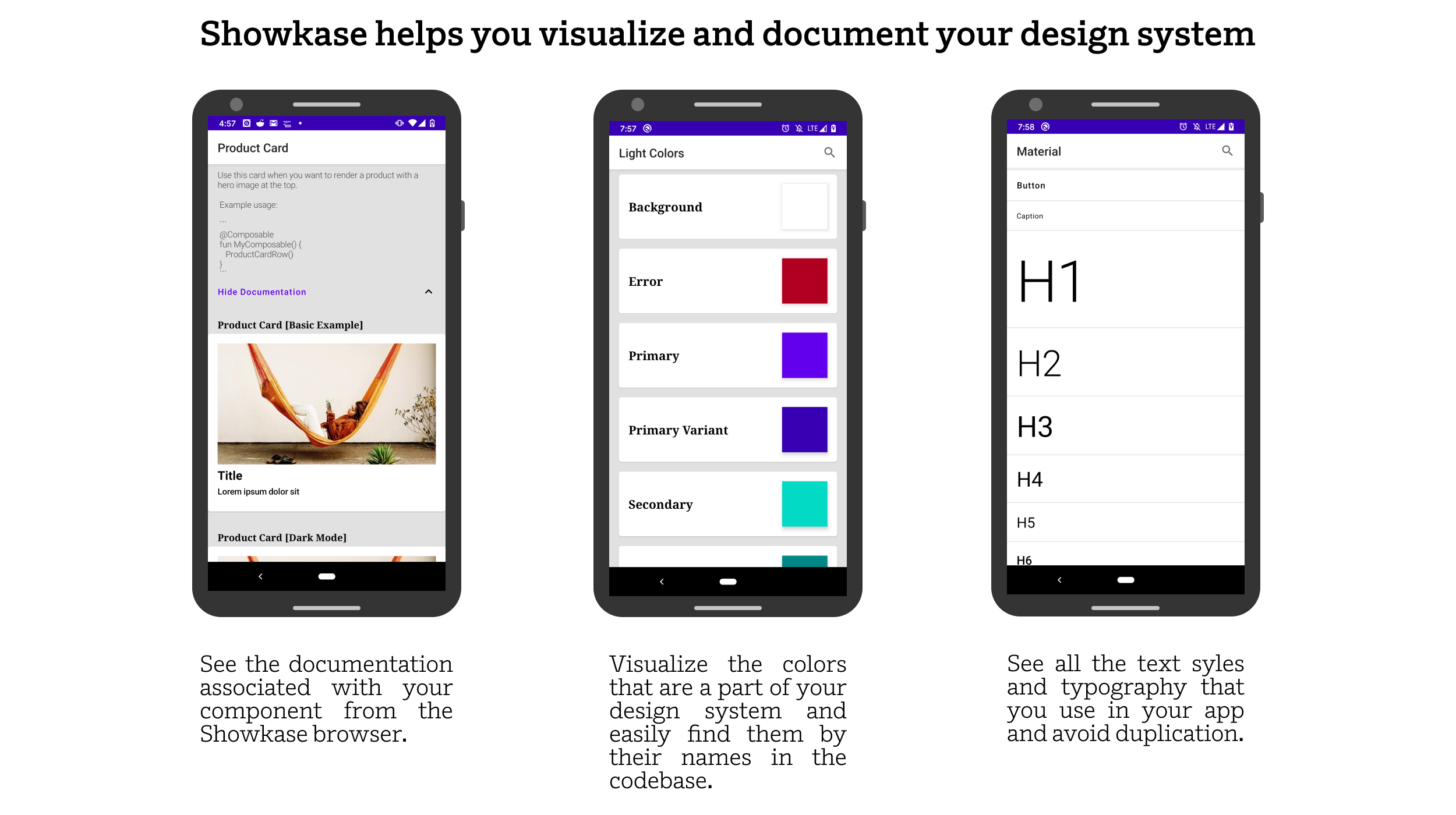
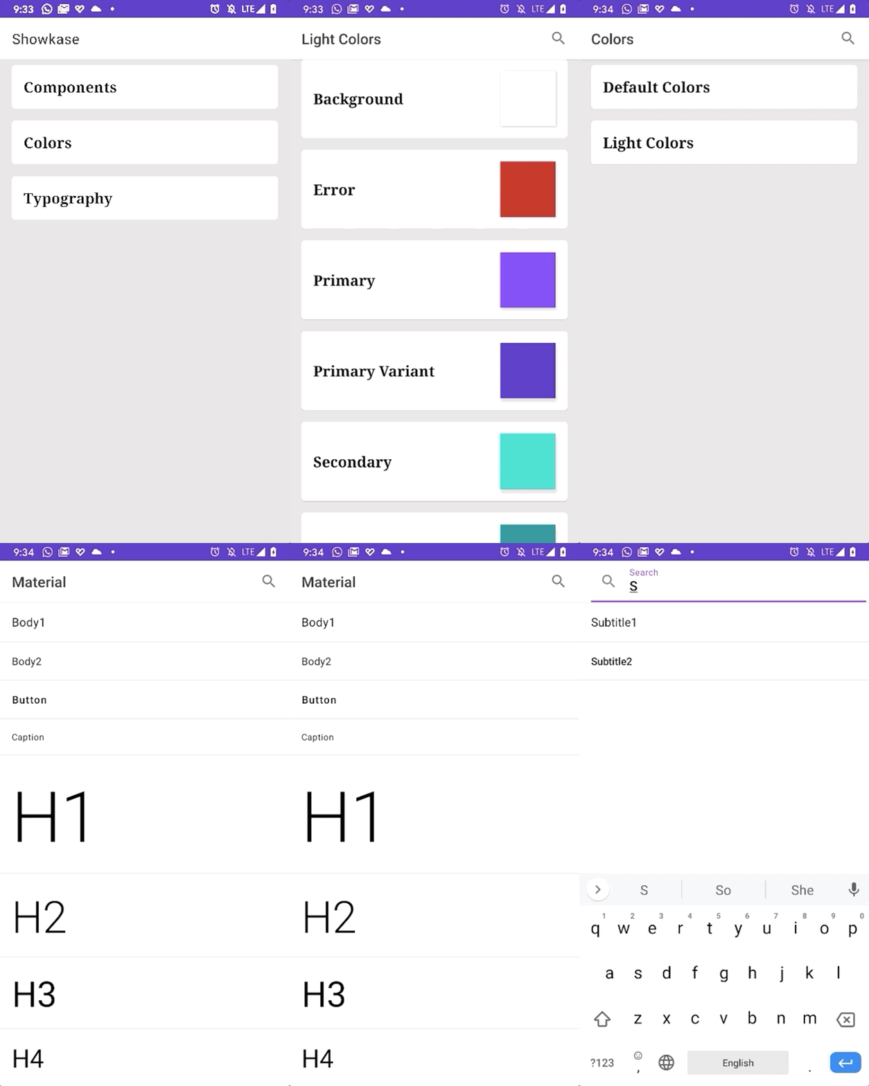
Showkase is an annotation-processor based Android library that helps you organize, discover, search and visualize Jetpack Compose UI elements. With minimal configuration it generates a UI browser that helps you easily find your components, colors & typography. It also renders your components in common situations like dark mode, right-to-left layouts, and scaled fonts which help in finding issues early.
 |
 |
- When using component based UI toolkits (like React, Compose, Flutter, etc), our codebase often ends up with hundreds of components that are hard to discover, visualize, search and organize.
- Showkase eliminates the manual work of maintaining a UI preview/browser app that each company is forced to build in order to maintain their design system.
- Since all the available UI elements are now easily searchable and discoverable, there is better reuse of UI elements in your repo. This makes it useful for maintaining consistency across your app. The biggest problem for enforcing a design system is discoverability and Showkase hopefully solves that problem for your team.
- It allows you to quickly visualize
@Composablecomponents,Colorproperties andTextStyle (Typography)as you are building them. The goal is to improve the turnaround time in creating production-ready UI elements. - Showkase aids in catching common UI issues early with the help of auto-generated permutations of your components.
- Super simple setup
- Support for visualizing composables(
@ShowkaseComposable), colors(@ShowkaseColor) & typography(@ShowkaseTypography). - First class support for @Preview
annotation. If you are already using
@Previewfor previews in Android Studio, using Showkase is even easier as all those components are included in the Showkase browser. - Support for top level, class, object & companion object functions and properties to be annotated with the Showkase annotations.
- 5 Permutations are auto created for each composable (Basic Example, Dark Mode, RTL, Font Scaled, Display Scaled. Look in the gif above for examples)'. More to be added in the future!
- Support for searching a Showkase UI element by name or group.
- KDoc support that shows the documentation that you added for a component in the Showkase browser.
- Multi-module support for showcasing UI elements across multiple modules.
- Support for constraining a component with a custom height/width using additional parameters in the annotation.
- Descriptive error messages so that the users of the library can fix any incorrect setup.
- Incremental annotation processor that makes the code-gen more performant.
Using Showkase is straightforward and takes just a couple of minutes to get started.
Step 1: Add the dependency to your module's build.gradle file. If you have a multi-module
setup, add this dependency to all the modules with UI elements that should be displayed inside the
Showkase browser.
Showkase supports both ksp and kapt. By default, it uses kapt as we only recently added ksp support.
implementation "com.airbnb.android:showkase:1.0.0-beta18"
kapt "com.airbnb.android:showkase-processor:1.0.0-beta18"implementation "com.airbnb.android:showkase:1.0.0-beta18"
ksp "com.airbnb.android:showkase-processor:1.0.0-beta18"Step 2: Add the relevant annotations for every UI element that should be a part of the Showkase browser.
For @Composable components, you can either use the @Preview annotation that Compose comes with
or use the @ShowkaseComposable annotation:
@Preview(name = "Custom name for component", group = "Custom group name")
@Composable
fun MyComponent() { ... }

// or

@ShowkaseComposable(name = "Name of component", group = "Group Name")
@Composable
fun MyComponent() { ... }
For Color properties, you can add the @ShowkaseColor annotation to the field:
@ShowkaseColor(name = "Primary Color", group = "Material Design")
val primaryColor = Color(0xFF6200EE)
For TextStyle properties that are useful for typography, you can add the @ShowkaseTypography
annotation to the field:
@ShowkaseTypography(name = "Custom name for style", group = "Custom group name")
val h1 = TextStyle(
    fontWeight = FontWeight.Light,
    fontSize = 96.sp,
    letterSpacing = (-1.5).sp
)
Step 3: Define an implementation of the ShowkaseRootModule interface in your root module.
If your setup involves only a single module, add this implementation in that module. Ensure that this
implementation is also annotated with the @ShowkaseRoot annotation.
@ShowkaseRoot
class MyRootModule: ShowkaseRootModule
Step 4: Showkase is now ready for use! Showkase comes with an Activity that you need to start
for accessing the UI browser. Typically you would start this activity from the debug menu of
your app but you are free to start this from any place you like! A nice helper extension function
getBrowserIntent is generated for you so you might have to build the app once
before it's available for use. Just start the intent and that's all you need to do for accessing
Showkase!
startActivity(Showkase.getBrowserIntent(context))Used to annotate @Composable functions that should be displayed inside the Showkase browser. If
you are using the @Preview annotation with your @Composable function already then you don't
need to use this annotation. Showkase has first class support for @Preview.
Here's how you would use it with your @Composable function:
@ShowkaseComposable(name = "Name", group = "Group")
@Composable
fun MyComposable() {
    .......
    .......
}
Name and group are optional. Look at the properties section to understand the behavior when you don't pass any properties.
Note: Make sure that you add this annotation to only those functions that meet the following criteria:
- Functions that don't have any parameters
- If it does have a parameter, it has to be annotated with
@PreviewParameterthat is provided aPreviewParameterProviderimplementation. - Stacked
@PreviewandShowkaseComposableannotations are only supported with KSP at the moment. This is because of this issue. - If you use
@Previewto generate UI in the Showkase app, you have to make theminternalorpublicfunctions. If you would like to have private previews, but skip them in during compilation, you can addskipPrivatePreviewcompiler flag:
If you use KSP:
ksp {
 arg("skipPrivatePreviews", "true")
}
If you use KAPT:
kapt {
 arguments {
  arg("skipPrivatePreviews", "true")
 }
}
This is identical to how @Preview works in Compose as well so Showkase just adheres to the same rules.
// Consider a simple data class
data class Person(
    val name: String,
    val age: Int
)

// In order to pass a person object as a parameter to our composable function, we will annotate
// our parameter with `@PreviewParameter` and pass a `PreviewParameterProvider` implementation.
@ShowkaseComposable(name = "Name", group = "Group") or @Preview(name = "Name", group = "Group")
@Composable
fun MyComposable(
    @PreviewParameter(provider = ParameterProvider::class) person: Person
) {
    ...
}

class ParameterProvider : PreviewParameterProvider<Person> {
    override val values: Sequence<Person>
        get() = sequenceOf(
            Person("John", 12),
            Person("Doe", 20)
        )

    override val count: Int
        get() = super.count
}

// Since we return 2 objects through our ParameterProvider, Showkase will create 2 previews
// for this single composable function. Each preview will have it's own parameter that's passed
// to it - Person("John", 12) for the first preview and Person("Doe", 20) for the second one.
// This is an effective way to preview your composables against different sets of data.
Alternatively, you could simply wrap your function inside another function that doesn't accept any parameters -
@Composable
fun MyComposable(name: String) {
    .......
    .......
}
In order to make this function compatible with Showkase, you could further wrap this function inside a method that doesn't accept parameters in the following way:
@ShowkaseComposable(name = "Name", group = "Group")
@Composable
fun MyComposablePreview() {
    MyComposable("Name")
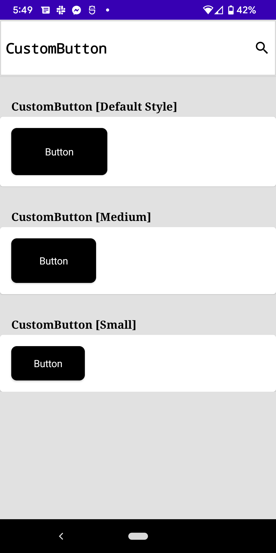
}There are usecases where you might have a component that supports multiple styles. Consider the following example where you have a CustomButton composable and it supports 3 different sizes - Large/Medium/Small. You want to be able to document this in Showkase so that your team can visualize what these different styles look like in action. One option would be to treat them as 3 separate components. However this isn't ideal. ShowkaseComposable offers two properties that help you represent this information better - styleName & defaultStyle. Using these properties allow you to describe all the styles offered by a given Composable component in an organized manner as they are shown on the same screen in the Showkase browser.
Here's what the usage would actually look like for this example -
// Actual component
@Composable
fun CustomButton(
    size: ButtonSize,
    ...
)

// Previews
@ShowkaseComposable(name = "CustomButton", group = "Buttons", defaultStyle = true)
@Composable
fun Preview_CustomButton_Large() {
    CustomButton(size = ButtonSize.Large)
}

@ShowkaseComposable(name = "CustomButton", group = "Buttons", styleName = "Medium size")
@Composable
fun Preview_CustomButton_Medium() {
    CustomButton(size = ButtonSize.Medium)
}

@ShowkaseComposable(name = "CustomButton", group = "Buttons", styleName = "Small size")
@Composable
fun Preview_CustomButton_Small() {
    CustomButton(size = ButtonSize.Small)
}
| Property Name | Description |
|---|---|
| name | The name that should be used to describe your @Composable function. If you don't pass any value, the name of the composable function is used as the name. |
| group | The grouping key that will be used to group it with other @Composable functions. This is useful for better organization and discoverability of your components. If you don't pass any value for the group, the name of the class that wraps this function is used as the group name. If the function is a top level function, the composable is added to a "Default Group". |
| widthDp | The width that your component will be rendered inside the Showkase browser. Use this to restrict the size of your preview inside the Showkase browser. |
| heightDp | The height that your component will be rendered inside the Showkase browser. Use this to restrict the size of your preview inside the Showkase browser. |
| skip | Setting this to true will skip this composable from rendering in the Showkase browser. A good use case for this would be when you want to have composable with @Preview but want to stop Showkase from picking it up and rendering it in its browser |
| styleName | The name of the style that a given composable represents. This is useful for scenarios where a given component has multiple style variants and you want to organize them through Showkase for better discoverability. |
| defaultStyle | A boolean value to denote whether the current composable is using its default style (or the only style if the composable doesn't have other style variants) |
Used to annotate Color properties that should be presented inside the Showkase browser. Here's
how you would use it with your Color fields:
@ShowkaseColor(name = "Name", group = "Group")
val redColor = Color.Red

@ShowkaseColor("Primary", "Light Colors")
val primaryColor = Color(0xFF6200EE)
Name and group are optional. Look at the properties section below to understand the behavior when you don't pass any properties.
| Property Name | Description |
|---|---|
| name | The name that should be used to describe your Color fields. If you don't pass any value, the name of the color field is used as the name. |
| group | The grouping key that will be used to group it with other Color fields. This is useful for better organization and discoverability of your colors. If you don't pass any value for the group, the name of the class that wraps this field is used as the group name. If the field is a top level field, the color is added to a "Default Group". |
Used to annotate TextStyle properties that should be presented inside the Showkase browser.
Here's how you would use it with your TextStyle fields:
@ShowkaseTypography(name = "Name", group = "Group")
val h1 = TextStyle(
    fontWeight = FontWeight.Light,
    fontSize = 96.sp,
    letterSpacing = (-1.5).sp
)
Name and group are optional. Look at the properties section below to understand the behavior when you don't pass any properties.
| Property Name | Description |
|---|---|
| name | The name that should be used to describe your TextStyle fields. If you don't pass any value, the name of the textStyle field is used as the name. |
| group | The grouping key that will be used to group it with other TextStyle fields. This is useful for better organization and discoverability of your typography. If you don't pass any value for the group, the name of the class that wraps this field is used as the group name. If the field is a top level field, the textStyle is added to a "Default Group". |
Used to annotate the ShowkaseRootModule implementation class. This is needed to let Showkase
know more about the module that is going to be the root module for aggregating all the Showkase
supported UI elements across all the different modules(if you are using a multi-module project).
If you are only using a single module in your project, add it to that module. You are allowed to
have only one @ShowkaseRoot per module.
Here's an example of how you would use it:
@ShowkaseRoot
class MyRootModule: ShowkaseRootModule
Note: The root module is the main module of your app that has a dependency on all other modules in the app. This is relevant because we generate the Showkase related classes in the package of the root module and we need to be able to access the UI elements across all the sub modules. This is only possible from the root module as it typically has a dependency on all the sub-modules.
The Showkase object is the receiver for all the helper methods that this library generates.
Currently there are a few extension functions that are generated with the Showkase object as the
receiver. In order to get access to these functions, you need to build the app once so that the
methods can be generated for your use.
| Extension function | Description |
|---|---|
| getBrowserIntent | Helper function that return an intent to start the ShowkaseBrowser activity. |
| getMetadata | Helper function that's give's you access to Showkase metadata. This contains data about all the composables, colors and typography in your codebase that's rendered in the Showkase Browser. |
// Example Usage

val intent = Showkase.getBrowserIntent(context)
startActivity(intent)

val metadata = Showkase.getMetadata()
val components = metadata.componentList
val colors= metadata.colorList
val typography = metadata.typographyList
Is Airbnb using Jetpack Compose in their main app?
Airbnb has been one of the earliest adopters of Jetpack Compose and has been using it in production since early 2021. Compose is a really critical pillar of our overall Android strategy and we continue to heavily invest in building more tooling on top of it. We spoke about our experience of using Jetpack Compose at Google I/O 2022.Can I contribute to this library?
Pull requests are welcome! We'd love help improving this library. Feel free to browse through open issues to look for things that need work. If you have a feature request or bug, please open a new issue so we can track it.How do I provide feedback?
The issues tab is the best place to do that.Why can't we have a single annotation like `Showkase` for all the UI elements? Why did you create a different annotation for each UI element(@ShowkaseComposable for composables, @ShowkaseColor for colors & @ShowkaseTypography for text styles)?
This was done mostly for future proofing. Even though these annotations have the same properties right now, it's possible that they will diverge as we add more features. Once more people start using this library, we will get a more clear idea about whether that needs to happen or not. If we find that it didn't evolve the way we expected, we will consider consildating these annotations.I would like to customize my component browser. Can this library still be useful?
We provide a nice helper function that gives you access to the metadata of all your UI elements that are configured to work with Showkase. You can use `Showkase.getMetadata()` to get access to it and then use it in whatever way you see fit.Here are some ideas that we are thinking about. We are also not limited to these and would love to learn more about your use cases.
- Support for passing a
@PreviewParameterparameter to@Preview/@ShowkaseComposablecomponents. (See https://github.com/airbnb/Showkase#1-showkasecomposable) - Hooks for screenshot testing. Since all your components are a part of the Showkase browser,
this would be a good opportunity to make this a part of your CI and detect diffs in components. (The
getMetadatamethod can be useful to accomplish this. More info here - https://github.com/airbnb/Showkase#5-showkase-object) - Support for other UI elements that are a part of your design system (like icons, spacing, etc)
- Generating a web version of the Showkase browser with documentation, search and screenshots.
Pull requests are welcome! We'd love help improving this library. Feel free to browse through open issues to look for things that need work. If you have a feature request or bug, please open a new issue so we can track it.
Copyright 2022 Airbnb, Inc.

Licensed under the Apache License, Version 2.0 (the "License");
you may not use this file except in compliance with the License.
You may obtain a copy of the License at

   http://www.apache.org/licenses/LICENSE-2.0

Unless required by applicable law or agreed to in writing, software
distributed under the License is distributed on an "AS IS" BASIS,
WITHOUT WARRANTIES OR CONDITIONS OF ANY KIND, either express or implied.
See the License for the specific language governing permissions and
limitations under the License.


