The panelview package has three main functionalities:
(1) it visualizes the treatment and missing-value statuses of each observation in a panel dataset;
(2) it plots the outcome variable (either continuous or discrete) in a time-series fashion;
(3) it visualizes the relationships between the outcome and treatment variable individually or in an aggregate fashion.
We develop this package in the belief that it is always a good idea to understand your raw data better before conducting statistical analyses.
Date: November 07, 2021
Version: 0.1 (Github)
Authors: Hongyu Mou, Yiqing Xu
Please report bugs to hongyumou5@gmail.com or yiqingxu@stanford.edu.
We thank Yifan Huang for the initial coding and Ziyi Liu for the kind suggestion.
Table of Contents
[TOC]
Firstly, we need to install 4 dependencies, including: grc1leg, gr0075, labutil, and sencode. Type the following commands in your Stata console:
net install grc1leg, from(http://www.stata.com/users/vwiggins) replace
net install gr0075, from(http://www.stata-journal.com/software/sj18-4) replace
ssc install labutil, replace
ssc install sencode, replace

cap ado uninstall panelview //in-case already installed
net install panelview, all replace from("https://yiqingxu.org/packages/panelView_stata")
The general syntax of the package can be summarized as:
panelview Y D X [if] [in], 			      ///
	i(varname) t(varname numeric)	      ///
	type(string)						   					///
	[									  				 				///
	continuoustreat						   				///
	discreteoutcome						   				///
	bytiming							   						///
	ignoretreat							   				  ///
	MYCOLor(string)						   				///
	PREpost					 			   						///
	xlabdist(integer 1)					   			///
	ylabdist(integer 1)					  		  ///
	bygroup								   						///
	style(string)						   					///
	byunit								   						///
	theme(string)						   					///
	lwd(string)							   					///
	*									   								///
	]
where the subcommand can be:
| Subcommand | Description |
|---|---|
Y D X |
varlist of outcome variable, treatment variable, and covariates, respectively. Including covariates may change the look of the plot due to missing values in these covariates. |
if and in |
We recommend users to add variable that is not included in the varlist or i() / t() but appears in the if/ in subcommand to the varlist following panelview command. |
i() and t() |
Specify the unit (group) and time indicators. |
type() |
Use type(treat) to plot treatment assignment using a heatmap. Use type(outcome) to plot an outcome variable---or any variable---in a time series fashion. Use type(bivar) or type(bivariate) to plot the outcome and treatment variables against time in the same graph. Use type(miss) or type(missing) to plot the missing data status of a variable. |
continuoustreat |
The treatment variable is presented as a continuous variable |
discreteoutcome |
When a variable is discrete, make sure panelview respects its discreteness in type(outcome) plots. |
bytiming |
Sort units by the timing of first receiving the treatment; if the timing is the same, then by the total number of periods exposed to the treatment. |
ignoretreat |
Omit the treatment indicator, that is, any variables after Y will be interpreted as covariates. |
MYCOLor() |
Change the color schemes; click here for sequential colors (3-9 colors). |
PREpost |
Distinguish the pre- and post-treatment periods for treated units. |
xlabdist() and ylabdist() |
Change integer gaps between labels on the x- and y-axes. Default is 1. |
bygroup |
Put each unit into different treatment groups, then plot them separately when type(outcome) is invoked. |
style() |
Determine the style of the elements in a plot. The first and second entries define the style of the outcome and treatment, respectively. connected or c for connected lines, line or l for lines, bar or b for bars. |
byunit |
Plot the outcome and treatment variables against time by each unit when type(bivar) is invoked. |
theme(bw) |
Use the black and white theme (default when specified type(bivar)). |
lwd() |
Set the line width in type(bivar) (default is medium). |
First, we show how to visualize the dichotomous treatment conditions in a panel dataset. The treatment may switch on and off or have missing values.
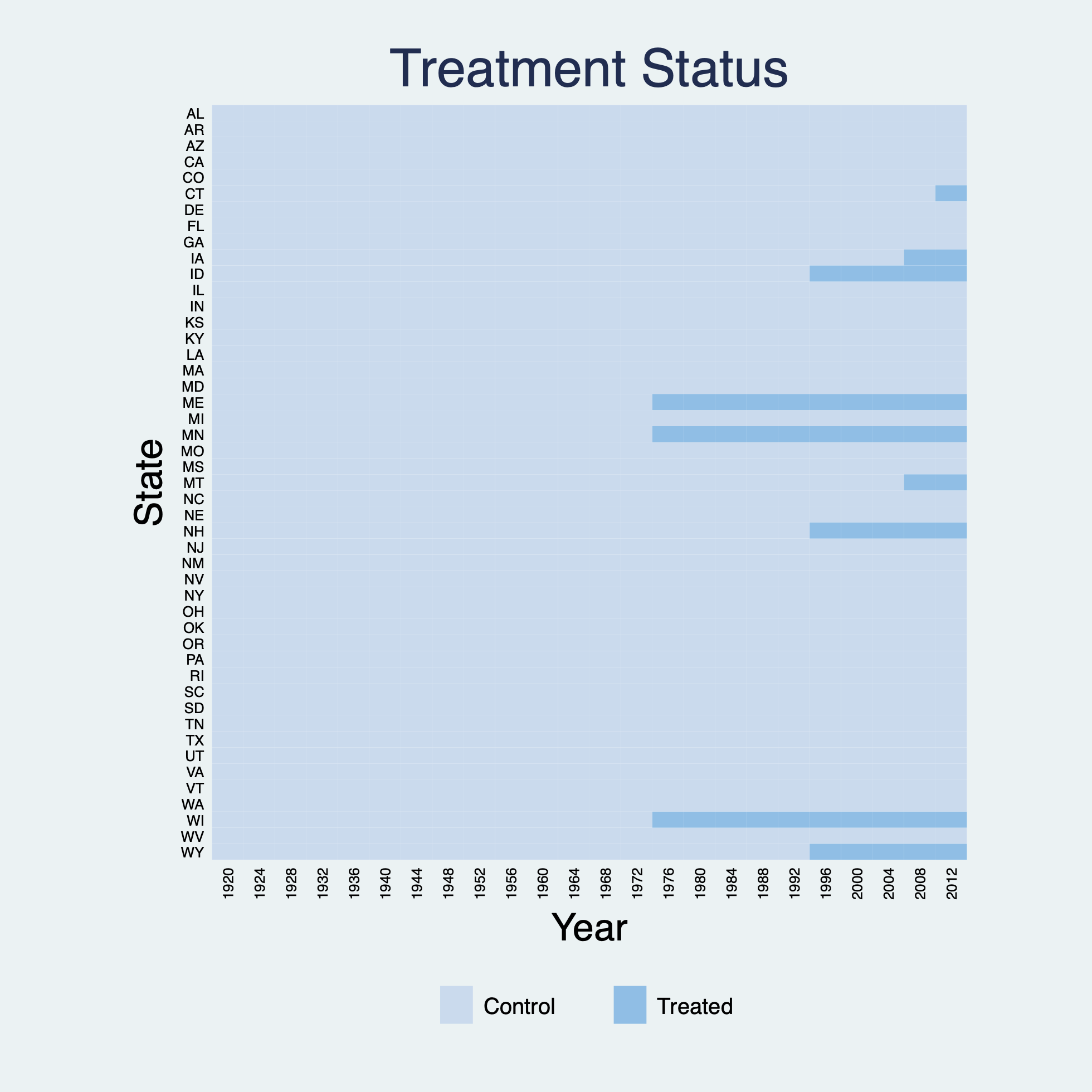
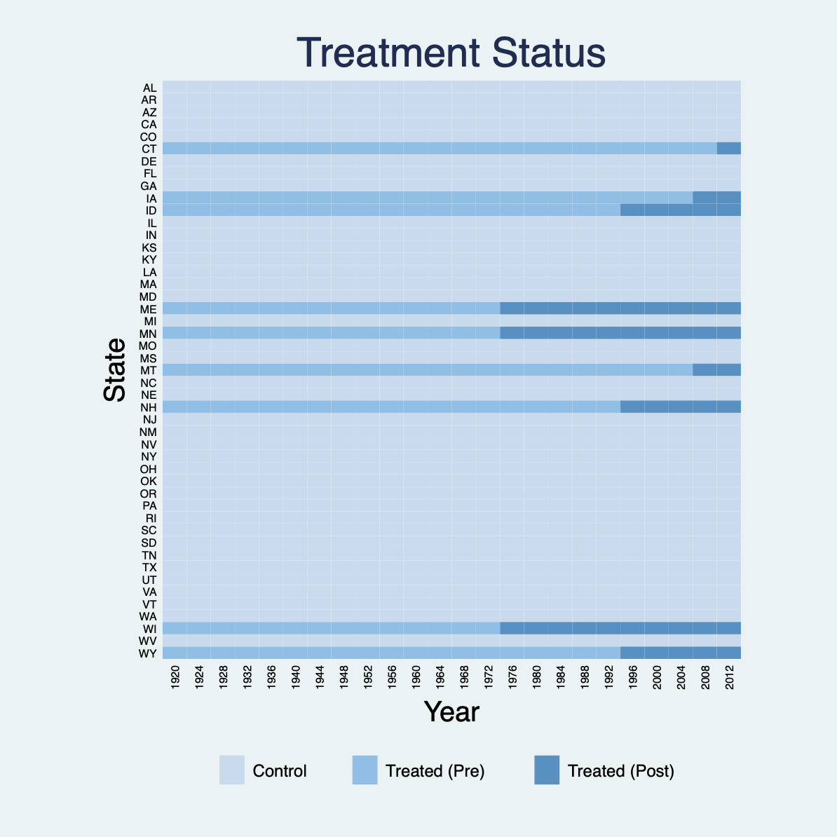
Using the turnout dataset (a balanced panel), we show the treatment status of Election Day Registration (EDR) in each state in a given year (Xu 2017). We can use the title option to change the title of the plot and change the titles of x- and y-axes through xtitle and ytitle, respectively. For DID-type panel data with a dichotomous treatment indicator, we can distinguish the pre- and post-treatment periods for treated units by specifying prepost.
In the plot below, turnout is the outcome, policy_edr is the treatment, policy_mail_in and policy_motor are covariates.
use turnout.dta, clear
panelview turnout policy_edr policy_mail_in policy_motor, i(abb) t(year) type(treat) xtitle("Year") ytitle("State") title("Treatment Status")
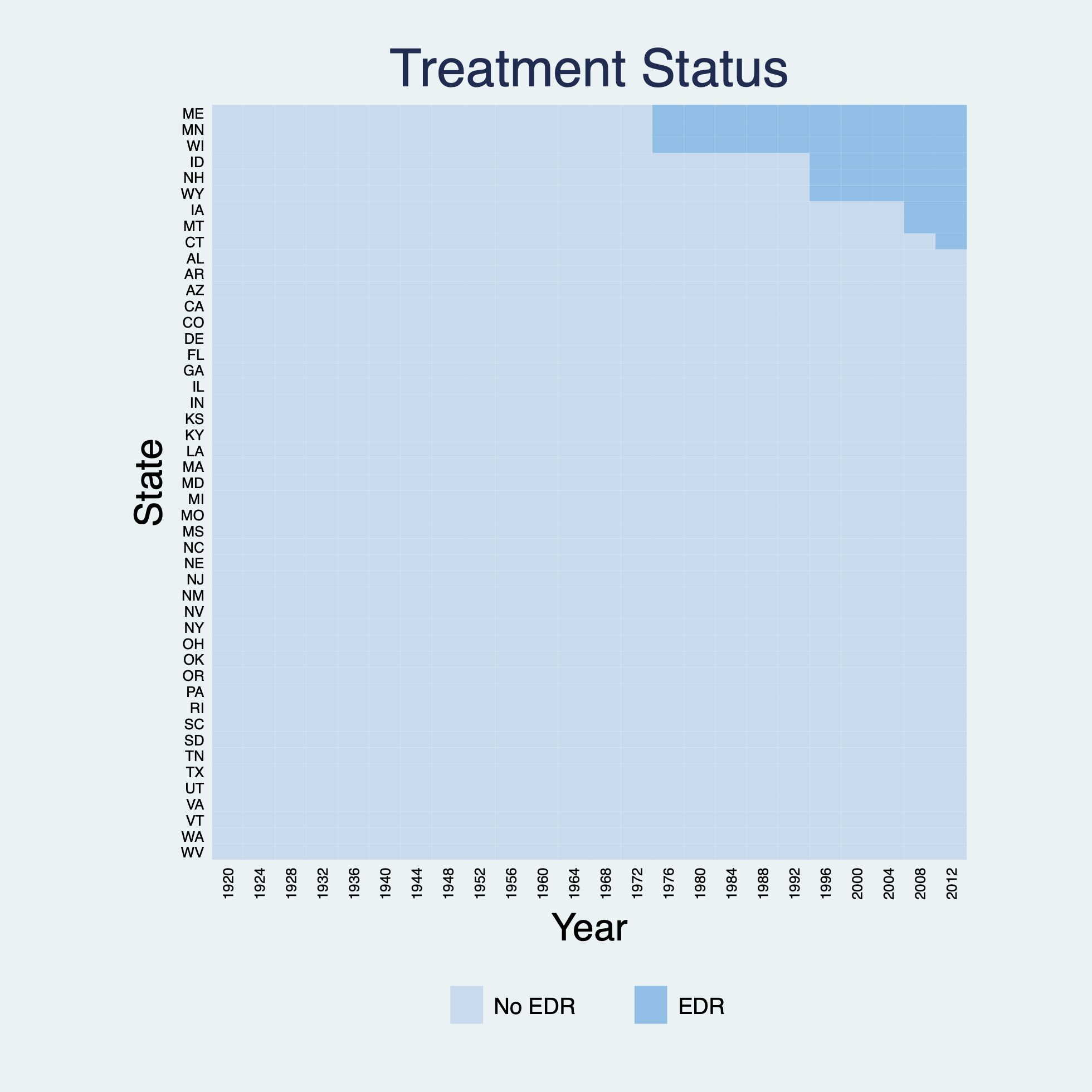
We can use the bytiming option to sort units by the timing of first receiving the treatment and use legend to change labels in the legend:
*bytiming
panelview turnout policy_edr policy_mail_in policy_motor, i(abb) t(year) type(treat) xtitle("Year") ytitle("State") title("Treatment Status") bytiming legend(label(1 "No EDR") label(2 "EDR"))
Distinguish the pre- and post-treatment periods for treated units by specifying prepost:
*prepost
panelview turnout policy_edr policy_mail_in policy_motor, i(abb) t(year) type(treat) xtitle("Year") ytitle("State") title("Treatment Status") prepost
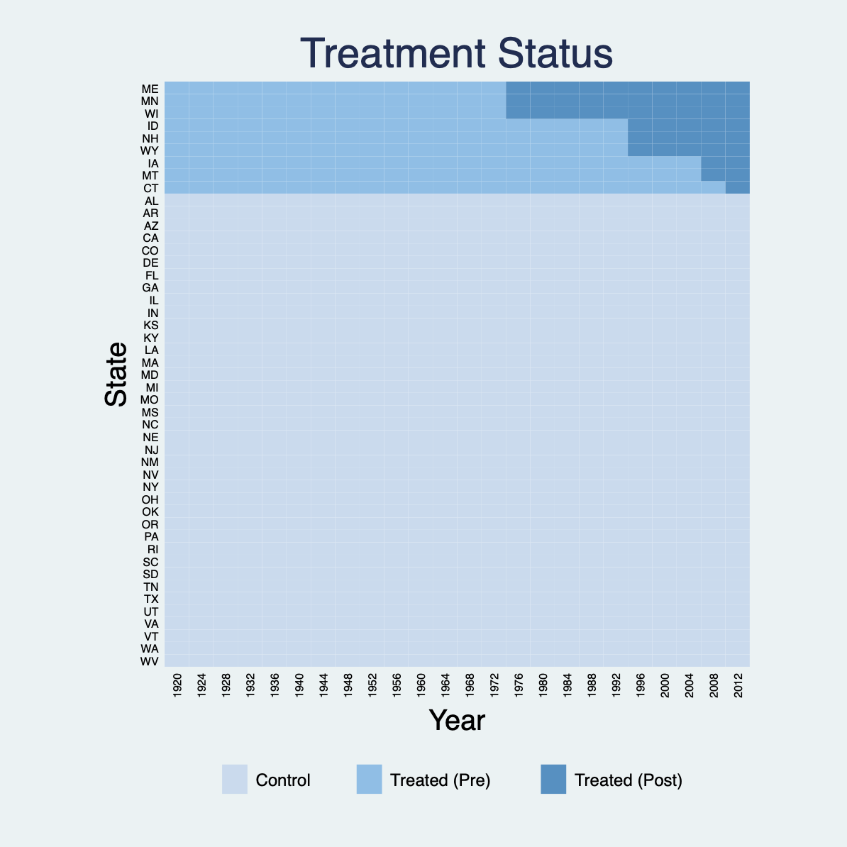
Again, sort units by the timing of receiving the treatment:
*bytiming
panelview turnout policy_edr policy_mail_in policy_motor, i(abb) t(year) type(treat) xtitle("Year") ytitle("State") title("Treatment Status") prepost bytiming
Remove the labels on the y-axis by specifying ylabel("") or ylabel(none):
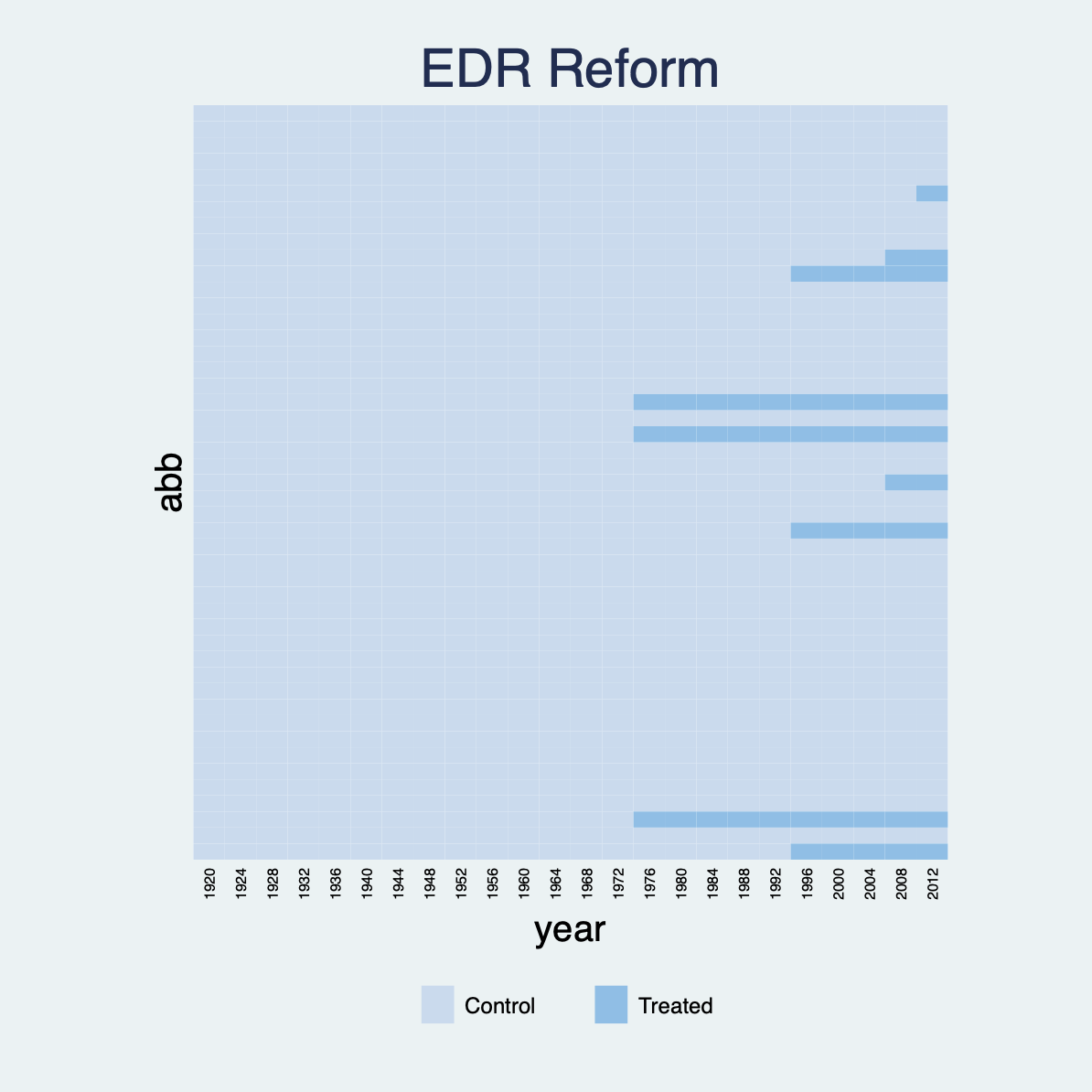
panelview turnout policy_edr policy_mail_in policy_motor, i(abb) t(year) type(treat) title("EDR Reform") ylabel("")
Change the color schemes for the controls and treated using the mycolor option. For example, PuBu indicates light purple to blue. Click here for more sequential colors' choice.
*mycolor(PuBu)
panelview turnout policy_edr policy_mail_in policy_motor, i(abb) t(year) type(treat) xtitle("Year") ytitle("State") title("Treatment Status") mycolor(PuBu) bytiming
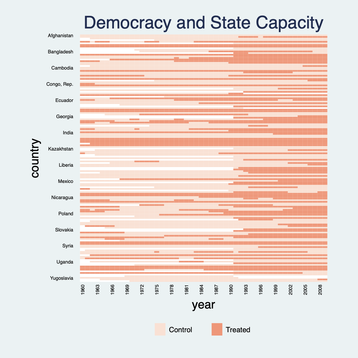
For a panel dataset in which the treatment may switch on and off, we no longer differentiate between pre- and post-treatment statuses. To demonstrate how panelview can be used in a more general setting, the following plot uses the capacity dataset, which is used to investigate the effect of democracy, the treatment, on state capacity, the outcome (Wang and Xu 2018). demo is a binary indicator of regime type. From the figure below, we see quite a few cases of democratic reversals and that there are many missing values (the white area). We use the xlabdist and ylabdist option to change the gaps between labels on the x- and y-axes:
use capacity.dta, clear
panelview lnpop demo lngdp , i(country) t(year) type(treat) mycolor(Reds) title("Democracy and State Capacity") xlabdist(3) ylabdist(10)
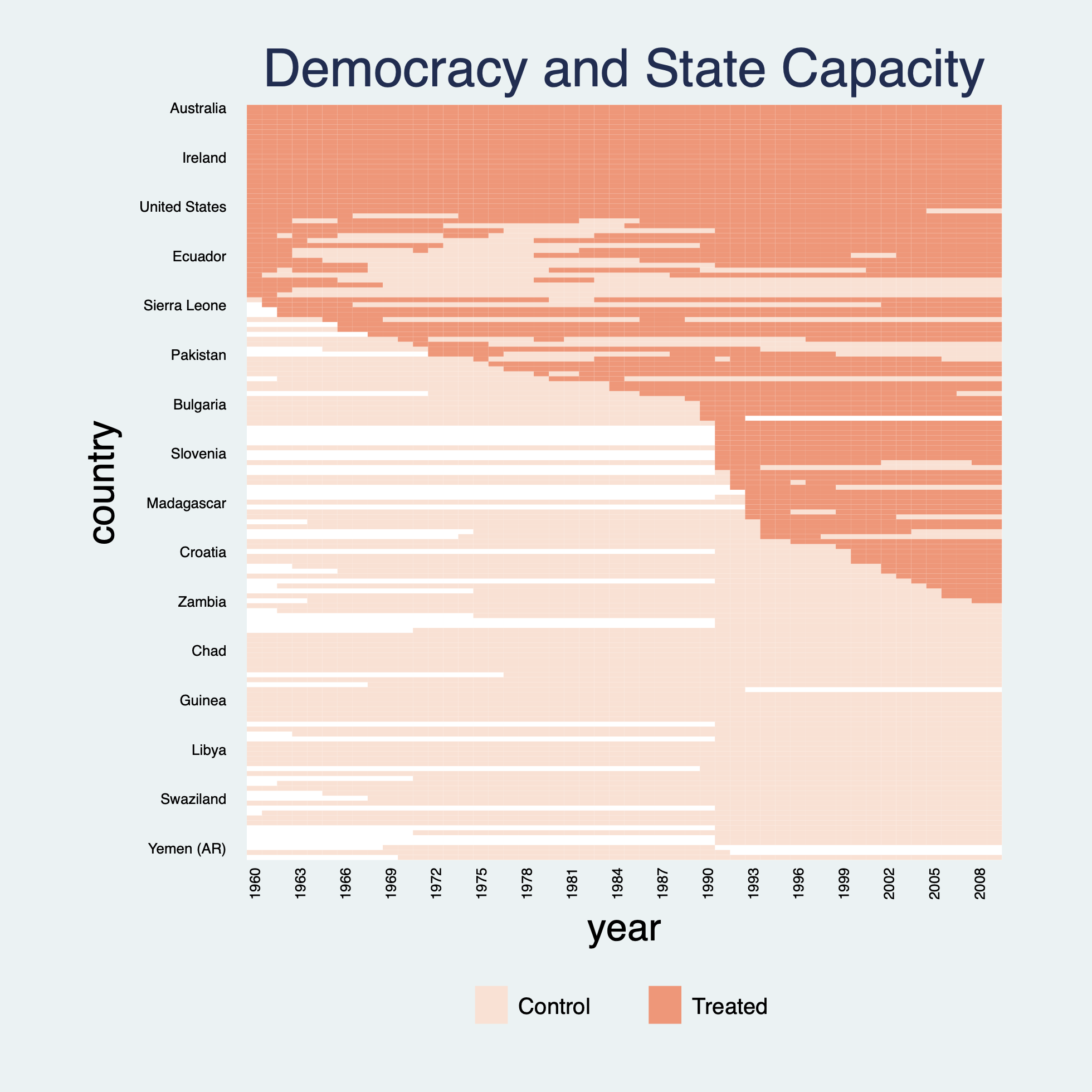
Sorting units based on the first period a unit receives the treatment gives a more appealing visual:
*bytiming
panelview lnpop demo lngdp, i(country) t(year) type(treat) mycolor(Reds) title("Democracy and State Capacity") xlabdist(3) ylabdist(10) bytiming
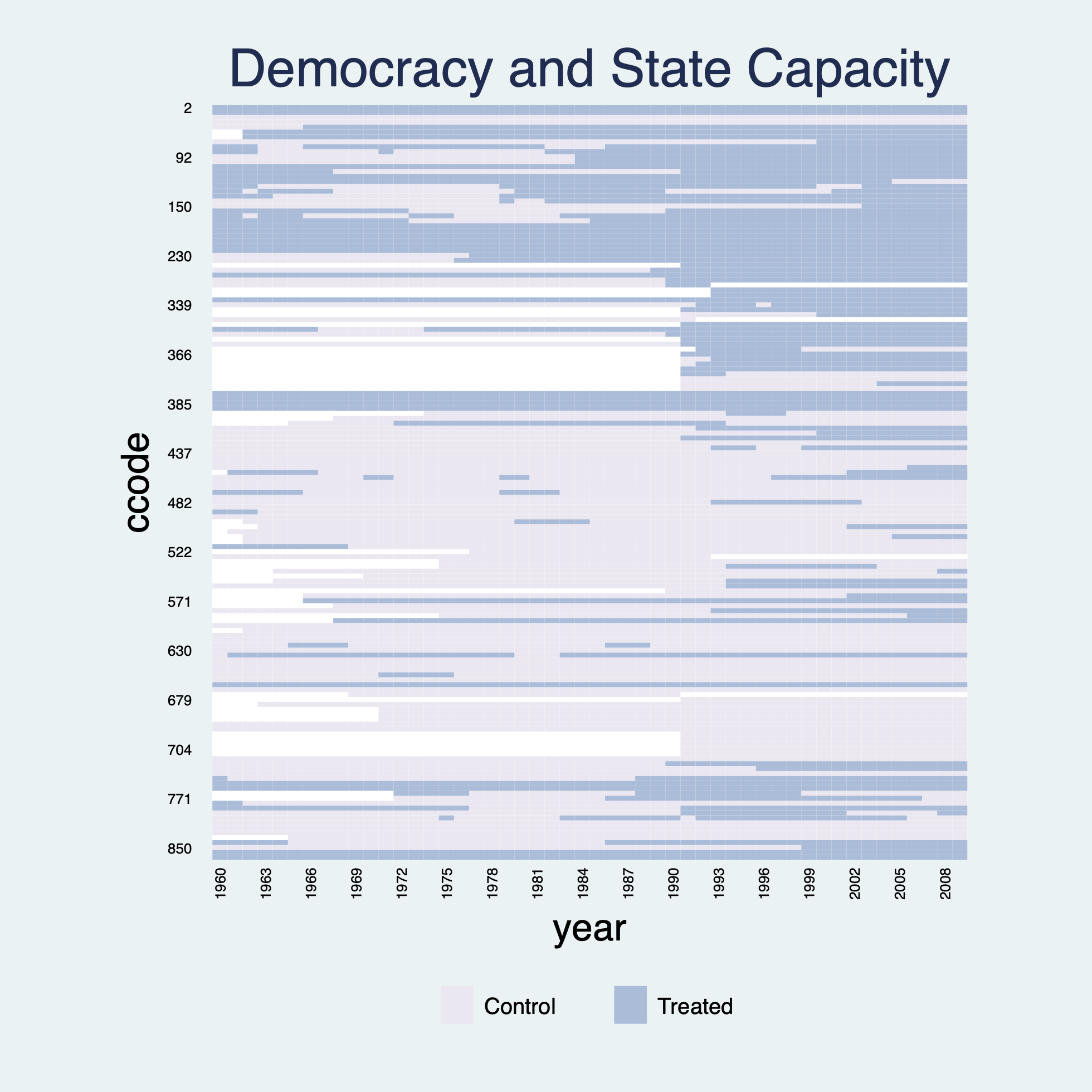
Instead of indicate country as units, we use i(ccode) to indicate country code as units, which will change the label and sequence in our figure:
panelview lnpop demo lngdp, i(ccode) t(year) type(treat) mycolor(PuBu) title("Democracy and State Capacity") xlabdist(3) ylabdist(10) //If we set ylabdist(11), the "155" appears at the bottom of ylabel and is hard to remove, different with R package
Sort units based on the first period a unit receives the treatment and use ylabel(none) to remove the labels on the y-axis:
*bytiming
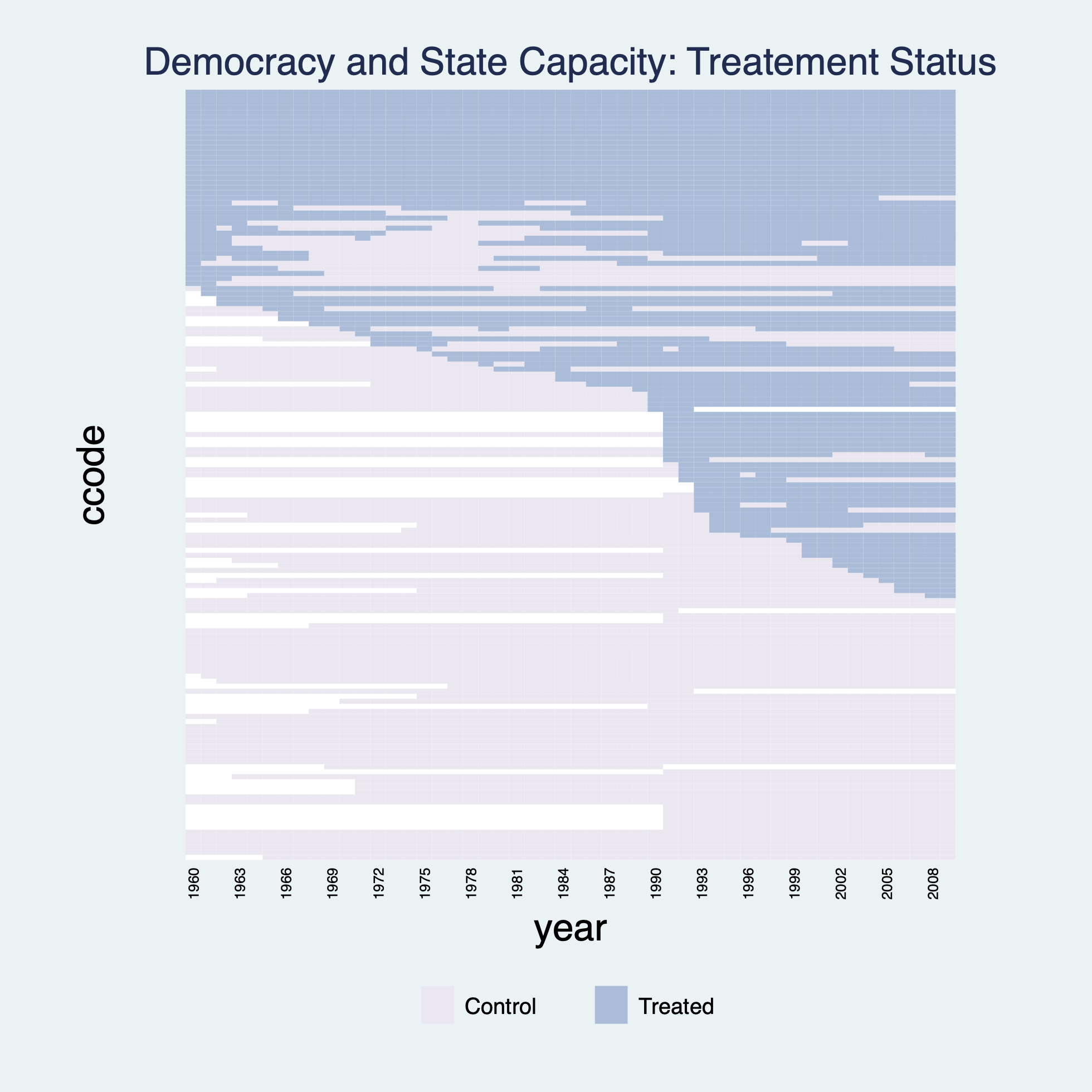
panelview lnpop demo lngdp, i(ccode) t(year) type(treat) mycolor(PuBu) title("Democracy and State Capacity: Treatement Status", size(medsmall)) bytiming xlabdist(3) ylabel(none)
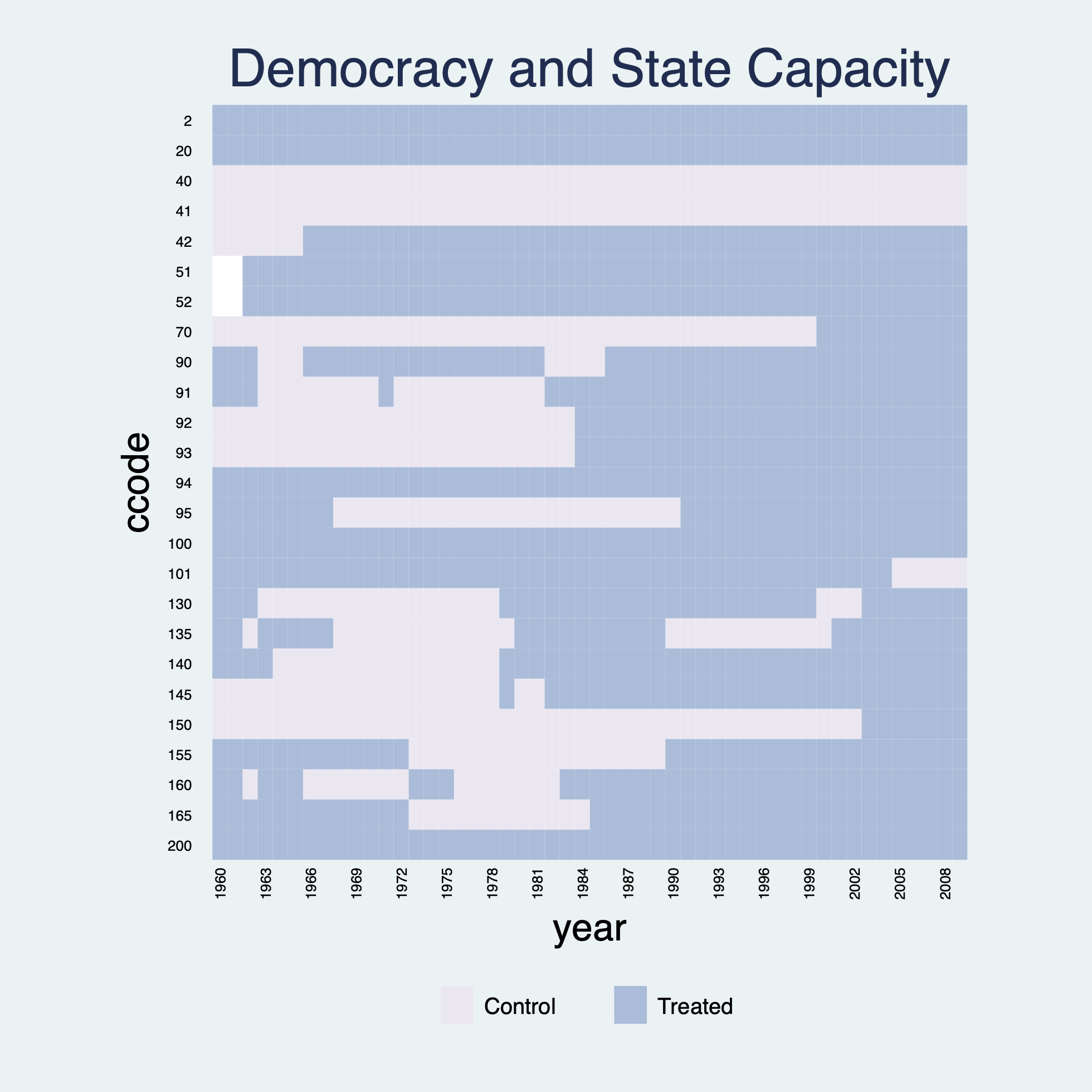
Sometimes a dataset has many units and we only want to take a peak of a subset of the units. panelview allows users to specify the units to be shown by the if subcommand. Note that if any variable not included in the varlist or i() / t() following panelview appears in the if or in command, we recommend researchers to add such variable into the varlist following panelview. In the following figure, we plot the treatment statuses of the first 25 units:
use capacity.dta, clear
egen ccodeid = group(ccode)
panelview lnpop demo lngdp ccodeid if ccodeid >= 1 & ccodeid <= 26, i(ccode) t(year) type(treat) mycolor(PuBu) title("Democracy and State Capacity") xlabdist(3)
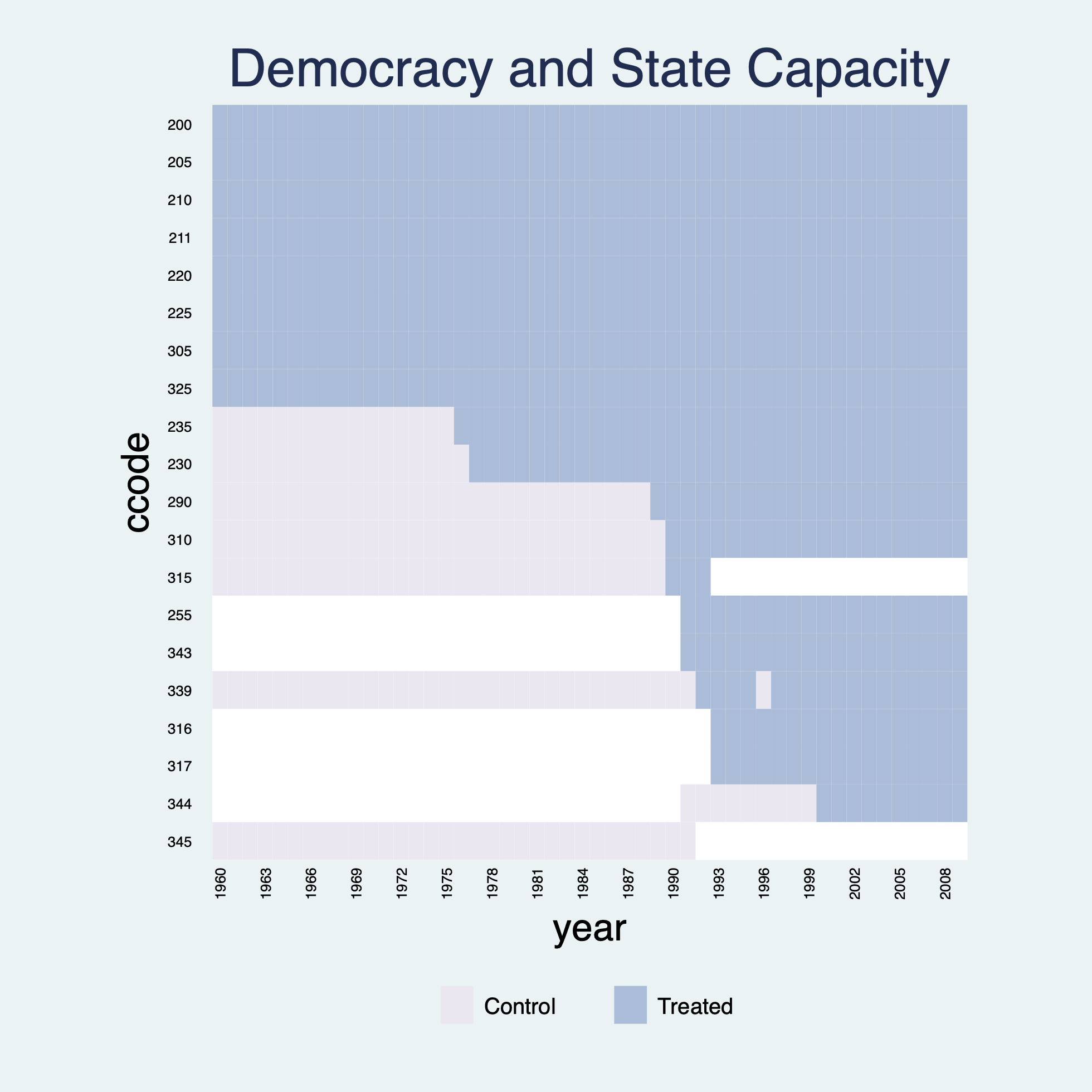
Sort units based on the first period a unit receives the treatment:
*bytiming
panelview lnpop demo lngdp ccodeid if ccodeid >= 26 & ccodeid <= 51, i(ccode) t(year) type(treat) mycolor(PuBu) title("Democracy and State Capacity") xlabdist(3) bytiming
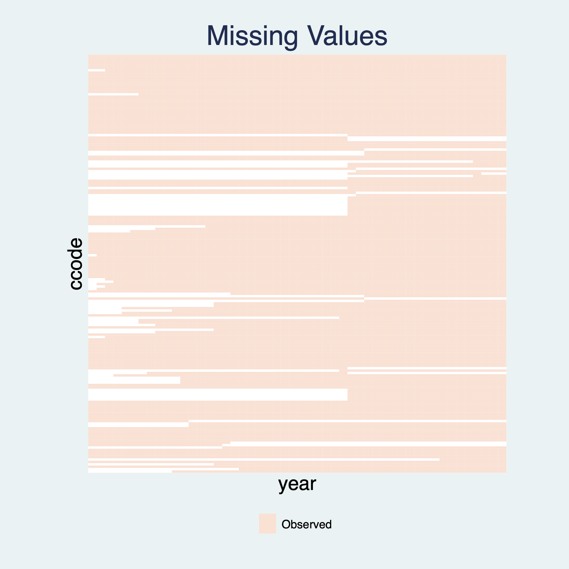
When we omit the treatment variable in a type(treat) plot, the plot will show missing (the white area) and non-missing values only. Another way to achieve this goal is to set type(missing).
use capacity.dta, clear
panelview demo, i(ccode) t(year) type(treat) mycolor(Reds) title("Missing Values") xlabel(none) ylabel(none) ignoretreat
If the treatment indicator has only 1 level, then treatment status will not be shown in the type(treat) plot, which is the same as ignoretreat:
use capacity.dta, clear
gen demo2 = 0
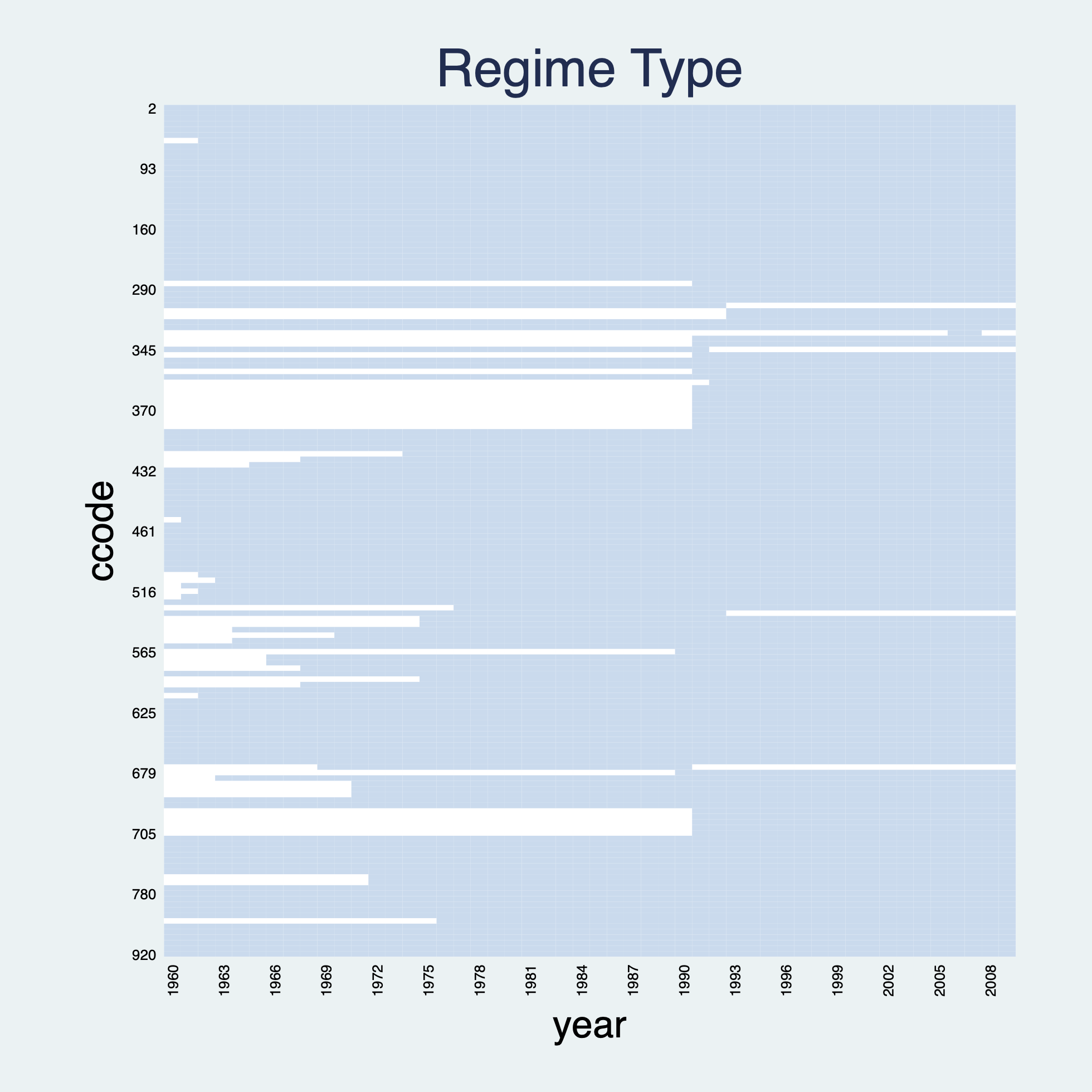
panelview Capacity demo2 lngdp, i(ccode) t(year) type(treat) title("Regime Type") xlabdist(3) ylabdist(11) legend(off) // type(treat) & number of treatment level = 1: same as ignoretreat
If the treatment indicator has only 1 level, then treatment status will not be shown in the type(outcome) plot, which is the same as ignoretreat:
use capacity.dta, clear
gen demo2 = 0
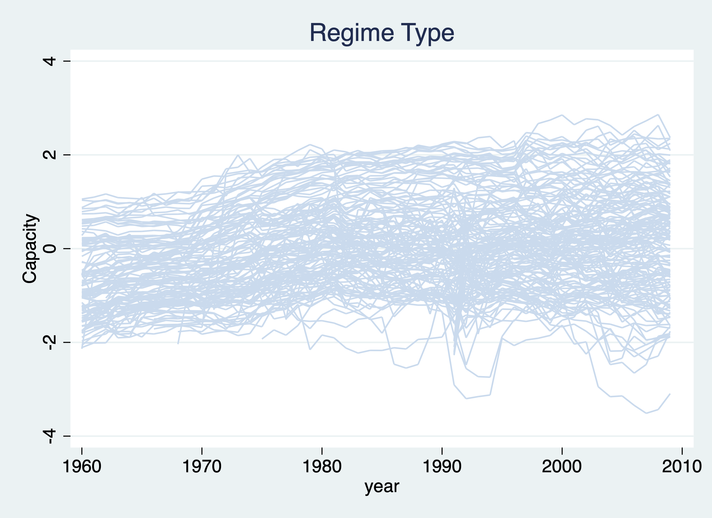
panelview Capacity demo2 lngdp, i(ccode) t(year) type(outcome) title("Regime Type") legend(off) // type(outcome) & number of treatment level = 1: same as ignoretreat
If the treatment indicator has more than 2 treatment levels or is a continuous variable, then treatment status will not be shown on the type(outcome) plot. In other words, type(outcome) combined with continuoustreat or > 2 treatment levels is the same as ignoretreat.
With a continuous treatment variable (e.g. polity2), the treatment status will not be shown on the type(outcome) plot. We also indicate theme(bw) for black and white color style.
use capacity.dta, clear
* Continuous Outcome: Capacity; Continuoustreat: polity2
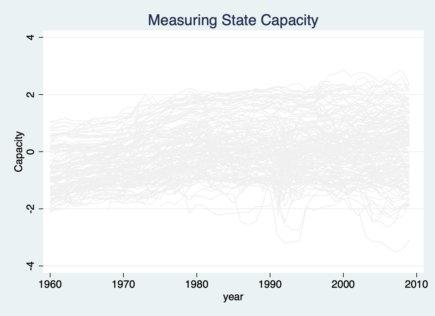
panelview Capacity polity2 lngdp, i(ccode) t(year) type(outcome) continuoustreat title("Measuring State Capacity") legend(off) theme(bw)
Same as the following two commands:
use capacity.dta, clear
panelview Capacity demo lngdp, i(ccode) t(year) type(outcome) title("Measuring State Capacity") ignoretreat legend(off)
* Treatment indicator has more than 2 treatment levels
* Continuous Outcome: Capacity
use capacity.dta, clear
gen demo2 = 0
replace demo2 = -1 if polity2 < -0.5
replace demo2 = 1 if polity2 > 0.5
tab demo2, m
panelview Capacity demo2 lngdp, i(ccode) t(year) type(outcome) title("Measuring State Capacity") legend(off) // number of treatment level = 3
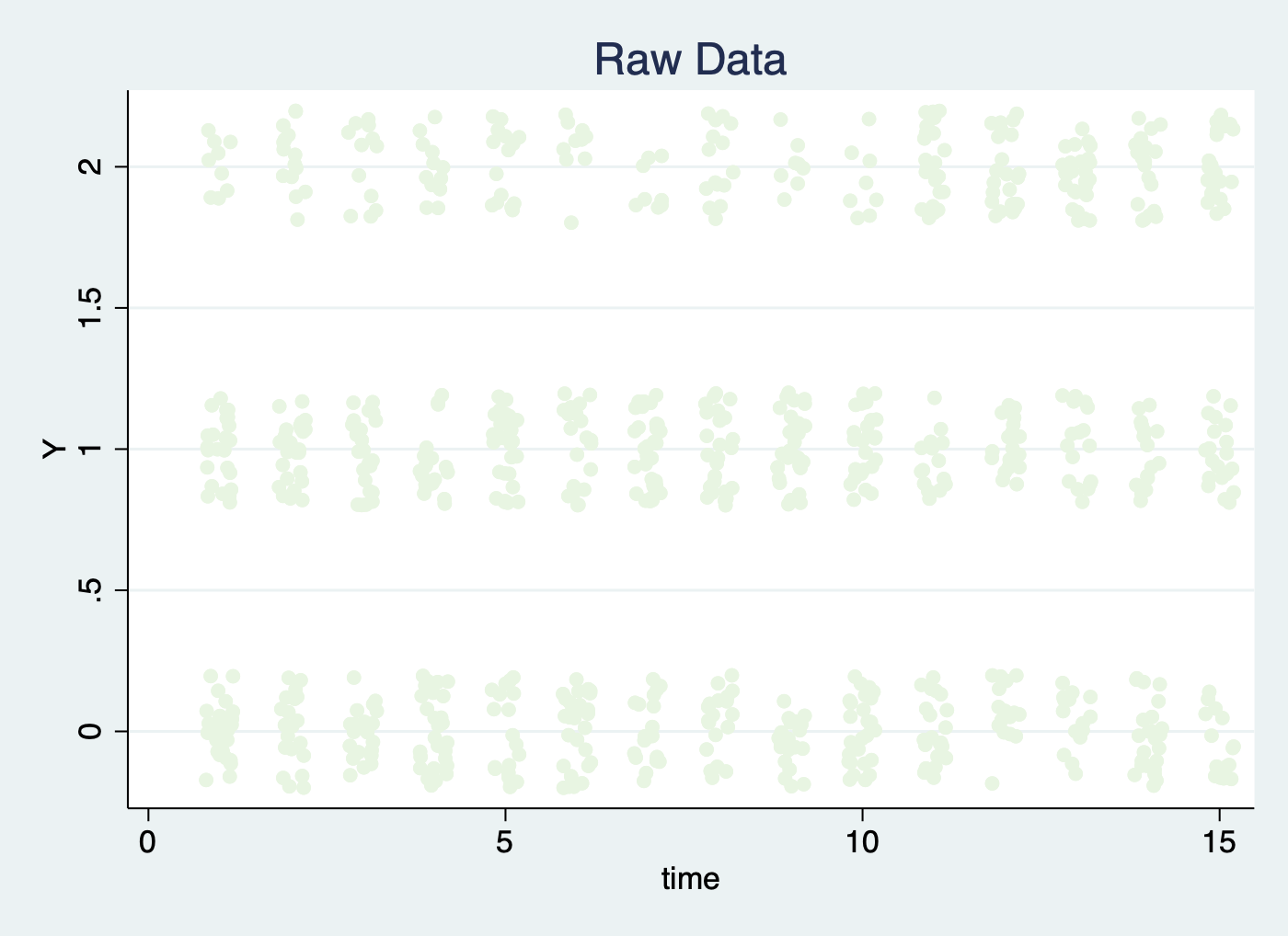
When the number of treatment levels is more than two, the treatment status will not be shown on the type(outcome) plot:
use simdata.dta, replace
replace D = 2 if time < 5
tab D, m
panelview Y D, type(outcome) i(id) t(time) mycolor(Greens) discreteoutcome title("Raw Data") // number of treatment level = 3
Same as the following two commands:
use simdata.dta, replace
panelview Y D, type(outcome) i(id) t(time) mycolor(Greens) discreteoutcome title("Raw Data") ignoretreat
use simdata.dta, replace
range x 0 1
panelview Y x, type(outcome) i(id) t(time) discreteoutcome title("Raw Data") continuoustreat theme(bw) // continuous treatment & black and white theme
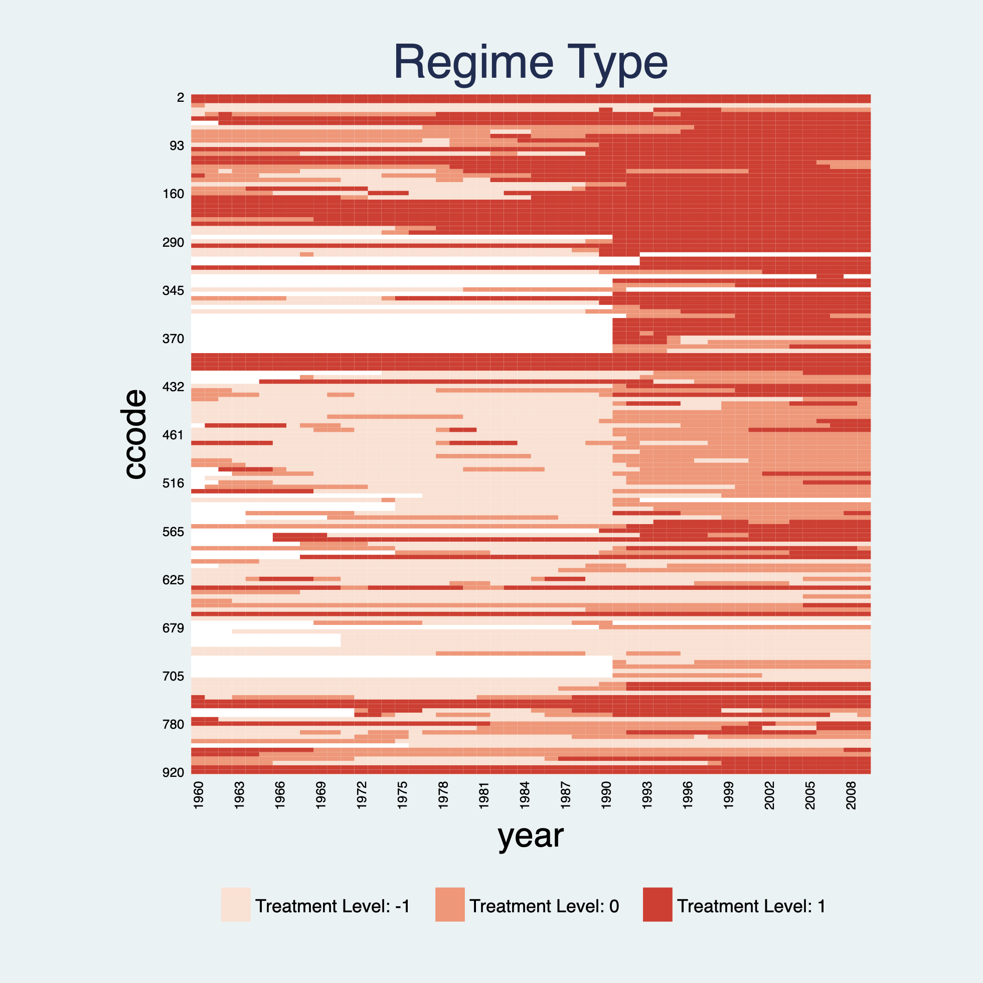
panelview supports panel data with more than 2 treatment levels. For example, we create a measure of regime type with three treatment levels:
use capacity.dta, clear
gen demo2 = 0
replace demo2 = -1 if polity2 < -0.5
replace demo2 = 1 if polity2 > 0.5
panelview Capacity demo2 lngdp, i(ccode) t(year) type(treat) title("Regime Type") xlabdist(3) ylabdist(11) mycolor(Reds) // type(treat) & number of treatment level = 3
use capacity.dta, clear
gen demo2 = 0
replace demo2 = -2 if polity2 < -0.7
replace demo2 = -1 if polity2 < -0.5 & polity2 > -0.7
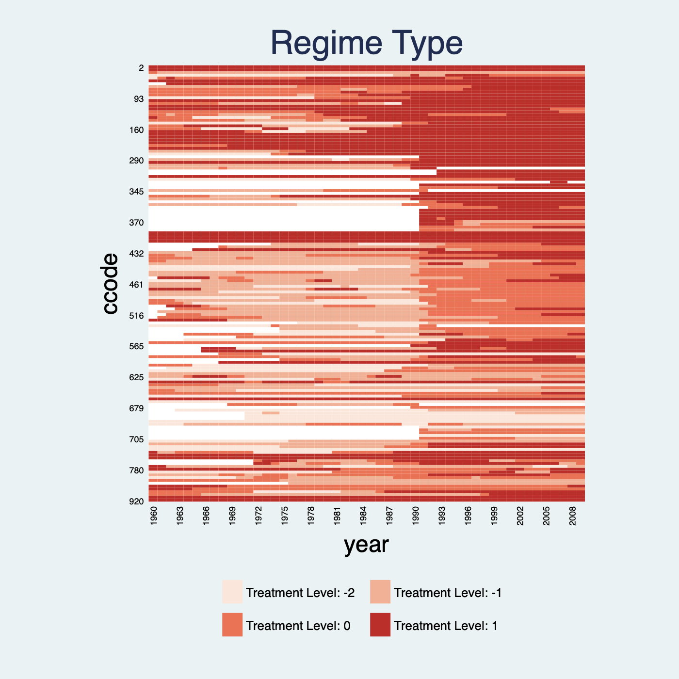
replace demo2 = 1 if polity2 > 0.5
panelview Capacity demo2 lngdp, i(ccode) t(year) type(treat) title("Regime Type") xlabdist(3) ylabdist(11) mycolor(Reds) // number of treatment level = 4
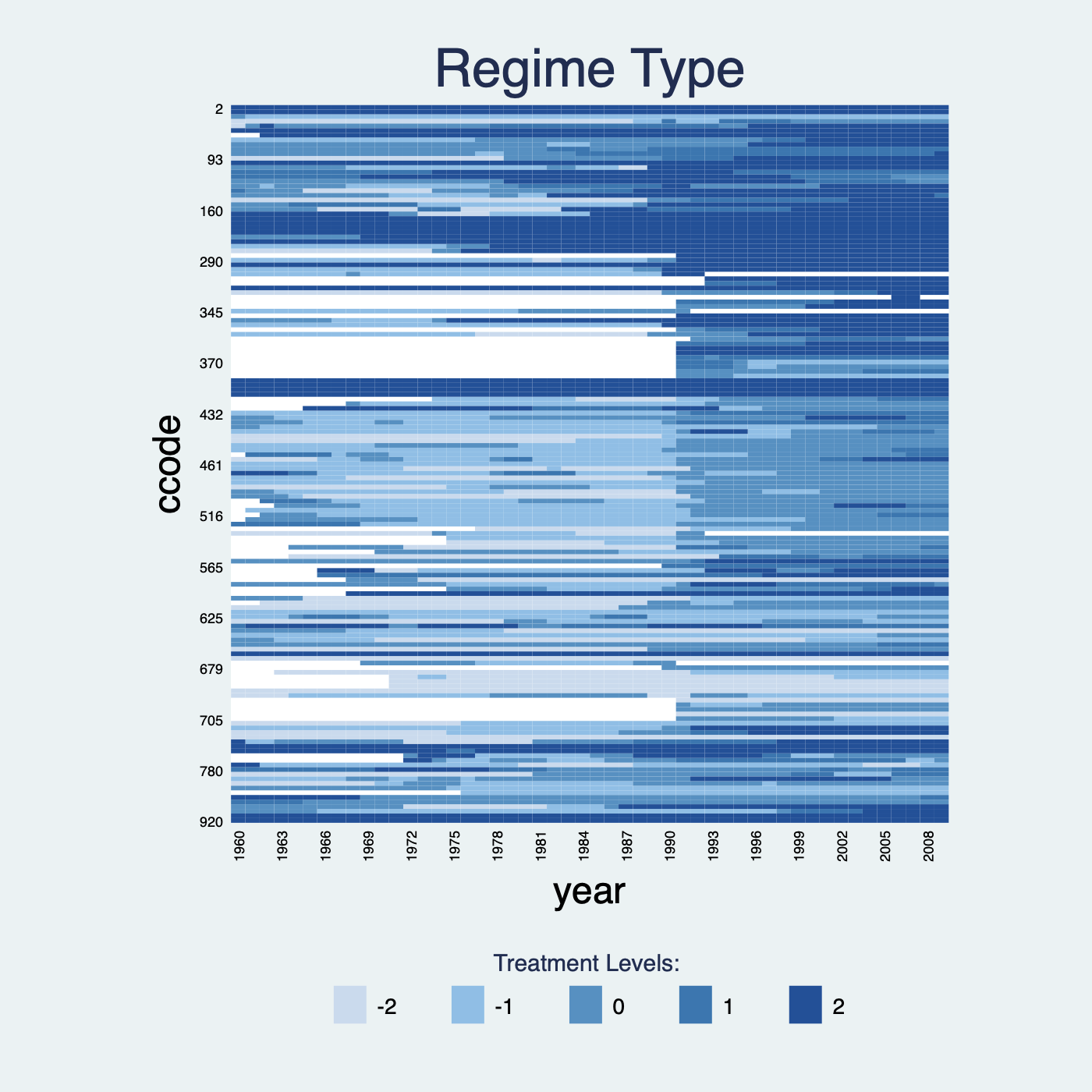
If the number of treatment levels is greater than 5, then the treatment indicator will be regarded as a continuous variable.
use capacity.dta, clear
gen demo2 = 0
replace demo2 = -2 if polity2 < -0.7
replace demo2 = -1 if polity2 < -0.5 & polity2 > -0.7
replace demo2 = 1 if polity2 > 0.5 & polity2 < 0.7
replace demo2 = 2 if polity2 > 0.7
tab demo2, m
panelview Capacity demo2 lngdp, i(ccode) t(year) type(treat) title("Regime Type") xlabdist(3) ylabdist(11) continuoustreat
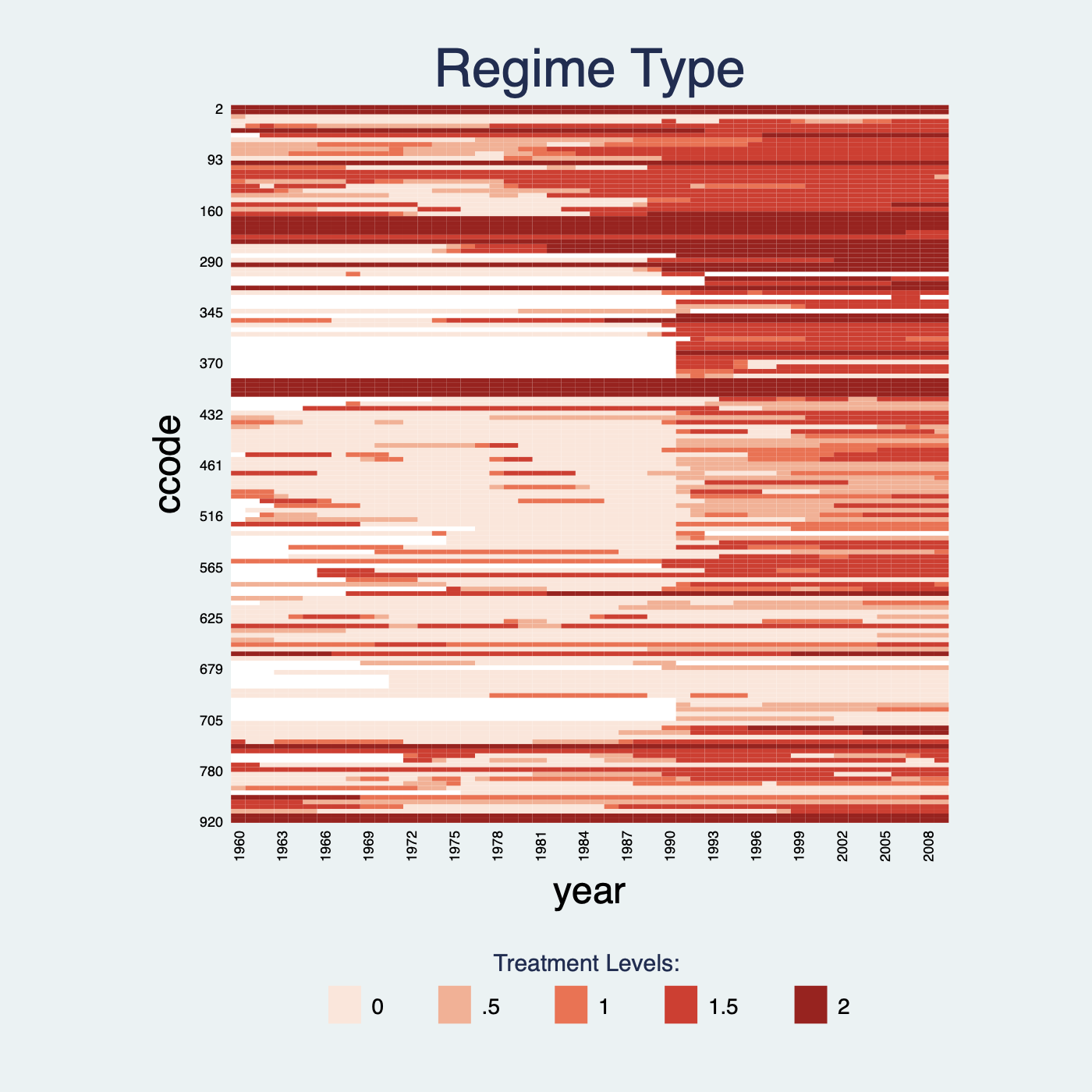
Plot the continuous treatment variable by continuoustreat.
use capacity.dta, clear
panelview lngdp polity2, i(ccode) t(year) type(treat) continuoustreat mycolor(Reds) title("Regime Type") xlabdist(3) ylabdist(11)
If we change the level of the continuous treatment variable, the legend will modify correspondingly:
use capacity.dta, clear
replace polity2 = polity2 + 1
panelview lngdp polity2, i(ccode) t(year) type(treat) continuoustreat mycolor(Reds) title("Regime Type") xlabdist(3) ylabdist(11)
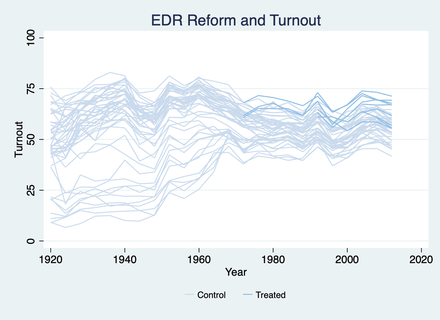
The second functionality of panelview is to show the raw outcome variable of a panel dataset in a time-series fashion. The syntax is very similar except that we need to specify type(outcome). Different colors represent different treatment conditions.
Note that we paint the period right before when the treatment begin as treated period. Different with type(treat), type(outcome)does not need xlabdist and ylabdist. If needed, we should use xlabel and ylabel instead.
* Continuous outcome: turnout: 0-100; Discrete Treatment: policy_edr: 0/1
use turnout.dta, clear
panelview turnout policy_edr policy_mail_in policy_motor, i(abb) t(year) type(outcome) xtitle("Year") ytitle("Turnout") title("EDR Reform and Turnout") ylabel(0 (25) 100)
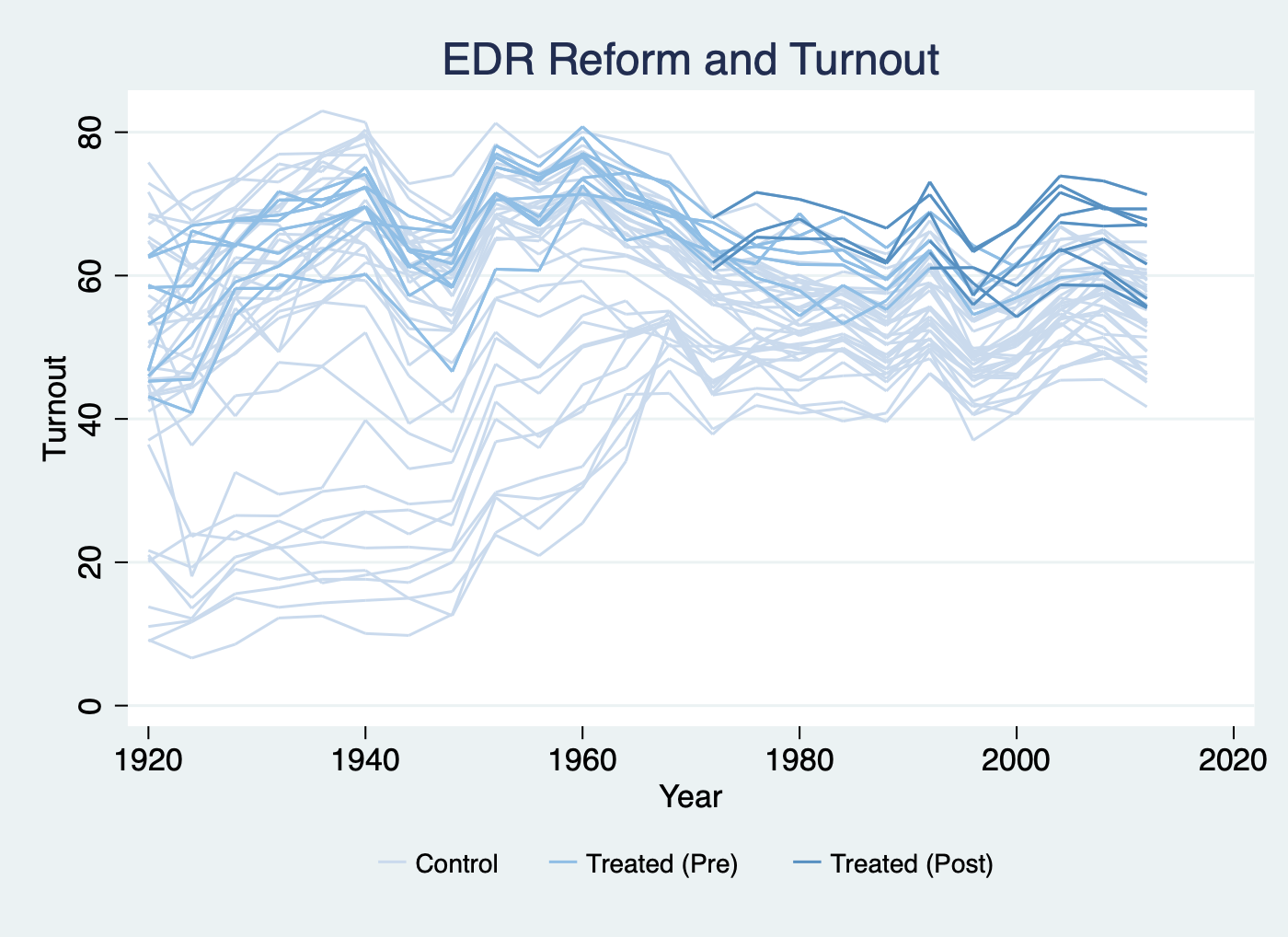
Distinguish the pre- and post-treatment periods for treated units:
*prepost
panelview turnout policy_edr policy_mail_in policy_motor, i(abb) t(year) type(outcome) xtitle("Year") ytitle("Turnout") title("EDR Reform and Turnout") prepost
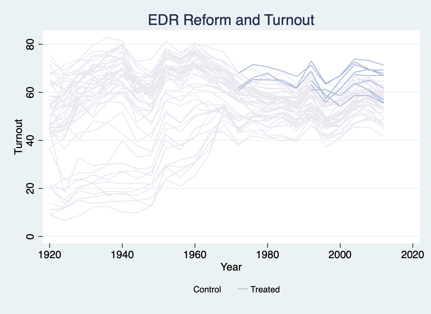
Apply the light purple to blue theme by specifying mycolor(PuBu):
use turnout.dta, clear
panelview turnout policy_edr policy_mail_in policy_motor, i(abb) t(year) type(outcome) xtitle("Year") ytitle("Turnout") title("EDR Reform and Turnout") mycolor(PuBu)
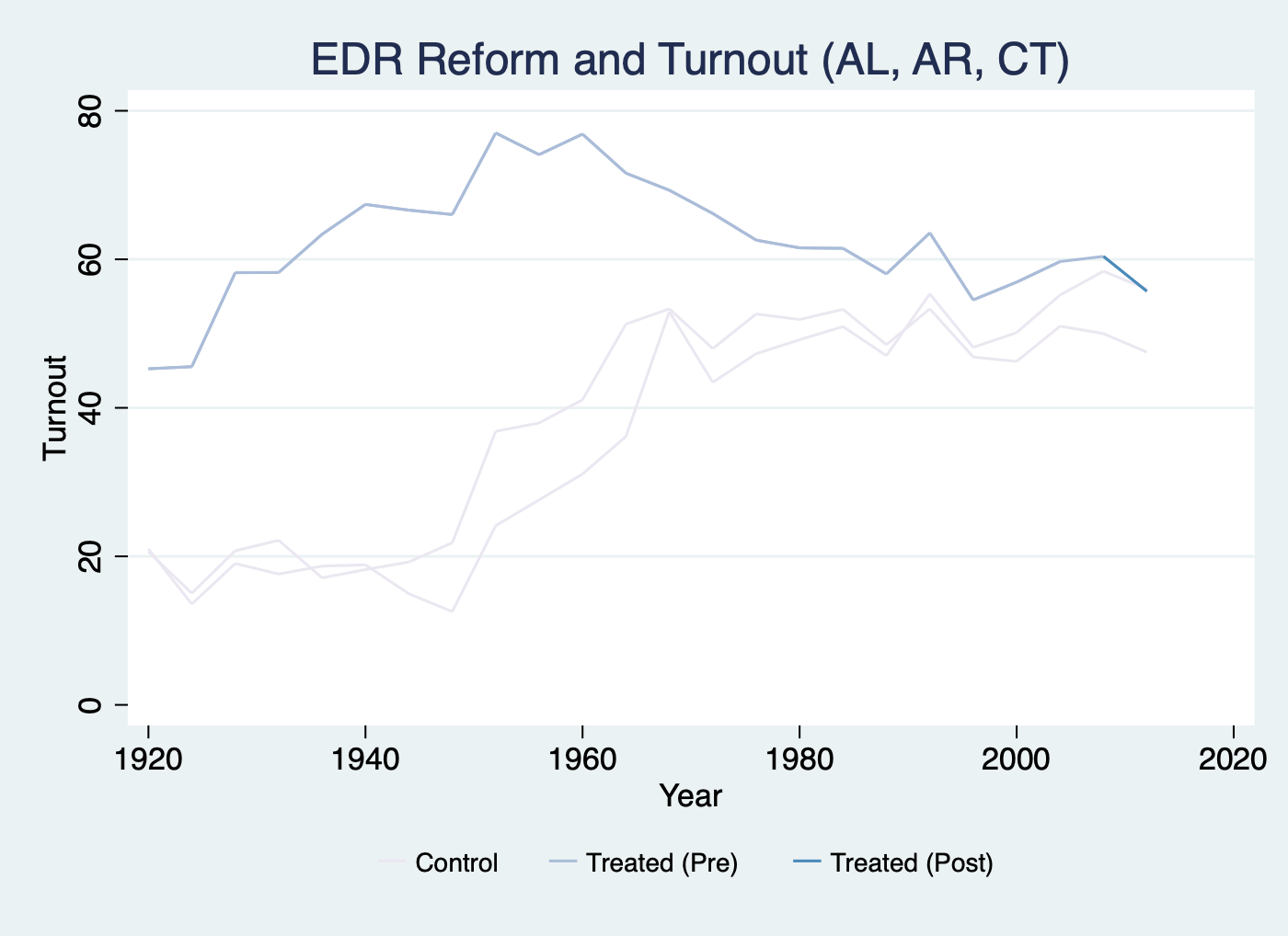
We can specify which unit(s) we want to take a look at:
use turnout.dta, clear
panelview turnout policy_edr policy_mail_in policy_motor if abb == 1|abb == 2|abb == 6, i(abb) t(year) type(outcome) xtitle("Year") ytitle("Turnout") title("EDR Reform and Turnout (AL, AR, CT)") mycolor(PuBu) prepost
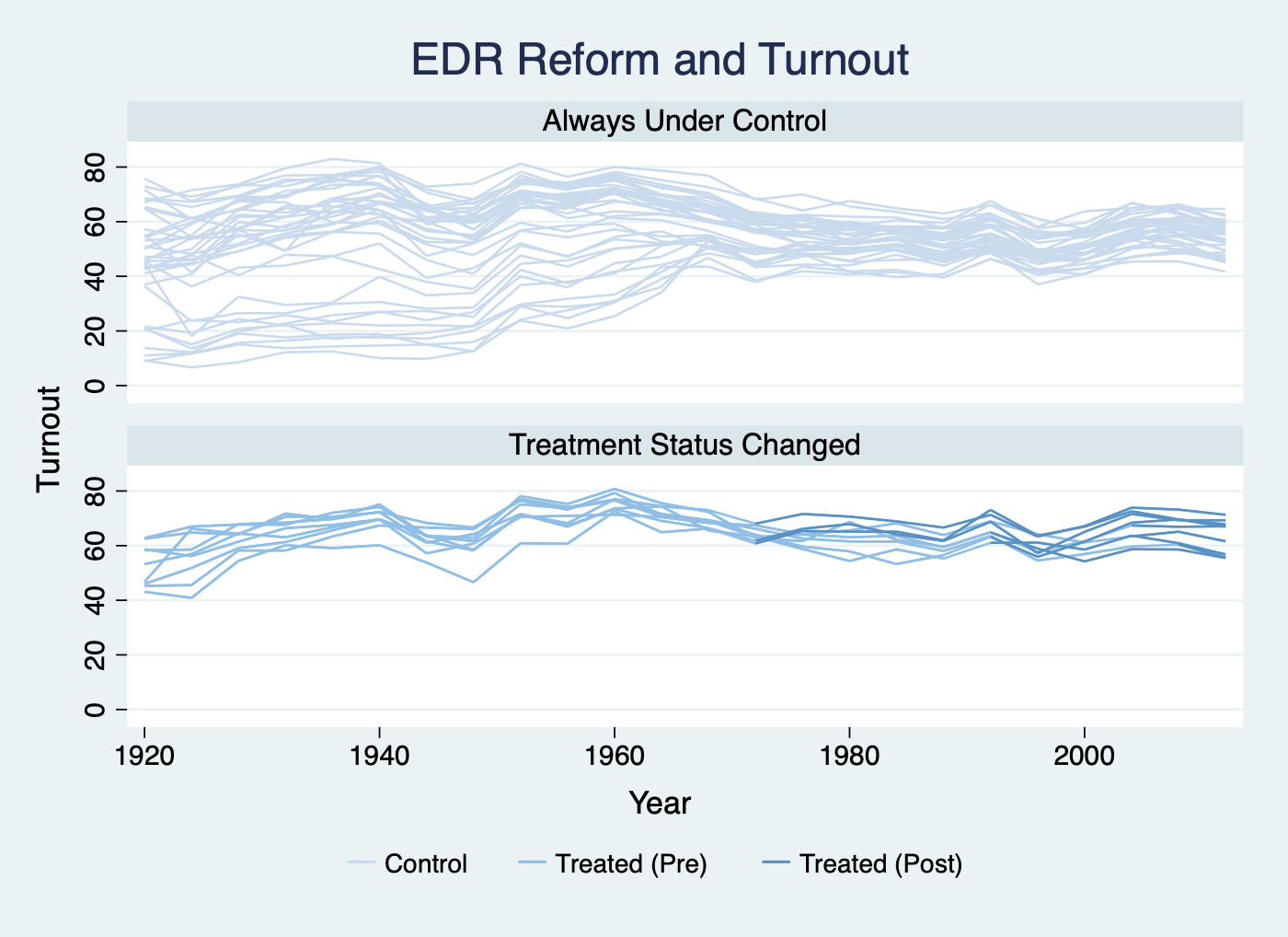
To better understand the data, sometimes we want to plot the outcome based on whether the treatment status has changed during the observed time period. We can simply add options prepost and bygroup. The algorithm will analyze the data and automatically put each unit into different groups, e.g. (1) units always being treated, (2) units always under control, (3) units whose treatment status has changed.
use turnout.dta, clear
panelview turnout policy_edr policy_mail_in policy_motor, i(abb) t(year) type(outcome) xtitle("Year") ytitle("Turnout") by(, title("EDR Reform and Turnout")) bygroup prepost xlabel(1920 (20) 2000)
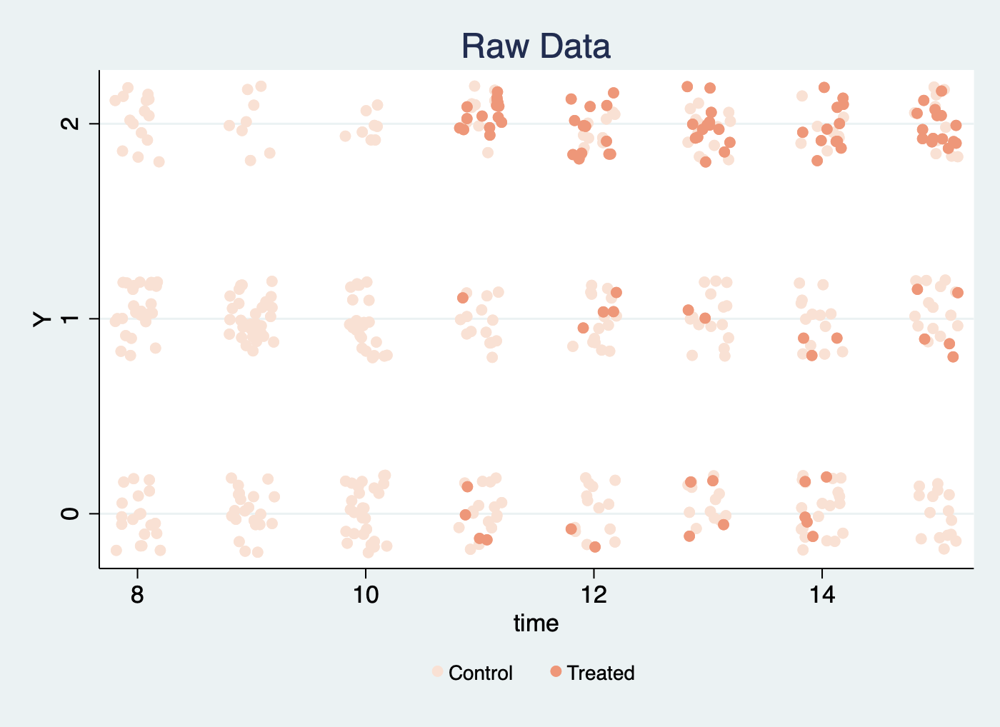
We can accommodate discrete variables by setting discreteoutcome. Below is an example using the simdata dataset, in which the outcome variable takes three values: 0, 1, and 2.
use simdata.dta, replace
panelview Y D if time >= 8 & time <= 15, type(outcome) i(id) t(time) mycolor(Reds) discreteoutcome title("Raw Data") xlabel(8 (2) 15) ylabel(0 (1) 2)
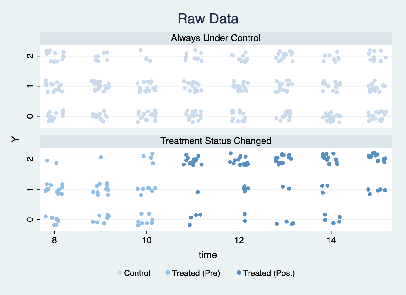
We split the sample based on changes in treatment status:
use simdata.dta, replace
panelview Y D if time >= 8 & time <= 15, type(outcome) i(id) t(time) discreteoutcome by(,title("Raw Data")) xlabel(8 (2) 15) ylabel(0 (1) 2) bygroup prepost
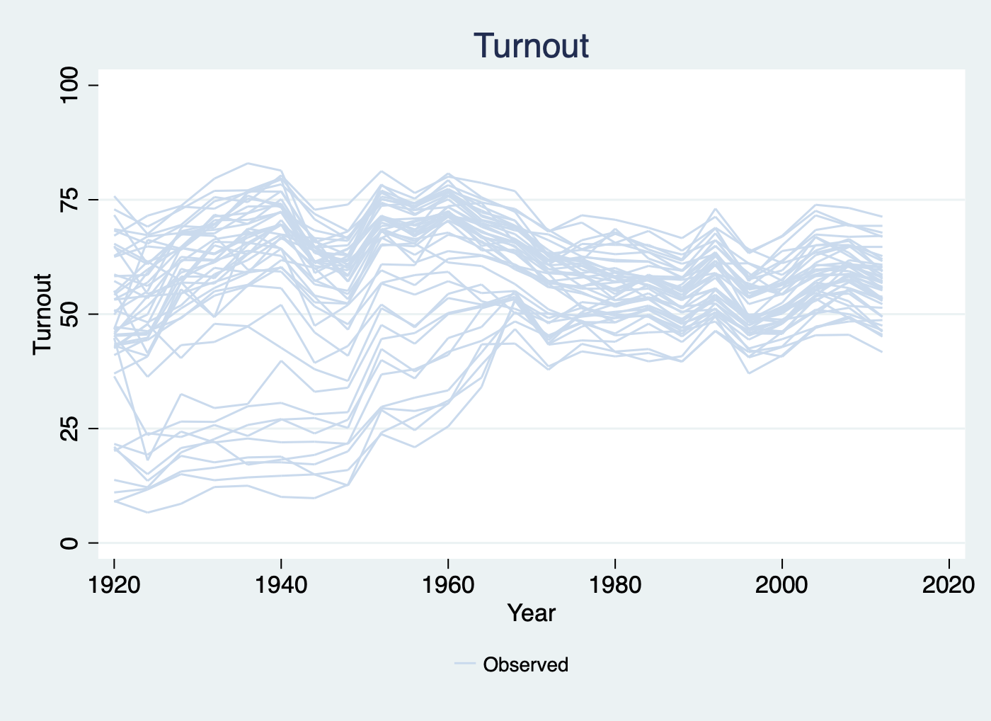
Plot an outcome variable (or any variable) in a panel dataset by type(outcome) and ignoretreat:
use turnout.dta, clear
panelview turnout, i(abb) t(year) type(outcome) xtitle("Year") ytitle("Turnout") title("Turnout") ylabel(0 (25) 100) ignoretreat
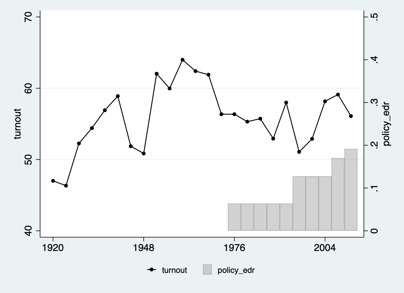
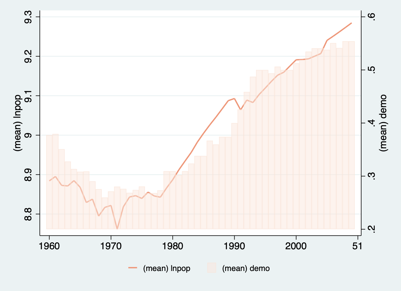
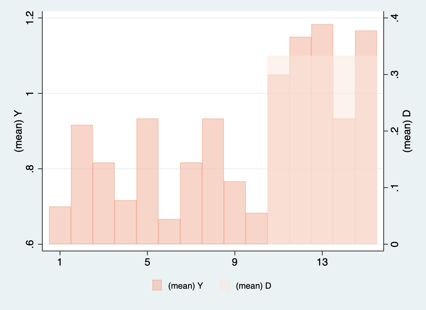
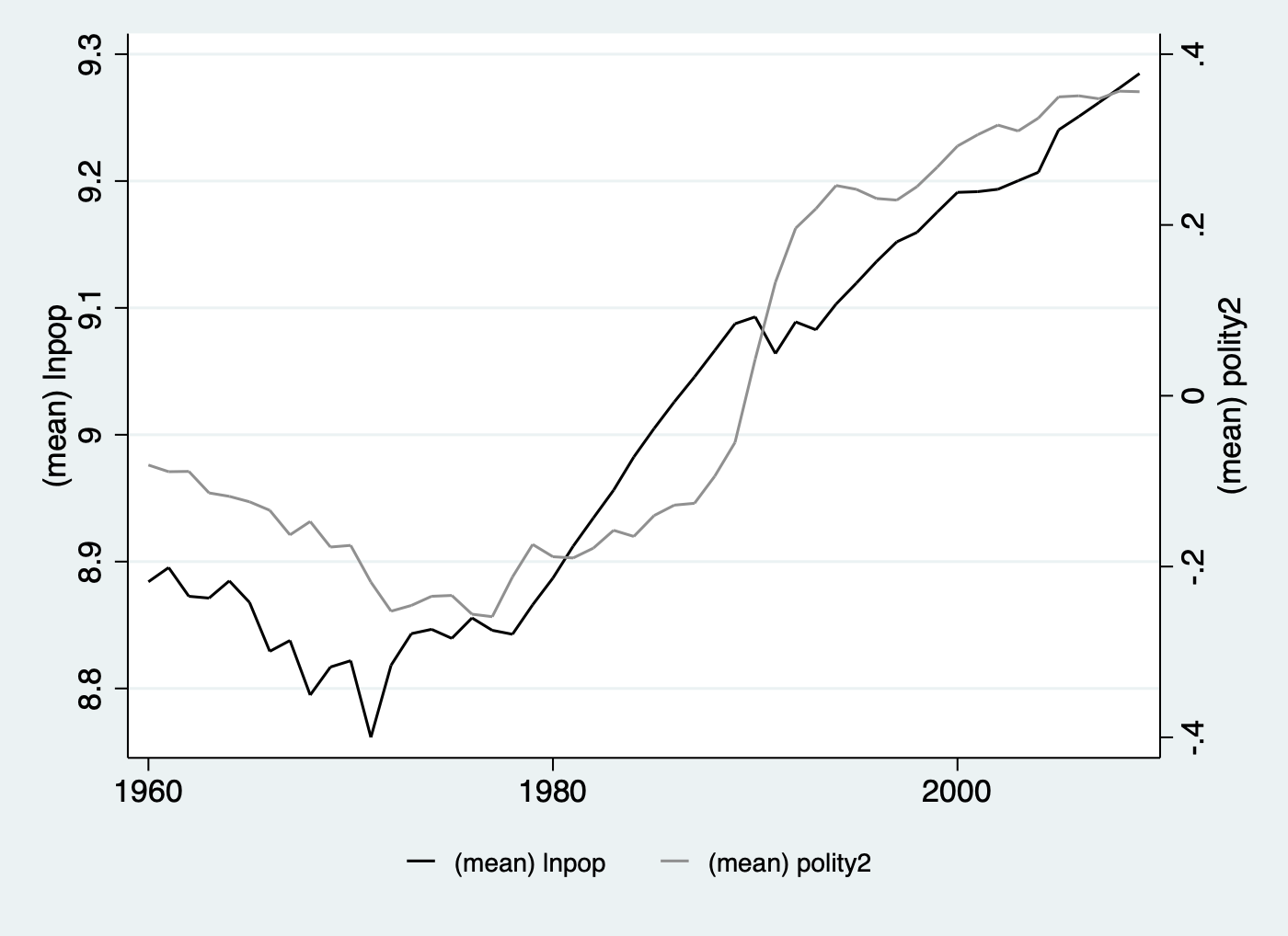
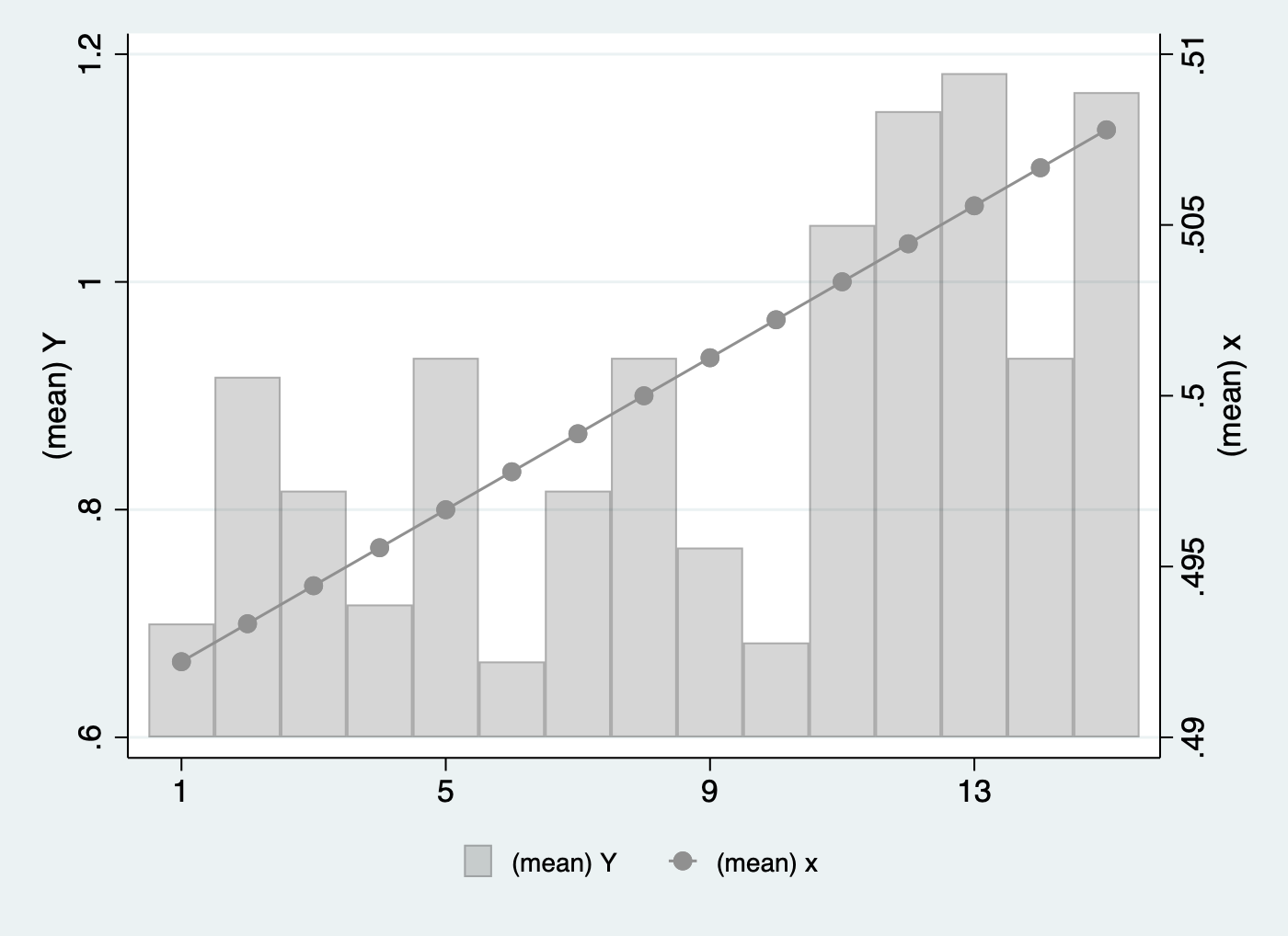
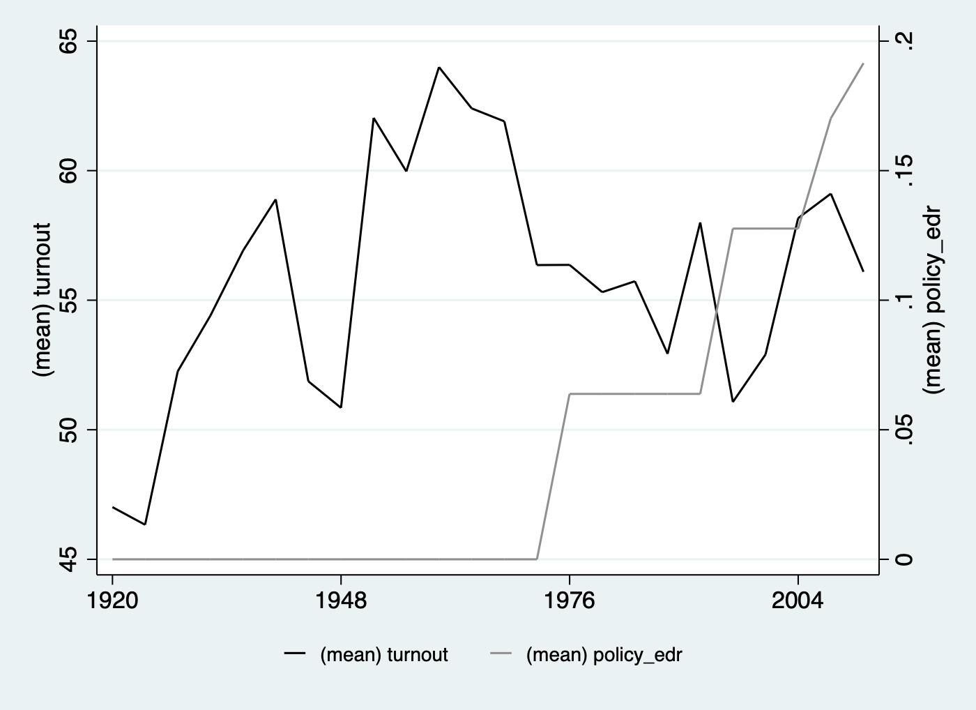
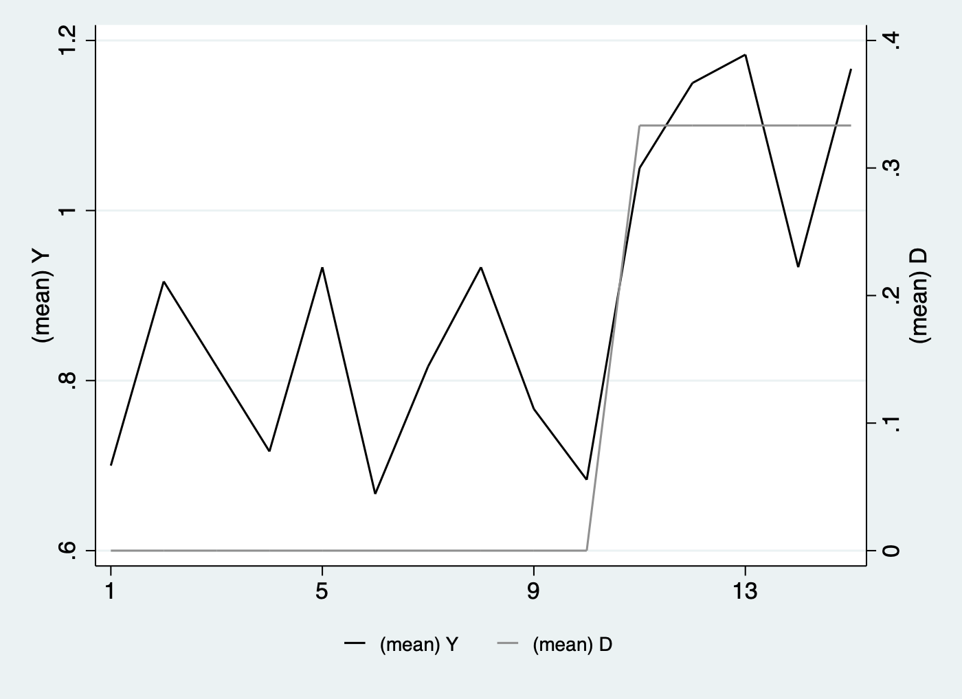
Visualize time series of the outcome and treatment in one figure by specifying type(bivar) or type(bivariate). For continuous variable, we use line plot as default; for discrete variable, we use bar plot. To plot connected lines ( connected or c ), lines ( line or l ), or bars ( bar or b ) rather than the default, please add style( , ), where the first element defines the outcome style, and the second defines the treatment style.
This section plots mean D and Y against time in the same graph.
With continuous outcome and discrete treatment, here are two examples. In the former one, style(c,b) means connected scatter instead of default line plot for the outcome and bar plot for the treatment. If any connected line, we can specify the symbol size by msize():
/***** 1. Y: continuous; D: discrete *****/
use turnout.dta, clear
*label the first and second y axes
panelview turnout policy_edr, i(abb) t(year) xlabdist(7) type(bivariate) msize(*0.5) style(c b) ytitle("turnout") ytitle("policy_edr", axis(2)) legend(label(1 "turnout") label(2 "policy_edr")) ylabel(40 (10) 70) ylabel(0 (0.1) 0.5, axis(2))
If not apply the default black and white theme, set option mycolor(). Besides, lwd(medthick) is to change the line width from the default medium to medthick:
use capacity.dta, clear
panelview lnpop demo, i(country) t(year) xlabdist(10) type(bivar) mycolor(Reds) lwd(medthick)
If the outcome is discrete, we can plot outcome and treatment against time in the same figure adding discreteoutcome:
/***** 2. Y: discrete; D: discrete *****/
use simdata.dta, replace
panelview Y D,i(id) t(time) discreteoutcome xlabdist(4) type(bivar) mycolor(Reds)
When treatment variable is continuous, we need to add the subcommands of continuoustreat:
/***** 3. Y: continuous; D: continuous *****/
use capacity.dta, clear
panelview lnpop polity2, i(country) t(year) continuoustreat xlabdist(20) type(bivar)
In the last situation, we plot discrete outcome and continuous treatment with options continuoustreat and discreteoutcome:
/***** 4. Y: discrete; D: continuous *****/
use simdata.dta, replace
range x 0 1
panelview Y x, i(id) t(time) continuoustreat discreteoutcome xlabdist(4) type(bivar) style(b c)
We can add style(l,l) or style(line) to plot lines instead of bars for treatment:
/***** Line the discete treatment *****/
* Y: continuous; D: discrete
use turnout.dta, clear
panelview turnout policy_edr policy_mail_in policy_motor, i(abb) t(year) xlabdist(7) style(line) type(bivar)
*Y: discrete; D: discrete
use simdata.dta, replace
panelview Y D,i(id) t(time) discreteoutcome xlabdist(4) style(line) type(bivar)
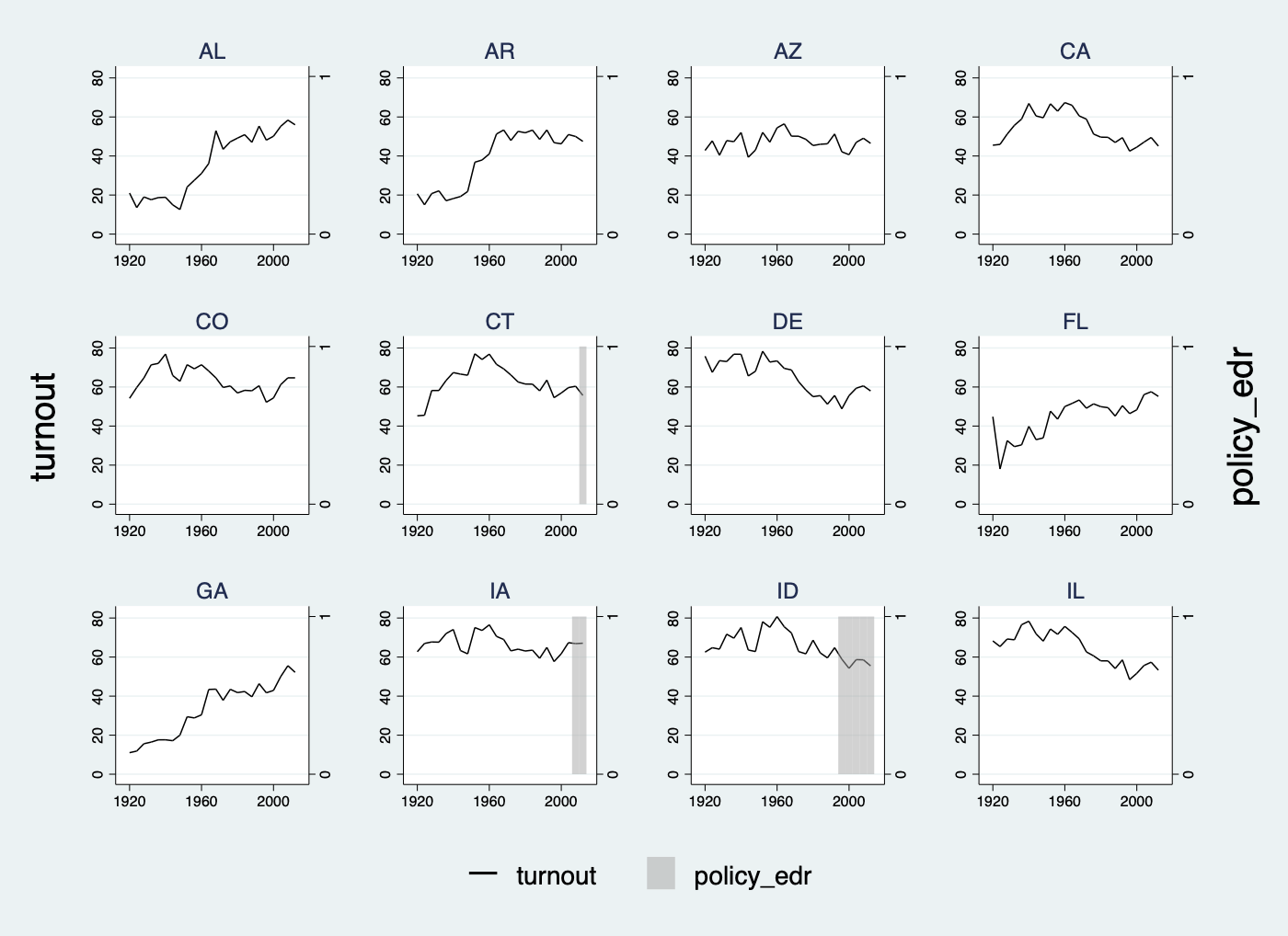
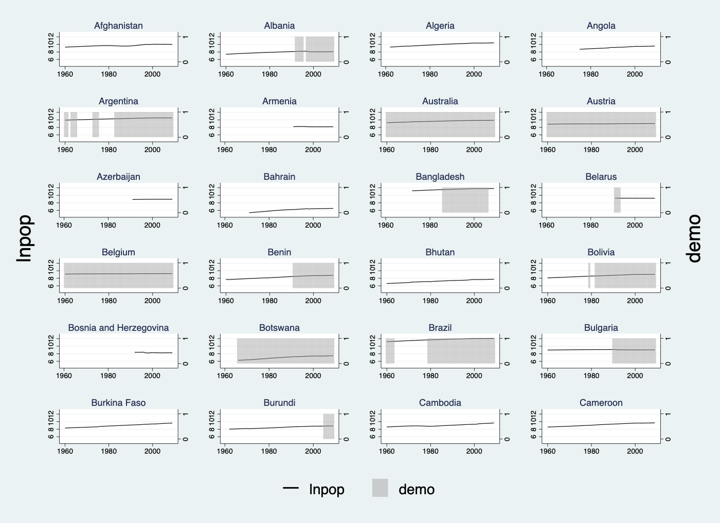
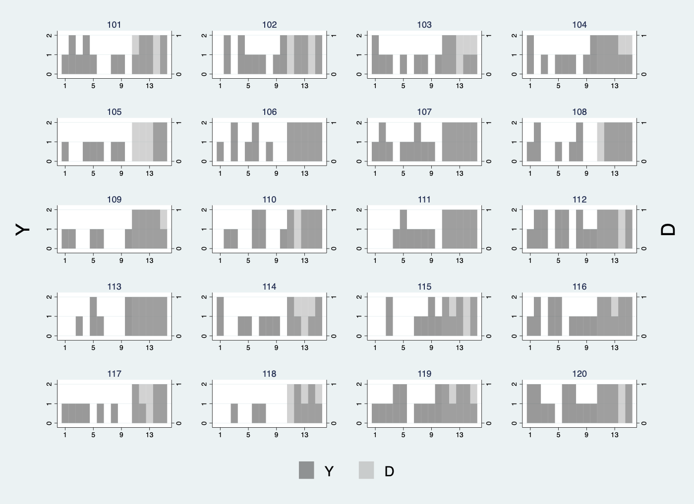
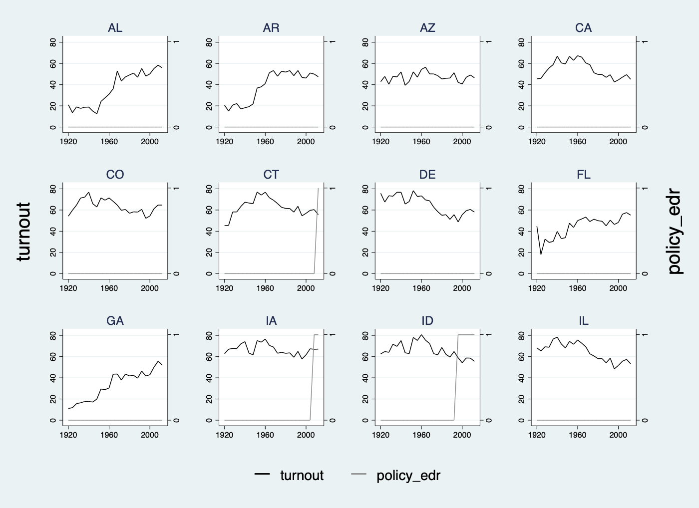
We plot D and Y against time by each unit by option byunit. Below are two examples with continuous outcome and discrete treatment variable. We arrange four subgraphs in one row:
/***** 1. Y: continuous; D: discrete *****/
use turnout.dta, clear
panelview turnout policy_edr policy_mail_in policy_motor if abb >= 1 & abb <= 12, i(abb) t(year) xlabdist(10) type(bivar) byunit
use capacity.dta, clear
panelview lnpop demo if country >= 1 & country <= 24, i(country) t(year) xlabdist(20) type(bivar) byunit
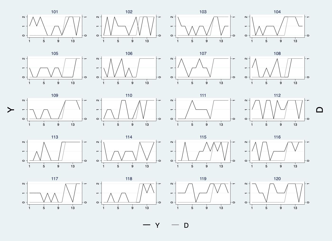
With discrete outcome and treatment:
/***** 2. Y: discrete; D: discrete *****/
use simdata.dta, replace
panelview Y D if id >= 101 & id <= 120,i(id) t(time) discreteoutcome xlabdist(4) type(bivar) byunit
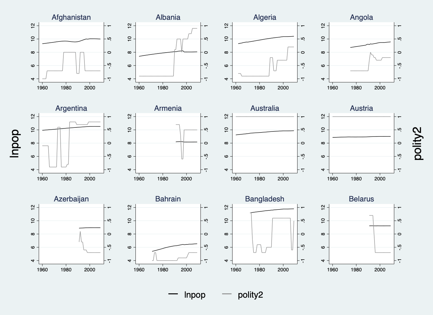
With continuous outcome and treatment:
/***** 3. Y: continuous; D: continuous *****/
use capacity.dta, clear
panelview lnpop polity2 if country >= 1 & country <= 12, i(country) t(year) continuoustreat xlabdist(20) type(bivar) byunit
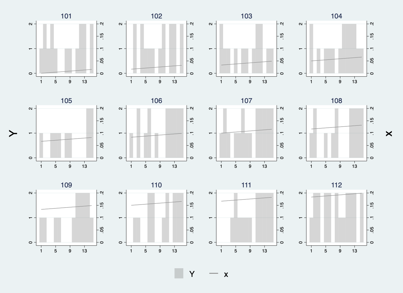
With discrete outcome and continuous treatment:
/***** 4. Y: discrete; D: continuous *****/
use simdata.dta, replace
range x 0 1
panelview Y x if id >= 101 & id <= 112, i(id) t(time) continuoustreat discreteoutcome xlabdist(4) type(bivar) byunit
To better visualize a discrete treatment whose value is sometimes zero, add style(l l) to invoke line plots instead of bar plots:
/***** Line the discete treatment *****/
* Y: continuous; D: discrete
use turnout.dta, clear
panelview turnout policy_edr policy_mail_in policy_motor if abb >= 1 & abb <= 12, i(abb) t(year) xlabdist(10) style(l l) type(bivar) byunit
*Y: discrete; D: discrete
use simdata.dta, replace
panelview Y D if id >= 101 & id <= 120,i(id) t(time) discreteoutcome xlabdist(4) style(l l) type(bivar) byunit
