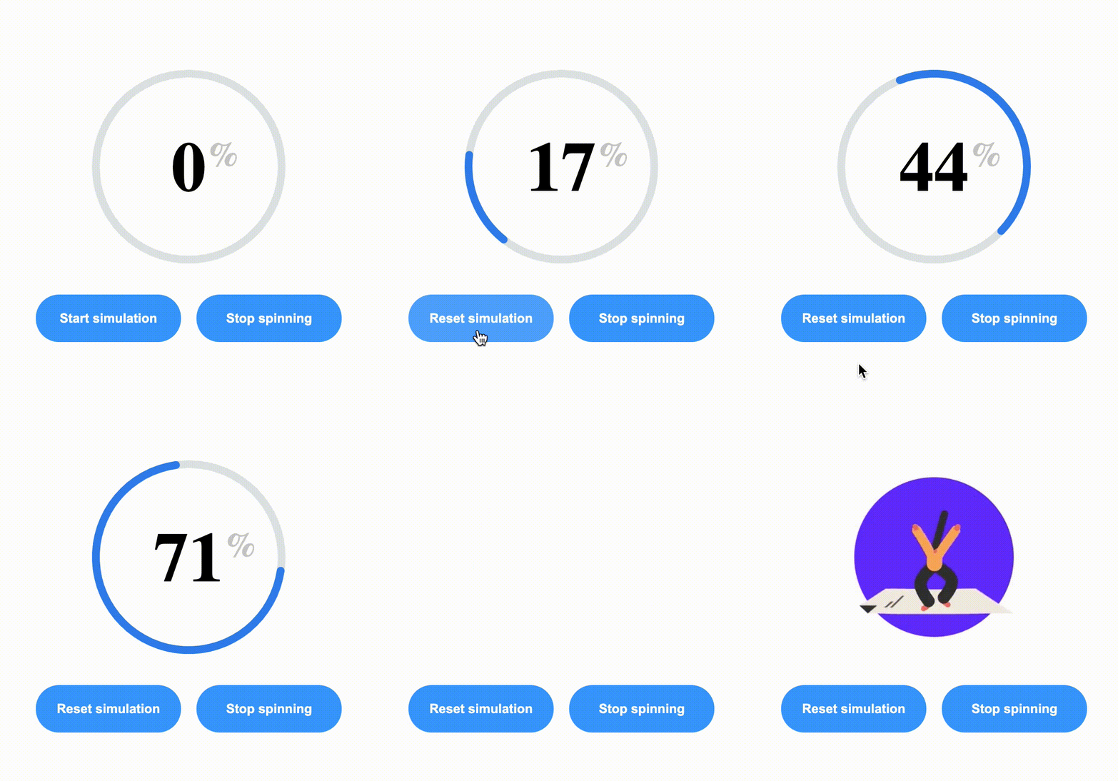
This project is a sample web app demoing a file transfer spinner similar to the one used by WeTransfer. A circular spinner is user where the progress segment increases in size while it rotates around text showing the upload progress as a percentage.
The following tools and technologies have been used to build up the project.
- React as the frontend framework and Typescript for typing.
- Parcel for the build process given its ease of use and zero-config setup
- CSS Modules for styling
- Jest and testing-library for testing. Given the incompatibility of Jest with Parcel we've had to transpile our components with Babel to be able to test them. So the Babel transpile is only done for test purposes.
To run the project on the browser simply
  git clone https://github.com/joaquindk/upload-spinner
  cd upload-spinner
  yarn install && yarn start
To run the tests
yarn test
To build the app for production
yarn build
The progress spinner component has been built using the VX library (https://github.com/hshoff/vx) based on D3JS given that I have prior experience using the library and that it makes it extremely easy to draw SVG shapes. In this case the component is basically made up of 2 SVG arcs:
- A progress arc that grows in size as the upload progress grows.
- A placeholder arc, shown in grey in the image above, around which the progress arc rotates.
The actual rotation of the progress arc is done with a simple CSS simulation that rotates the SVP path 360 degrees infinitely. The keyframe for the animation is define here: https://github.com/joaquindk/upload-spinner/blob/master/src/components/progressSpinner/ProgressSpinner.css#L1
| Property | Type | Description |
|---|---|---|
| progress | number | Current progress. |
| total | number | Total progress for which the task is considered completed. |
| progressColor | string | Color used for the segment showing the currently completed progress. |
| remainingColor | string | Color used for the segment showing the remaining progress. |
| backgroundColor | string | Color used for the background. |
| strokeWidth | number | Width of the segment strokes. |
| fontSizePx | number | Font size for the progress text. |
| spin | boolean | True if the progress arc should spin. |
A demo app has been built as part of the project to simulate an actual file upload and demonstrate the spinner's capabilities. As shown on the GIF above the app has 2 buttons:
- A button to start and reset an upload simulation. When we press this button and start a simulation the app starts injecting properties into the spinner component to simulate a file upload progress.
- A button to enable/disable the spinning feature on the component. When spinning is disabled the progress segment will continue to gro during an upload simulation, but not spin around while it does so.
Access the Demo here
