This project utilizes various CSS mechanics to create a near replica of the NASA website - visually speaking.
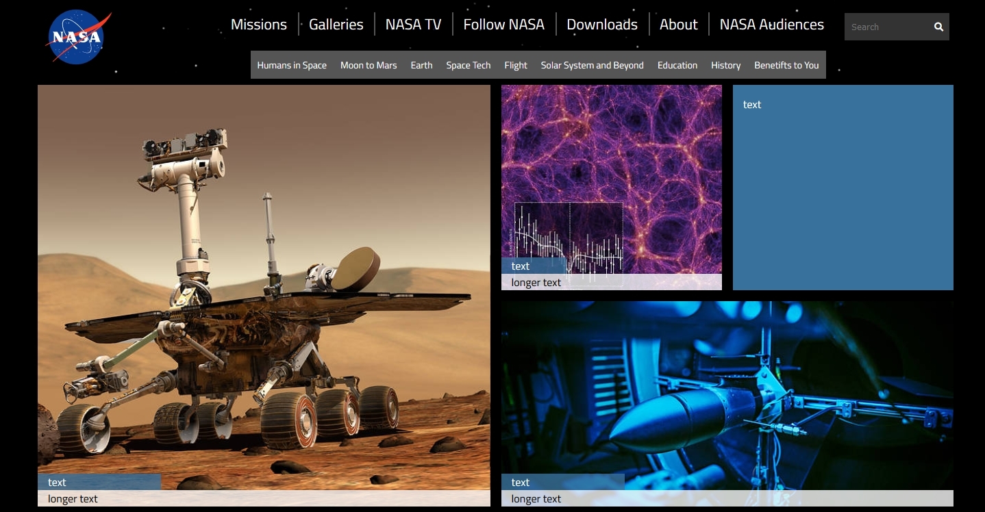
I used flexboxes for the navbar, and a CSS grid for the main content of the body.
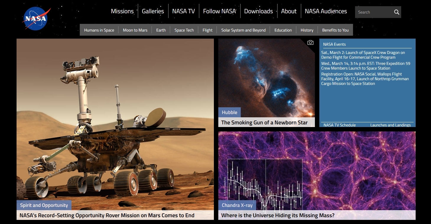
All images featured on my site were pulled from the NASA site, though the NASA site updated while I was in the middle of my project, which is why some of the images in my screenshots are different.
I had tried to embed the same twitter feed featured on the original site, but it was causing problems with my CSS grid and I ultimately decided not to do it. However the code for it is still in 'index.html' if you would like to try enabling it. I was also having some weird issues trying to add text to the items in the grid which is partially why it's all place holder text. I have somehow never used or learned about CSS grids until today so I suppose that played a part in the issues I had.
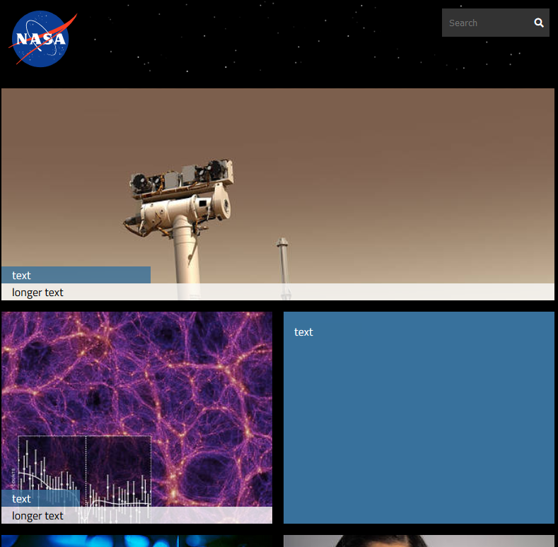
Here's my site at its max width.
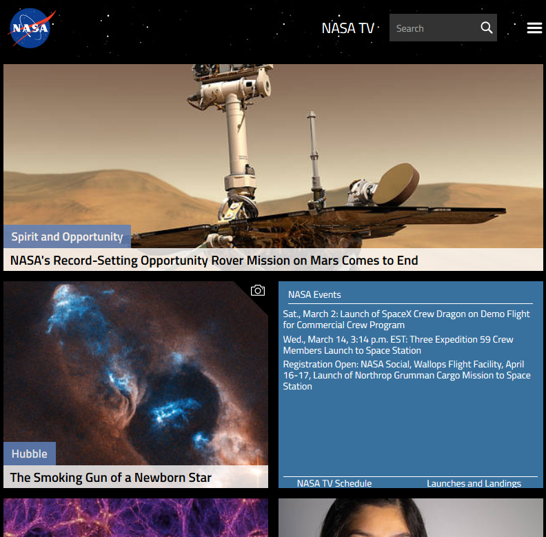
NASA
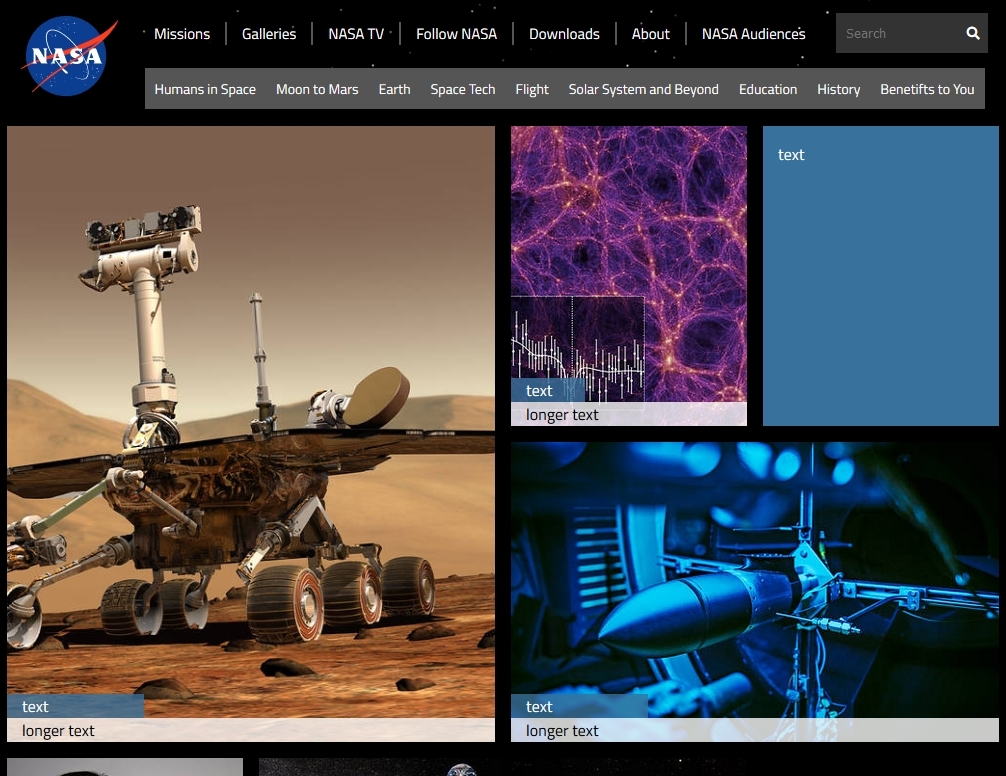
My site slightly smaller, I'd argue that mine looks a little better than the NASA at this width.
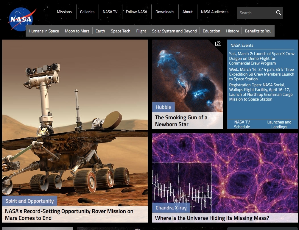
NASA - notice how the text clips the logo at this width.
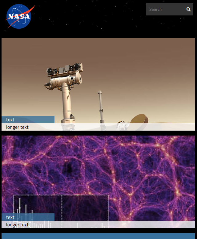
My site
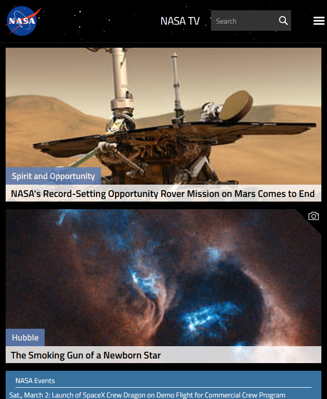
NASA
My site
NASA
To view the live version:
- Click here!
The view it locally:
- Clone this repo
- Open 'index.html' with your browser of choice
None
Feel free to contact me via email here.
HTML, CSS, SASS, Git Bash, Atom
Copyright © 2019 Joe Pritchett
