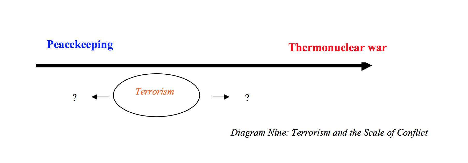
Welcome to gorkaplot. This library exists to fill a gap in the R programming environment for easily replicating the following famous figure from Sebastian Gorka's dissertation:
This library contains a single function, gorkaplot, which takes six arguments:
- data: A dataframe
- x: The name of the x variable, as a character string
- y: The name of the y variable, as a character string
- xmin_lab: A character string label for the lower end of the range of the x variable
- xmax_lab: A character string label for the upper end of the range of the x variable
- y_var_lab: A character string label for the y variable
- caption: A text string to use as a caption, including diagram number
These plot settings were built on the following assumptions. Below the primary arrow in the original plot is a text string, Terrorism,'' with two arrow segments branching out on either side. Above the primary arrow are two character strings describing the ends of an apparently ordinal scale ranging from Peacekeeping'' at the lower end to Thermonuclear war'' at the upper end. These choices indicate that Terrorism,'' according to the argument being presented visually, causes an observation to move up or down the peace-to-war'' scale. That would imply that terrorism'' is the independent variable and peace-to-war'' is the dependent variable (terrorism'' causes movement along ``peace-to-war''). Thus, while the blue and red text would intuitively represent two ends of the x-axis, the one typically presented along the horizontal dimension of a two-dimensional figure, this is no ordinary plot style.
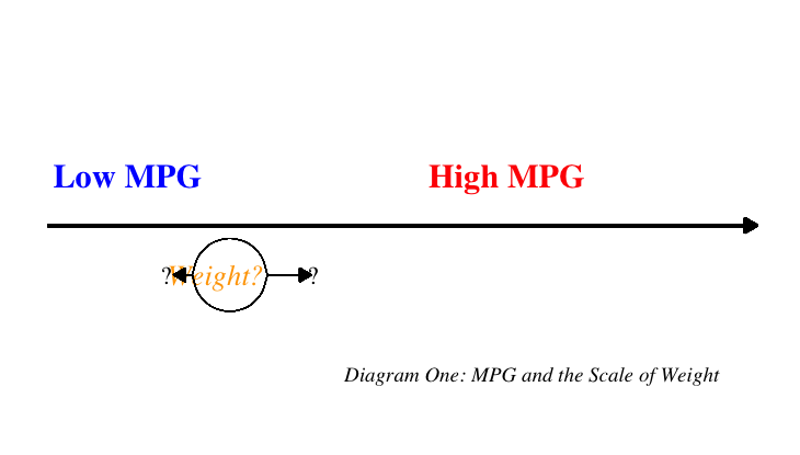
The following example produces a gorkaplot of the mtcars data.
library(devtools)
install_github(``johnlray/gorkaplot'')
library(gorkaplot)

data(mtcars)

gorka_plot(mtcars, x = "wt",
          y = "mpg",
          x_var_lab = "Weight?",
          ymin_lab = "Low MPG",
          ymax_lab = "High MPG",
          caption = "Diagram One: MPG and the Scale of Weight"
          )

