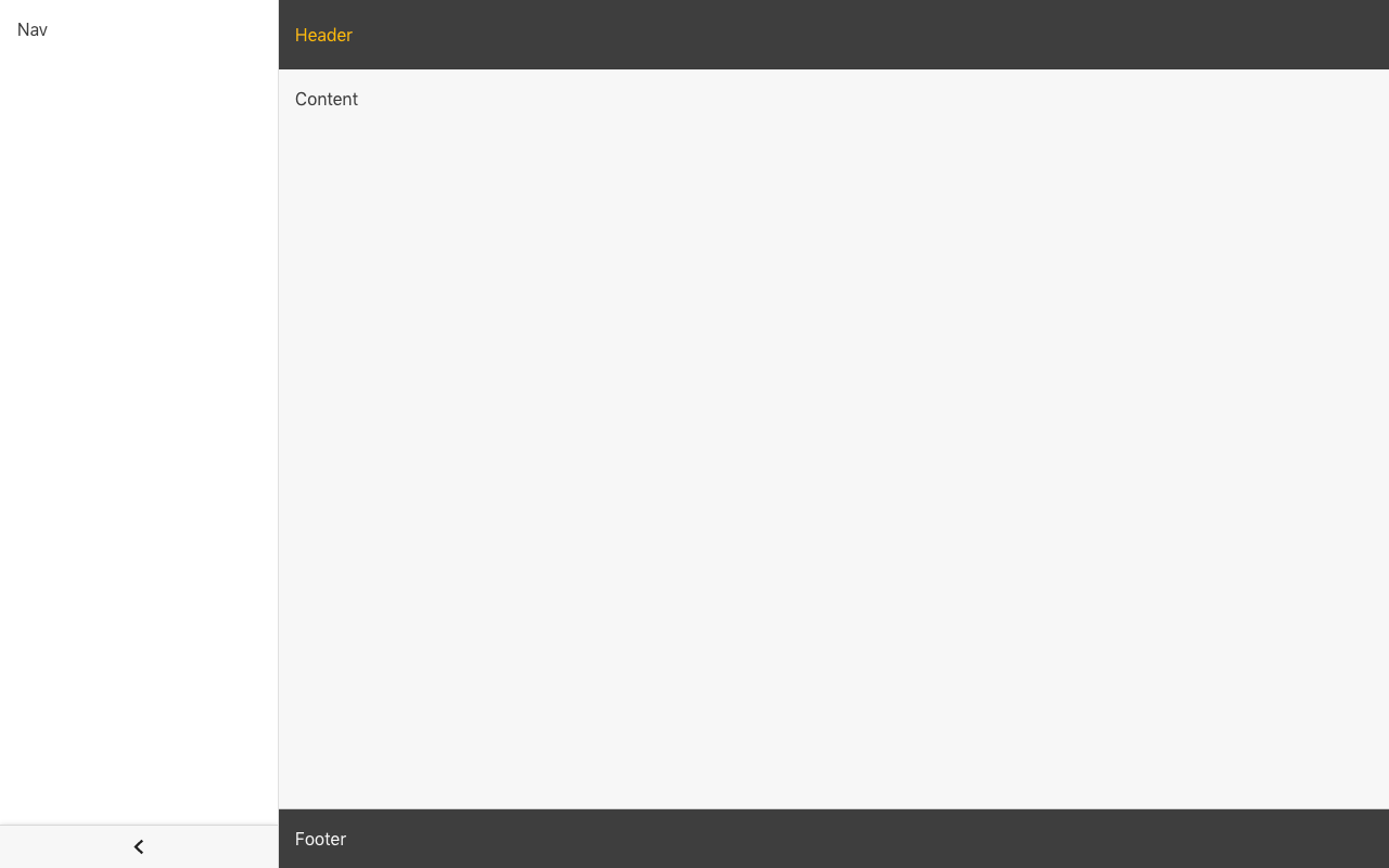
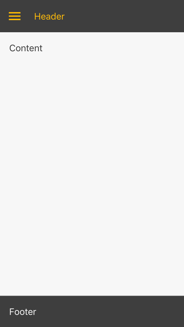
This is a simple layout for standard looking material based apps, based on Mui Layout
but using @committed/components as its base.
Here's a live demo
For use with @committed/components,
yarn add @committed/layoutadd any missing peer dependencies
yarn add @committed/components @material-ui/core @material-ui/icons react react-domimport React from 'react'
import ReactDOM from 'react-dom'
import { ThemeProvider } from '@committed/components'
import { Root, Header, Nav, Content, Footer } from '/layout'
const App = () => (
<ThemeProvider>
<Root
style={{ minHeight: '100vh' }}
config={
{
// adjust behavior here!
// See LayoutConfig
}
}
>
<Header>Header</Header>
<Nav
header={
// you can provide fixed header inside nav
// change null to some react element
ctx => null
}
>
Nav
</Nav>
<Content>Content</Content>
<Footer>Footer</Footer>
</Root>
</ThemeProvider>
)
ReactDOM.render(<App />, document.getElementById('root'))The layout adjusts for small screen sizes.
For each config parameter a single value or an object with breakpoint keys can be supplied, e.g.
const config = {
  navWidth: {
    // xs is 256px by default
    sm: 200, // in sm
    md: 256 // mdUp
  }
}| Prop | Type | Description | Default Value |
|---|---|---|---|
| clipped | boolean | ScreenProps<boolean> | Clipped moves the header over the top of the navigation drawer, unclipped makes navigation full height | false |
| collapsible | boolean | ScreenProps<boolean> | Can the navigation be collapsed to a smaller form | true |
| collapsedWidth | number | ScreenProps<number> | Width of the collapsed navigation | 64 |
| footerShrink | boolean | ScreenProps<boolean> | Footer to adjust the size to fit when nav expanded,set false to keep the same width and overflow the screen. | true |
| navAnchor | Orientation | ScreenProps<Orientation> | Which side of the screen to show the nav panel | left |
| navVariant | Variant | ScreenProps<Variant> | Permanent: stays all the time. Persistent: remains open but can be hidden with button. Temporary: hides on click away (and selection). | permanent |
| navWidth | number | ScreenProps<number> | Width of the navigation drawer | 256 |
| headerPosition | Position | ScreenProps<Position> | Position applied to the AppBar header. one of 'static', 'relative', 'sticky', 'fixed', 'absolute' See https://developer.mozilla.org/en-US/docs/Learn/CSS/CSS_layout/Positioning | relative |
| squeezed | boolean | ScreenProps<> | Both header and content adjust the size to fit when nav expanded, set false to keep the same width and overflow the screen. | boolean |
ReactNode
Props to pass to the underlying Close Button. IconButtonProps
{
    active: ReactNode
    inactive: ReactNode
}
One of 'static', 'relative', 'sticky', 'fixed', 'absolute'. See Root.headerPosition.
Props to pass to the underlying Toolbar. commitd/components ToolbarProps
Props to pass to the underlying Menu Button. IconButtonProps
{
    active: ReactNode
    inactive: ReactNode
}
On first use run yarn install in both the root folder and the example folder.
The main build is currently performed using Rollup:
yarn buildFor development use
yarn startthe same command can be run in the example folder to run a usage example.
Pull requests go through CI checks using GitHub actions.
It is based on Mui Layout from https://mui-treasury.com/ for further reference see https://github.com/siriwatknp/mui-layout.
MIT - © Committed Software 2019 https://committed.io


