A tiny (~2kb) CSS grid layout for React, built with styled-components 💅.
See the website.
Install React and styled-components, then:
$ yarn add styled-css-gridimport React from "react";
import { Grid, Cell } from "styled-css-grid";
const MyGrid = () => (
<Grid columns={2} gap="2px">
<Cell>foo</Cell>
<Cell height={2}>bar</Cell>
<Cell width={2}>baz</Cell>
</Grid>
);Wrap your cells in Grid. Pretty simple.
Props:
columns: The grid-template-columns CSS property. When a number is passed it is a shorthand to specify the number of columns. Default is12.gap: The grid-gap CSS property. Default is"8px".minRowHeight: Minimum height of each row. Default is"20px".height: The height CSS property. Default is"auto".flow: The grid-auto-flow CSS property. Default is"row".rows: The grid-template-rows CSS property. When a number is passed it is a shorthand to specify the number of columns. Not provided by default.areas: The grid-template-areas CSS property. Pass an array of strings, e.g.["a a", "b c"]. Not provided by default.justifyContent: The justify-content CSS property. Not provided by default.alignContent: The align-content CSS property. Not provided by default.
A cell. Not too much to say...
Props:
width: Cell width in units, default is1.height: Cell height in units, default is1.left: The grid-column-start CSS property. Not provided by default.top: The grid-row-start CSS property. Not provided by default.middle: Vertically align the contents of the cell. Default isfalse.center: Horizontally align the text contents of the cell. Default isfalse.area: The grid-area CSS property. Not provided by default.
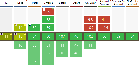
You can use CSS grid in production today if you don't need to support IE and Edge, or you're building tooling or internal sites where you only need to support one browser.
You can use CSS grid soon if you have to support the latest version of modern browsers. Edge 16 will implement the latest CSS grid spec.


