Full report is available at: https://analysis.shangjielyu.com/
Coronavirus disease (COVID-19) is caused by the Severe Acute Respiratory Syndrome Coronavirus 2 (SARS-CoV-2) and has had a worldwide effect. On March 11 2020, the World Health Organization (WHO) declared it a pandemic, pointing to the more than 1.6 million cases of the coronavirus illness in over 110 countries and territories around the world at the time.
In this report, I hope to give an overview of the pandemic in the UK by trying to answer the following questions:
- What is the current situation?
- How can we tell if we are succeeding?
- When will we reach the turning point?
And special thanks to Emmadoughty and RamiKrispin for collating and sharing the datasets.
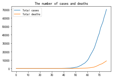
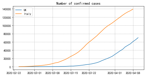
The graph indicates that the number of confirmed cases began to grow exponentially after one and a half months since outbreak (around March 10 2020). One month later (April 10 2020), the UK has 70,272 confirmed cases and 8,958 deaths recorded.
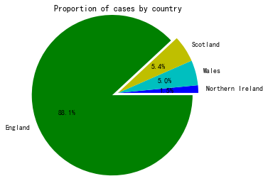
As shown above, the vast majority of infections happened in England, accounting for 88% of the total cases, while Northern Ireland was least affected with the corresponding figure of 1.5%.
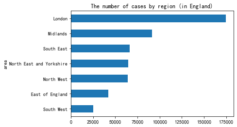
We can see that London has the largest number of confirmed cases among the regions of England, with almost twice that of the second most affected region, the Midlands.
In epidemiology, the basic reproduction number (R0) of an infection can be thought of as the expected number of cases directly generated by one case.
- If R0 > 1, each existing infection causes more than one new infection. The disease will spread between population and cause an outbreak.
- If R0 = 1, each existing infection causes one new infection. The disease will circulate but it no longer leads to an epidemic.
- If R0 < 1, each existing infection causes less than one new infection. The disease will decline and eventually die out.
The R0 value only applies when everyone in a population is completely vulnerable to the disease (which is the case for a novel coronavirus with no vaccines as of yet). Therefore, all of the goverment's restrictive measures(i.e. lockdown, social distancing) are intended to lower the R0 value until it's less than 1.
With limited epidemiological knowledge and a basic dataset, I will use a very crude model to estimate the reproductive rates and show the general numerical growth trend of confirmed cases and deaths:
- If we assume every infected person will infect R0 people during one day, we then have:
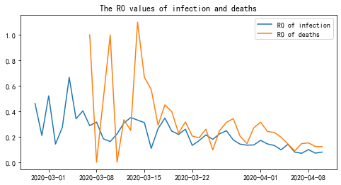
Despite the simplicity of the formula, there is some information we can gain from this graph:
- The situation is getting better.
- Since the restrictive measures such as social distancing and lockdown were introduced, the R0 values of both infection and deaths have been gradually decreasing . This does not mean that the number isn't growing rapidly, but rather that the rate of growth itself is slowing down.
- The exact R0 values in the graph are inaccurate. For the purpose of this crude calculation, I assumed the infection period to be 1 day, whereas it is around 10 in reality (there are also many other vital factors I didn't take into consideration). The actual R0 value should be at least few times larger than this graph suggests.
- The graph of deaths was extremely unstable in early March - this was due to the small sample size initially.
- We are not testing enough.
- We can see that the R0 value for deaths is consistently higher than that for infection, when it should be at the same level.This indicates that there are more infected people than have been recorded and we are not testing enough.
In the middle of an exponential curve, it is very hard to tell how it will develop and whether a turning point is approaching. However, for an exponential function y = f(x), if we plot y values in the x-axis, and the changes of x value (i.e. delta x) in the y-axis, both in logarithmic scale, the resulting graph should be linear.
This method has provided us with a simple and straightforward approach to show the trend:
- If we plot the total number of cases in the x-axis and the number of new cases in the y-axis (both in logarithmic scale), where a positive linear relationship means that the virus is spreading and a drop indicates that the pandemic is under control.
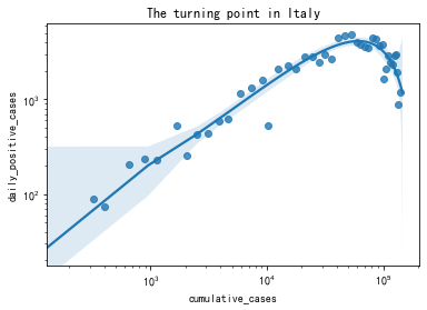
Italy is one of the countries most affected by the coronavirus and currently has the highest death rate, with hundreds of new cases confirmed daily and a huge number of total cases. However, from the graph above we can see that Italy is getting out of the crisis and the hardest times have passed: the line has dropped off and is no longer experiencing exponential growth.
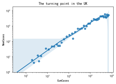
Compared to Italy, the UK faces a more challenging situation at the moment. There is still no clear turning point observed in the graph, indicating that the disease is still progressing in line with the exponential law. However, toward the end of the curve, we can see that the scatter points are more clustered, and the statistical algorithms also simulated a downward trend. Therefore, with an appropriate degree of caution, I would suggest that we are approaching the turning point (the peak), although there are uncertainties.
Given the information that:
- The turning point of Italy in the first graph happened on around March 25 2020.
- On March 25 2020, Italy had 4,492 new cases, 74,386 total cases and 7,503 total deaths.
- As of today (April 10 2020), the UK has 5,195 new cases, 70,272 total cases and 8,958 total deaths.
- On April 8 2020, the number of new cases in Italy dropped below 1,000 for the first time and has kept decreasing.
Combining the data, graphs and anlyses in this section, assuming that the development of coronavirus in the UK will follow a similar pattern to Italy, we have reason to believe that the disease will reach a peak within the next few days in the UK, and the daily increase in cases will drop below 1,000 within the next 25 days.
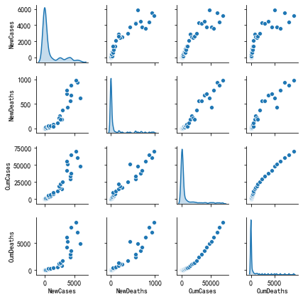
Finally, we can examine the relationship between infection and mortality.
From this graph, we can tell that:
- The mortality rate increased almost exponentially at the beginning and is still increasing.
- The mortality rate is growing much slower than it was initially, but is not yet stable.
- The rate of infection is decelerating and is almost stable.
Therefore, we must lower the mortality rate as a matter of priority.
This report has examined three aspects of the coronavirus pandemic in the UK, and the conclusions are as follows:
- The restrictive measures have worked effectively and we are now fairly close to the peak.
- The daily increase in confirmed cases is very likely to drop below 1,000 within the next 25 days.
- What currently needs to be prioritised is the expansion of testing and the reduction of mortality rate.
