Tags: ToDo, in progress source link: https://elearning.tableau.com/desktop-ii-intermediate
In this course, I pushed my data analysis skills in Tableau Desktop to the next level. Determining when to create extracts and when to use joins, unions, and blends to modify data connections. I've learnt to filter across data sources and analyze subsets of data using context filters and sets. I went further with calculations, using LOD expressions and specifying options to control table calculations, and I did more with mapping. To enable analysis, I created parameters and user controls, and show data trends and forecasts, as well as data distributions. Round out your skills by designing dashboards that incorporate visual best practices.
8+ hours
- Combine data from multiple tables using joins and unions, and learn when to use blends.
- Use extracts to improve performance.
- Build advanced chart types, including bar-in-bar and bullet graphs.
- Use advanced calculations and table calculations to modify data as needed for analysis.
- Use statistical techniques to analyze your data.
- Use parameters and input controls to support audience analysis.
- Implement advanced geographic mapping techniques and use custom images and geocoding to build visualizations of non-geographic data.
- Build better dashboards using techniques for guided analytics, interactive dashboard design, and visual best practices.
- It creates a TDs file.
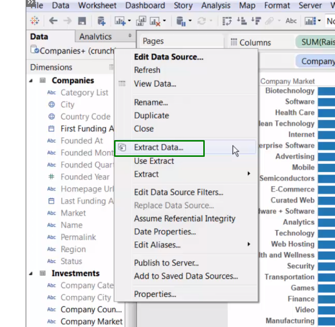
- A live data connection may not be an option (offline). Maybe you're traveling, or the connection is slowing down workbook performance. Discover the power of data extracts!
- Use a data extract to improve workbook speed, streamline data in the view, and add portability to a workbook, as we are working with a copy of the data.
- Uses Tableau Data Engine to Perform queries (queries are not processed in the source dB) .
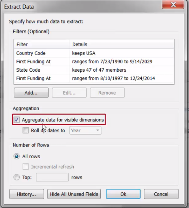
- May include only a subset of the data.
Some limitations:
- Doesn't update automatically - manually refresh the data extract or configure a incremental/scheduler refresher.
We can use it from here:
Or from here:
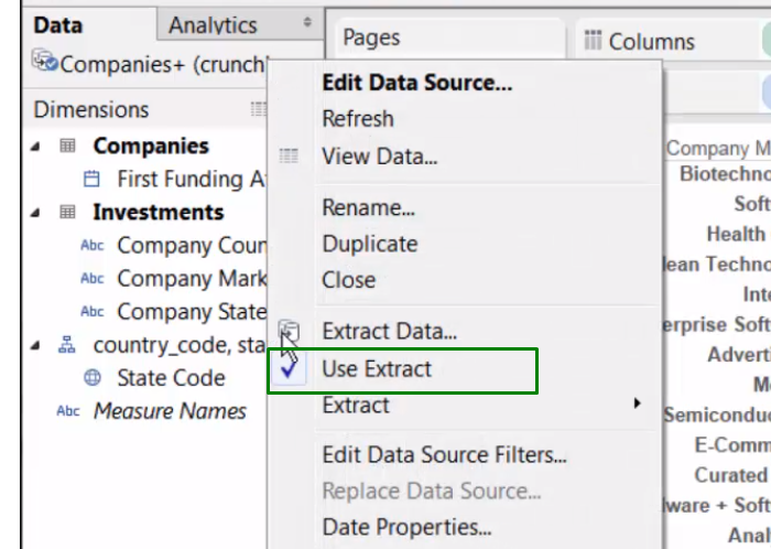
the symbol changed:
Update extract:
inner, left, right, and outer join
we can to create a join field but that new field won't be available for using in sheets or dashboard.
Blue checkmark to the primary Data-source. It's defined by the first field we drag on the view.
Orange checkmark on the pane for the secondary source.
It always behaves as a LEFT JOIN.
we can change which it's the principal and visitor sheets on multiples sheets through the workbook.
- We need to create a common field, we can do it by:
- Renaming the field in one of the data-sources.
- Data > Edit Relantiopships
we can also edit Aliases or create field from already created fields:
- Data > SourceDataName > Edit Aliases > Specific FIeld
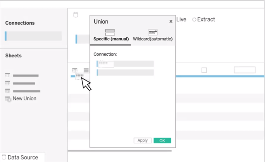
Whereas joins appends COLUMNS, unions appends ROWS.
Across database filter: we need to find/create a common field (datatype and name matches) that we are gonna use it as main field for all worksheets.
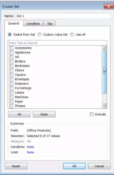
create Sets to monitor key data values(part of data).
A set commonly appeared under Measures.
Tableau automatically creates an IN/OUT field for sets.
Sets can be used as a Filter as well.
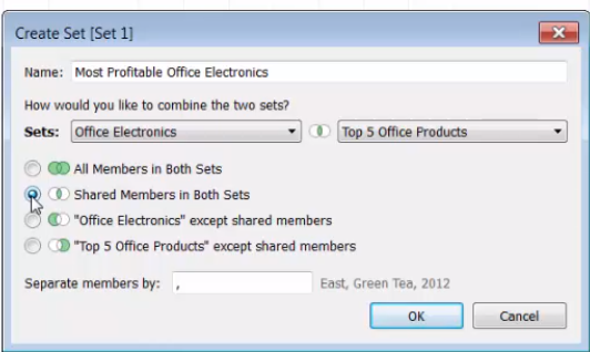
Combined Sets: allows you to compare multiple sets to one another.
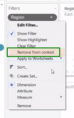
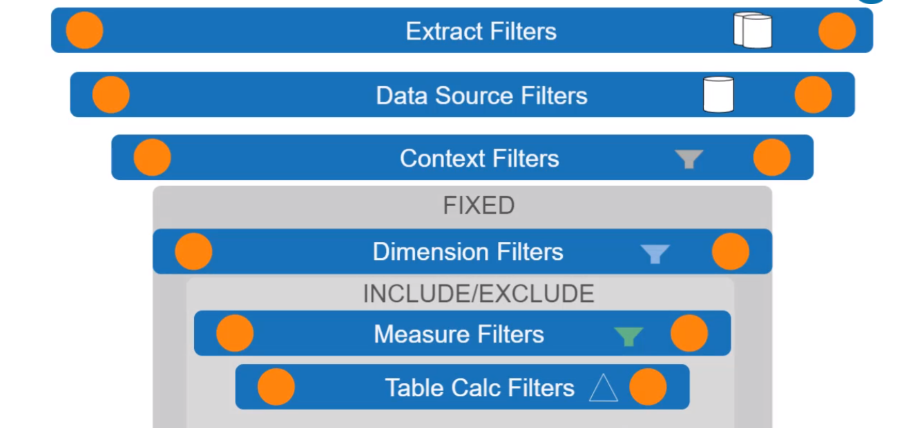
Context Filter: Pre filter for a filter.
Has to be positioned as the first filter.
you can't join on a split but you can blend on it.
we can make it custom
we can make it automatically from the Data Source or "Transform" in the field's option
Dimensions can be aggregated in 3 ways:
- Creating a new calculated field
- Dragging dimension into the view and select an aggregation types: ATTR, MAX, MIN , COUNT or Count Distinct.
- Click on Attribute
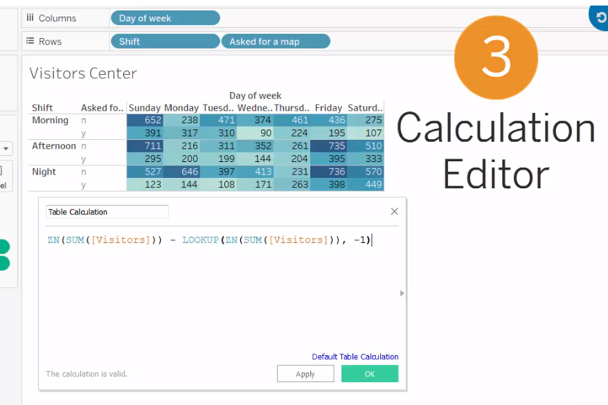
unlike basic calculations, table calculations are based on the view when it's filter.
They are context sensitive.
They are applied to MEASURES in the view.
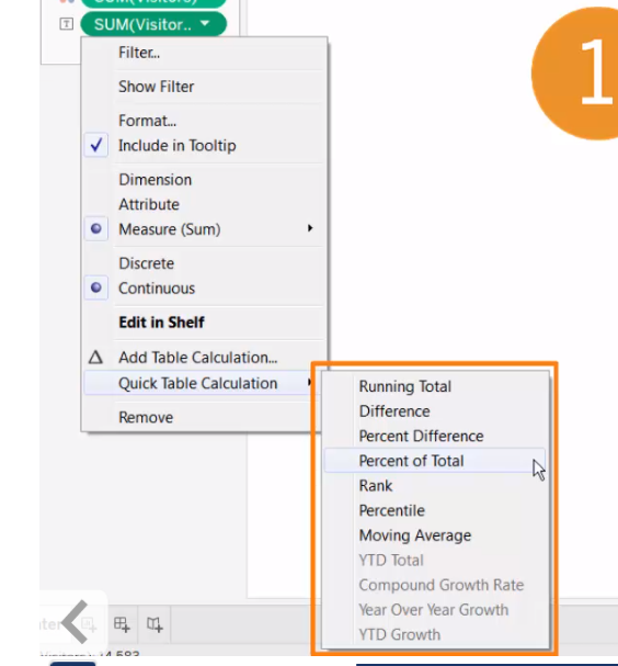
Quick table calculation:
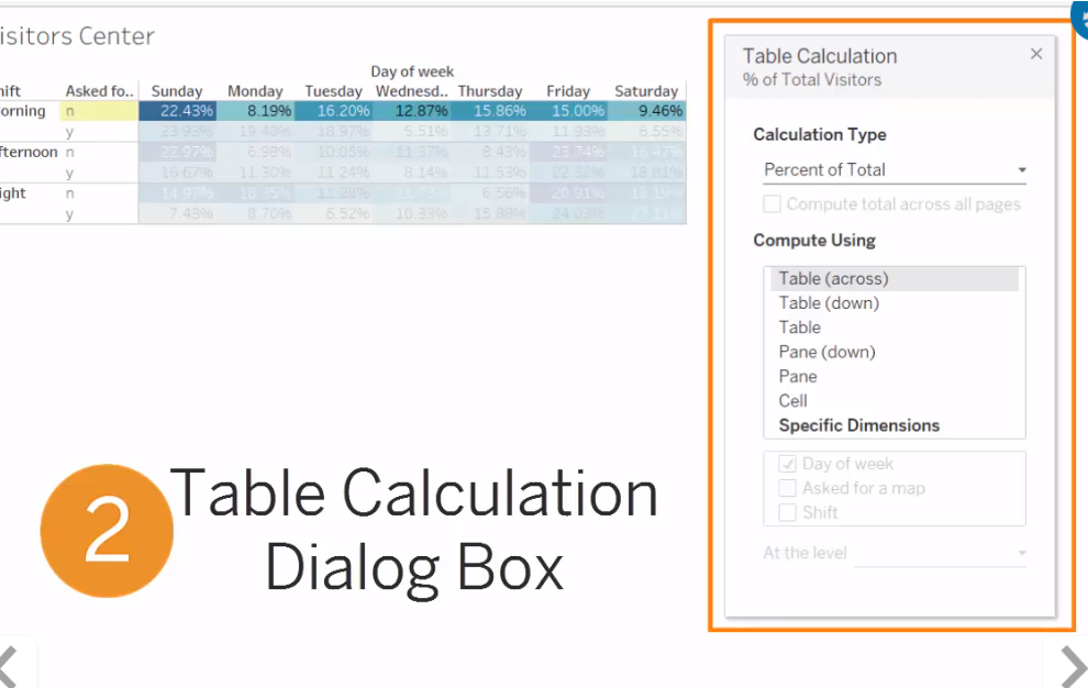
Table Calculation:
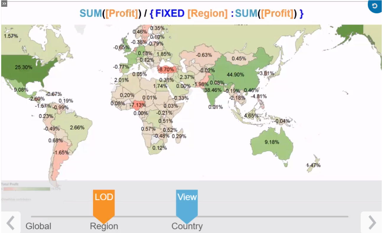
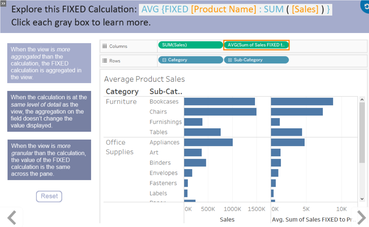
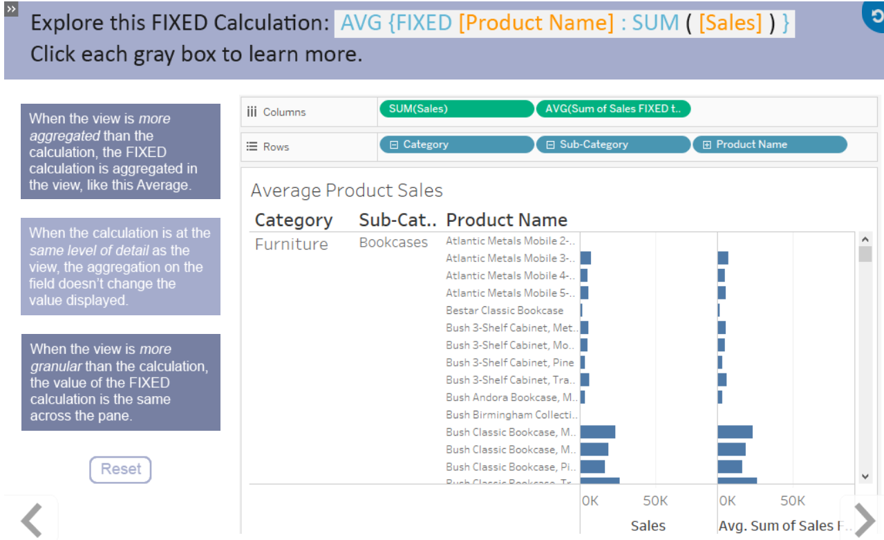
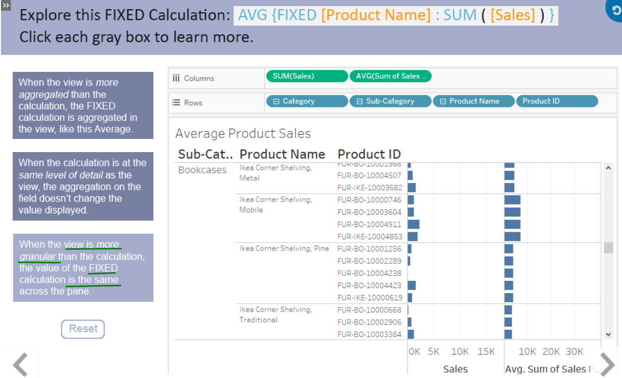
As we are more dimensions we make the data more granular or aggregated if we use less dimensions.
Levels:
Locked at some field.
Some cases:
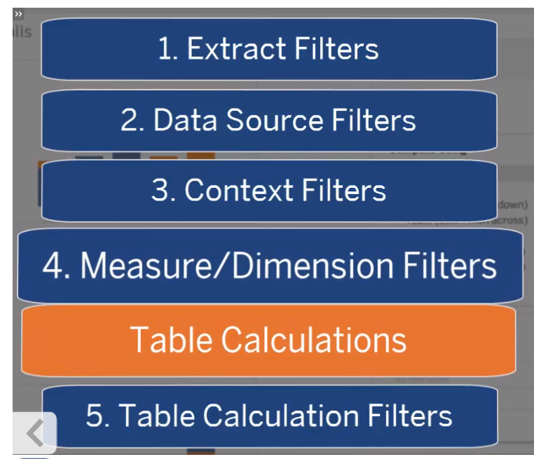
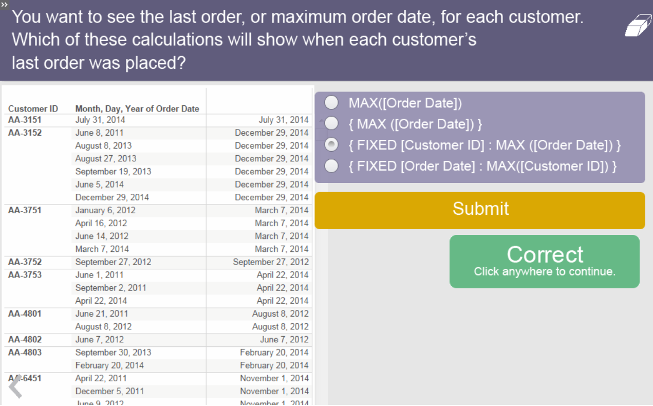
applied before table calculations.
First we need to create parameters, then use them and finally show them.
Parameters are global, meaning that are applied for all sheets.
Purpose:
- to adjust calculation
- to control filters
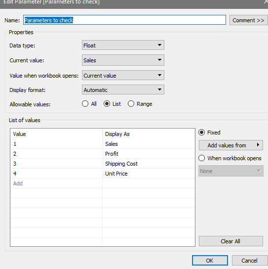
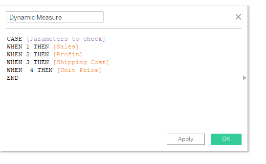
Dynamic Measure selection - to set a single view but with multiple Measures to show.
First we create a parameter, in this case: "Parameters to check"
Then we create a calculated Filed:
we can also do Dynamic Aggregation following similar flow.
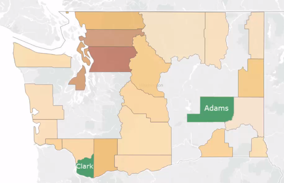
to fix gaps in maps or fix data locations in general.
-
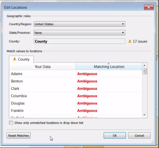
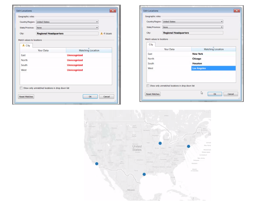
Edit Errors in Geocode data
Maps > Edit Locations
<More than 1 place has that name. So adjust the geographic role or matching locations>
-
Assign Locations to data
we can set manually the latitude and longitude geocode (user-defined)
Typically we use a 2nd data source that contains fields with specific geolocation data and we blend the data based on common field.
On the Map menu, select Background Images and choose image location+ (Work Data.xls).
In the Background Images dialog box, click Add Image.
Complete the Add Background Image dialog box with these settings:
Name: Injury Image
File or URL: click Browse, then navigate to and select X Map Image.gif
Click Open.
Set the X Field drop-down list to Location X, and enter 0 for Left and 99 for Right.
Set the Y Field drop-down list to Location Y, and enter 0 for Bottom and 100 for Top.
Click OK, then click OK again in the Background Images dialog box.
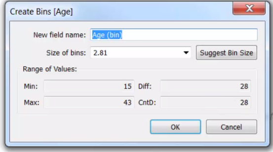
compose of ranges/bins with continuous data.
Select measure and then
- select Using "Show me", a Histogram can be created.
Or we can create manually a bin (right click - create bin)
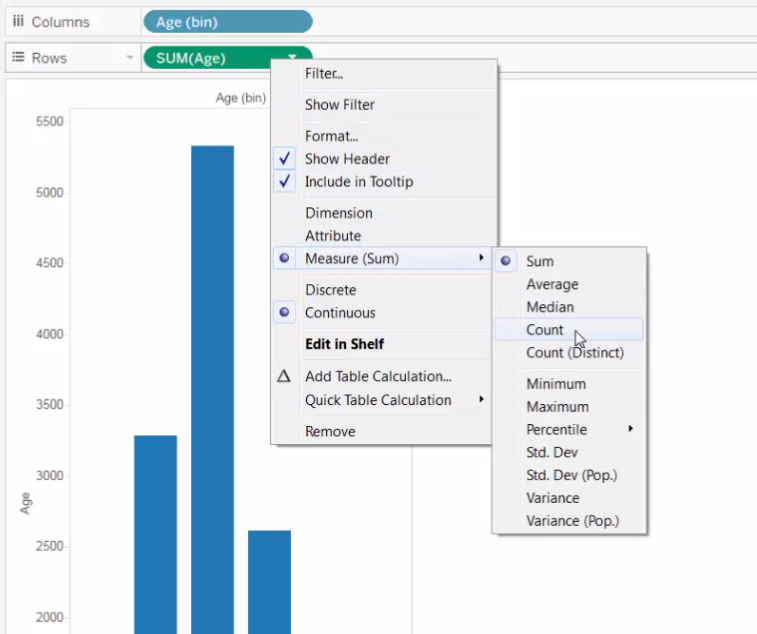
we need to change to a ***Discrete*** Value on the Aggregation Function and a C***ontinuous*** in Bins
IF number of bins is 1 , it will include every field value.
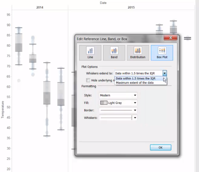
Box uses a circle mark type.
In Analytics pane, we can find Box Plot.
Another way is to use : select the dimension and then "Show ME"
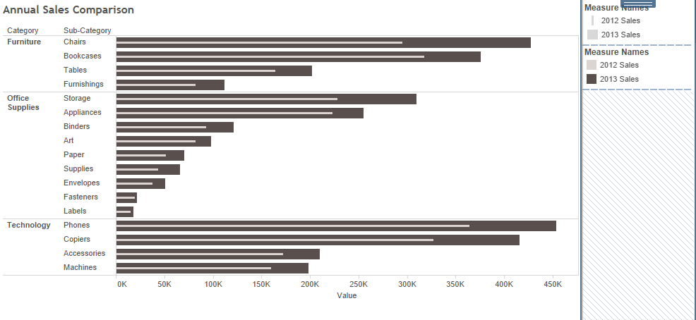
to compare two measures.
Drag the 2nd measure into the Axis.
We use Measure Names(dimension) and Measure Values (which are created automatically).
We move the Measure Names to COLOR → to create stack bars.
To merge and start both from 0 → Go to Analysis → stack bars → OFF
We can make both bars visible by changing the size → Ctrl + Measure Names→ drag to Size.
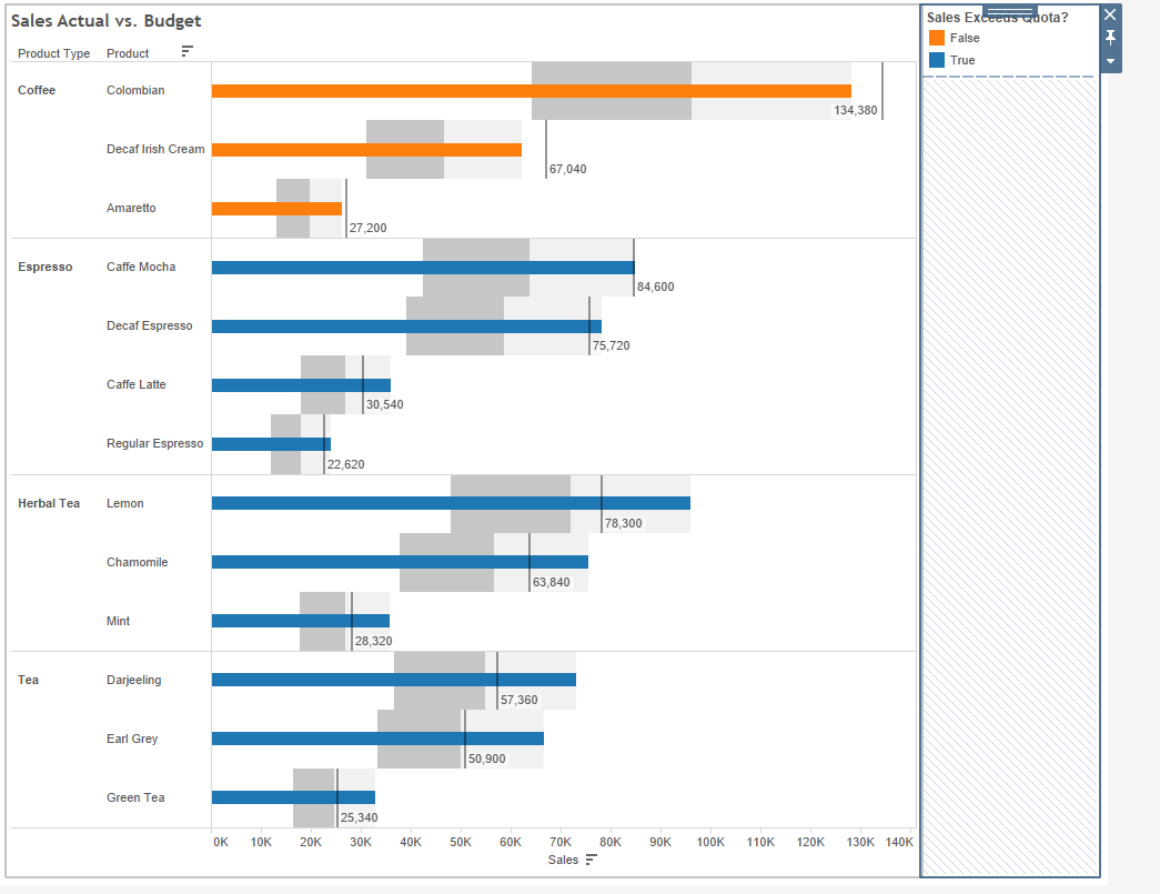
Start by maximum value- > Select a measure to Detail, then:
Add reference line → per cell option (line by default) → sum value→ Sum aggregation type.
Add 2nd reference line → Distribution type → per cell → percentages of sum
Create a Boolean field, and add it to color.
-
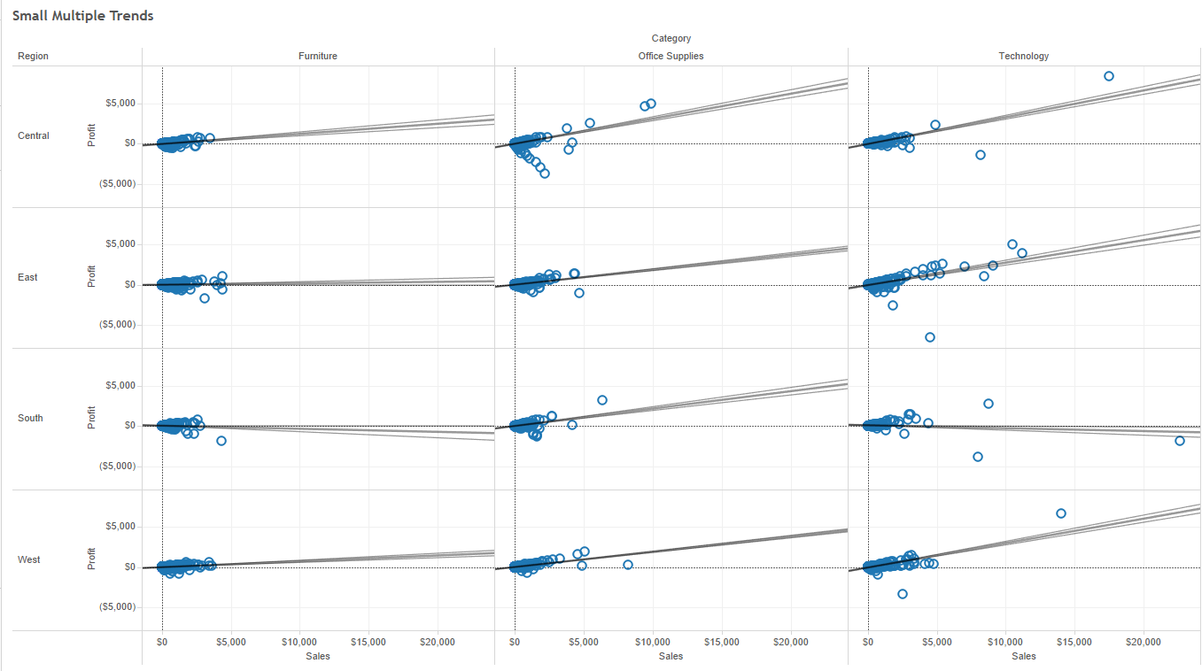
To explain relationship between two MEASURES. e.g. Regression or correlation.
-
It has 4 types: linear, logaritmic, exponential and polynomial.
-
Clicks in Analytics pane > Model > Trend Line. (by default per pane)
-
It has a bold-line(the actual trend line) and two lighter lines (referencing the confident).
-
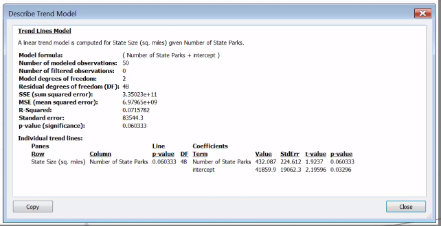
Summary in Describe Trend Model
-
It's good when High R-squared and a low P-value
Example:
You need:
- One continuous date
- One Measure
- Five data points
- At least two seasons (if required)
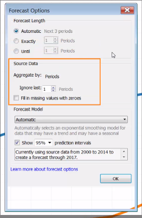
Click on Analytics pane > Model > Forecast (drag and drop)
Verify the accurate of "prediction interval" of forecasting:
- Select a sheet and Duplicate as cross tab resulting in one listing the actual and other estimated.
Make use of four-key steps when planning a dashboard:
- Determine Purpose and Audience
- Plan thoroughly
- Build using design best practices:
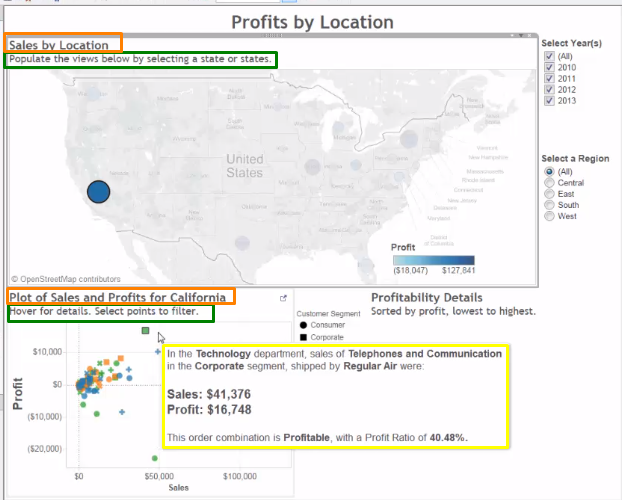
- don't overcrowd it, use story points / coherent subsections
- Streamline the legend (keep the important ones) and filter (one acting on multiple view or even better use action of parameters to avoid lots of filters.
- Filters should be on the left.
- Include instructions.
- Include meaningfully tooltips, that will improve clarity, consistency, etc.
- Don't put lots of titles
- Remove unneeded headers, labels, tick marks.
- Use muted and contrasting colors. (color blind palette)
- Font sizes adjustments.
- Test Dashboard
- Apply 5 seconds rule.
Use a target filter to filter both data sources(1) and regions view(2)
-
Click the Dashboard menu, and then click Actions.
-
In the Actions dialog box, click Add Action, and then Filter.
-
Fill out the Filter Action dialog box:
• Name: “Filter Coffee Chain”
• Source Sheets: Profit Analysis dashboard
Region Selection with Run action on: Select
• Target Sheets: Profit Analysis dashboard
Coffee Chain Profit Analysis and Coffee Chain Profit Trend• Clearing the selection will: Show all Values
-
Under Target Filters, choose Selected Fields, and then click Add Filter.
• Source Data Source: Superstore, Field: Region
• Target Data Source: Coffee Chain, Field: Market
-
Click OK three times to close the dialog boxes.
-
Test to make sure the Region Selection filter controls the Coffee Chain views.
Build a view with an arrow to use as a link to another dashboard
- Click the New Worksheet tab and rename the new worksheet: Navigate
- Confirm that the Superstore data source is selected, then click the Analysis menu, and select Create Calculated Field.
- Name the calculated field “Navigation” and enter the formula: “Click here to view the Profits by Location dashboard.” NOTE: Include the quotation marks.
- Click OK to close the calculation editor.
- From Dimensions, drag Navigation to Rows.
- On the Marks card, change the mark type drop-down menu to Shape.
- On the Marks card, click Shape and then change the symbol to a filled, right-pointing arrow.
- Press CTRL + SHIFT + B a few times to make the cells on the view larger.
- Right-click the Navigation header, and select Hide Field Labels for Rows.
- Click the Profit Analysis dashboard tab. Drag the view Navigate to the dashboard to the left of Region Selection.
- Select the Navigate view, then click its drop-down menu, click Fit, and select Entire View.
- On the Dashboard menu, click Actions.
- In the Actions dialog box, click Add Action and then click Filter.
- Fill out the dialog box:
- Name: “Navigate to Profits by Location”
- Source Sheets: Profit Analysis dashboard Navigate (Superstore)
- Run action on: Select
- Target Sheets: Profits by Location dashboard (leave all worksheets selected)
- Clearing the selection will: Leave the filter
- Click OK twice to close the dialog boxes.
- Test the new action to make sure the link works.
Tableau Stories are created by dragging worksheets and dashboards into the view of each story point and adding descriptive captions on the navigator.
Useful to guide users through data.
It doesn't change the data in worksheets and vice versa(once it is updated - snapshot was captured).

