I spend a lot of time on Twitter, and over the years I have been following a wide variety of people: old friends, work colleagues, funny accounts, etc. Gradually, my timeline has become this messy mix that makes Twitter so enjoyable.
Wouldn't it be be nice, though, to have some hindsight and perspective on what's actually going on?
Contents | Example | Usage | References | Credits
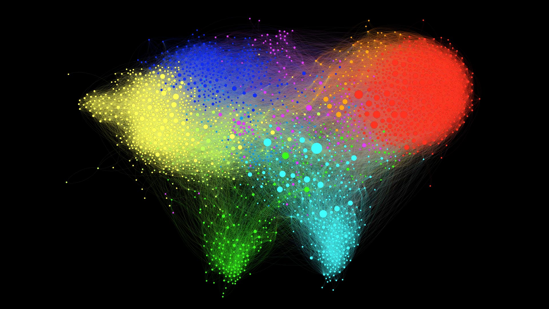
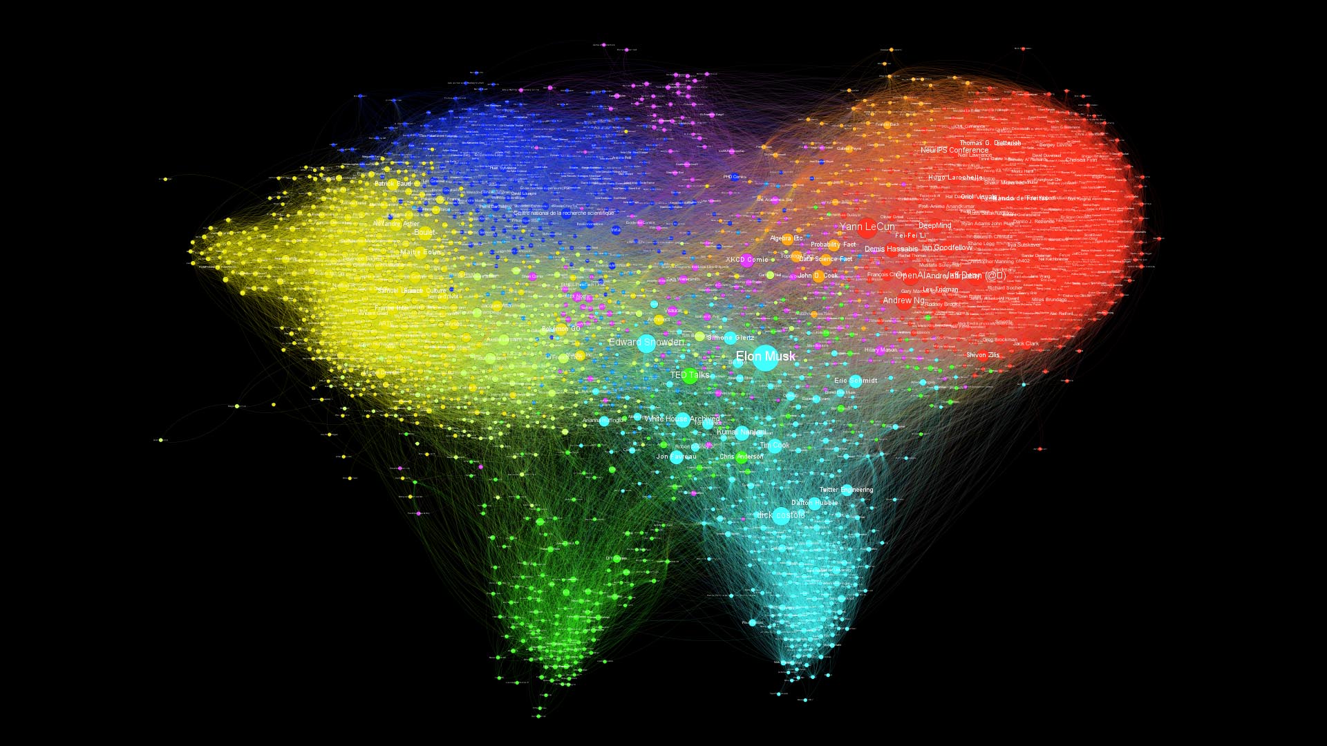
My twitter world litterally looks like a world map, which is fantastic!
| Original | 1080p | 2160p | 4320p | 8640p | |
|---|---|---|---|---|---|
| Labeled | 1080p | 2160p | 4320p | 8640p | |
| Hubs | 1080p | 2160p | 4320p | 8640p |
By running a clustering algorithm [1, 2], several communities are automatically discovered:
the Machine Learning research community;
French academia;
software engineers, mainly from my internship at Twitter, and silicon valley startups;
the Drone community, from my time at Parrot;
entertainment accounts: youtubers, cartoonists, video games.
As we zoom in closer, we can find additional smaller clusters:
the Inria SequeL lab, where I did my PhD, and French researchers in theoretical ML
Anglo-Saxon academia;
students and staff of Mines ParisTech, my university;
French tech, startups and entrepreneurs
The size of the nodes represents which accounts are the most popular according to this graph.
Intuitively, a popular account is followed by many other popular accounts. Popularity is also related the probability of reaching a node by walking randomly in the graph. The PageRank algorithm [3], used in search engines, provides such a metric.
On this graph the results are reasonable: accounts with many followers such as @elonmusk, @ylecun and @snowden end up with a high PageRank. But the structure of the network also plays an important part, since by only relying on the number of followers, accounts such as @TheRealJimCarey, @RobertDowneyJr, @tomhanks would be very salient while they barely stand out in terms of PageRank.
Instead of scaling the nodes by popularity, we can also look for nodes that are in-between several communities, and connect them together. It is measured by the Betweenness Centrality, which measures how often a node appears on shortest paths between nodes of the Network.
For instance, we see accounts that belong to both the AI/ML research and French academia stand out, like @freakonometrics and @bguedj, or people like @chr1sa who is in-between drones and Silicon Valley clusters.
| Statistics | Value |
|---|---|
| Nodes | 2406 |
| Edges | 107697 |
| Diameter | 9 |
| Average path length | 3.1 |
| Average degree | 44.65 |
| Average clustering coefficient | 0.234 |
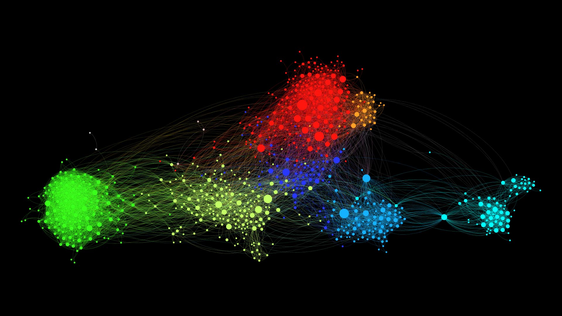
The first thing we can notice is that this graph looks more clustered than the previous one, which is confirmed by a higher average clustering coefficient.
Some clusters also seem to have disappeared, namely the entertainment and
Anglo-Saxon academia.
| Original | 1080p | 2160p | 4320p | 8640p | svg | |
|---|---|---|---|---|---|---|
| Labeled | 1080p | 2160p | 4320p | 8640p | svg | |
| Hubs | 1080p | 2160p | 4320p | 8640p | svg |
| Statistics | Value |
|---|---|
| Nodes | 839 |
| Edges | 10614 |
| Diameter | 8 |
| Average path length | 3.4 |
| Average degree | 12.65 |
| Average clustering coefficient | 0.316 |
To get access to the Twitter API, you must first register on the Twitter Developer Portal. Then, create an app (with read permissions) and record your authentication keys in app/credentials.json.
[
  {
    "api_key": "www",
    "api_secret_key": "xxx",
    "access_token": "yyy",
    "access_token_secret": "zzz"
  }
]
Moreover, this script currently relies Twitter's API v1.1, for which an Elevated access is required, so you will have to submit a request for elevated access.
NEW! You can now declare several standalone apps on the Twitter Developer Portal (up to 10) and save all the corresponding keys in credentials.json. These keys will be used to send the API calls in parallel, thus yielding a x10 speedup.
Then, set the working directory to app
cd <path-to-twitter-graph>/app
Install requirements with
pip install -r requirements.txt
and finally run the script fetch_data.py.
Usage: fetch_data <mode> <query> [options]
Fetch a list of targets from Twitter API, following the given <mode>.
- In the 'users' mode, <query> refers to usernames, and we get their friends and followers.
- In the 'search' mode, <query> refers to a search query, and we get the users of the resulting tweets.
- In the 'likes' mode, <query> refers to usernames, and we get the users of the tweets they have liked.
Arguments:
  <mode>                       Mode of data fetching. Must be one of 'users', 'search', or 'likes'.
  <query>                      The username or search query for which to fetch data, depending on the mode.
Options:
  -h --help                    Show this screen.
  --max-tweets-count <type>    Maximum number of tweets to fetch before stopping. [default: 2500].
  --nodes-to-consider <type>   Nodes to consider in the graph: friends, followers or all. [default: followers].
  --edges-ratio <ratio>        Ratio of edges to export in the graph (chosen randomly among non-mutuals). [default: 1].
  --credentials <file>         Path of the credentials for Twitter API [default: credentials.json].
  --excluded <file>            Path of the list of excluded users [default: excluded.json].
  --out <path>                 Directory of output files [default: out].
  --run-http-server            Run an HTTP server to visualize the graph in your browser with d3.js.
In the users mode, you can enter a username and the script will start by getting the list of their friends and followers, before going through these accounts one by one in order to build the edges of the graph.
$ python fetch_data.py users eleurent
Found 841 followers.
Found 2406 friends.
[1/2406] Fetching friends of @Mehdi_Moussaid
[2/2406] Fetching friends of @Inria_Lille
[3/2406] Fetching friends of @Limericking
Alternatively, in the search mode, you can enter a search query, and the script will pull tweets matching the search query along with their authors.
Note that Twitter monetizes historical search results through Gnip, and that you will only be able to access the previous seven days worth of tweets through that endpoint.
$ python fetch_data.py search #AcademicChatter --max-tweets-count=200
Found 100/200 tweets.
Found 200/200 tweets.
[1/200] Fetching friends of @Dr_Meming
[2/200] Fetching friends of @EtheHerring
[3/200] Fetching friends of @GrumpyReviewer2
Finally, in the likes mode, you can enter a username and the script will fetch all tweets favorited by the user and their authors.
$ python fetch_data.py likes eleurent --max-tweets-count=200
Found 99/200 tweets.
[0] Fetching friends of @sbuggames
[1] Fetching friends of @C195__TeViNaMi
[2] Fetching friends of @singletau
Since Twitter limits the rate of its API to 15 requests per window of 15 minutes, running the script is going to take a while. In order to interrupt and resume the requests at any time, a very simple caching system immediately exports the requests results to a local json file.
KeyboardInterrupt

python fetch_data.py users eleurent
[1/2406] @Mehdi_Moussaid found in cache.
[2/2406] @Inria_Lille found in cache.
[3/2406] @Limericking found in cache.
[4/2406] Fetching friends of @Ariane_lis
If you are too impatient and want to preview the graph with the data downloaded so far, you can use CTRL + C to interrupt fetching.
The resulting graph will be exported to two .csv files containing the nodes and edges.
[4/2406] Fetching friends of @Ariane_lis
KeyboardInterrupt. Exporting the graph...
Successfully exported 2406 nodes to out\graph.nodes.csv.
Successfully exported 128 edges to out\graph.edges.csv.
Finally, note that you can skip an account by filling out the exclude.json file.
Fill the credentials.json with your keys
Then build the docker image using docker-compose
$ docker-compose build
Finally fetch the data by running the script from the docker image
$ docker-compose run app python fetch_data.py users <your_username> --out /out
Data output should be now in /out folder at the root of your project directory.
Step 2. (optional) Visualize with d3.js
Once exported, the graph can be visualized directly in your browser with d3-force.
To that end, use the --run-http-server to automatically spawn an HTTP server at the end of the script.
[2406/2406] Fetching friends of @AdrienRahier
Successfully exported 2406 nodes to out\graph.nodes.csv.
Successfully exported 107697 edges to out\graph.edges.csv.
Serving HTTP at http://localhost:8000?nodes=out/graph.nodes.csv&edges=out/graph.edges.csv
Open the URL in your browser to see the results. While d3-force is lightweight and convenient, it can be a bit slow when the graph becomes too large (about 2000 nodes on my computer), and will only handle the graph layout. For more advanced customization options, you can turn to Gephi.
Step 2. (bis) Visualize with Gephi
Gephi is the leading visualization and exploration software for all kinds of graphs and networks. Gephi is open-source and free.
The User Guide contains all the information that you need, and I recommend that you read the Quick Start Guide. I will simply recall the main steps involved.
- Start a new project;
- go to the the Data Laboratory tab;
- select Import Spreadsheet in the toolbar, and choose
out/graph.nodes.csv; - in the General Options pane, select Import as: Nodes table, then click Next and Finish;
- in the Import report window, select Append to existing workspace, and click OK.
A table of nodes should appear in the Data Laboratory.
- select again Import Spreadsheet in the toolbar, and choose
out/graph.edges.csv; - in the General Options pane, select Import as: Edges table (not Matrix), then click Next and Finish;
- in the Import report window, click on More options and uncheck Create-missing nodes and choose Edges merge strategy: Last;
- select Append to existing workspace, and click OK.
A table of edges should appear in the Data Laboratory.
- Go back to the Overview tab. You should see the graph with a random square layout;
- In the Layout window, select a force-based layout, and click Run. I use ForceAtlas2 [4];
- You can tinker with the layout parameters, such as strength, Dissuade Hubs or Prevent Overlap.
The graph will reorganise so that connected nodes are closer, and you should see the emergence of clusters. Once the graph has converged, stop the simulation.
As mentioned above, I use PageRank [3] to set the nodes sizes.
- First, the PageRank of nodes must be computed. In the Statistics window, locate Network Overview/PageRank and click Run. Keep default parameters and close the report;
- In the Appearance window, select Nodes and Size in the toolbar. Then, select Ranking, PageRank. Select the range of sizes (I use 10-50), and click Apply.
The nodes labels can be enabled by clicking the black T icon in the bottom Overview toolbar. Then, the labels can be scaled with node size by selecting the A icon (Size mode) and choosing Node size.
The nodes can be colored automatically in the Appearance/Nodes/Color tab, by either a Partition of attributes (e.g. verified or location), or by a Ranking of attributes (e.g. Degree, In-Degree, Out-Degree, followers_count, etc.).
In order to identify clusters, we must first run the Modularity algorithm from the Statistics window. Use the Resolution parameter to tune the desired number of clusters. Then, set the nodes colours in the Appearance window by Ranking of Modularity.
Go to the Preview window, select the desired options, and Export to png, pdf or svg.
In order to improve the final Render, it might be useful to exclude the very far nodes. To do this, go to the Overview tab, click on Filters (right panel). Open Topology and double-click on Giant Component. Just below, in the Queries panel, activate this filter by pressing the Filter button. You should now be able to see in the Context panel at the top the percentage of nodes visible.
First, a date field must be parsed as a timestamp. In the Data Laboratory, click Merge colums, and select a colum such as created_at or query_created_at, and pick the Create time interval merge strategy.
Then, if you want the nodes to persist after appearing (rather than disappear) select a blank end-time column.
Choose the parse date option, and set the Date format to EEE MMM dd HH:mm:ss Z yyyy. After validating, an Enable timeline button should appear at the bottom of the window, which can be used to make a video of the graph evolution.
An easy solution for this is to go to the Data Laboratory tab. Click at the bottom on the Copy data to other column button. Select screen_name to Label. If you return now to the Overview tab you will see the Twitter's handle as labels.
- [1] Fast unfolding of communities in large networks, Blondel V. et al. (2008).
- [2] Laplacian Dynamics and Multiscale Modular Structure in Networks, Lambiotte R. et al. (2008).
- [3] Sergey Brin, Lawrence Page, The Anatomy of a Large-Scale Hypertextual Web Search Engine, Brin S., Page L. (1998).
- [4] Continuous Graph Layout Algorithm for Handy Network Visualization Designed for the Gephi Software, Jacomy M. et al. (2014).
This project was more than inspired by this excellent video by Mehdi Moussaïd 📺.


