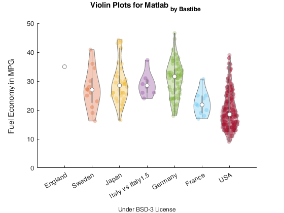
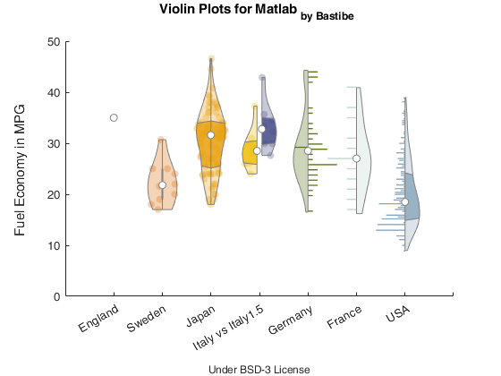
A violin plot is an easy to read substitute for a box plot that replaces the box shape with a kernel density estimate of the data, and optionally overlays the data points itself. The original boxplot shape is still included as a grey box/line in the center of the violin.
Violin plots are a superset of box plots, and give a much richer understanding of the data distribution, while not taking more space. You will be able to instantly spot too-sparse data, or multi-modal distributions, which could go unnoticed in boxplots.
violinplot is meant as a direct substitute for boxplot (excluding
named arguments). Additional constructor parameters include the width
of the plot, the bandwidth of the kernel density estimation, and the
X-axis position of the violin plot.
For more information about violin plots, read "Violin plots: a box plot-density trace synergism" by J. L. Hintze and R. D. Nelson in The American Statistician, vol. 52, no. 2, pp. 181-184, 1998 (DOI: 10.2307/2685478).
For a simple call:
load carbig MPG Origin
Origin = cellstr(Origin);
figure
vs = violinplot(MPG, Origin);
ylabel('Fuel Economy in MPG');
xlim([0.5, 7.5]);
You can also play around with the different options, and tune your violin plots to your liking.
grouporder={'England','Sweden','Japan','Italy','Germany','France','USA'};
vs = Violin({MPG(strcmp(Origin, grouporder{pos}))},...
    position,...
    'HalfViolin','right',...% left, full
    'QuartileStyle','shadow',... % boxplot, none
    'DataStyle', 'histogram',... % scatter, none
    'ShowNotches', false,...
    'ShowMean', false,...
    'ShowMedian', true,...
'ViolinColor', color);If you want to cite this repository, use
Bechtold, Bastian, 2016. Violin Plots for Matlab, Github Project
https://github.com/bastibe/Violinplot-Matlab, DOI: 10.5281/zenodo.4559847

