Storybook
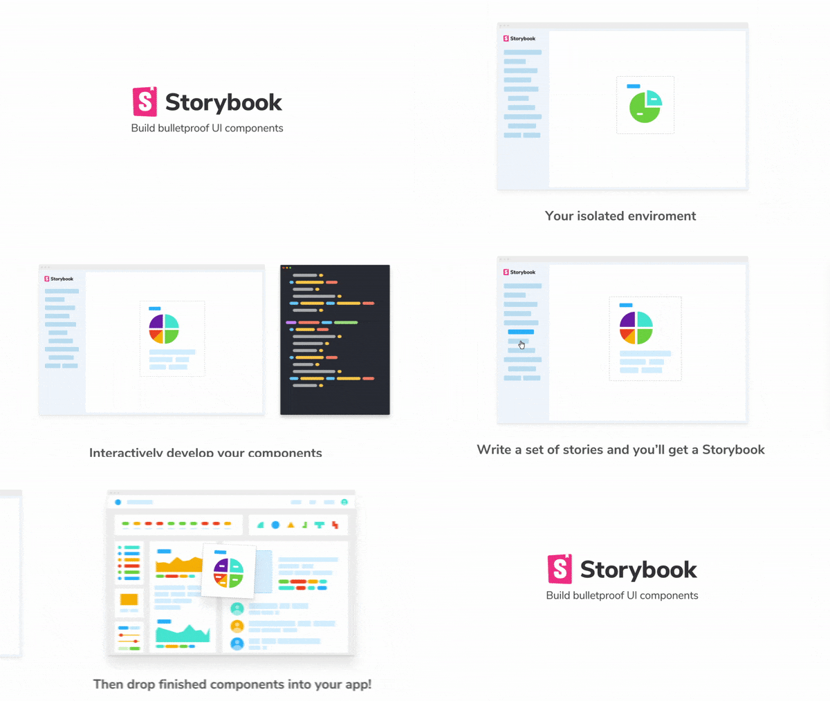
Storybook is a development environment for UI components. It allows you to browse a component library, view the different states of each component, and interactively develop and test components.
Intro
Storybook runs outside of your app. This allows you to develop UI components in isolation, which can improve component reuse, testability, and development speed. You can build quickly without having to worry about application-specific dependencies.
Here are some featured examples that you can reference to see how Storybook works: https://storybook.js.org/examples/
Storybook comes with a lot of addons for component design, documentation, testing, interactivity, and so on. Storybook's easy-to-use API makes it easy to configure and extend in various ways. It has even been extended to support React Native development for mobile.
Table of contents
Getting Started
First install storybook:
cd my-react-app
npx -p @storybook/cli sb init
If you'd rather set up your project manually, take a look at our Slow Start Guide.
Once it's installed, you can npm run storybook and it will run the development server on your local machine, and give you a URL to browse some sample stories.
Storybook v2.x migration note: If you're using Storybook v2.x and want to shift to 4.x version the easiest way is:
cd my-storybook-v2-app
npx -p @storybook/cli sb init
It runs a codemod to update all package names. Read all migration details in our Migration Guide
For full documentation on using Storybook visit: storybook.js.org
For additional help, join us in our Discord or Slack
Projects
Supported Frameworks
| Framework | Demo | |
|---|---|---|
| React | v5.1.0 |  |
| React Native | - |  |
| Vue | v5.1.0 |  |
| Angular | v5.1.0 |  |
| Polymer | v5.1.0 |  |
| Mithril | v5.1.0 |  |
| Marko | v5.1.0 |  |
| HTML | v5.1.0 |  |
| Svelte | v5.1.0 |  |
| Riot | v5.1.0 |  |
| Ember | v5.1.0 |  |
| Preact | v5.1.0 |  |
Sub Projects
- CLI - Streamlined installation for a variety of app types
- examples - Code examples to illustrate different Storybook use cases
Addons
| Addons | |
|---|---|
| a11y | Test components for user accessibility in Storybook |
| actions | Log actions as users interact with components in the Storybook UI |
| backgrounds | Let users choose backgrounds in the Storybook UI |
| centered | Center the alignment of your components within the Storybook UI |
| contexts | Interactively inject component contexts for stories in the Storybook UI |
| cssresources | Dynamically add/remove css resources to the component iframe |
| design assets | View images, videos, weblinks alongside your story |
| events | Interactively fire events to components that respond to EventEmitter |
| graphql | Query a GraphQL server within Storybook stories |
| google-analytics | Reports google analytics on stories |
| info | Annotate stories with extra component usage information |
| jest | View the results of components' unit tests in Storybook |
| knobs | Interactively edit component prop data in the Storybook UI |
| links | Create links between stories |
| notes | Annotate Storybook stories with notes |
| options | Customize the Storybook UI in code |
| storyshots | Easy snapshot testing for components in Storybook |
| storysource | View the code of your stories within the Storybook UI |
| viewport | Change display sizes and layouts for responsive components using Storybook |
See Addon / Framework Support Table
Badges & Presentation materials
We have a badge! Link it to your live Storybook example.
[](link to site)If you're looking for material to use in your presentation about storybook, like logo's video material and the colors we use etc, you can find all of that at our press repo.
Community
- Tweeting via @storybookjs
- Blogging at Medium
- Chatting on Slack
- Discussions on Discord
- Streaming saved at Youtube
Contributing
We welcome contributions to Storybook!
- 📥 Pull requests and 🌟 Stars are always welcome.
- Read our contributing guide to get started. or find us on Discord, we're will take the time to guide you
Looking for a first issue to tackle?
- We tag issues with
when we think they are well suited for people who are new to the codebase or OSS in general.
- Talk to us, we'll find something to suits your skills and learning interest.
Development scripts
Storybook is organized as a monorepo using Lerna. Useful scripts include:
yarn bootstrap
Installs package dependencies and links packages together - using lerna
yarn run publish
Push a release to git and npm will ask for version in interactive mode - using lerna.
yarn lint
boolean check if code conforms to linting rules - uses remark & eslint
-
yarn lint:js- will check js -
yarn lint:md- will check markdown + code samples -
yarn lint:js --fix- will automatically fix js
yarn test
boolean check if unit tests all pass - uses jest
yarn run test --core --watch- will run core tests in watch-mode
Sponsors
Become a sponsor and get your logo on our README on Github with a link to your site. [Become a sponsor]
Backers
Support us with a monthly donation and help us continue our activities. [Become a backer]
License
-the end-


