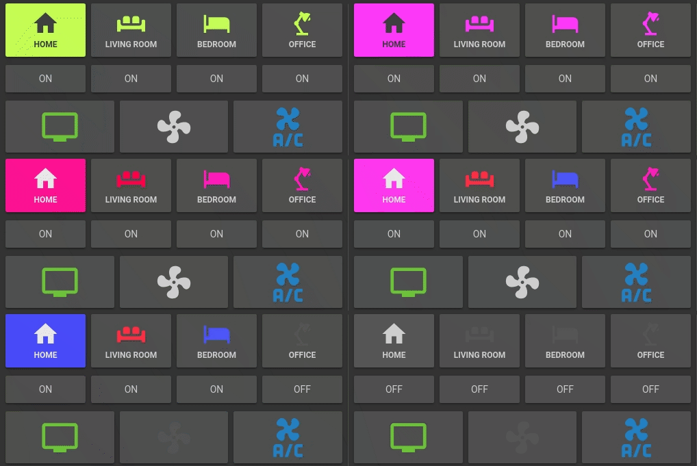
Lovelace Button card for your entities.
- works with any toggleable entity
- 3 actions on tap
toggle,more_infoandservice - state display (optional)
- custom color for
onandoffstate (optional) - custom size (optional)
- custom icon (optional)
- custom css style (optional)
- automatic color for light (optional)
- custom default color for lights (when color cannot be determined) (optional)
- 2 color types
icon: apply color settings to the icon onlycard: apply color settings to the card only
- automatic font color if color_type is set to
card - blank card (for organization)
- support for custom_updater
| Name | Type | Default | Supported options | Description |
|---|---|---|---|---|
| type | string | Required | custom:button-card |
Type of the card |
| entity | string | Required | switch.ac |
entity_id |
| icon | string | optional | mdi:air-conditioner |
Icon to display in place of the state |
| color_type | string | icon |
icon | card | blank-card |
Color either the background of the card or the icon inside the card. Setting this to card enable automatic font and icon color. This allows the text/icon to be readable even if the background color is bright/dark. |
| color | string | var(--primary-text-color) |
auto | rgb(28, 128, 199) |
Color of the icon/card when state is on. auto sets the color based on the color of a light. |
| color_off | string | var(--disabled-text-color) |
rgb(28, 128, 199) |
Color of the icon/card when state is off. |
| size | string | 40% |
20px |
Size of the icon. Can be percentage or pixel |
| action | string | toggle |
toggle | more_info | service |
Define the type of action |
| service | Object | optional | See example section | Service to call and service data when action is set to service |
| name | string | optional | Air conditioner |
Define an optional text to show below the icon |
| show_state | boolean | false |
true | false |
Show the state on the card. defaults to false if not set |
| style | object | optional | - text-transform: none |
Define a list of css attribute and their value to apply to the card |
- Download the button-card
- Place the file in your
config/wwwfolder - Include the card code in your
ui-lovelace-card.yaml
title: Home
resources:
  - url: /local/button-card.js
type: module- Write configuration for the card in your
ui-lovelace.yaml
To configure custom_updater with button-card
custom_updater:
  card_urls:
    - https://raw.githubusercontent.com/kuuji/button-card/0.0.2/tracker.json
More examples in here
Show a button for the air conditioner (blue when on):
- type: "custom:button-card"
  entity: switch.ac
  icon: mdi:air-conditioner
  color: rgb(28, 128, 199)
Show an ON/OFF button for the home_lights group:
- type: "custom:button-card"
  entity: group.home_lights
  show_state: true
Light entity with custom icon and "more info" pop-in:
- type: "custom:button-card"
  entity: light.living_room_lights
  icon: mdi:sofa
  color: auto
  action: more_info
Light card with card color type, name, and automatic color:
- type: "custom:button-card"
  entity: light._
  icon: mdi:home
  color: auto
  color_type: card
  default_color: rgb(255, 233, 155)
  action: more_info
  name: Home
  style:
    - font-size: 12px
    - font-weight: bold
Horizontal stack with :
- 2x blank cards
- 1x volume up button with service call
- 1x volume down button with service call
- 2x blank cards
- type: horizontal-stack
  cards:
    - type: "custom:button-card"
      color_type: blank-card
    - type: "custom:button-card"
      color_type: blank-card
    - type: "custom:button-card"
      color_type: card
      color: rgb(223, 255, 97)
      icon: mdi:volume-plus
      action: service
      service:
        domain: media_player
        action: volume_up
        data:
          entity_id: media_player.livimg_room_speaker
    - type: "custom:button-card"
      color_type: card
      color: rgb(223, 255, 97)
      icon: mdi:volume-minus
      action: service
      service:
        domain: media_player
        action: volume_down
        data:
          entity_id: media_player.livimg_room_speaker
    - type: "custom:button-card"
      color_type: blank-card
    - type: "custom:button-card"
color_type: blank-card- ciotlosm for the readme template and the awesome examples


