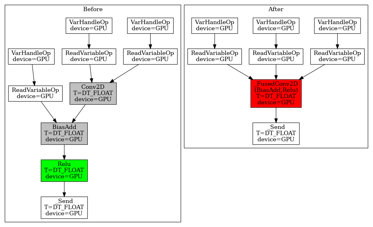
A visualization tool to display TF-Grappler optimized op graph. Grappler is the default graph optimization system in the TensorFlow runtime. Many different graph optimization passes will be applied before the actual execution, such as layout optimization, remapping optimizations, etc. (For the full list of optimization passes, see here). The traditional way to display the op graph is via Tensorboard; however, Tensorboard only shows the op graph before the grappler passes.
To better understand how the grappler changes the graph, this tool can be used
to print out the op graphs before and after any specified optimization pass.
Users only need to provide the model function. Besides, we also provide a
command line tool graphdef2pydot to plot and compare user-specified GraphDef
files.
- Install the dependencies.
pip install pydot && apt update && apt install -y graphviz- Install the visualization tool.
pip install --no-cache-dir git+https://github.com/kaixih/tf_op_graph.git- Using the API to plot the op graphs before and after a specified optimizer.
import tf_op_graph_vis
tf_op_graph_vis.grappler_optimized_graph(
    conv_bias_relu_model, (n, c, h, w), "remapper_conv_bias_relu.png",
    ['remapper'])
The above example generates the op graphs before and after the remapping
optimization. Note, at this point we only support three optimizers: remapper,
layout, and arithmetic. There are many sample codes in examples
and the following section shows how to use them.
In the generated graphs, we conduct a simple graph identity check so that the nodes getting changed will be highlighted:
- GREEN: The nodes appear only in the "before" graph. They have the corresponding nodes in the "after" graph with the same names but different contents, such as the operation, dtype, etc.
- RED: The nodes appear only in the "after" graph. They have the corresponding nodes in the "before" graph with the same names but different contents, such as the operation, dtype, etc.
- GREY: The nodes get deleted from the "before" graph or get added in the "after" graph.
Note: usually the green nodes are transformed to the red nodes. In addition, the plotted graph supports the control edges (in dashed lines) and port numbers (if they are not 0s).
python examples/remapper_conv_bias_relu.pyBesides, we provide a command-line tool graphdef2pydot to support user
generated GraphDef files and visualize (and compare) them:
graphdef2pydot -g0 pics/first.pb.txt -g1 pics/second.pb.txt -o output.png
