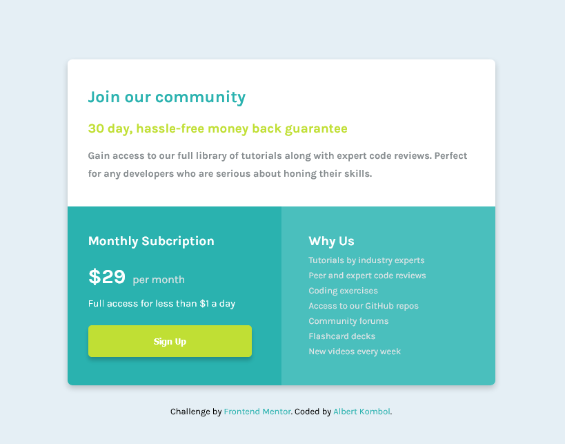
This is a solution to the Single price grid component challenge on Frontend Mentor. Frontend Mentor challenges help you improve your coding skills by building realistic projects.
Users should be able to:
- View the optimal layout for the component depending on their device's screen size
- See a hover state on desktop for the Sign Up call-to-action
- Solution URL: https://github.com/kalush89/single-price-grid-component
- Live Site URL: https://kalush89.github.io/single-price-grid-component/
- CSS custom properties
- Flexbox
- Mobile-first workflow
Learnt how to create a layout in Flexbox
.container {
    display: flex;
    flex-direction: column;
    justify-content: center;
    align-items: center;
    flex-wrap: nowrap;
    max-width: 436px;
    margin: auto;
}
Learnt how to write a media query and implement mobile first workflow
/*Desktop responsive code*/
@media screen and (min-width: 631px) {
    .container {
        max-width: 680px;

    }

    .left {
        padding: 20px 30px;
        width: 100%;
        border-radius: 0 0 0 7px;
    }
}Wish to focus on the following concepts in the future
- Flexbox
- CSS custom properties
- Mobile-first workflow
- Normalize.css - This helped me for fix an issue with the button element in Firefox. I will use this resourse going forward.
- Flexbox - Helped alot. I'd recommend it to anyone still learning this concept.
- Frontend Mentor - @kalush89
Big thanks to the Frontend Mentor team for the oppotunity to learn Front-end development wth such ease. This is the perfect place to be for anyone that aspires to become proficient in the required Front-end tools.
