Interrogate the GitHub API to build visualisation of data available that elucidates some aspect of the softare engineering process, such as a social graph of developers and projects, or a visualisation of indiviudal of team performance. Provide a visualisation of this using the d3js library.
For this project I decided to do something regarding social connections between people. I previously heard about the 6 degrees of separation idea and decided to test if it's true between developers on GitHub.
Six degrees of separation - is the idea that all people are six, or fewer, social connections away from each other. Often called as 6 Handshakes rule. As a result, a chain of "a friend of a friend" statements can be made to connect any two people in a maximum of six steps.
I wanted to test if this idea holds true for all developers who have contributed to the same repository. Users can enter two usernames of developers and get back a graph of the shortest path between them - if one exists and is shorter than 6 connections (edges) away.
The project is developed in Python3 and the PyGithub library. It runs on localhost:5000 through the use of Flask. The following command is used to boot it up: python3 -m flask run
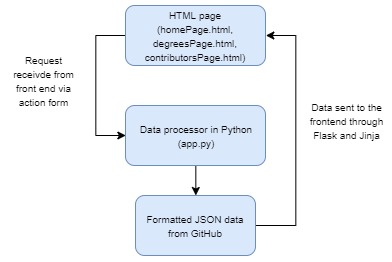
The project uses locally stored JSON files rather than a database to store the fetched data from GitHub. There is pre-processing done on the data to format it into the desired shape, and then the JSON files are passed to the relevant HTML files which display the graphs through the d3 library. The connection between Python and HTML/JS is handled by Flask in the 'app.py' file. The overall application design follows this structure:
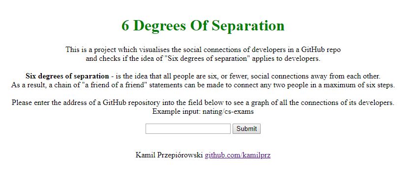
The landing page localhost:5000 has a description of the project and the expected user input. The user can enter the address of a repository and click submit - this will display a force directed graph of all the contributors to the repository and the connections between them based on GitHub followers.
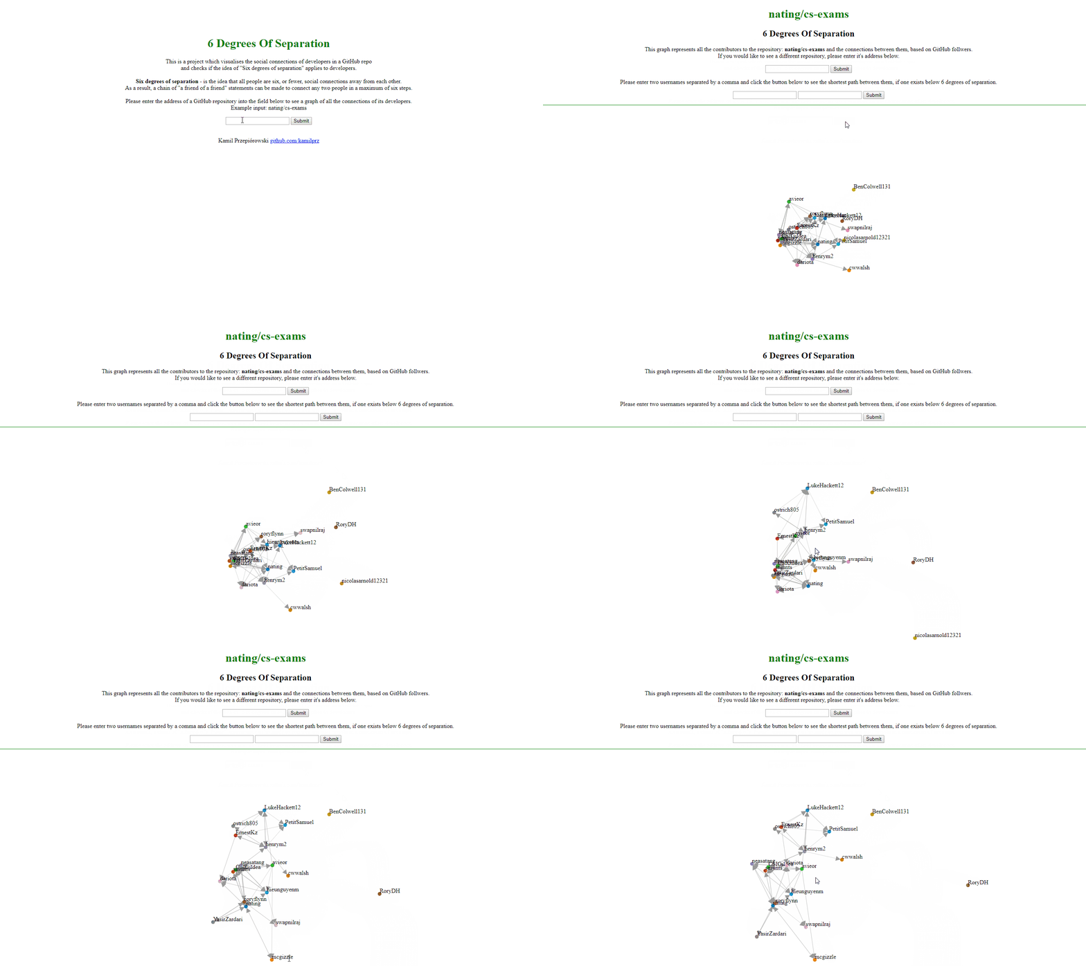
The user can then enter an address of a repository - this will redirect them to localhost:5000/repo where a force directed graph will be displayed. (for the purposes of demonstration the gif has been sped up to show off the functionality, in practise the loading time is longer as all the data needs to be fetched from GitHub first)
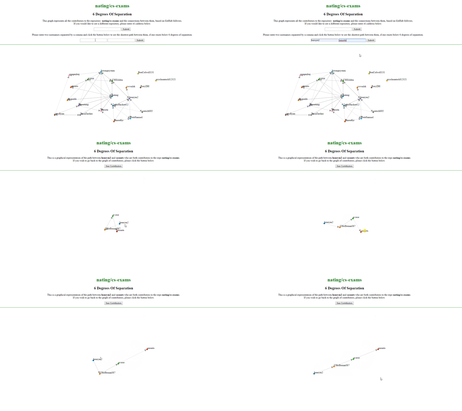
From here, the user can either enter a new repository to view, or two usernames of contributors to the currently displayed repo. This will redirect them to localhost:5000/degrees and display a graph of the shortest path between the two users if one exists and is within the "Six degrees of separation". The path can consist of any users which are connected to the source and target - the only requirements are that the source and target are both contributors to the current repository, and the path is consistently directed. (again, for the purposes of demonstration the gif has been sped up for the same reasons as previously)
The algorithmic approach to calculating the shortest path between source and target after finding the degree of separation is as follows.
- Expand the source by a "degree".
- Check for intersection with target.
- Expand the target by a "degree"
- Check for intersection with source.
- Continue until intersection found or until source and target both expanded by 3 "degrees" - at which point you're at the maximum 6 degrees.
Here "expand" means to get all the nodes in the next degree of separation. (For example, getting all the followers of each follower of the target would be equivalent to expanding the target for a 2nd time)
- If an intersection is found, return back and build a path through parents and children.
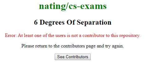
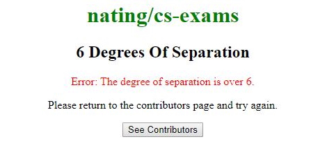
There is error handling built in. The user will be redirected to localhost:5000/degrees and prompted with an error if either:
- 1 : At least one of the users requested is not a contributor to the repository in question.
- 2 : The degree of separation between the two requested users is greater than 6.
From the error page, the user can click "See Contributors" to return to the screen which shows the graph of social connections.
