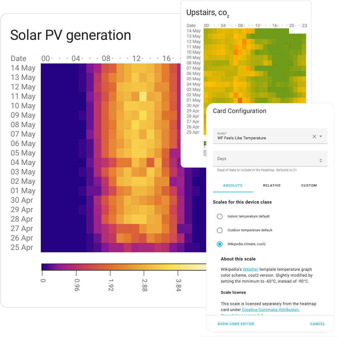
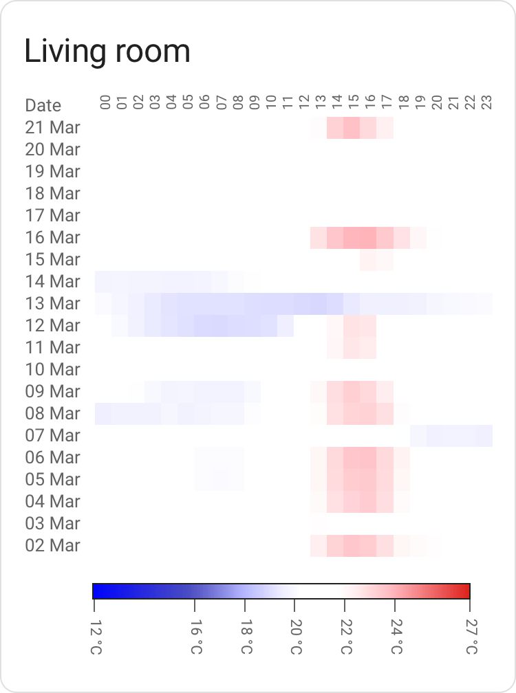
Custom card enabling Heat maps in Home Assistant. Makes it simple to visualize the data in your Home Assistant, as a heatmap, in a way that (hopefully) makes sense to you.
Will pick a hopefully useful scale out of the box based on your type of data (Device Class), but you can override most aspects of the card to suit your needs.
- Somewhat real world tested, but there might well be corner cases.
- Still need a decent chunk of work in terms of built-in color scales for various sensor types. Expect the scales to change.
- Bit of polish still needed in some spots.
If you use HACS as-is, this card can be added as a custom repository.
(As always, you should be careful with software which lets you pull random code from the Internet and run it)
- Download
heatmap-card.js, place it in yourconfig/wwwdirectory. - Add
/local/heatmap-card.jsin your Resource config, type ofJavaScript Module.
Most of the functionality of this card can be configured via the editor GUI.
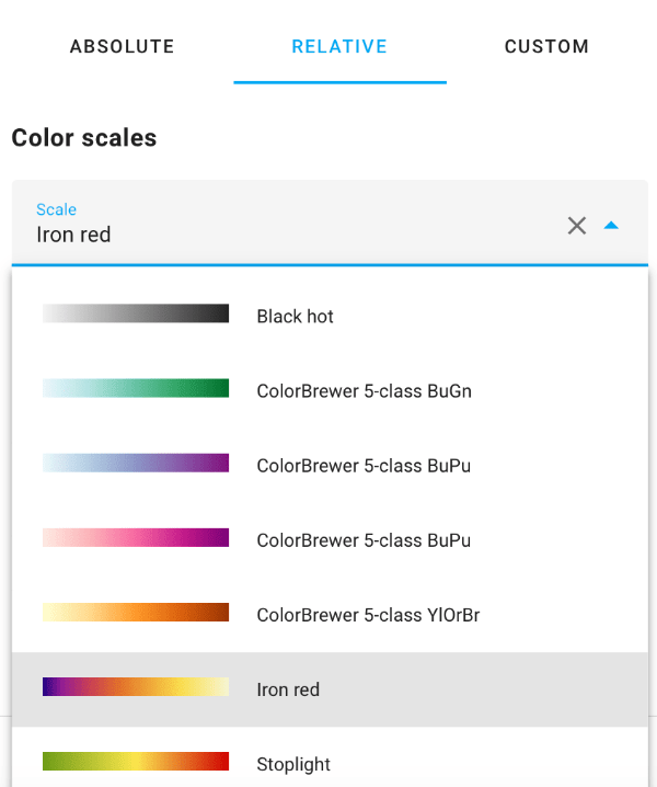
You pick between absolute scales and relative scales.
Absolute scales cover things like PM2.5 particle counts, VOC, CO2 and temperature. For these scales, there's typically one or more authorities that define what's a good value and a bad value. For instance, for PM2.5, WHO is one such authority.
Absolute scales don't require any additional configuration, but they don't support all types of sensors.
Relative scales cover any data. You pick a color you fancy and optionally tell the card the min and max values of the data.
While setting min/max is optional, it's encouraged to do so where possible, as the colors will be stable; a particular shade of green will always mean the same thing. Without setting min and max, it'll fluctuate depending on the data.
Given a minimal config, the card will try to figure out how to present data in a somewhat sane way:
type: custom:heatmap-card
entity: sensor.aranet_uppe_temperature
It'll pick a card title based on the name of the entity, present the default 21 days worth of
data and pick a color scheme and scale based on the entity device type.
It's a bit opinionated in what a "good" scale will be, and may give you something that's not really fit for your usage (for instance by assuming that temperature sensor data refers to indoor temperature).
This can be solved by picking a scale explicitly instead.
A slightly more involved example, setting the number of days to present as well as
defining the max value. Setting a max value is important in order to make the display
consistent across different time periods; ensuring that the same shade of color always
translates to the same consumption.
In the case of energy type entities, setting max to f.x the total production
capacity in kW of a PV install or the main fuse capacity of your house would make
sense.
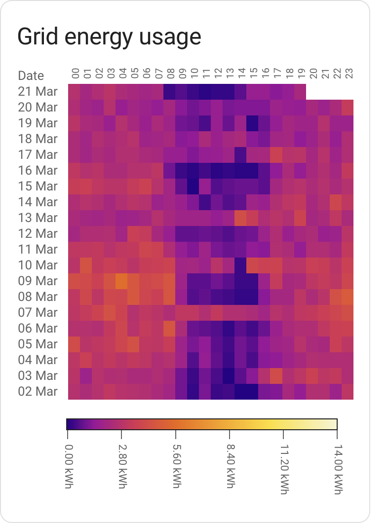
title: Grid energy usage
type: custom:heatmap-card
entity: sensor.elforbrukning_lb
data:
  min: 0
  max: 14
days: 20
Some common fuse sizes and the corresponding maximum power draw:
| Fuse size | kW / data.max |
|---|---|
| 16A | 11 |
| 20A | 14 |
| 25A | 17 |
| 35A | 24 |
Don't fancy the out of the box color scales? Bring your own!
A color scale contains steps. Each step has a value and
a color attached to it; these are used to create a gradient.
A scale also has a type, which is either relative or absolute.
Relative scales stretch from 0 to 1 and will scale automatically from your min value (default 0) to your max value; you bring the colors, the code will figure out the range. This is useful for any scale where the numbers aren't known in advance.
Absolute scales map to the values defined in the scale itself. These are good for when you need to map a color to a specific value; for instance, 420 ppm worth of co₂ is good (by some measure of good), 1000 ppm is getting hairy. This isn't going to be relative to your data; thus, absolute.
A relative scale example:
# This is an energy sensor
type: custom:heatmap-card
entity: sensor.total_pv_generation
data:
  max: 4.8
scale:
  type: relative
  steps:
    - value: 0
      color: '#000000'
    - value: 0.5
      color: '#FFFF00'
    - value: 1
      color: '#FF00FF'
An absolute scale example:
# This is a temperature sensor
type: custom:heatmap-card
entity: sensor.aranet_uppe_temperature
scale:
  type: absolute
  steps:
    - value: 10
      color: '#000000'
    - value: 20
      color: '#FFFF00'
    - value: 30
      color: '#FF00FF'
- Home Assistant is nifty and I appreciate the work that has gone into making sure that data is standardized and decorated in a sane way. A gadget like this card would be much harder without that effort as a foundation.
- chroma-js for the heavy lifting of color related operations.


