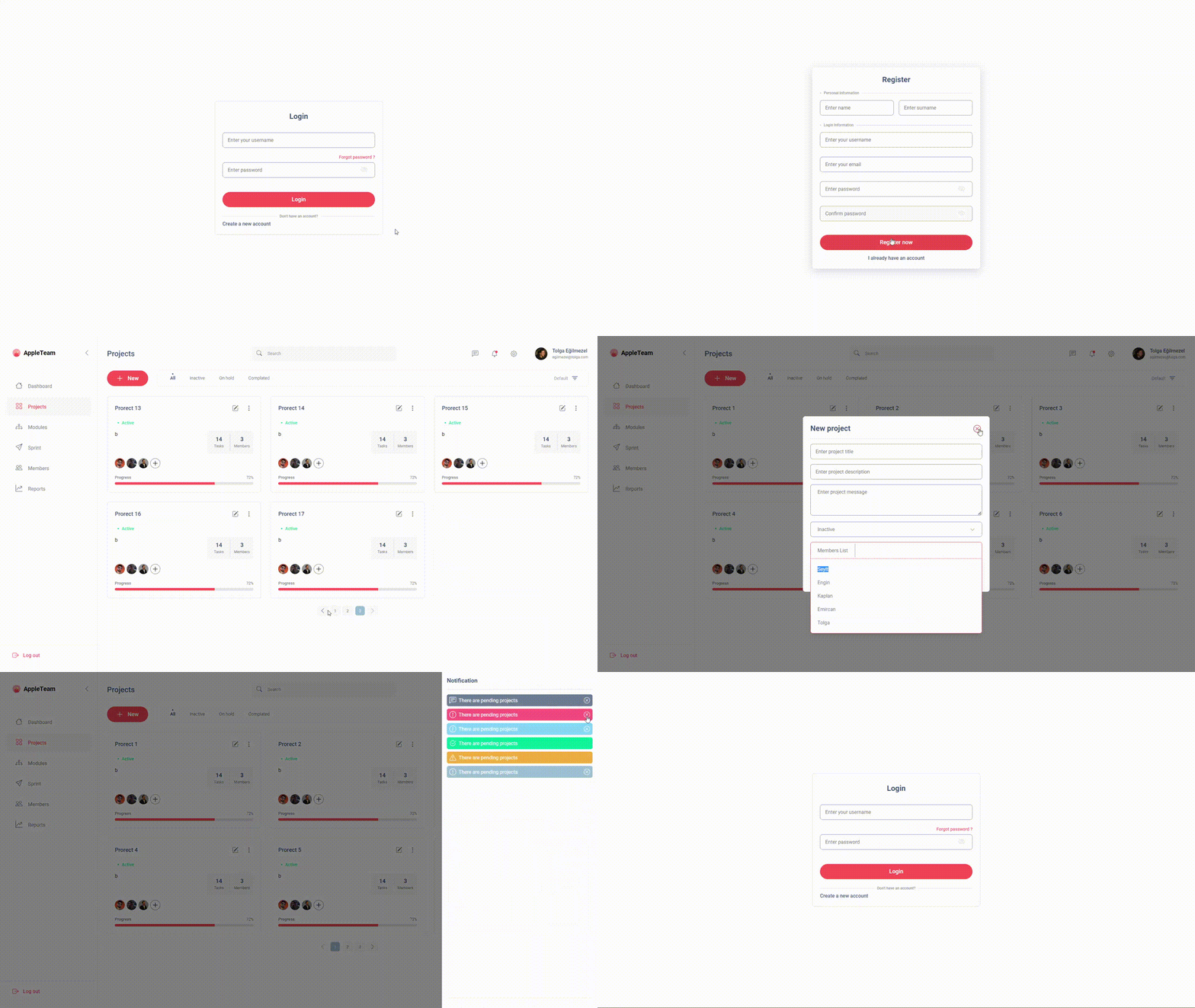
It is a Dashborad ui kit project made with Vue.js composition api. It is a free and open source project. You can use it for your personal and commercial projects.
LIVE
This template should help get you started developing with Vue 3 in Vite. The template uses Vue 3 <script setup> SFCs, check out the script setup docs to learn more.

| Name |
Type |
Default |
Description |
| type |
String |
'default' |
It takes values such as success, error, info, warning, default, message. |
| message |
String |
undefined |
It takes the message to be displayed in the alert component. |
| closable |
Boolean |
false |
It takes the value of true or false. If it is true, the alert component will be closed. |
| Name |
Type |
Default |
Description |
| image |
String |
undefined |
It takes the image path to be displayed in the avatar component. |
| size |
Number |
32 |
It takes the size of the avatar component. |
| classes |
String |
undefined |
Retrieves the class names to add to the avatar component. |
| Name |
Type |
Default |
Description |
| icon |
String |
undefined |
It takes the icon name to be displayed in the badge component. |
| active |
Boolean |
false |
It takes the value of true or false. If it is true, the badge component will be active. |
| classes |
String |
undefined |
Retrieves the class names to add to the badge component. |
| Name |
Type |
Default |
Description |
| name |
String |
undefined |
It takes the name to be displayed in the button component. |
| variant |
Boolean |
'primary' |
It takes values such as primary, secondary, success, error, info, danger, warning, light, dark, link. |
| classes |
String |
undefined |
Retrieves the class names to add to the button component. |
| Name |
Type |
Default |
Description |
| bordered |
Boolean |
false |
It takes the value of true or false. If it is true, the card component will be bordered. |
| classes |
String |
undefined |
Retrieves the class names to add to the card component. |
| Name |
Type |
Default |
Description |
| title-placement |
String |
'center' |
It takes values such as left, right, center. If it is true, the divider component will be bordered. |
| title |
String |
undefined |
It takes the title to be displayed in the divider component. If it is true, the divider component will be bordered. |
| Name |
Type |
Default |
Description |
| value |
String |
undefined |
It takes the value to be displayed in the dropdown component. |
| icon |
String |
undefined |
It takes the icon name to be displayed in the dropdown component. |
| items |
Array |
[] |
It takes the array of items to be displayed in the dropdown component. |
Global icon component, src/assest/icons/icons.js file is used. You can add your own icons to this file. You can use the icons in the components by using the name of the icon. For example, you can use the icon named home in the components by using the name of the icon.
<icon icon="home" size="32" />
| Name |
Type |
Default |
Description |
| icon |
String |
undefined |
It takes the icon name to be displayed in the icon component. |
| size |
Number |
32 |
It takes the size of the icon component. |
- Download the icon svg file from bootstrap-icons.
- Add the icon to the src/assest/icons/icons.js file.
- Use the icon in the components by using the name of the icon.

