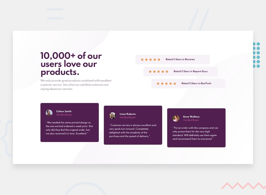
https://karvaroz.github.io/-reto-diseno-web-brightCoders/
El propósito de este ejercicio es conocer tus habilidades de diseño web. No vamos a evaluar que tan experto eres, sino lo que buscamos es comprobar que tienes las bases necesarias para poder aprovechar al máximo nuestro bootcamp
Para evaluar tus habilidades de diseño web utilizaremos un ejercicio tomado de la página Frontend Mentor.
Your challenge is to build out this social proof section and get it looking as close to the design as possible.
You can use any tools you like to help you complete the challenge. So if you've got something you'd like to practice, feel free to give it a go.
Your users should be able to:
- View the optimal layout for the section depending on their device's screen size
Your task is to build out the project to the designs inside the /design folder. You will find both a mobile and a desktop version of the design to work to.
The designs are in JPG static format. This will mean that you'll need to use your best judgment for styles such as font-size, padding and margin. This should help train your eye to perceive differences in spacings and sizes.
You will find all the required assets in the /images folder. The assets are already optimized.
There is also a style-guide.md file, which contains the information you'll need, such as color palette and fonts.
Feel free to use any workflow that you feel comfortable with. Below is a suggested process, but do not feel like you need to follow these steps:
- Look through the designs to start planning out how you'll tackle the project. This step is crucial to help you think ahead for CSS classes that you could create to make reusable styles.
- Before adding any styles, structure your content with HTML. Writing your HTML first can help focus your attention on creating well-structured content.
- Write out the base styles for your project, including general content styles, such as
font-familyandfont-size. - Start adding styles to the top of the page and work down. Only move on to the next section once you're happy you've completed the area you're working on.
- Ejecución
- Apariencia de la página, es decir que tan similar es al diseño solicitado
- La página debe ser responsiva, por eso se proporciona tanto el diseño móvil como el de escritorio
- Código fuente
- HTML + CSS (si así lo prefieres puedes utilizar el framework de tu elección)
- Código fuente en Github
- La solución debe cumplir con los requerimientos funcionales y no funcionales
- HTML + CSS
- No es necesario utilizar algún framework en particular, pero si necesitas hacerlo adelante, no hay problema.
- Cumplimiento de los requerimientos funcionales
- Cumplimiento de los requerimientos no funcionales
- 5 días para resolver el ejercicio

