Provides several plotting utilities to aid in performing exploratory analysis with publication-quality figures.
plot_pairwise_annotation: Plot a pairwise annotation (such as the results of pairwise statistical tests) onto a plot with a discrete x-axis and continuous y-axis and automatically assign the tiers to minimize the number of tiers needed to plot the comparisons.plot_distributions: Plot distributions with flexibility of quickly changing plot attributes in a one-liner.plot_pairwise_scatterplot: Plot a pairwise scatterplot.plot_heatmap: Plot an annotatedheatmap using ComplexHeatmap, but with a simplified yet flexible interface (notggplotbased, might need to rename the package!)plot_barplot: Plot a barplot with annotations and easily switch between stacked, unstacked and adjust text annotations accordingly.theme_ggexp: Variation onggplot2::theme_classicwith a blank strip background for facets.
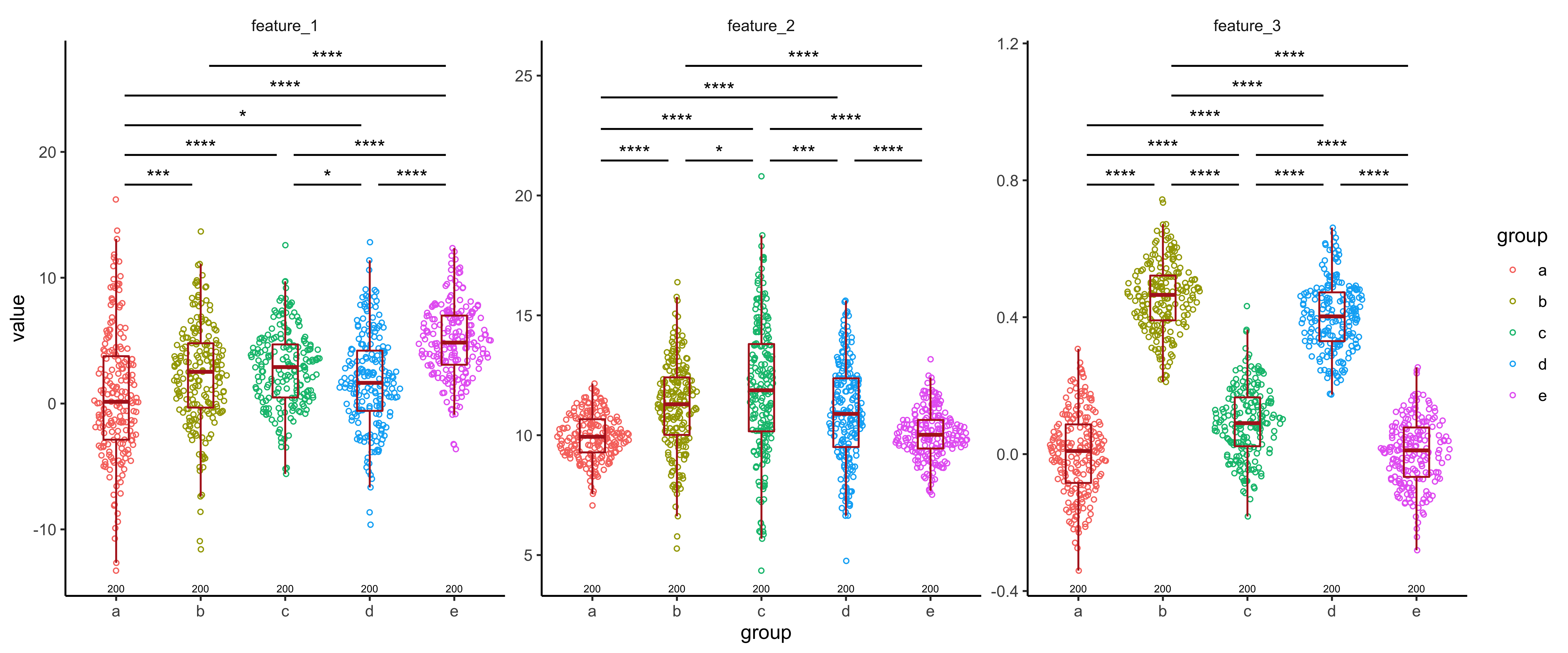
We generate some random data for illustration purposes. This consists of
a total of 5 groups to compare across for a total of 3 features. For
each of these features, we compute the p-values for pairwise Wilcoxon
rank-sum test, and annotate these comparisons on a geom_sina plot.
library(ggexp)
library(ggplot2)
library(magrittr)

set.seed(1234)

data = data.frame(
  "feature" = rep(c("feature_1", "feature_2", "feature_3"), each = 1000),
  "value" = c(
    c(
      rnorm(200, 1, 5),
      rnorm(200, 2, 4),
      rnorm(200, 3, 3),
      rnorm(200, 2, 4),
      rnorm(200, 5, 3)
    ),
    c(
      rnorm(200, 10, 1),
      rnorm(200, 11, 2),
      rnorm(200, 12, 3),
      rnorm(200, 11, 2),
      rnorm(200, 10, 1)
    ),
    c(
      rnorm(200, 0, .11),
      rnorm(200, .45, .1),
      rnorm(200, .10, .11),
      rnorm(200, .4, .1),
      rnorm(200, 0, .1)
    )
  ),
  "group" = rep(rep(c(
    "a", "b", "c", "d", "e"
  ), each = 200), 3),
  "id" = rep(1:200, 15),
  "status" = rep(1:5, 600)
)

wilcox_results = data %>%
  tidyr::nest(-feature) %>%
  dplyr::mutate(test = purrr::map(data, ~ as.data.frame(rstatix::wilcox_test(.x, value ~ group)))) %>%
  dplyr::select(feature, test) %>%
  tidyr::unnest(test)

plot = ggplot(data, aes(x = group, y = value, color = group)) +
  ggforce::geom_sina(shape = 1,
                     size = 1,
                     alpha = 0.5) +
  geom_boxplot(
    alpha = 0,
    width = 0.3,
    outlier.size = 0,
    position = position_dodge(width = 1),
    color = "firebrick"
  ) +
  facet_wrap(~ feature, scales = "free") +
  ggexp::theme_ggexp()

plot_pairwise_annotation(
  plot = plot,
  pairwise_annotation = wilcox_results,
  label = "p.adj.signif",
  values_to_exclude = "ns",
  tier_width = 0.08
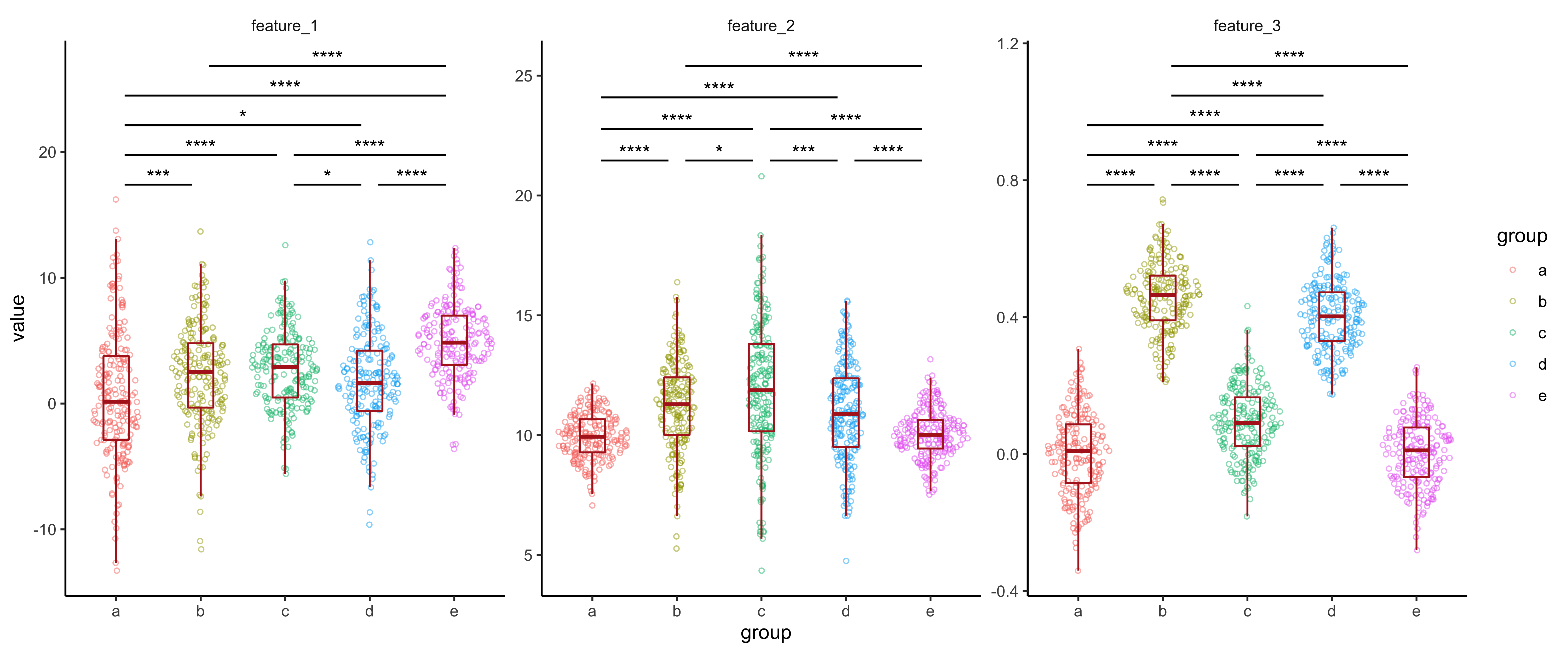
)This function creates very similar plots to the example shown above, but in a more convenient way by providing a single function call. It also includes a few additional useful features, such as annotating counts. We will recreate a similar plot as above using this, in a single function call.
plot_distributions(
  data = data,
  pairwise_annotation = wilcox_results,
  x = "group",
  y = "value",
  color = "group",
  pairwise_annotation_label = "p.adj.signif",
  pairwise_annotation_exclude = "ns",
  pairwise_annotation_tier_width = 0.08,
  facet_columns = "feature",
  facet_type = "wrap",
  type = "sina",
  scales = "free"
)
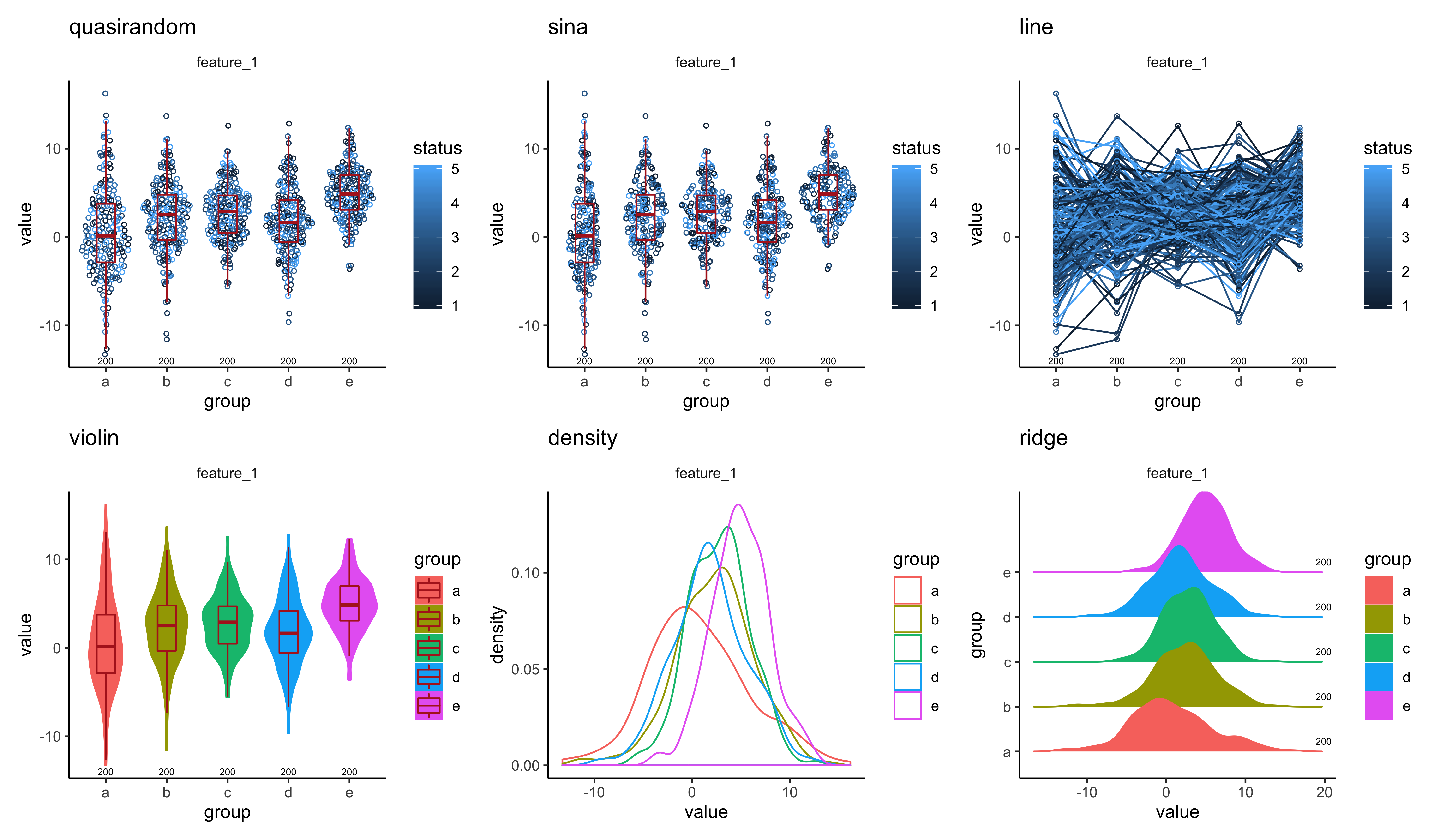
We can also use
different plot styles. We use a subset of the data to show this:
data = data %>% dplyr::filter(feature == "feature_1")
quasirandom = plot_distributions(
  data = data,
  x = "group",
  y = "value",
  color = "status",
  facet_columns = "feature",
  type = "quasirandom"
) + labs(title = "quasirandom")
sina = plot_distributions(
  data = data,
  x = "group",
  y = "value",
  color = "status",
  facet_columns = "feature",
  type = "sina"
) + labs(title = "sina")
line = plot_distributions(
  data = data,
  x = "group",
  y = "value",
  color = "status",
  group = "id",
  facet_columns = "feature",
  type = "line"
) + labs(title = "line")
violin = plot_distributions(
  data = data,
  x = "group",
  y = "value",
  color = "group",
  fill = "group",
  facet_columns = "feature",
  type = "violin"
) + labs(title = "violin")
density = plot_distributions(
  data = data,
  x = "group",
  y = "value",
  color = "group",
  facet_columns = "feature",
  type = "density"
) + labs(title = "density")
ridge = plot_distributions(
  data = data,
  x = "group",
  y = "value",
  color = "group",
  fill = "group",
  facet_columns = "feature",
  type = "ridge"
) + labs(title = "ridge")
patchwork::wrap_plots(quasirandom, sina, line, violin, density, ridge, nrow = 2)Often we will want to visualize the relationship between a set of variables in a pairwise manner. However, we may also want to restrict the variable pairs that we visualize to keep things concise. Additionally, we may want to facet on other features that give us example-level information.
For example, let’s consider the iris dataset.
Lets say we have some information about the features and only want to plot pairwise annotations within groups defined by this. We will call these axis annotations.
axis_annotations = data.frame(
  axis = c("Sepal.Length", "Sepal.Width", "Petal.Length", "Petal.Width"),
  feature_group = c("Sepal", "Sepal", "Petal", "Petal")
)
Based on the feature_group we want to restrict the pairwise
scatterplots made.
In the following plot, we make the pairwise scatterplots restricted on
feature_group and facet on Species.
plot_pairwise_scatterplot(
  data = iris,
  combination_groups = "feature_group",
  axis_annotations = axis_annotations,
  facet_type = "wrap",
  facet_columns = "Species",
  nrow = 1
)

