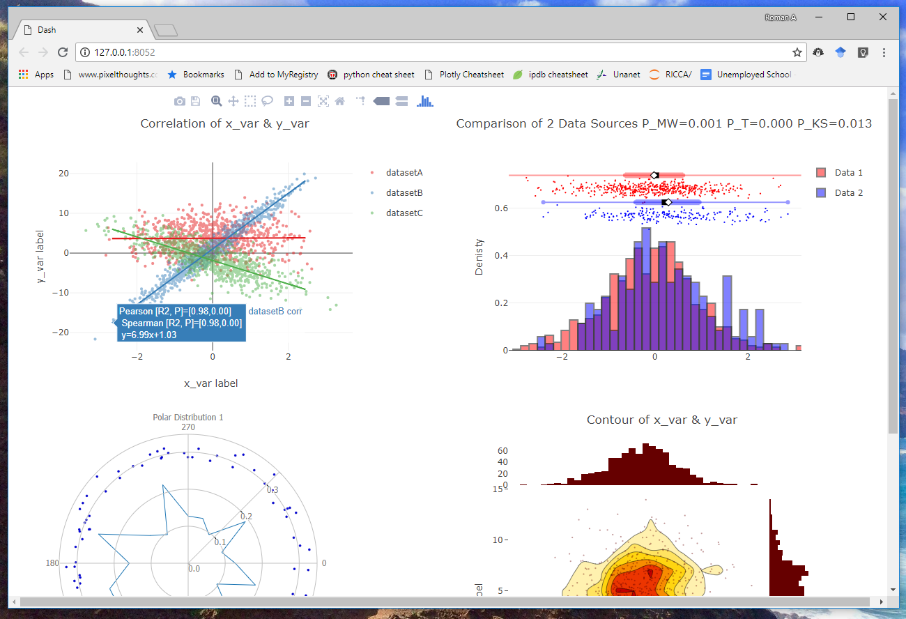
This python library is meant to augment the plotly and dash visualization libraries. It is designed to facilitate rapid and beautiful data visualizations for research scientists and data scientists.
Its advantages over naive plotly are:
- One-line commands to make plots
- Integrated scatistical testing above plots
- Expanded plot types (such as confusion amtrices, ROC plots)
- more 'Matlab-like' interface for those making the Matlab --> python transition
- Easily make full multi-figure dashboards in a single line using Dash
Required packages:
- numpy
- scipy
- plotly
- colorlover
- dash
- dash_core_components
- dash_html_components
To install, simply use pip install plotly-scientific-plots
NOTE: to get latest version install directly from git, which is more commonly updated. Use the following:
pip install git+https://github.com/rsandler00/plotly-scientific-plots.git
To import use import plotly_scientific_plots as psp
Plotly's key strength is its ability to do interactive visualizations.
For scientists, this allows novel ways of exploring data with mouse clicks and hovers. To see a full list of plotly-scientific-tools examples and their descriptions, go through the examples.ipynb
in nbviewer by clicking here
Below, are a limited set of examples to give the feel of how psp works:
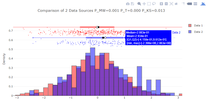
psp.plot2Hists(data_source_1, data_source_2, names=['Data 1','Data 2'],
            normHist=True, title='Comparison of 2 Data Sources',
            KS=True, MW=True, T=True)
Notice that the statistics box only appears when mouse hovers on the databar of the given color.
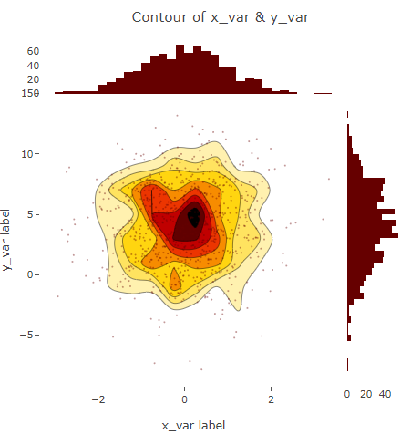
psp.scatterHistoPlot(data_source_1, data_source_3, title='Contour of x_var & y_var',
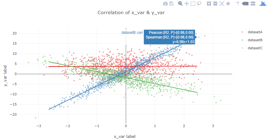
xlbl='x_var label', ylbl='y_var label')psp.corrPlot([data_source_1, data_source_11, data_source_12], [data_source_3, data_source_31,
data_source_32], names=['datasetA', 'datasetB', 'datasetC'],addCorr=True,
addCorrLine=True, title='Correlation of x_var & y_var', xlbl='x_var label',
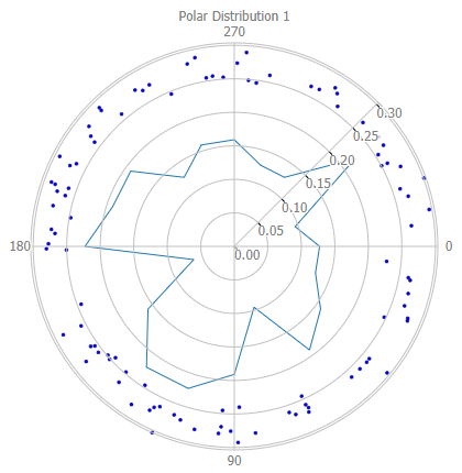
ylbl='y_var label')psp.plotPolar([polar1], numbins=20, title='Polar Distribution')To make multi-figure dashboards simply collect all desired figures in a nested list. Each outer list will correspond
to a column in the dashboard, and each figure within each outer list will be a row in the column. The pass that list
to psp.startDashboard. A flask-based web-server will start showing the figures in the browser at the provided port
(default port=8050). For example:
plot1 = psp.plotHist(..., plot=False)
plot2 = psp.plot2Hists(..., plot=False)
plot3 = psp.corrPlot(..., plot=False)
plot4 = psp.plotPolar(..., plot=False)
dash_plots = [
            [plot1, plot2],
            [plot3, plot4]
        ]
psp.startDashboard(dash_plots, port=8052)
An example dashboard appears below:
