This data is mostly from the City of Richmond Assessor's Office property transfer reports, which go back to 2012.
- get_all_transfers.ipynb - combines all of the Excel files into one dataframe and saves it
- flip analysis.ipynb - does most of the work
- data/ - this directory is mostly empty in this repo, but locally I store working data files here
- data/flips.csv - the output from data processing
In the flip analysis notebook, I applied some data filters and transforms:
- Filter to single-family homes (property classes 101, 110, 115, 120, 130, 150)
- Group by parcel ID + sale to combine extension cards (e.g. see the extensions tab for this parcel )
- To identify flips:
- self-join on parcel id and grantee=grantor (ie, the buyer resold it)
- where the property was held for between 0 and 2 years before reselling
- removed most of the foreclosures / multiple parcel sales / special financing, etc.
- removed new construction (<2 years old)
- Added some fields - hold_time, price_diff, size_diff, year, age, council, roi
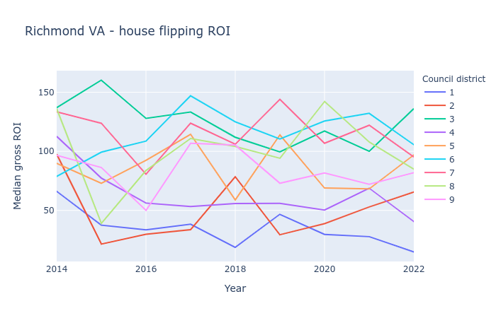
I also made some plots, like this one showing how the gross ROI varies by council district and year. If you're not familiar with the local geography, districts 1, 2, and 4 are statistically wealthier and whiter than the rest of the city.
Gross ROI % is calculated as the price difference (second sale - first sale) divided by the first sale. 100% means the second sale was twice as much as the first.
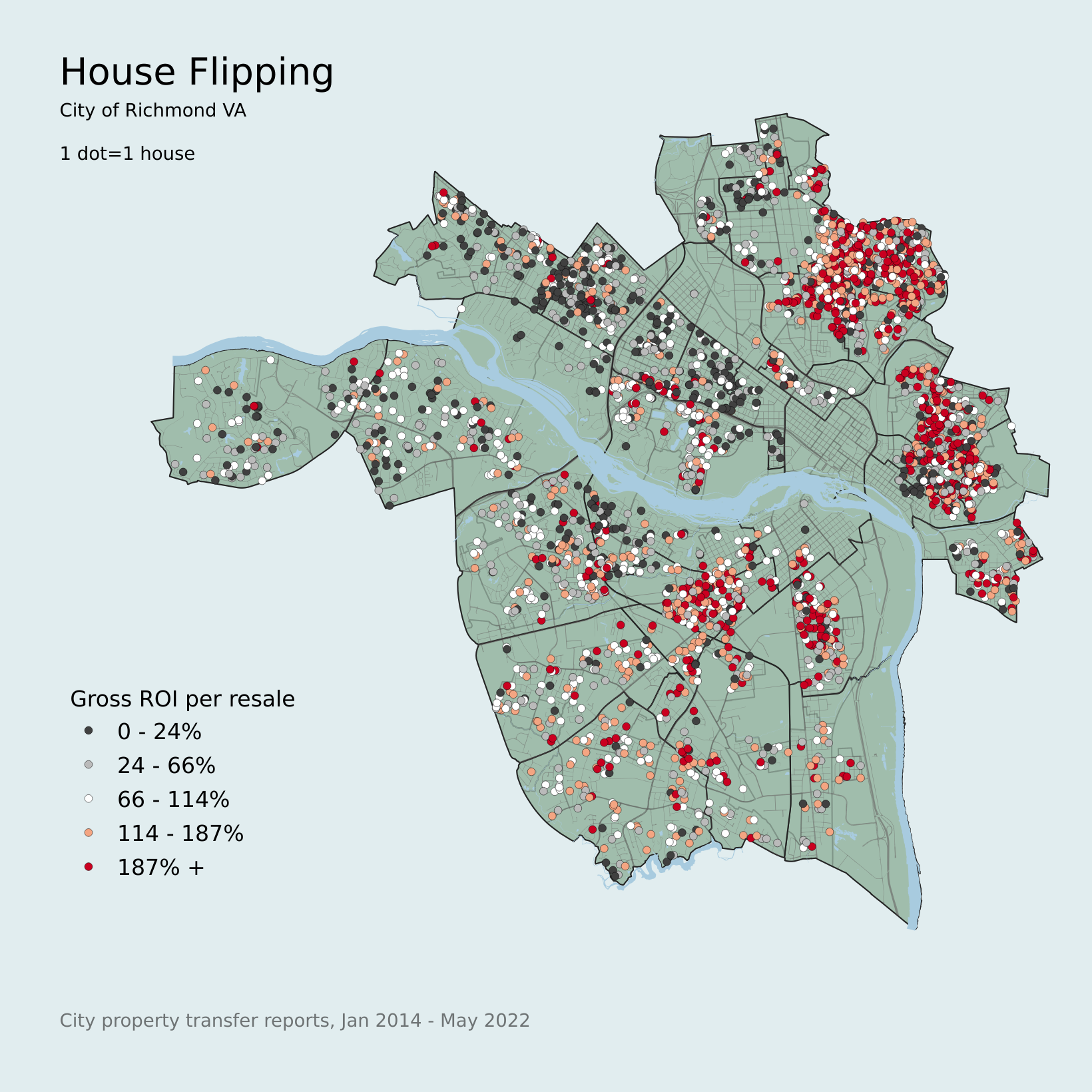
To make this map, I joined the CSV to the Parcels shapefile from the city's GeoHub. The parcels are to-scale polygons, which isn't very convenient for heatmaps and also emphasizes the relative size of each parcel, so I converted the layer to geometry centroids, and applied an equal-count 5-class gray-red colormap based on the flips_roi column.
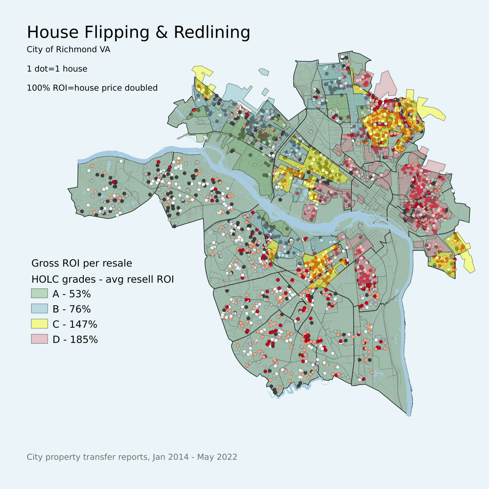
Since several people asked about it, I also overlayed the 1923 HOLC "redlining" grades. As expected from my previous homeownership and redlining project, the clusters of high gross ROI are mostly in grade D areas with high "negro" populations, and in adjacent grade C areas. The gross ROI is the gross profit relative to the house price, and indicates the cost increase or "markup" that the flipper added to the house.


