- Introduction to GIS with QGIS
Introduction to GIS with QGIS
Stacey Maples – Geospatial Manager – Stanford Geospatial Center – stacemaples@stanford.edu
David Medeiros – GIS Instruction & Support Specialist - Stanford Geospatial Center - davidmed@stanford.edu
This introductory session will focus upon the fundamental concepts and skills needed to begin using Geographic Information Systems software for the exploration and analysis of spatial data using the ArcGIS platform. Topics will include:
- What is GIS?
- Spatial Data Models and Formats
- Projections and Coordinate Systems
- Basic Data Management
- The ArcMap User Interface
- Simple Analysis using Visualization.
GIS Resources
Stanford Geospatial Center website - http://gis.stanford.edu/
Stanford GIS Listserv - https://mailman.stanford.edu/mailman/listinfo/stanfordgis
QGIS 2.8 Help - http://docs.qgis.org/2.8/en/docs/user_manual/
Download Tutorial Data
-
In a browser, go to https://stanford.box.com/SGCIntroGIS and click on the drop-down arrow to the right of each folder to download individual datasets. Save the Dataset to your Desktop.
-
Right-click on the resulting *.zip file and select Extract All…
-
Accept all defaults to extract the data file.
Open QGIS and Explore the User Interface
QGIS (Quantum GIS) is a freen and open – source desktop geographic information system (GIS) applocation. The first thing we want to do is Open QGIS and get familiar with the Default User Interface.
- In Windows, go to the Programs menu and find the QGIS Pisa, then select QGIS Desktop 2.10.1
- You should be presented with the New Document. You should then be presented with something like the interface you see below:

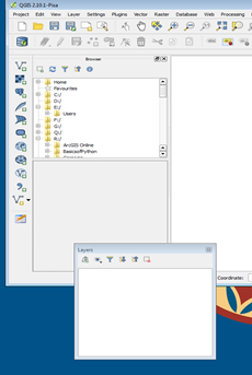
The Basic Components of the QGIS Interface
The QGIS interface is made up of three basic components:
The Map Canvas – This is where the raster and vector layers are displayed.
Tabbed Windows:
-
The Browser Window – Functions much as Explorer does in Windows. In this window, you can visualize your drives and folders. Is the equivalent of ArcCatalog in ArcMap.
-
The Layers Window – This is where your added geographic and non-geographic datasets will show. This is similar to the Table of Contents in ArcMap.
General Menu Bars:
-
File Bar – Has the basic commands of any file: New, Open, Save, Save As. The New Print Composer and Composer Manager are to create and manage layout views.
-
Map Navigation – Allows the user to Pan, Zoom to a Selected Feature, Zoom In, Zoom Out, Zoom to previous/next extent, and Refresh.
-
Attributes – These tools allow the user to: Identify attributes, Select / Deselect features, Opens attribute table, measure distance/areas/angles, create spatial bookmarks.
-
Plugins – QGIS comes with two default plugins: Python Console and QGis 2 Leaflet Webmap.
-
Help – The question mark booklet is linked to the QGIS User Guide.
-
Manage Layers – This bar is to add layers (vector, raster, new shapefile layer)
Interacting with Tabbed Windows
-
Move your cursor over the Browser dotted line. Click on the dotted line and drag the window to the bottom, below the Layers tabbed window.

Explore the Browser
-
Using the Window Explorer, browse to the \Introduction to ArcGIS\EX01_World folder, where you extracted the EX01_World.zip file and browse into the EX01_World\Data Folder.
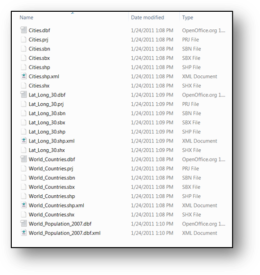

Note that, while there are 23 files in this folder, there are actually only 3 Shapefiles and a CSV Table here, as far as QGIS is concerned. This is because a Shapefile isn’t really a file but a collection of files. You are looking at this folder in Windows Explorer in order to illustrate a very important point about many types of geographic data formats: Geographic datasets are often not easily manageable using software not specifically designed for handling GIS data. In the case of the Shapefile, for example, if you wish to rename or move a shapefile, you must move or rename ALL of its component files in exactly the same way, or you can corrupt the shapefile.
- Return to QGIS and use the Browser Tabbed Window to expand the Home Folder.
- Expand the Home and Desktop folder.
- Expand the Introduction to ArcGIS, and then expand the Workshop Data Folder.
Note that the Shapefile is much simplified in the Browser Window. Although the Shapefile is still made up of several files, QGIS seems to know that it’s not a good idea to make you deal with all that, so it simplifies things by only showing you the .shp file.

Finally, let’s open a Map Document!
You should, in addition to a Data Folder full of shapefiles, have a Map Document in your \Introduction to ArcGIS\EX01_World \EX01_World Folder called… EX01_World.qgs. The icon looks like this:
- Drag the EX01_World Map Document into the Map Canvas to open it.
But Wait!
Has something gone awry? Do you see something that looks like this?

You are experiencing the dreaded “Absolute Paths” problem, endemic to GIS Softwares. To fix this issue, do the following:
- Press shift and click to select all the layers.
- Click the Browse and look for the Data_QGIS of the tutorial dataset and select the folder. Click OK.
You should find that (because they are all in the same ‘workspace’) all of your layers have been repaired and you should see something like the image on the right.

The Layers Tabbed window and its Properties
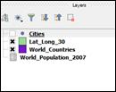
Now take a look at the Layers Tabbed Window. You should 3 Layers corresponding to the shapefiles in your Data Folder.

What you don’t see is that CSV Table. Look for the World_Population_2007 on the Browser Window, select it and drag it to the **Layers Window. **
Note that the World_Population_2007 table has been added to the Layers.
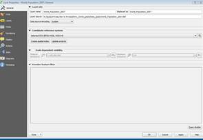
Notice how Asia almost disappears. Right-Click on the Lat_Long_30 shapefile. Select Properties and go to the General Tab. Under Coordinate Reference System (CRS) notice that the selected CRS is WGS 84**.** If you click on it, you will see that the Project CRS is World_Azimuthal Equidistant. This projection is useful for showing correct airline distances. So the layers in this document are displayed using World Azimuthal Distance.

Change the project Coordinate System.
-
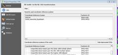
Close the Layer Properties and go to the Project Tab (Pull-down menu) and select Project Properties…
-
Click on the CRS Tab. Filter and Select “EPSG:4326 (WGS 84)”
-
Click OK
-
**Click Save **

What you have just done is reassigned the coordinate system of the Map Canvas to that of the Layers in your Map Document. This (GCS WGS 1984) is actually the coordinate system of all of the layers in your Map Document, so you should experience an increase in drawing performance, since QGIS is no longer projecting these layers on-the-fly to the World Azimuthal Equidistant projection (which was chosen for its extremity, in this case). The result of this change should be a fairly substantial change to the view on the Map Canvas.

Change the Layer Coordinate System.
Where are the cities?
- Right Click on the Cities Layer and Zoom to Layer. Notice how the cities are displayed.
- Right click on the Cities Layer and select Layer Properties. Notice how the coordinate system is not WGS. Change the coordinate system to **“**Project CRS EPSG:4326 (WGS 84)”
- Click OK
- **Click Save **
Explore Navigations Tools and Visibility in Data Frames
Before we begin to explore the properties of individual layer in the Map Document, we will first spend some time getting familiar with the navigation tools in ArcMap. Most of these tools can be found on the “Tools” toolbar, though some of the more useful ones involve right-click context menus of the layers.
Zoom to Layer
- Right-click on the Lat_Lon_30 Layer, in the Layers Window, and select Zoom to Layer.
Note that this should present you with the entirety of the Lat_Lon_30 Layer’s extent.
Map Navigation Toolbar
The Map Navigation Toolbar provides the bulk of the tools for navigation in the Map Canvas. Most of them are fairly obvious. Take a moment to explore each of these tools, and how it works.

-
The Touch Zoom and Pan - Works if you have a notebook with touch screen. Zoom in and zoom out using double finger touch.
-
The Pan Map changes the Extent of Map Canvas, without changing the scale. Click on the Pan Tool and use it to move around the Map Canvas.
-
The Pan Map to Selection changes the Extent of your Map Canvas to the feature being selected, without changing the scale
-
The Zoom In Tool and Zoom Out works exactly as you would expect. Click on the Zoom Tool, and drag a box to enclose the Continental United States. You can also single-click with this tool to use it as a Fixed Zoom Tools.
-
The Zoom Full zooms you to the full extent of the layer in your Map Project with the largest spatial extent. This can sometimes be problematic if you are working at a local level, but using one or more layers that are global in extent (for example, many of the network base map services).
-
The Zoom to Selection changes the Extent of your Map Canvas and zooms in or out to the selected feature.
When zooming in or out, the Scale Values at the bottom page change. Remember that the bigger the number (1:60,000,000), the larger the area being displayed. Although 60,000,000 is bigger than 60, a scale 1:60,000,000 is a small scale and 1:60 is a large scale because the division of 1/60,000,000 is smaller than 1/60.

-
The Zoom to Layer to a specific layer extent.
-
The Zoom Last and Zoom Next works as a Redo or Undo tool ONLY for the Scale/Extent in your Map Canvas. This tool is particularly useful if you change your Map Extent inadvertently.
-
The Refresh Button will reload your Map Extent
Bookmarks
One of the most useful navigation tools is the ability to create spatial Bookmarks.
- Right Click on any grey area and select Spatial Bookmarks.
- Using the Zoom Tools on the Tools Toolbar, Zoom your Data Frame view to the European/Asian Landmass.
- Go to the Spatial Bookmark Tabbed Window and Click on Add Bookmark and name it Europe & Asia
 4. Click on the Zoom Full button.
5. Go to your Spatial Bookmark Window. Select “Europe &
Asia” and click the Zoom to bookmark. You can also zoom to a
bookmark by double- clicking on it.
4. Click on the Zoom Full button.
5. Go to your Spatial Bookmark Window. Select “Europe &
Asia” and click the Zoom to bookmark. You can also zoom to a
bookmark by double- clicking on it.

Bookmarks can even be easily shared or moved from one using the Import/Export tool Bookmarks, too. The bookmarks are saved as xml files that can be imported into other QGIS projects. Bookmarks can also be deleted or edited on its name or coordinates.
Display Order
The Layer Order in the Layer Window determines the order of display in your Map Canvas
-
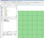
If you haven’t already, change your Layers view, click and drag the Lat_Lon_30 layer to the top of the Layers Window. Note that the other layers in your Map Canvas are now obscured.

Working with Layers & Their Properties
Layer Visibility
The Table of Contents also controls Layer Visibility. You can toggle the Layer Visibility using the checkbox next to each Layer in the Layer Window.
-
Use the Visibility Checkbox next to the Lat_Long_30 Layer to turn off the visibility of the layer and reveal the other layers again.

Examining and Selecting by Attributes
The most basic method of analysis in GIS is selection and sub-setting of data by attribute values. Now that the Cities Layer is visible again, we can begin to address the fact that this layer is a bit overpopulated for our purposes. Let’s say we are interested in visualizing the global distribution of cities with populations greater than or equal to 1 million. First we need to see if the data necessary to do this exists in our dataset.

- Right-Click on the Cities Layer and select “Open Attribute Table” to open the Attribute Table of the layer.
- Click and Drag the resulting Table Window to the bottom of the Map Document and expand the entire width of the Window.
- Scroll to the right until you can see the POP, POP_RANK and POP_CLASS Attribute Fields
- Click on the POP Field Header and select Sort Descending (Arrow Down).
- Scroll down through the Attribute table to examine the relationship between these three variables.
Selecting By Expression
What we would like to do is select all of the cities in this dataset that have a population of 1 million or greater. This can be accomplished using any one of these three of these variables, but we will use the POP_RANK variable for the sake of simplicity.
- On the Upper left corner of the Attribute Table, find the Select by Expression button and click on it.
- Expand Fields and Values, and Double-click on the “POP_RANK”
- Type <= 2
- Click the Select button and and Close.
 5. Scroll through the Attribute Table and note the records that are
selected.
6. You can **observe that the selection from the Attribute Table is
also reflected in the Map Canvas. **
5. Scroll through the Attribute Table and note the records that are
selected.
6. You can **observe that the selection from the Attribute Table is
also reflected in the Map Canvas. **
Exporting Data
Notice that the Selection looks more manageable that the full dataset. Now you will export this selection as a new shapefile, and bring it back into QGIS as a new Layer.
- Right-click on the Cities Layer and select **Save As. **
- Check Save only selected features.
- Click on the Browse Button and Browse into the Data Folder to save the new shapefile as **Major_Cities.shp. **

 4. Click Save and OK.
5. Right-click on the original Cities Layer and select
Remove.
4. Click Save and OK.
5. Right-click on the original Cities Layer and select
Remove.
Change City Symbology
Now we have two classes of POP_RANK to work with, and would like to distinguish them from one another, visually.
- Right-Click on the new Major_Cities Layer and Open its Properties
- Click on the Style Tab and **Select Categorized **
- On Column, select **POP_CLASS **
- Click on Classify
 5. Double click the point symbol.
6. In the resulting Symbol Selector, select Color Black and change Size
to 1 for “1,000,000 to 4,999,999” item. Click OK
5. Double click the point symbol.
6. In the resulting Symbol Selector, select Color Black and change Size
to 1 for “1,000,000 to 4,999,999” item. Click OK
 7. Using the same method, change the
symbol for the “5,000,000 and greater” item to Color Black with
a size of 3 points.
8. Unchecked the point with no value.
9. Click OK to close the Layer Properties Window.
10. Click Save
7. Using the same method, change the
symbol for the “5,000,000 and greater” item to Color Black with
a size of 3 points.
8. Unchecked the point with no value.
9. Click OK to close the Layer Properties Window.
10. Click Save

Label Cities
Another property of the layers in our Document that we might want to enable is the labeling of features. This can be accomplished, based upon an attribute value for each of the features. In many cases, this might be the name, or some other identifying attribute of the feature, but in some cases it might be a quantitative value associated with the features. It is even possible to use VB Scripting to assemble labels from several attributes and text elements. In this example, we will label only the cities with a POP_RANK value of 1.
- Right-Click on the Major_Cities Layer and select Layer Properties.
- Click on the Labels Tab.
- Check the Label this layer with to enable options and Select CITY_NAME and Click Ok.

Note that this turns on labels for all features and. Because there are so many visible features in this layer, this creates an unreadable labeling scheme. To remedy this, we will limit labeling to the largest cities in the Major Cities Layer.
- Right-click on the Major_Cities Layer and select Properties. Go to the Labels Tab and Click on Rendering.
- Click on the Show Label icon and Select Edit to open the Expression string builder window.
 6. Expand Fields and Values and Double Click on POP_RANK.
7. In the SQL Query window, create a SELECT argument as
follows:
“POP_RANK”=1
6. Expand Fields and Values and Double Click on POP_RANK.
7. In the SQL Query window, create a SELECT argument as
follows:
“POP_RANK”=1
 8. Click OK
9. Go to the TEXT Tab and change the Label Size to 7
points and Click OK to apply this labeling scheme to the Data
Frame.
8. Click OK
9. Go to the TEXT Tab and change the Label Size to 7
points and Click OK to apply this labeling scheme to the Data
Frame.
Definition Queries
- Right-click the World_ Countries dbf and open the Attribute Table.
You may have noticed that many of the features in the World_Population dbf file had values of -99999 for the POP2007 attribute. This normally indicates NODATA for the particular feature in demographic datasets. In this case, we would like to exclude this value from our Map Document. We could use the method used to subset the Cities layer earlier in the tutorial, but this time we will use another method called Definition Query. Definition Queries “define” a dataset, based upon a SQL Query, like the ones we have used to create the selection by attributes and the labeling class. In this case, the Definition Query “defines” a subset of the data layer that QGIS treats as the entirety of the dataset. It does not, however, require creating a new dataset (preventing redundancy in data storage) and does not alter the dataset being referenced, only our view of it in QGIS.
-
Close the World_Countries Attribute Table.
-
Right-click the World_ Countries.dbf and open the Properties Window.
-
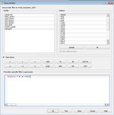
Go to the General Tab and Click on the Query Builder button at the bottom right**. **
-
On the Query Builder window create an Expression as follows: "POP2007" < > -99999
-
Click OK twice to apply the Definition Query.
-
Click the Refresh button. Open the Attribute Table for the World_Countries Layer and notice how the POP2007 Field no longer contains records with -99999 as a value.


Join a Table to a Layer
Now we will turn our attention to the World_Countries Layer. Ultimately, we would like to visualize the layer based upon population density. However, the attribute table for this layer doesn’t contain data on population. Fortunately we have a table in our Map Document with the necessary population attribute.
- Right-click on the World_Population_2007 Table and select Open.
- Scroll through the attributes and note the FIPS_CNTRY Attribute Field.
- Open the Attribute Table for the World_Countries Layer and note that it also has a FIPS_CNTRY Attribute Field.
Since this attribute exists in both of these attribute tables, and its values are identical across the two datasets, we can use this attribute as the “Key Field” for our table join.
-
Close the Attribute Table for the World_Countries Layer.
-
Right Click on the World_Countries Layer and Select Properties
-
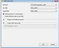
Go to the Joins Tab and Click the Green Plus Sign to open the Add vector join window.
-
Select World_Population_2007 as the Join layer and FIPS_CNTRY for the Join & Target fields.
-
Click OK to close the Window and Apply to create the Join.
-
Close the Layer Properties Window and Open the Attribute Table for the World_Countries Layer and note the **POP2007 Attribute (along with all other attributes from the World_Population_2007 table). ** Some values are NULL because they were dropped when we perform the definition query.

Symbolize Countries by Population Density
We can now use the POP2007 attribute to visualize population density. Even though the POP2007 variable is a raw counts variable, we can use the Style Tabs Normalization capability to divide the POP2007 variable by the area of the features to create the density value on-the-fly.
- Open the Properties for the World_Countries Layer and click on the Style Tab.
- Select Graduated and click the Expression Dialog button.
- Expand the Fields and Values and double click on the fields to write the normalization expression: "World_Population_2007_POP2007" / "SQMI" and **Click OK. **
 4. Select Quantiles as the classification mode and with 5
Classes.
5. Click OK.
6. Select a Color Ramp and Click OK to apply the
Symbology.
7. Uncheck the Lat_Long_30 shapefile
4. Select Quantiles as the classification mode and with 5
Classes.
5. Click OK.
6. Select a Color Ramp and Click OK to apply the
Symbology.
7. Uncheck the Lat_Long_30 shapefile
Note: When selecting your color ramp, be careful about selecting anything other than monochrome color ramps. This is because you want your map to “read well” in grayscale. In some of the 2-3 color ramps, the Intensity value of the colors at each end of the spectrum is the same, so that they produce identical grayscale values when converted, Xeroxed or printed in black & white.
Print Composer
- Click on New Print Composer and name it World_Population07. Click OK.
Note that a new window opens. Take a moment to explore the Composer toolbar

- Click the Add a new map icon and place the mouse pointer over the blank sheet. Notice a crosshair pointer. Click and hold on the left corner of the page and extend to the bottom right to draw a bounding box.
The Page Orientation and Size can be changed using the composition tab.

-
Click on the Map Box to select the item.
-
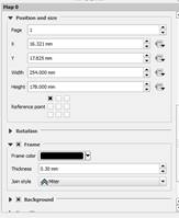
Go to the Item Properties Tab and expand Position and Size. Set the Map Size as 10 in wide by 7 in (254 by 178 mm).
-
Click on the Frame Tab and set the Border weight to .50mm points.
-
On the QGIS Map Canvas, go to Bookmarks and zoom to your Europe & Asia bookmark.
-
Go to the map composer > Item Properties > Extents and Click View extent in map canvas. To pan inside the map element click the Move Item content icon and pan inside the map.
-
Check the Background option and select a light blue as color background

Adding Map Elements
Legend
- Click the Add new legend and draw a bounding box inside the map.
- On the Legend items click the Filter by content icon.
- Expand the Spacing Tab and set the box space to 5.0 mm.
- Give the Legend a Border of .50 mm and Background (white is a good choice).
- Click Next> to accept all remaining default settings and insert the Legend.
- Use the Select move item tool to reposition the Legend
- Go back to the Map Document and Open the layer properties. Rename the layer Major_Cities to “Major Cities” removing the underscore, and click Ok to commit the change.
 8. Go to the map composer and click the Refresh button.
Note that the change you have made to the name of the Layer is also reflected in the Legend.
- Make changes to the other Text Elements of your Layers so that your Legend contains properly formatted and reasonable text descriptions and labels.
Scale Bar
- Click the Add new bar scale tool
- On the Item properties change the Style to Line Ticks Up.
- Change the Units to Feet.
- Set the Segments left 0 and right 2
- Use the Select Elements Tool to resize and reposition the Scale Bar.
Neat Line
- Click the Add figure and select add a rectangle.
- Be sure to draw it around all elements.
- Go to its Item properties and change the style to transparent fill and border width 0.50.
- Click OK to add the neatline.
Exporting Your Map
- Save your Map Composer.
- Click on the Export as Image Button.
- Save as type to PNG(*.png) and name it EX01_World
- Click Save.
- Browse to the Workshop Folder and double click on the EX01_World.png file to view it in the default image viewer.
