Nova is a playground to explore ideas around a more approachable, readable and compact way to working with the Android resource system, specifically for themes and styles.
The overall approach is to wrap the existing system in a custom Kotlin DSL (domain-specific language). The DSL will allow expressing the same richness and granularity as the existing XML-based approach does, with the added benefit of a more concise way of expressing the most common scenarios.
Stretch goal is to allow the developer to take the same DSL resource snippets as static, build-time declarations that are fed to AAPT as they are today, and use them as dynamic, run-time blocks that can be configured by the app and applied to parts / the whole of the running UI.
We're interested in your feedback on specific pain points for working with themes and styles, and whether the proposed approach addresses those areas.
This Nova snippet
theme(name = "MyMainTheme", parent = "Theme.Material.Light") {
    // Simple boolean attributes
    windowDrawsSystemBarBackgrounds = true
    windowActionModeOverlay = true

    // Attributes that point to color resources
    statusBarColor = android.attr.colorAccent
    actionMenuTextColor = android.color.background_light

    // Inline widget style. The output will create a separate <style> entry with an
    // autogenerated name and correct parent name based on what is defined in the base
    // theme for this widget style
    actionModeStyle {
        background = color.action_mode_background
    }
}
is converted to the following "traditional" XML resource snippets:
<resources
	xmlns:android="http://schemas.android.com/apk/res/android"
	xmlns:tools="http://schemas.android.com/tools" >
   <style name="MyMainTheme" parent="@android:style/Theme.Material.Light">
       <item name="android:windowDrawsSystemBarBackgrounds">true</item>
       <item name="android:windowActionModeOverlay">true</item>
       <item name="android:statusBarColor" tools:targetApi="21">@android:attr/colorAccent</item>
       <item name="android:actionMenuTextColor">@android:color/background_light</item>
       <item name="actionModeStyle">@style/MyMainTheme_actionModeStyle</item>
   </style>
   <style name="MyMainTheme_actionModeStyle" parent="@android:style/Widget.Material.Light.ActionMode">
       <item name="android:background">@color/action_mode_background</item>
   </style>
</resources>
What do we have here? Simple boolean attributes were "copied" as they were. The android:statusBarColor has tools:targetApi to mark that this attribute was added in version 21 of the platform
The more interesting part is our actionModeStyle. In the Nova snippet it is an inline style with no explicit parent. When Nova converts this DSL snippet into the "traditional" world, it does two things:
- Creates a separate
<style>for action mode - Finds the right parent for it based on the parent theme being used (
Theme.Material.Light) in our case.
Why stop at just one level of inline / nested styles?
theme(name = "MyMainTheme", parent = "Theme.Material") {

    // Inline widget style with inline text appearance
    toolbarStyle {
        background = color.toolbar_background
        title = string.toolbar_title
        titleTextAppearance {
            fontFamily = font.opensans
        }
    }
}
is converted into
<resources
	xmlns:android="http://schemas.android.com/apk/res/android"
	xmlns:tools="http://schemas.android.com/tools" >
   <style name="MyMainTheme" parent="@android:style/Theme.Material">
       <item name="toolbarStyle">@style/MyMainTheme_toolbarStyle</item>
   </style>
   <style name="MyMainTheme_toolbarStyle" parent="@android:style/Widget.Material.Toolbar">
       <item name="android:background">@color/toolbar_background</item>
       <item name="android:title">@string/toolbar_title</item>
       <item name="titleTextAppearance">@style/MyMainTheme_toolbarStyle_titleTextAppearance</item>
   </style>
   <style name="MyMainTheme_toolbarStyle_titleTextAppearance" parent="@android:style/TextAppearance.Material.Widget.Toolbar.Title">
       <item name="android:fontFamily">@font/opensans</item>
   </style>
</resources>
Two levels of nesting create two additional <style> elements, each one with the explicitly resolved parent from the implicit relationship that starts at the level of the core Theme.Material theme, one for the toolbar and the other for the title text appearance in the toolbar.
In the traditional system, if you want to give different values to an attribute based on resource qualifiers (portrait vs landscape, larger screens vs smaller screens, etc), you need to "split" the definition of that attribute across multiple resource folders.
In Nova it looks like this:
theme(name = "MyMainTheme", parent = "Theme.Material.Light") {
    // This attribute is a conditional with multiple selectors on one of the conditions.
    // The output will have <string> resources in the matching values.xml in -sw600dp-land,
    // -sw600dp and default.
    navigationBarColor {
        baseline use color.nav_bar
        smallestWidth(600) use color.nav_bar_wide
        allOf(smallestWidth(600), landscape) use color.nav_bar_wide_land
    }
}
and it is converted into multiple resource files. First, we have the style itself:
<resources
	xmlns:android="http://schemas.android.com/apk/res/android"
	xmlns:tools="http://schemas.android.com/tools" >
   <style name="MyMainTheme" parent="@android:style/Theme.Material.Light">
       <item name="android:navigationBarColor" tools:targetApi="21">@string/MyMainTheme_navigationBarColor</item>
   </style>
</resources>
As before, the attribute is marked with tools:targetApi to mark that it has been added in version 21 of the platform. The interesting part is what happens with the navigationBarColor attribute value. It is being placed in three separate resource folders.
The first one is the default in values:
<resources
	xmlns:android="http://schemas.android.com/apk/res/android"
	xmlns:tools="http://schemas.android.com/tools" >
    <string name="MyMainTheme_navigationBarColor">@color/nav_bar</string>
</resources>
The second one goes into values-sw600dp:
<resources
	xmlns:android="http://schemas.android.com/apk/res/android"
	xmlns:tools="http://schemas.android.com/tools" >
    <string name="MyMainTheme_navigationBarColor">@color/nav_bar_wide</string>
</resources>
And the third one goes into values-sw600dp-land:
<resources
	xmlns:android="http://schemas.android.com/apk/res/android"
	xmlns:tools="http://schemas.android.com/tools" >
    <string name="MyMainTheme_navigationBarColor">@color/nav_bar_wide_land</string>
</resources>Defining a Nova theme with a conditional parent uses the same syntax as for conditional attribute values:
theme(name = "MyMainTheme",
        parent = parentCondition {
            baseline use "Theme.Material.Light"
            night use "Theme.Material"
        }) {

    actionMenuTextColor {
        baseline use android.color.primary_text_dark
        night use android.color.primary_text_light
    }

}
Here, we want to use Theme.Material.Light as the parent by default, and Theme.Material for the night resource qualifier. In addition, we want our actionMenuTextColor to use different android:color values based on the same resource qualifier.
What do we get from this Nova snippet?
First, we have our values/styles.xml:
<resources
	xmlns:android="http://schemas.android.com/apk/res/android"
	xmlns:tools="http://schemas.android.com/tools" >
   <style name="MyMainTheme_GeneratedBase" parent="@android:style/Theme.Material.Light" />
   <style name="MyMainTheme" parent="@style/MyMainTheme_GeneratedBase">
       <item name="android:actionMenuTextColor">@string/MyMainTheme_actionMenuTextColor</item>
   </style>
</resources>
And we also have our values-night/styles.xml that "redefines" the parent of MyMainTheme accordingly:
<resources
	xmlns:android="http://schemas.android.com/apk/res/android"
	xmlns:tools="http://schemas.android.com/tools" >
   <style name="MyMainTheme_GeneratedBase" parent="@android:style/Theme.Material" />
</resources>
The value for action menu text color in the values folder is:
<resources
	xmlns:android="http://schemas.android.com/apk/res/android"
	xmlns:tools="http://schemas.android.com/tools" >
    <string name="MyMainTheme_actionMenuTextColor">@android:color/primary_text_dark</string>
</resources>
and finally, the same entry in the values-night folder is:
<resources
	xmlns:android="http://schemas.android.com/apk/res/android"
	xmlns:tools="http://schemas.android.com/tools" >
    <string name="MyMainTheme_actionMenuTextColor">@android:color/primary_text_light</string>
</resources>
Note how much more compact and readable the original Nova snippet is. It expresses the exact intent for the logical structuring of the specific theme, while the "underlying" implementation in the traditional resource system has to split that structure into multiple folders.
A Nova theme can extend another Nova theme:
theme(name = "MyMainTheme", parent = "Theme.Material.Light") {
    // Simple string attribute
    statusBarColor = color.status_bar_overlay

    // Inline widget style
    actionModeStyle {
        background = color.action_mode_background
    }

    toolbarStyle = null

}

// This theme extends another app theme overriding one top-level attribute and another
// attribute in one of the inline widget styles. The output will create a separate
// <style> entry with autogenerated name and parent name that points to the autogenerated
// name for the parent's actionModeStyle
theme(name = "MyMainTheme.Red", parent = "MyMainTheme") {
    // Conditional string attribute that overrides the value in the parent
    statusBarColor {
        baseline use color.status_bar_overlay_red
        smallestWidth(600) use color.status_bar_overlay_red_wide
    }

    // Inline widget style that overrides the value in the parent
    actionModeStyle {
        background = color.action_mode_background_red
    }
}
Here, our MyMainTheme extends the core Material light theme, with an inline actionModeStyle and null toolbarStyle. And then, MyMainTheme.Red extends MyMainTheme, overriding statusBarColor with a conditional, and overriding the inline actionModeStyle.
What do we get from this Nova snippet?
First, we have the default styles in the values folder:
<resources
	xmlns:android="http://schemas.android.com/apk/res/android"
	xmlns:tools="http://schemas.android.com/tools" >
   <style name="MyMainTheme.Red" parent="@style/MyMainTheme">
       <item name="android:statusBarColor" tools:targetApi="21">@string/MyMainTheme.Red_statusBarColor</item>
       <item name="actionModeStyle">@style/MyMainTheme.Red_actionModeStyle</item>
   </style>
   <style name="MyMainTheme.Red_actionModeStyle" parent="@style/MyMainTheme_actionModeStyle">
       <item name="android:background">@color/action_mode_background_red</item>
   </style>
   <style name="MyMainTheme" parent="@android:style/Theme.Material.Light">
       <item name="android:statusBarColor" tools:targetApi="21">@color/status_bar_overlay</item>
       <item name="actionModeStyle">@style/MyMainTheme_actionModeStyle</item>
       <item name="toolbarStyle">@null</item>
   </style>
   <style name="MyMainTheme_actionModeStyle" parent="@android:style/Widget.Material.Light.ActionMode">
       <item name="android:background">@color/action_mode_background</item>
   </style>
</resources>
Note how MyMainTheme_actionModeStyle gets the correct parent from the theme parent, and how MyMainTheme.Red_actionModeStyle gets correctly parented as well.
In addition to this XML block, Nova generates two more for the conditional values of statusVarColor in MyMainTheme.Red. One is in values:
<resources
	xmlns:android="http://schemas.android.com/apk/res/android"
	xmlns:tools="http://schemas.android.com/tools" >
    <string name="MyMainTheme.Red_statusBarColor">@color/status_bar_overlay_red</string>
</resources>
and the other is in values-sw600dp:
<resources
	xmlns:android="http://schemas.android.com/apk/res/android"
	xmlns:tools="http://schemas.android.com/tools" >
    <string name="MyMainTheme.Red_statusBarColor">@color/status_bar_overlay_red_wide</string>
</resources>First, let's take a look at the following Nova snippet:
theme(name="MainTheme.CustomToolbar", parent="Theme.Material.Light") {
    toolbarStyle {
        background = color.toolbar_background
    }
}

// This theme uses versioned blocks that allow specifying that a certain set
// of attributes be used only on a certain version of the platform. The output
// will have three entries for the same theme under the same name. The default
// one will not have any attribute, the -v21 will have only windowTranslucentStatus
// and -v23 will have only windowLightStatusBar
theme(name="MainTheme.CustomToolbar.LightStatusBar", parent="MainTheme.CustomToolbar") {
    // Attributes that point to color resources
    statusBarColor = android.attr.colorAccent
    actionMenuTextColor = android.color.background_light

    version(21) {
        windowTranslucentStatus = true
    }
    version(23) {
        windowLightStatusBar = true
    }
}
Here we have our base theme with an inline toolbarStyle, and another theme that extends it. This second theme is where it gets interesting:
- It defines a couple of simple color attributes
- In addition, we want to "backport" the light status bar functionality - that was introduced in version 23 of the platform by using the
windowTranslucentStatusattribute on versions 21 and 22.
In the traditional resource system, you need to copy-paste the "common" attributes (our status bar and action menu text colors) in three versions of this extending theme, one targeting version 23 of the platform, one targeting versions 21 and 22, and the default one targeting earlier versions. And that is indeed how it looks like in the output that Nova produces.
First, we have our values default styles:
<resources
	xmlns:android="http://schemas.android.com/apk/res/android"
	xmlns:tools="http://schemas.android.com/tools" >
   <style name="MainTheme.CustomToolbar.LightStatusBar" parent="@style/MainTheme.CustomToolbar">
       <item name="android:statusBarColor" tools:targetApi="21">@android:attr/colorAccent</item>
       <item name="android:actionMenuTextColor">@android:color/background_light</item>
   </style>
   <style name="MainTheme.CustomToolbar" parent="@android:style/Theme.Material.Light">
       <item name="toolbarStyle">@style/MainTheme.CustomToolbar_toolbarStyle</item>
   </style>
   <style name="MainTheme.CustomToolbar_toolbarStyle" parent="@android:style/Widget.Material.Toolbar">
       <item name="android:background">@color/toolbar_background</item>
   </style>
</resources>
There's our base MainTheme.CustomToolbar with auto-resolved parent for its toolbarStyle, and there's the default MainTheme.CustomToolbar.LightStatusBar with those two color attributes.
Nova also generates this for values-v21:
<resources
	xmlns:android="http://schemas.android.com/apk/res/android"
	xmlns:tools="http://schemas.android.com/tools" >
   <style name="MainTheme.CustomToolbar.LightStatusBar" parent="@style/MainTheme.CustomToolbar">
       <item name="android:statusBarColor" tools:targetApi="21">@android:attr/colorAccent</item>
       <item name="android:actionMenuTextColor">@android:color/background_light</item>
       <item name="android:windowTranslucentStatus">true</item>
   </style>
</resources>
Note that in addition to the two color attributes, we also have our android:windowTranslucentStatus that comes from the version(21) block.
And this is what is generated for values-v23:
<resources
	xmlns:android="http://schemas.android.com/apk/res/android"
	xmlns:tools="http://schemas.android.com/tools" >
   <style name="MainTheme.CustomToolbar.LightStatusBar" parent="@style/MainTheme.CustomToolbar">
       <item name="android:statusBarColor" tools:targetApi="21">@android:attr/colorAccent</item>
       <item name="android:actionMenuTextColor">@android:color/background_light</item>
       <item name="android:windowLightStatusBar">true</item>
   </style>
</resources>
The same two color attributes, accompanied by android:windowLightStatiusBar that comes from the version(23) block.
If you add more attributes to the original Nova snippet for MainTheme.CustomToolbar.LightStatusBar, they will be added to all three generated <style> sections in the three values folders. No need to remember where to copy-paste those attributes any more.
The AppCompat library backports newer platform features, especially around the core elements of Material design, to older platform versions. As such, it exposes a very similar set of themes, styles, and related attributes.
However, while that set is similar to that of the core platform, it is not 100% identical. Developers need to know which attributes need to be in the android: namespace, which attributes need to be in the app: namespace, and which (in very few cases) need to be in both.
Nova can help. Here is a Nova snippet that uses appCompatTheme construct:
appCompatTheme(name = "MyMainTheme", parent = "Theme.AppCompat.Light") {
    // Simple boolean attributes. The first two will be from the android:
    // namespace, while the third will be in the app: (implicit) namespace.
    windowDrawsSystemBarBackgrounds = true
    windowLightStatusBar = true
    windowActionModeOverlay = true

    focusable = true

    // Attributes that point to color resources. The first will be from the android:
    // namespace, while the second will be in the app: (implicit) namespace.
    statusBarColor = android.attr.colorAccent
    actionMenuTextColor = android.color.background_light

    // Inline widget style. The output will create a separate <style> entry with an
    // autogenerated name and correct parent name based on what is defined in the base
    // theme for this widget style
    actionModeStyle {
        background = color.action_mode_background
    }
}
And the output:
<resources
	xmlns:android="http://schemas.android.com/apk/res/android"
	xmlns:tools="http://schemas.android.com/tools" >
   <style name="MyMainTheme" parent="@style/Theme.AppCompat.Light">
       <item name="android:windowDrawsSystemBarBackgrounds">true</item>
       <item name="windowActionModeOverlay">true</item>
       <item name="android:windowLightStatusBar">true</item>
       <item name="android:focusable">true</item>
       <item name="android:statusBarColor" tools:targetApi="21">@android:attr/colorAccent</item>
       <item name="actionMenuTextColor">@android:color/background_light</item>
       <item name="actionModeStyle">@style/MyMainTheme_actionModeStyle</item>
   </style>
   <style name="MyMainTheme_actionModeStyle">
       <item name="android:background">@color/action_mode_background</item>
   </style>
</resources>
Note how relevant attributes get "placed" in correct namespaces.
The nova-sample Github project has the full sample that you can use to start experimenting with Nova.
The main idea is to process the Nova snippet(s) before your R class gets generated so that any themes or styles defined in Nova are "visible" to the rest of your codebase.
At the present moment this is done by placing the Nova snippet(s) into the buildSrc folder of your Gradle Android project.
First, add the following repositories for the Nova snapshots builds to your buildSrc/build.gradle file:
repositories {
    mavenCentral()
    maven {
        url 'http://oss.sonatype.org/content/repositories/snapshots'
    }
}

dependencies {
    implementation 'org.pushing-pixels:nova-core:0.1-SNAPSHOT'
    implementation("org.jetbrains.kotlin:kotlin-stdlib:1.3.72")
    implementation("org.jetbrains.kotlin:kotlin-reflect:1.3.72")
}
Next, add your Nova snippet(s) in the src folder:
fun helloWorldNova() {
    theme(name = "MyMainTheme", parent = "Theme.Material") {
        // Simple attributes (can use primitive values or reference framework
        // application resources)
        windowActionModeOverlay = true
        actionMenuTextColor = android.color.background_light

        // Inline widget style (no need for a separate style object)
        actionModeStyle {
            background = android.color.background_dark
            height = 48.dp
        }
    }
    ...
}
The next step is to decide on the location of Nova-generated resource files for the styles and themes. As your Nova snippet is the "source of truth", you will probably want to have the generated resource file reside somewhere in the build folder:
sourceSets {
    main {
        // Add the location of Nova-generated resources to be processed
        // for generating the R references
        res.srcDirs += ['build/generated/res/custom',]
    }
}
The directive above tells Gradle to add build/generated/res/custom to the resource source directory list of your Android module.
Now add the same Nova dependencies to your main module as above (repositories and dependencies). Finally, add and configure the custom Gradle task to process your Nova DSL snippet:
import com.example.novasample.Sample
import dev.android.playground.nova.core.base.DictionaryKt

task runNova {
    // Run our theme/style DSL snippet
    Sample.helloWorldNova()
    // And write the resulting <style> blocks into build/generated location
    DictionaryKt.write(new File(projectDir, "build/generated/res/custom").path, true)
}

gradle.projectsEvaluated {
    preBuild.dependsOn('runNova')
}
What do we have here?
- We import the Kotlin class (
Sample) with the DSL snippet, as well as Nova's coreDictionaryKtclass - We add a
runNovatask that "runs" the snippet and outputs all the matching<style>XML resource blocks to thebuild/generatedlocation that we've configured in the previous step - Finally, we mark our custom task to run before all the "regular" build steps performed on our Android module
This is the content of the build/generated folder after building our main module:
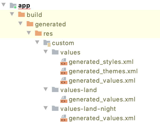
As these files are generated at the very beginning of the build process, the generated R class will have all the expected R.style references for usage in the rest of your codebase.
Nova is a layer of syntactic sugar on top of the existing Android resource system. It aims to bring more structure, readability and expressiveness to working with themes and styles.
Nova is also restricted by the limitations of the Android resource system. If you can't express a certain construct in the existing system, Nova is not going to be of help.
For example, the Android resource system (and by that we refer to the compile time, XML expression part of it) does not have dynamic modifiers such as:
- Always maintain a 2:1 ratio of the specific view width:height
- If the specific text view has more than 20 characters, use red color as the foreground
- If some other view is visible, make this view use bold text
These cannot be expressed in Nova, and you're probably looking for Compose.