This is a demonstration of a basic navigation system created with Elm. It's useful because it shows how a parent module can share information with its nested child module, and also how sibling modules can communicate back and forth. This essential system can be used as the basis for building all kinds of menu bars or navigation systems for websites or apps. It's based on the Elm Architecture using techniques no more advanced than Example #4: A Fancier List of Counters. If you're new to Elm, I recommend that you carefully work through and understand the first 4 Elm Architecture examples before approaching the code in this repository.
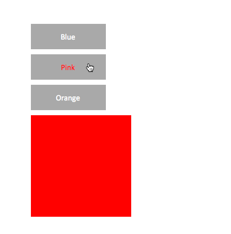
Run Main.elm and you'll see 3 buttons, each labeled with the name
of a different color. When the mouse moves over a button, the button
label changes to red. When the mouse moves out, the label changes back to
white.
The mouse pointer also changes to a hand icon when it's over a button.
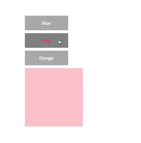
When you click on a button, the button color darkens and the big square below the list of buttons changes to the same color as the button label.
The selected button will stay selected until you click another button.
In most other programming languages, building a navigation menu bar like this usually involves a lot of tricky state management and is highly bug-prone. But, as you'll see ahead, thanks to Elm's immutable data structures and pristine module encapsulation, button states practically manage themselves.
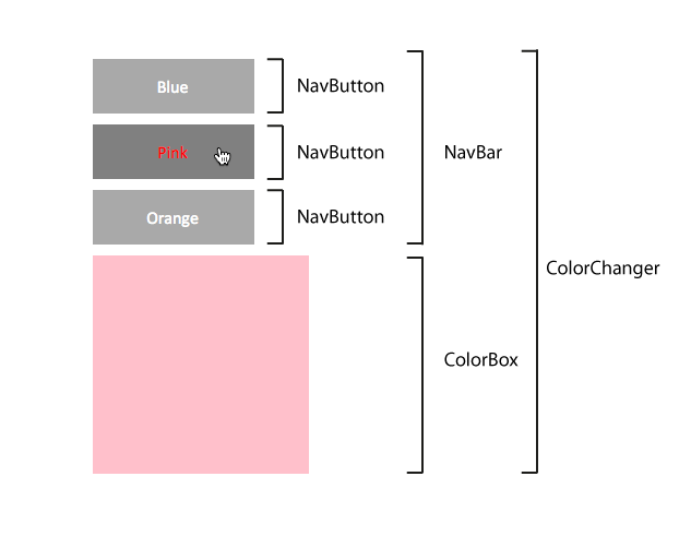
Each button is made from a module called NavButton. The buttons are nested
inside a parent module called NavBar, which creates the list of buttons.
The main program is a module called ColorChanger, which imports the
NavBar and ColorBox. The ColorBox is just the big square which
changes color when any of the buttons are clicked.
ColorChanger is the top-level module. Its job is to find out from
the NavBar what the currently selected button is, and then change
the color of the ColorBox to match that color.
It's the job of the NavBar to track which button has been selected,
and to tell that button to switch to its selected state. It's this
interesting back-and-forth communication between parent and child
modules which is very useful pattern to know for building menu systems
for all kinds of applications.
The NavButton is the lowest level building block. Its update function
is a very simple state machine that describes all the possible actions
that a button can have.
type Action
  = Over
  | Out
  | Select
  | Deselect

update : Action -> Model -> Model
update action model =
  case action of
    Over ->
      { model | textColor = "red" }

    Out ->
      { model | textColor = "white" }

    Select ->
      { model
          | backgroundColor = "grey"
          , selected = True
      }

    Deselect ->
      { model
          | backgroundColor = "darkGrey"
          , selected = False
      }
If you've read through the Elm Architecture, you'll immediately recognize this pattern.
The button's Over and Out hover states can be handled internally
by the NavButton module itself. However (and very importantly!), we want the Select and Deselect
actions to be handled by the parent NavBar module.
How can we do this? By creating a Context which allows the
selection actions to be handled by the parent module. Here's the
Context in the NavButton that sets this up.
type alias Context =
  { actions : Signal.Address Action
  , select : Signal.Address ()
  }
actions will be directed internally to this NavButton module, and
select will be directed to the external parent module. We don't need to know
what the parent module is - this will work no matter what other module
NavButton is imported into.
Here's the code in the NavButton's view that uses the Context to set this up.
view : Context -> Model -> Html
view context model =
  li
    [ navButtonStyle model
    , onMouseEnter context.actions Over
    , onMouseLeave context.actions Out
    , onClick context.select ()
    ]
    [ text model.content ]
You can see that the onClick event is directed to context.select.
Now the next step is to set up the parent module to handle the
context.select action.
The NavBar module imports the NavButton module. Its Model
record is very simple: a list of buttons, and selectedButton
property that is used to track the currently selected button.
type alias Model =
  { buttons : List NavButton.Model
  , selectedButton : String
  }

model : Model
model =
  { buttons = []
  , selectedButton = ""
  }
It has an initialize function that takes a list of button label
names, and uses them to create a list of buttons. If you give it 10
names, you'll end up with 10 buttons. (The example in this repository
just uses a list of three names: "Blue", "Pink" and "Orange")
initialize : List String -> Model
initialize names =
  let createButtons names =
    List.map (\button -> NavButton.initialize button) names
  in
    { model | buttons = createButtons names }
The structure of the NavBar module is otherwise very similar to the
CounterList module in Example 4 of the Elm Architecture. The
viewButton function uses the NavButton.Context to determine which
modules should handle which actions.
viewButton : Signal.Address Action -> ID -> NavButton.Model -> Html
viewButton address id model =
  let context =
      NavButton.Context
        (Signal.forwardTo address (Hover id))
        (Signal.forwardTo address (always (Select model)))
  in
    NavButton.view context model
The Hover action (which sets the buttons Over and Out states)
will be handled by the child NavButton module. But the Select action
will be handled by the NavBar module itself. We want the NavBar module to
handle it so that it can track which button has currently been
selected. Here's the Select action code from the NavBar's update
function that does this.
Select selectedButtonModel ->

  let

    -- `updateButton` checks whether a button has the same
    -- content string as the selected button. If it does, it
    -- updates the model and sets its action to `Select`.
    -- If it doesn't, it sets the button's action to `Deselect`
    -- (See the `NavButton` module for details on how this works.)

    updateButton buttonModel =
      if buttonModel.content == selectedButtonModel.content
         then
           NavButton.update NavButton.Select buttonModel
         else
           NavButton.update NavButton.Deselect buttonModel

  in

  -- Set the name of the currently clicked-on button as the
  -- model's `selectedButton` and update the buttons to reflect
  -- their selection state.

  { model
      | selectedButton = selectedButtonModel.content
      , buttons = List.map updateButton model.buttons
  }
Here's how this works:
Select takes the currently clicked NavButton model as an argument,
and sets the NavBar's selectedButton property to the same value as
the selected button's content. (This will be either "Blue", "Pink" or
"Orange" in this example.) The NavBar's buttons list is then
updated by checking whether any button in the list has the same
content as the selected button that was passed into the Select
action. If it does, then that button's update function is called with
the value Select. If it doesn't, the button's update function is
called with the value Deselect. Select and Deselect are actions
in the NavButton module which will change the button's background
color.
This is how the navigation bar maintains the correct button selection state, but how does it actually change the color of the big square in the main application?
The ColorBox is the big square at the bottom of the navigation bar
that changes color when the buttons are pressed. It has a very simple
model:
model =
  { color = "red"
  , width = 200
  , height = 200
  }
It also has a function called changeColor that returns a new model
with a different color.
changeColor : String -> Model
changeColor newColor =
  { model | color = newColor }
Both this ColorBox module and the NavBar module are imported into
a new parent module called ColorChanger which is actually the main
application that puts everything together. The ColorChanger model is a record which initializes a new
NavBar with a list of the button names you want to use. It also has a ColorBox model.
type alias Model =
  { navigationBar : NavBar.Model
  , colorBox : ColorBox.Model
  }

model : Model
model =
  { navigationBar = NavBar.initialize ["Blue", "Pink", "Orange"]
  , colorBox = ColorBox.model
  }
Its view is typical of any ordinary Elm Architecture view pattern.
It directs the NavBar to handle its own actions, and simply displays
the ColorBox (which has no actions.)
view : Signal.Address Action -> Model -> Html
view address model =
  div []
    [ NavBar.view (Signal.forwardTo address UpdateNavigation) model.navigationBar
    , ColorBox.view model.colorBox
    ]
The ColorChanger's update function first updates the navigation
bar with a newNavBar. This is important so that the correct, current
button states are properly displayed. Next, it uses the ColorBox's changeColor function
to get a new colorBox which is the same color as whatever the newNavBar's current
selectedButton is.
type Action = UpdateNavigation NavBar.Action

update : Action -> Model -> Model
update action model =
  case action of
    UpdateNavigation action ->
      let

        -- Get a new updated version of the navigation bar

        newNavBar = NavBar.update action model.navigationBar

        -- Get the color of the NavBar's selected button

        getColor selectedButton =
          if selectedButton /= ""
             then
               ColorBox.changeColor selectedButton
             else
               model.colorBox

      in

      -- Update the model with the new navigation bar and set the
      -- `colorBox` to the color of the new navigation bar's
      -- `selectedButton`

      { model
          | navigationBar = newNavBar
          , colorBox = getColor newNavBar.selectedButton
      }
And that's it!
A few reasons:
- The buttons manage their internal state, and don't need to know anything about the state of the other buttons in the navigation bar. They don't need to know whether they've been selected or deselected.
- The navigation bar just decides which buttons should be selected or deselected, and the buttons figure out for themselves how they should behave in those states.
- The color box doesn't need to know anything about the state of the buttons - it just cares about whatever the navigation bar's currently selected button is.
Building navigation bar menu systems like this tends to be one of the most tedious and usually bug-prone aspects of application design. That's because of all the tricky state management you have to be careful of. But thanks to Elm and the Elm Architecture, modules can manage their own internal states and remain completely encapsulated from the rest of the system. And, best of all: you can scale this same basic system to any size without having to do any more work, and be guaranteed the same bug-free performance. Yay, Elm!


