This documentation is for Docz v2. Follow our migration guide if you haven't upgraded your project yet.
- 🔩 Powered by Gatsby. Bundling and ecosystem powered by Gatsby.
- 🧘 Zero config and easy. Don't worry about complex configurations steps.
- ⚡️ Blazing Fast. Full hot reload support with webpack 4 and automatic code splitting.
- 💅 Easy to customize. Create and use real customizable themes.
- 📝 MDX Based. Write markdown enhanced by the power of components.
- 🎛 Pluggable. Use plugins to manipulate and customize Docz to suit your needs.
- 🔐 Typescript Support. Full support for TypeScript. Write your type definitions with no extra setup required.
Libraries that make development easier are appearing every day. Style guides and design systems are growing in popularity. Today, tools that allow us to get our best work done and be efficient are necessary. We shouldn't be spending too much time on tasks that should be trivial. This is why we created Docz.
Documenting code is one of the most important and time-heavy processes when you're creating something new. A lot of time is wasted on unnecessarily attempting to build a documentation site that will match the style we want.
👉🏻 More info on our website
- gatsby-theme-docz - Use Docz as a theme for Gatsby.
- netlify - Deploy your Docz site to Netlify.
- svg sprite loader - Docz plugin for SVG sprite loader.
- snapshots - A plugin for Docz that creates jest snapshots for all documented component usages.
- basic - Barebones example.
- gatsby - Example using Docz in a Gastby project.
- react native - Using Docz in a React Native project.
- styled-components - Using Docz with
styled-components. - with typescript - Using Docz with Typescript.
- with flow - Using Docz with Flow.
- with sass - Using Docz parsing CSS with SASS.
- with less - Using Docz parsing CSS with LESS.
- with postcss - Using Docz parsing CSS with PostCSS.
- with stylus - Using Docz parsing CSS with Stylus.
- Smooth UI - Modern React UI library.
- Set Protocol Docs - Documentation site of Set Protocol.
- RBX - The Comprehensive Bulma UI Framework for React.
- Circuit UI - React component library for SumUp web apps.
- Fannypack - A friendly & accessible React UI Kit built with Reakit.
- React Pixi - React Fiber renderer for Pixi.
- React Hotkey Tooltip - A global Hotkey provider with built in tooltip for React.
- Sajari React SDK - Library of React Components for the Sajari.
Since the release of v1 you need react and react-dom v16.8.0 or later installed.
Getting started with Docz is really quick and easy.
Firstly, install docz using your favourite package manager:
$ yarn add --dev docz@next react react-dom

# or

$ npm install --save-dev docz@next react react-domNote: react and react-dom will not be installed automatically. You'll have to install them yourself.
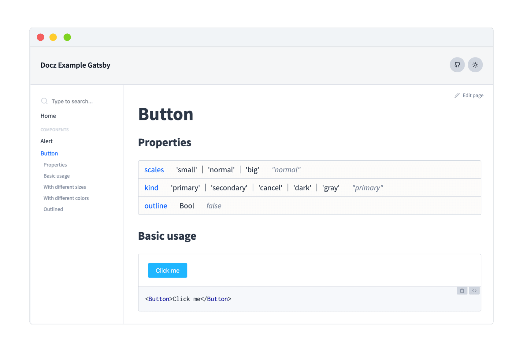
Next, add some .mdx files anywhere inside your project:
---
name: Button
---

import { Playground, Props } from 'docz'
import Button from './'

# Button

<Props of={Button} />

## Basic usage

<Playground>
  <Button>Click me</Button>
  <Button kind="secondary">Click me</Button>
</Playground>
Finally, run the Docz development server:
$ yarn docz devThat's it! Now you have some real badass documentation 👊
Any doubt? Check our docs to see more about Docz!
Contributions, issues and feature requests are very welcome. Please make sure to read the Contributing Guide before making a pull request.
This project exists thanks to all the people who contribute. [Contribute].
If you need some help you can chat with us on our Spectrum Community, we have a great team who would be more than happy to help you:
Pedro Nauck 💻 📖 🐛 👀 |
|---|


