📢 Use this project, contribute to it or open issues to help evolve it using Store Discussion.
As the name implies, the Condition Layout app allows a block to be rendered if certain conditions are met.
In your theme's manifest.json, add the Condition Layout app as a dependency:
  "dependencies": {
+   "vtex.condition-layout": "1.x"
  }
You are now able to use all blocks that are exported by the condition-layout app. Check out the full list below:
In the product theme template, add the condition-layout.{context} block, replacing the {context} value with product. For example:
{
  "store.product": {
    "children": ["condition-layout.product"]
  },
condition-layout directly. Make sure to always use it with the context variant, such as condition-layout.product.
Once the condition-layout.product block was added to the product template, you must declare its children using the condition.{context} block replacing the {context} value with product.
If desired, add the condition.else block as well. For example:
{
  "store.product": {
    "children": ["condition-layout.product"]
  },
+ "condition-layout.product": {
+   "children": [
+     "condition.product#custom-pdp-12",
+     "condition.product#custom-pdp-20",
+     "condition.else"
+   ]
+ },Now it is time to configure the condition.product block: use the block's props to define your layout condition and declare as its child a block of your choosing that will be rendered if this condition is met. For example:
{
  "store.product": {
    "children": ["condition-layout.product"]
  },
  "condition-layout.product": {
    "children": [
        "condition.product#custom-pdp-12",
        "condition.product#custom-pdp-20",
        "condition.else"
    ]
  },
+ "condition.product#custom-pdp-12": {
+   "props": {
+     "conditions": [
+       {
+         "subject": "productId",
+         "verb": "is",
+         "object": "12"
+       },
+     ]
+   },
+   "children": ["flex-layout.row#custom-pdp-layout-12"]
+ },
+ "condition.product#custom-pdp-20": {
+   "props": {
+     "conditions": [
+       {
+         "subject": "productId",
+         "verb": "is",
+         "object": "20"
+       },
+     ]
+   },
+   "children": ["flex-layout.row#custom-pdp-layout-20"]
+ },
+
+ "condition.else": {
+   "children": ["flex-layout.row#default"]
+ }
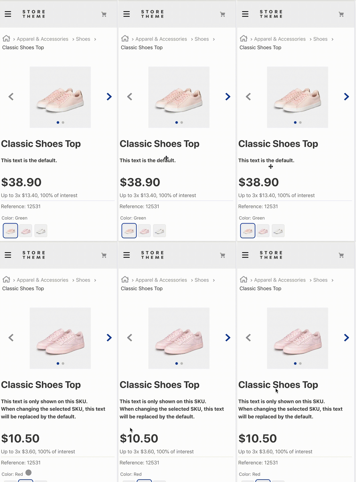
According to the example above, whenever users interact with a product whose ID is equal to 12, the block flex-layout.row#custom-pdp-layout-12 is rendered.
If users interact with a product whose ID is not equal to 12, the block that is rendered is the rich-text#default.
| Prop name | Type | Description | Default value |
|---|---|---|---|
conditions |
object |
List of desired conditions. | undefined |
match |
enum |
Layout rendering criteria. Possible values are: all (all conditions must be matched in order to be rendered), any (at least one of the conditions must be matched in order to be rendered) or none (no conditions must be matched in order to be rendered). |
all |
conditionsprop's object:
| Prop name | Type | Description | Default value |
|---|---|---|---|
subject |
string |
A subject is a similar data fetched from a given context. When passed as a value to this prop, the subject will be used to identify which data is needed from the UI to validate the value chosen in the object prop. Check below the possible value for the subject prop provided by the product context. |
undefined |
verb |
enum |
The condition validator. It directly depends on the subject chosen for the subject prop. For value type subjects, possible verbvalues are is or is-not (checking, respectively, for equality or inequality between the subject's value and the object prop's value). For array type subjects, possible values are contains and does-not-contain (checking, respectively, if the subject's array contains or does not contain the object prop's value). |
is (for value type subjects) and contains (for array type subjects). |
object |
string |
Value that you want to be matched when comparing to the data fetched in the subject prop in order to render the predefined layout. |
undefined |
- Possible
subjectprop's values provided by the product context:
| Subject | Type | Description |
|---|---|---|
productId |
value |
Product's IDs displayed on the UI. |
categoryId |
value |
Category's IDs displayed on the UI. |
brandId |
value |
Brand's IDs displayed on the UI. |
selectedItemId |
value |
ID of the item being selected by the user on the UI. |
productClusters |
array |
List of product clusters on the UI. |
categoryTree |
array |
List of categories on the UI. |
ℹ️ Since the Condition Layout can only be used with product contexts, only the subjects listed above are needed for the proper functioning of the condition block. Remember to choose the subject's value according to the value passed to the object prop.
In practice, the Condition Layout does not render a block on its own. The app provides 3 logic blocks, meaning blocks that lay out the reasoning behind rendering other Store Framework blocks.
The condition.{context} block is the one that does your store's actual Layout logic and, using the conditions and match props to set the conditions that blocks must meet to be rendered or not.
The conditions prop object has 3 other props, namely subject, verb and object, that together define the condition that must be met and how it is going to be validated: the object prop from conditions compares its value with the values fetched by the subject passed to the subject prop. The criteria used for this comparison stems from the value passed in the verb. The result being to define whether the condition put forth by the condition block and its props is acuatlly valid or not.
Lastly, the match prop decides the necessary number of valid conditions (defined in condition.{context} blocks) for the layout rendering to actually occur.
The Condition Layout merely establishes a logic to render other blocks. Therefore, the app doesn't have CSS Handles for its specific customization.
Instead, you should use the Handles of the child blocks chosen for rendering.
Thanks goes out to these wonderful people:
This project follows the all-contributors specification. Contributions of any kind are welcome!


