
px-modal is a Predix UI component that opens a modal window and overlays over the page.
- node.js
- npm
- bower
- webcomponents-lite.js polyfill
Node, npm and bower are necessary to install the component and dependencies. webcomponents.js adds support for web components and custom elements to your application.
First, install the component via bower on the command line.
bower install https://github.com/PredixDev/px-modal.git --save
Second, import the component to your application with the following tag in your head.
<link rel="import" href="/bower_components/px-modal/px-modal.html"/>
Finally, use the component in your application:
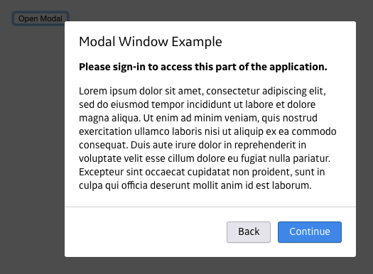
Modal triggered by button click
<px-modal
  btn-modal-positive="Continue"
  btn-modal-negative="Back"
  modal-heading="Sign-in required">
    <button class="btn btn--primary modal-trigger">Open Modal</button>
    <p>
      <b>Please sign-in to access this part of the application.</b>
    </p>
    <p>Lorem ipsum</p>
</px-modal>
Modal triggered by link
<px-modal
  btn-modal-positive="Continue"
  btn-modal-negative="Back"
  modal-heading="Sign-in required">
    <a href="javascript:void(0)" class="modal-trigger">Open Modal</a>
    <p>
      <b>Please sign-in to access this part of the application.</b>
    </p>
    <p><em>Two</em>Lorem ipsum dolor sit amet, </p>
</px-modal>
An input that brings up a modal when input loses focus (onblur event)
<input onblur="inputLostFocus()" class="text-input" type="text" placeholder="…">
<px-modal
  id="three"
  btn-modal-positive="Continue"
  btn-modal-negative="Back"
  modal-heading="Sign-in required">
    <p>
      <b>Please sign-in to access this part of the application.</b>
    </p>
    <p><em>Two</em>Lorem ipsum dolor sit amet, </p>
</px-modal>

<script>
  function inputLostFocus(evt){
    Polymer.dom(document).querySelector("#three").modalButtonClicked();
  }
</script>
Click on the link to open its modal, click OK to go to www.ge.com:
<a href="javascript:void(0)" onclick="gotoLink()">Goto GE.com?</a>
<px-modal
  id="four"
  btn-modal-positive="Continue"
  btn-modal-negative="Back"
  modal-heading="Sign-in required">
    <p>
      <b>Please sign-in to access this part of the application.</b>
    </p>
    <p><em>Two</em>Lorem ipsum dolor sit amet, </p>
</px-modal>

<script>
  function gotoLink(evt){
    Polymer.dom(document).querySelector("#four").modalButtonClicked();
  }

  document.getElementById('four').addEventListener('btnModalPositiveClicked', function() {
    window.location.href = 'https://www.ge.com';
  });
</script>
Read the full API and view the demo here.
From the component's directory...
$ npm install
$ bower install
$ gulp sass
From the component's directory
$ gulp serve
Starts a local server. Navigate to the root of that server (e.g. http://localhost:8080/) in a browser to open the API documentation page, with link to the "Demo" / working examples.
Please use Github Issues to submit any bugs you might find.