npm install --save react-announcementimport * as React from 'react'
import Logo from './logo.svg'
import Announcement from 'react-announcement'
class Example extends React.Component {
render () {
return (
<Announcement
title="Here is your component"
subtitle="The best announcement component for React is finally here. Install it in all your projects."
link="https://github.com/kristofferandreasen/react-announcement"
imageSource={Logo}
/>
)
}
}This example includes the optional properties in the component.
The daysToLive property changes to the cookie created by the component.
This way you can control how many days you want to wait before you show the announcement to the same user.
The secondsBeforeBannerShows property changes the number of seconds a user waits before the announcement is presented.
The closeIconSize is to allow you to change to size of the icon in the top right corner.
The animateInDuration changes the duration of the fade-in animation.
The animateOutDuration changes the duration of the fade-out animation - this is fired on the click of the close icon.
import * as React from 'react'
import Logo from './logo.svg'
import Announcement from 'react-announcement'

class Example extends React.Component {
  render () {
    return (
      <Announcement
        title="Here is your component"
        subtitle="The best announcement component for React is finally here. Install it in all your projects."
        link="https://github.com/kristofferandreasen/react-announcement"
        imageSource={Logo}
        daysToLive={3}
        secondsBeforeBannerShows={20}
        closeIconSize={30}
        animateInDuration={2000}
        animateOutDuration={500}
      />
    )
  }
}| Property | Type | Required | Default value | Description |
|---|---|---|---|---|
title |
string | yes | The title of the announcement | |
subtitle |
string | yes | The general card text on the announcement | |
imageSource |
string | yes | The image source string used on the left side of the image. Use a square image for the best results. Dimensions are 68x68 pixels. | |
link |
string | yes | The link used when the announcement is clicked. | |
daysToLive |
number | no | 7 | An optional property specifying the number of days the cookie will live before the announcement is shown again to a user. |
secondsBeforeBannerShows |
number | no | 5 | The number of seconds a user has to keep the page open before the announcement is shown. |
animateInDuration |
number | no | 1000 | Changes the duration of the fade-in animation. |
animateOutDuration |
number | no | 30 | Change the duration of the fade-out animation. |
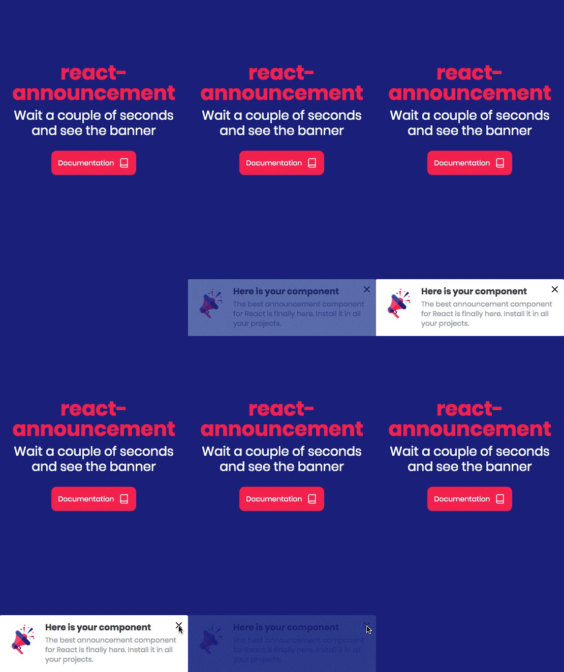
The announcement is shown on the left side of the screen on desktop and centered at the bottom on mobile.
The project is bootstrapped with create-react-library and TypeScript has been added to the project. You can read more about the development workflow in the project docs.
To start developing, you need to open two terminals.
In the first tab, run from the main directory:
npm start
This will activate rollup to watch for any changes to your src directory and build the dist everytime.
In another terminal, navigate to the example folder:
cd example
Then run:
npm install
and finally:
npm start
This will start up the development server allowing you to see the results. Be aware that the solution is setting a cookie and this cookie will be stored in your browser. In order to see the banner again, you will need to open the localhost link in incognito or clear your browser cookies.
Your contributions are always welcome! Please have a look at the contribution guidelines first 🎉
MIT © kristofferandreasen


