An aggregation dataset and interface for visualizing and analyzing the epidemiology of Coronavirus Disease 2019 aka SARS-CoV-2 aka COVID19 aka C19
How Effective Is Social Distancing?
What Factors Are Correlated With COVID19 Fatality Rates?
The dataset is in csv format and can be found here
You can find relevant statistics and detailed sourcing in the Guide
the see19 package is available on pypi and can be installed as follows:
pip install see19
The package provides a helpful pandas-based interface for working with the dataset. It also provides several visualization tools
The Guide details data sources, structure, functionality, and visualization tools.
- Carveth Read, Logic, Chapter 22
see19 is an early stage attempt to aggregate various data sources and analyze their impact (together and in isolation) on the virulence of SARS-CoV2.
- Ease-of-use is paramount, thus, all data from all sources have been compiled into a single structure, readily consumed and manipulated in the ubiquitous
csvformat.
see19 aggregates the following data:
- COVID19 Data Characteristics:
- Cumulative Cases for each region on each date
- Cumulative Fatalities for each region on each date
- State / Provincial-level data available for
- Factor Data Characteristics available for most regions include:
- Longitude / Latitude, Population, Demographic Segmentation, Density
- Climate Characteristics including temperatue and uvb radiation
- Historical Health Outcomes
- Travel Popularity
- Social Distancing Implementation
- And more and counting ...
There is no single all-encompassing data from an undoubted source that will serve the needs of every user for every use case. Thus, the dataset as it stands is an ad-hoc aggregation from multiple sources with eyeball-style approximations used in some instances. But while the dataset's imperfections are numerous, they cannot blunt the power of the insights that can be gleaned from an early exploratory analysis.
In addition to the dataset, see19 is a python package that provides:
- Helpful
pandas-based interface for manipulating the data - Visualization tools in
bokehandmatplotlibto compare factors across multiple dimensions .. - Statistical analysis is also a goal of the project and I expect to add such analysis tools as time progresses. Until then, the data is available for all.
I FIND ERRORS WITHIN THE DATA REGULARLY. PLEASE FLAG ANY ISSUES YOU SEE!
I am always on the hunt for new additions to the dataset. If you have any suggestions, please contact me. Specifically, if you are aware of any datasets that might integrate nicely with see19 in the following realms:
- German daily, state-level case and fatality data
- Russian daily, state-level case and fatality data
- State or city level travel data
- Global Commercial Airline route data (there seems to be plenty available, except only for a whopping price)
You can very quickly use see19 to develop visuals for COVID19 analysis and presentation.
The see19 package can be installed via pip.
pip install see19
Then simply:
# Required to use Bokeh with Jupyter notebooks
from bokeh.io import output_notebook, show
output_notebook()from see19 import get_baseframe, CaseStudy
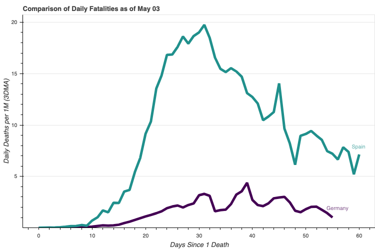
baseframe = get_baseframe()regions = ['Germany', 'Spain']
casestudy = CaseStudy(baseframe, regions=regions, count_categories='deaths_new_dma_per_1M')
label_offsets = {'Germany': {'x_offset': 8, 'y_offset': 8}, 'Spain': {'x_offset': 5, 'y_offset': 5}}
p = casestudy.comp_chart.make(comp_type='multiline', label_offsets=label_offsets, width=750)
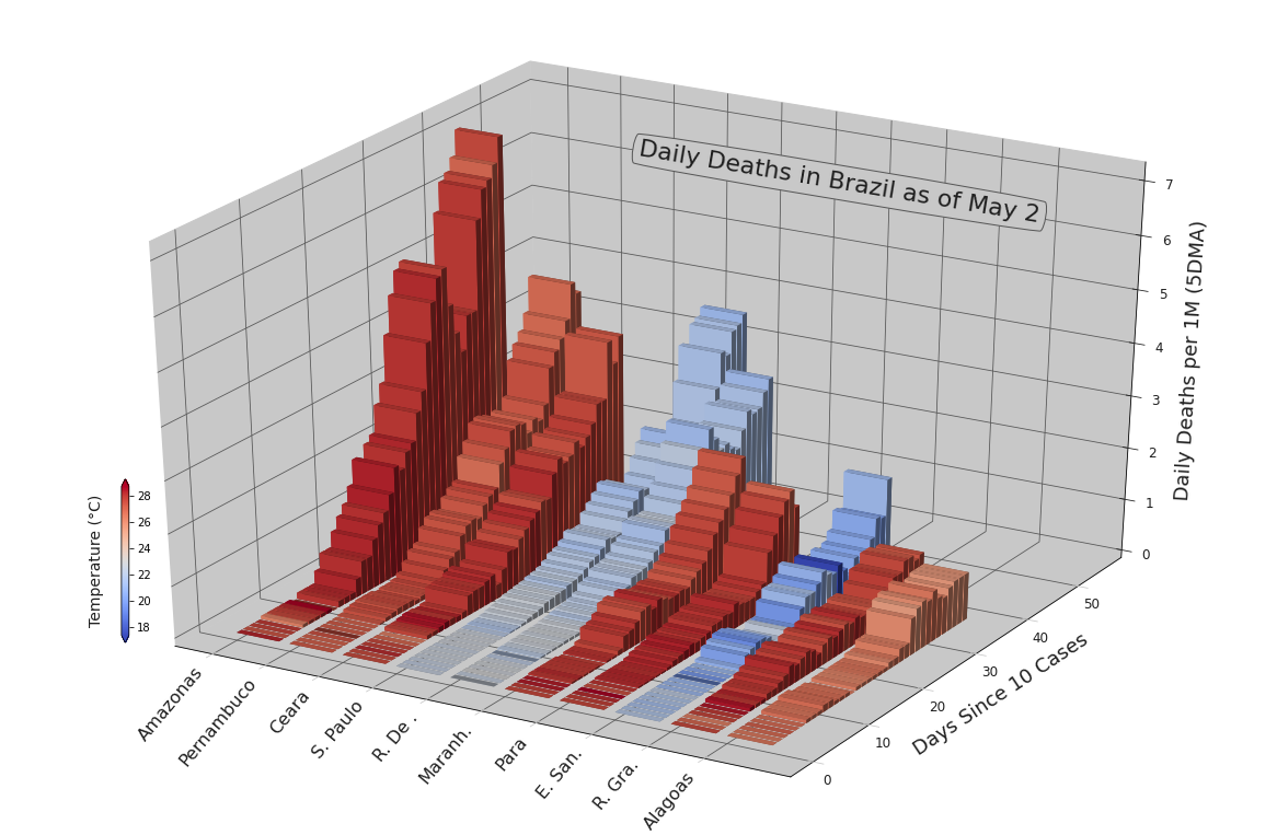
show(p)%matplotlib inlineregions = list(baseframe[baseframe['country'] == 'Brazil'] \
.sort_values(by='population', ascending=False) \
.region_name.unique())[:20]
casestudy = CaseStudy(
baseframe, count_dma=5,
factors=['temp'],
regions=regions, start_hurdle=10, start_factor='cases', lognat=True,
)
kwargs = {
'color_factor': 'temp',
'fs_xticks': 16, 'fs_yticks': 12, 'fs_zticks': 12,
'fs_xlabel': 12, 'fs_ylabel': 18, 'fs_zlabel': 18,
'title': 'Daily Deaths in Brazil as of May 2',
'x_title': 0.499, 'y_title': 0.738, 'fs_title': 22, 'rot_title': -9.5,
'x_colorbar': 0.09, 'y_colorbar': .225, 'h_colorbar': 20, 'w_colorbar': .01,
'a_colorbar': 'vertical', 'cb_labelpad': -57,
'tight': True, 'abbreviate': 'first', 'comp_size': 10,
}
p = casestudy.comp_chart4d.make(comp_category='deaths_new_dma_per_1M', **kwargs)
