You can use this project to visualise sentiment data of music lyrics. Read the origin story to find out why I created it.
Good to see that you want to visualise the lyrics of one of your favourite artists. The process is split into two parts:
- Analyse the song texts.
- Plot the sentiment data.
I'll use Avicii's posthumous album TIM as an example in this readme.
You can see an example setup in run-example.py.
Let's dig in.
To run an analysis, you'll need a connection to the Google Cloud Natural Language API.
Set up a project in the Google Cloud console and add your credentials.json to the project root folder.
After that, you'll need a .txt file for each song that you want to analyse.
I use https://www.azlyrics.com to get my lyrics.
Format each song file this way: song index-album name-song title.txt.
For the song Peace of Mind by Avicii, the first song on the album TIM, this would be: 1-tip-peace of mind.txt.
I store the text files of the albums I generate inside a songs folder in my project.
When you have the files ready, you can use analyse_files_and_store_in_excel.py to run the sentiment analysis and store the results in an Excel sheet.
The function takes two arguments:
- path to song files, e.g.
songs/avicii_tim. - name extension of Excel file. The file is called
song_sentiment_extension.xlsx, e.g.song_sentiment_avicii_tim.xslx.
A full example looks like this:
analyse_files_and_store_in_excel('songs/avicii_tim', 'avicii_tim')
You have the option to scrape for the lyrics using the lyrics.py file.
To use the script, you have to generate an access key on https://genius.com/api-clients.
Store the access key in a json file called credentials-genius.json with this format:
{
  "access-key": "your access key here"
}
After that, enter the song titles, artist, and album as appropriate in lyrics.py.
You will need to create the appropriate folder under the songs folder (for example, for Lady Gaga, you will need to create a Lady Gaga folder: songs/Lady Gaga.
The script will generate the text files and put them in the folder.
Small changes in the lyrics can impact the visual. So be sure to check the lyrics when you get them automatically.
You can visualise the data with the functions in visualise.py . There are two types of visualisations:
- Scatter plot -
scatter_plot_from_dataframe - Line plot -
plot_path_from_dataframe
You'll have to transform the generated sheet into a dataframe first. You can do so by using the convert_xlsx_into_dataframe function from visualise.py:
df = convert_xlsx_into_dataframe('output/song_sentiment_avicii_tim.xlsx')
You could also visualise the results of the analysis directly, without saving them into a file. But by doing so, you will call the Google API every time you run the visualisation. By storing the results into a file, you greatly reduce the amount of API calls you have to make.
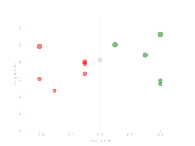
Use the scatter_plot_from_dataframe function to create a scatter plot. You only have to pass 1 value: a dataframe:
scatter_plot_from_dataframe(
    dataframe=tim_df,
)
Here's an example of the results:
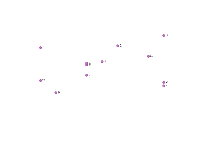
The function has some optional extra values you can use:
scatter_plot_from_dataframe(
    dataframe=tim_df,
    magnitude_amplifier=0,
    album_color='purple',
    annotate='index',
    disable_grid=True,
)
Some details on the values:
- dataframe: the data frame you want to visualise.
- magnitude_amplifier: changes the size of a dot based on the magnitude.
- album_color: the color for the dots. Leave empty for sentiment colours red, grey, and green.
- annotate: define how you'd like to annotate the dots. Use
'title','index', or'index title'. Leave empty for no annotation. - disable_grid: do you want to hide the grid of the plot (
True/False)?
Here's another example of the resulting dataviz from this function:
This one feels magical to me. Using the patches option from Matplotlib, you can draw an organic looking line. It's drawn from one song to the next based on the index on the album. Use the path_plot_from_dataframe function to create the line. You only have to pass a dataframe.
plot_path_from_dataframe(
    dataframe=df
)
And the result is:
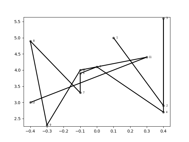
Also this function has some extra options. I've used these during testing to see if lines were drawn correctly. I decided to keep them in so you can get an understanding of how the drawing works. Here's an example of the function with all it's extra options set:
plot_path_from_dataframe(
    dataframe=df,
    show_dots=True,
    disable_grids=False,
    line_type='straight',
    line_color='black',
    emo_grid=False
)
Some details on the values:
- dataframe: the data frame you want to visualise.
- show_dots: do you want to show dots in this plot (
True/False)? - disable_grids: do you want to hide the grid of the plot (
True/False)? - line_type: the type of line you want to use. Use
's'or'straight'for a straight line. Default is curved. - line_color: set the colour for the line. Use supported default color label or hex colour, e.g.
'#ff0000'. - emo_grid: plots the following four quadrants in the image: weak negative, strong negative, weak positive, strong positive.
And again the result:
If you are interested in the why of this repository, read my story about the origin: The Avicii Project.
The project is currently in a rough state. Things I'll be working on are:
- Store data in csv instead of excel.


