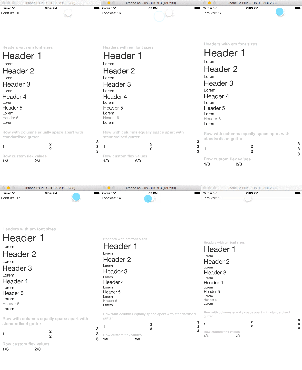
Having developed and published a large number of react-native applications and boilerplate code, of all the things I can't live without is this set of customisable layout components.
npm i react-native-common-elements --saveimport { init, em, Row, FormGroup, Flex, Container, Column, Text, Bold, H1, H2, H3, H4, H5, H6, globalise } from 'react-native-common-elements';
<H1>...<H6>- text ranging from 1em to 2.5 em<Text/>- text with standardised font size and styles<Bold/>- same as text but bold<Container/>- container with standardised guttering<Row space noPad/>- Horizontal view with options to space apart and negate container gutter padding<Flex/>- view with flex, can override value withvalue={x}<Column/>columns within a row element, uses standard guttering
em(value, baseValue)returns unit based on device widthglobalise()assigns components and em to global scope
Optionally you can override any style property or style variables by calling init, these are deeply merged when rendering see styles.js and styleVariables.js for full list of properties
init({text:{color:'red'},h1:{color:'blue'}},{fontSize:16});
<Flex>
    <Row space>
        <Column>
            <Text>Text</Text>
        </Column>
        <Column>
            <Text>Text2</Text>
        </Column>
    </Row>
    <Container style={{ justifyContent: 'center' }}>
        <FormGroup>
            <H1>Header 1</H1>
            <H2>Header 2</H2>
            <H3>Header 3</H3>
            <H4>Header 4</H4>
            <H5>Header 5</H5>
            <H6>Header 6</H6>
            <Bold>Header 6</Bold>
        </FormGroup>
        <FormGroup>
            <Row>
                <Flex value={1 / 3}>
                    <Bold>1/3</Bold>
                </Flex>
                <Flex value={2 / 3}>
                    <Bold>2/3</Bold>
                </Flex>
            </Row>
        </FormGroup>
    </Container>
</Flex>
