#Introduction
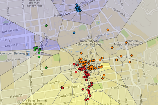
#In this project, you will create a visualization of restaurant ratings using machine learning and the Yelp academic dataset. In this visualization, Berkeley is segmented into regions, where each region is shaded by the predicted rating of the closest restaurant (yellow is 5 stars, blue is 1 star). Specifically, the visualization you will be constructing is a Voronoi diagram.
#In the map above, each dot represents a restaurant. The color of the dot is determined by the restaurant's location. For example, downtown restaurants are colored green. The user that generated this map has a strong preference for Southside restaurants, and so the southern regions are colored yellow.
#This project uses concepts from Sections 2.1, 2.2, 2.3, and 2.4.3 of Composing Programs. It also introduces techniques and concepts from machine learning, a growing field at the intersection of computer science and statistics that analyzes data to find patterns and make predictions. I hope you enjoy browsing through it.
