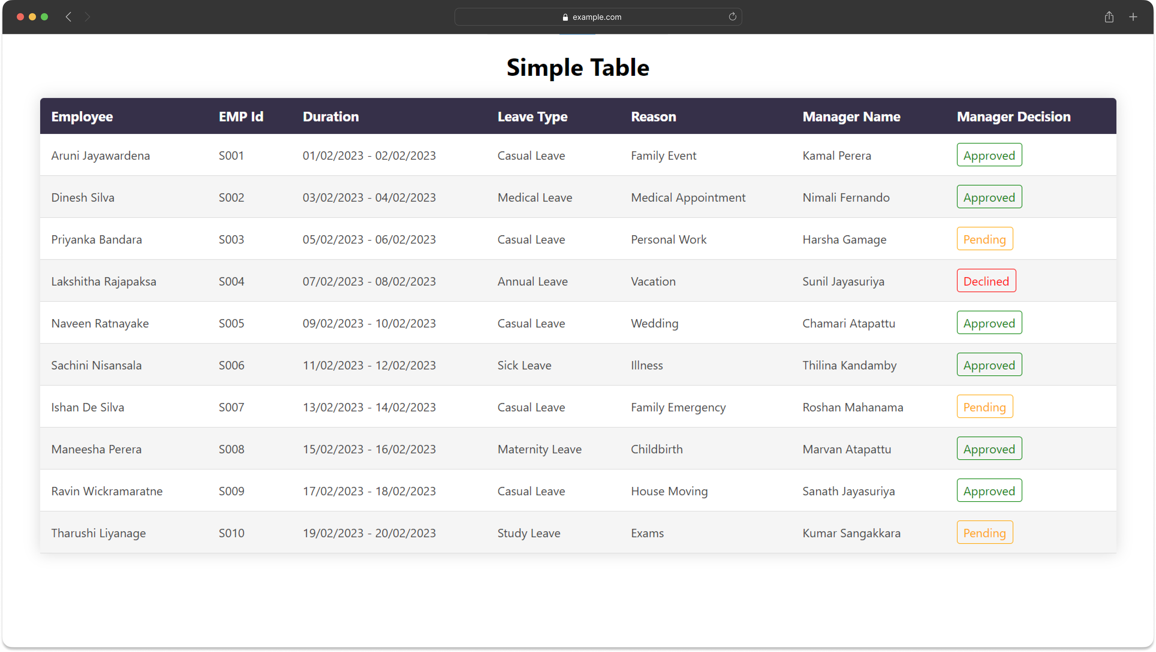
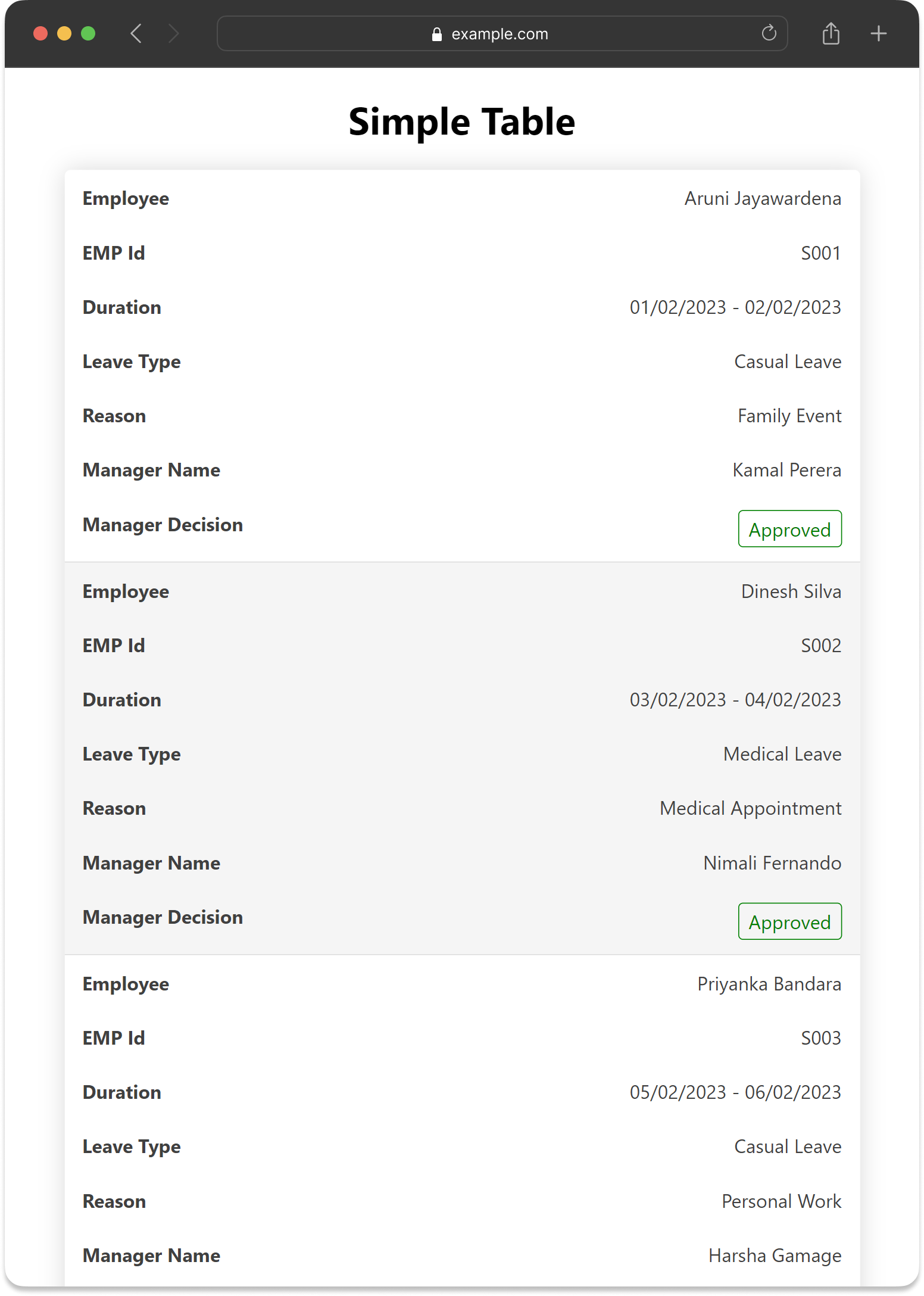
This project showcases the implementation of a custom table component called SimpleTable using React.js and TypeScript. The SimpleTable component is designed to display tabular data with customizable columns and cell rendering.
The project follows a directory structure where individual components, including the SimpleTable.tsx, are placed within the components directory.
- SimpleTable.tsx: Main component responsible for rendering the table based on provided data and column definitions.
- Label.tsx: Renders labels based on decision status for specific columns.
To set up and run the project locally:
- Clone this repository.
- Run
npm installto install dependencies. - Start the development server with
npm start. - Access the application in your browser at
http://localhost:3000.
npm start: Starts the development server.npm run build: Builds the app for production to thebuildfolder.npm test: Launches the test runner.
-
columnDefs(Array of ColumnDef objects):- Defines the characteristics of each table column.
- Users can optionally pass a
cellRendererfunction via ColumnDef. If provided, the function will be used to create the content of the cell.
-
data(Array of Record<string, object>):- Contains the data to be displayed in the table.
Users can add other props based on specific requirements or additional functionalities needed for the SimpleTable component.
import React from 'react';
import SimpleTable from './components/SimpleTable';

const columnDefs = [
  { headerName: 'Column 1', field: 'column1' },
  { headerName: 'Column 2', field: 'column2', cellRenderer: (data) => <CustomComponent data={data} /> },
  // Add more column definitions as needed
];

const data = [
  { column1: 'Value 1', column2: 'Value 2' },
  // Add more data objects as needed
];

const App = () => {
  return (
    <div>
      <h1>SimpleTable Example</h1>
      <SimpleTable columnDefs={columnDefs} data={data} />
    </div>
  );
};

export default App;The SimpleTable component is designed to be responsive for smaller screens using media queries in the CSS styles. It adjusts the table layout and cell display for better readability on devices with smaller viewports.
- The project has been implemented using React, TypeScript, and minimal dependencies to maintain simplicity and reduce external dependencies.
- Styling is done using CSS without relying on libraries like Bootstrap or Ant Design.
Feel free to extend the SimpleTable component or add additional features based on specific requirements.

