A collection of stories and configs to demonstrate how Storybook can improve you and your company's velocity.
Home: Storybook
For detailed reasoning see Storybook - Why.
Create a React app:
npm init vite@latest vite-number-conversion -- --template react-tsInitialize Storybook:
As of 2023-03-29
npx storybook@next initEventually:
npx storybook@7 initInstall: Yes! 🎉 There's not other choice required 🤩
npm run storybook- Material UI
- react-helmet-async
- react-router-dom
- Keep your eyes on the React Router 6 Addon It does basically what I've prototyped, but well! Just waiting on a v7 release.
Storybook is amazing for working with other developers.
You can and should use it to help create internal or public packages using npm publish.
When you start needing to work with a broader audience not code related, you need a way to publish your work in a way they can appreciate. Sure you could ask a designer, product owner, or CEO to "clone, install and run!". You're after better adoption though. You want the most recent result, in front of the, in something as simple as a link in your wiki.
You could publish the Storybook's built version using npm run build-storybook and your own CI/CD setup.
Or, you can integrate with the mother ship and get all kinds of fun tools via Chromatic. 🚀 The folks that build Storybook are actually the open source arm of Chromatic! Using Chromatic ensures a smooth, frictionless experience for you, and your stake holders.
You can review their totally valid sales pitch on their site, but at a high level:
Chromatic automates gathering UI feedback, visual testing, and documentation, so developers can iterate faster with less manual work.
You can look forward to features like:
- Visual testing
- Approval integrations for PR's
- Automatic versioning
- And more as they are still hiring in 2023...
Start by getting yourself an account, then come back with a new project created.
Account and proejct id in hand, your first step is to install the Chromatic packages:
npm install --save-dev chromaticFrom there, you can add a new script to package.json:
{
  "scripts": {
    "chromatic": "chromatic --exit-zero-on-changes"
  }
}
Then wire up your CI/CID to run using:
npm run chromaticCongrats, your stories are there for all your team to see! ❤️
If you visit the supplied link, you'll be suggested to wire up for tracking visual changes. If you have the time, this is best to do now so you have the tactile understanding of what they offer. I'll skip past it for now by clicking through and using "Go to your project" link.
The next suggestion is to setup your CI/CD, which is critical to you team trusting your process. The docs are fantastic, so we'll follow along with them, specifically, via GitHub Actions.
You'll need to setup a secret in your GitHub project. Remember the chromatic command they gave on install? That's your token. If you need a copy, you can always go to your project > manage > configure to get it.
For comprehensive (ish) docs, see: Figma - Storybook and Figma.
Let's start with setting your expectations. Figma integrations in either direction are not designed to translate code to bidirectionally. A story won't make components, variants, etc. A Figma frame is not code. These integrations provide a means of linking and viewing the other system's output.
A small problem due to Unable to install beta v2 after installing Storybook v7-beta63 #185. I expect this will be sorted before June 2023.
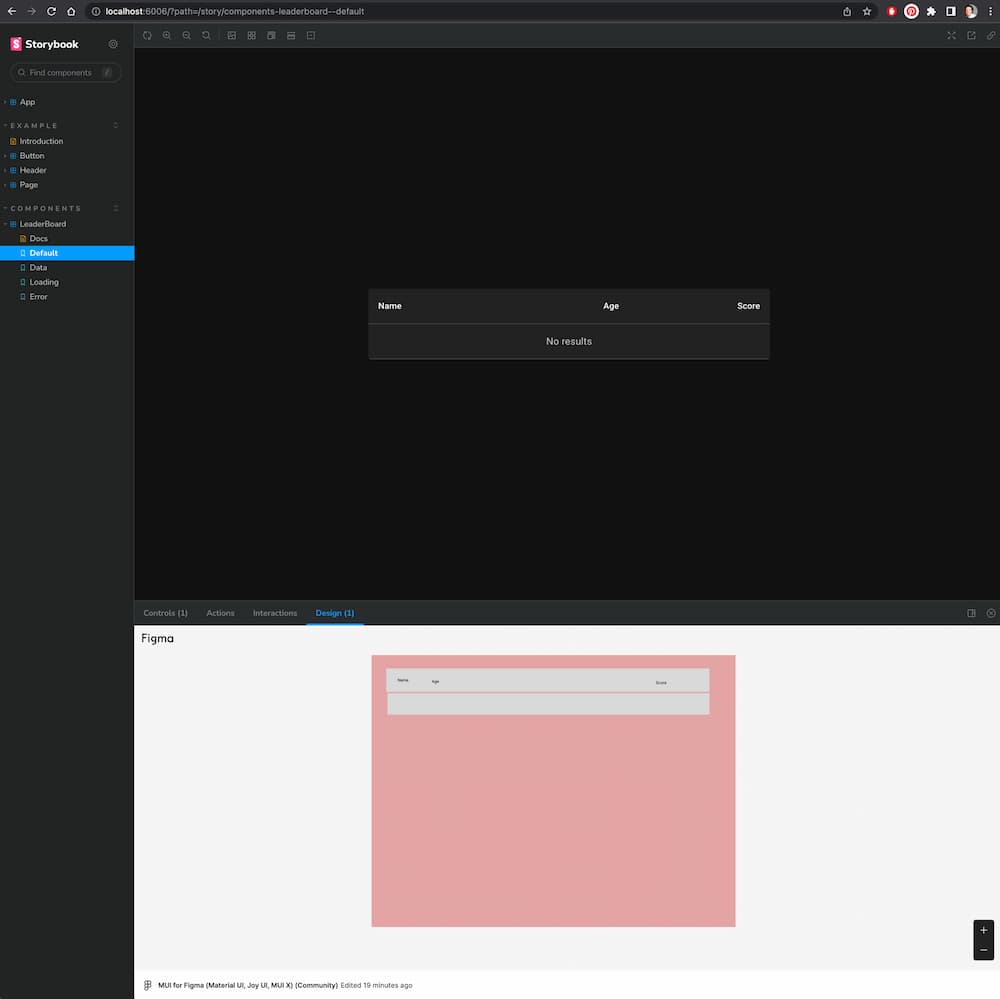
npm install --save-dev --legacy-peer-deps storybook-addon-designs@betaOtherwise it works! You'll find a "Design" tab with an embedded <canvas /> of your design component to eyeball from.
A (terrible) Figma design loaded in Storybook:
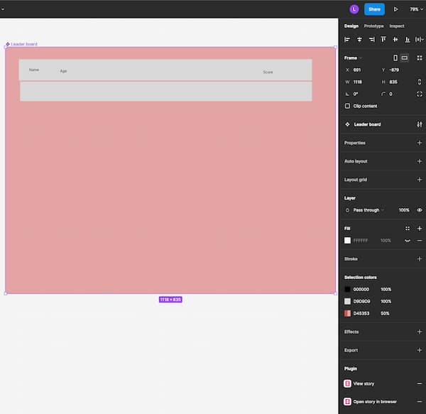
You'll need to be using the hosted Chromatic integrations for this. Navigate to any story, be it the Storybook or Chromatic version, and copy the URL. You'll be able to provide that link on a component, variant, or instance. The result will be links on the right panel to launch the Story in Figma via popup or new tab.

