react-notification-timeline is a reactjs based component helps in managing the notifications in time-based manner. It is capable of keep tracking of the incoming notifications, manage read vs unread messages and allows many more customizations.
- 👉 Is your project is based on react js and you are looking for a time-based notification system?
- 👉 Do you want to keep track of the notifications in timed manner and manage them ?
- 👉 Do you want to structure the notifications in a cleaner way?
- 👉 Do you want to manage multi-line notifications?
- 👉 Do you limit the number of notifications you may want to see?
Then, you should give react-notification-timeline a try.
-
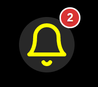
Notification Component with the unread message count

-
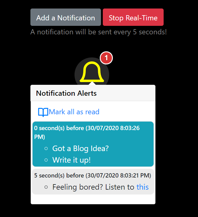
Notification Component with the messages as a pop-over
A Live demo of the component is available here, 💻 CLICK FOR DEMO
You can install react-notification-timeline using npm or yarn.
npm i react-notification-timelineyarn add react-notification-timeline
Once installed, it can be imported into a react component as,
import NotifyMe from 'react-notification-timeline';Here is an example usage,
<NotifyMe
  data={data}
  storageKey='notific_key'
  notific_key='timestamp'
  notific_value='update'
  heading='Notification Alerts'
  sortedByKey={false}
  showDate={true}
  size={64}
  color="yellow"
  markAsReadFn={() => yourOwnFunctionHandler()}
/>CLICK ME to know the details of the properties
| Property | Description | Required | Example |
| theme | customizing the background and foreground of the Notification and its icon | No |
color and background color can be either in HexaCode,rgb or string name. Default is
   {
     color:"yellow",
     backgroundColor:"#282828"
} |
| data |
Messages to show as notifications. This is expected to be an array of objects. Each of the object must have two properties.
|
Yes |
   [
     {
       "update":"70 new employees are shifted",
       "timestamp":1596119688264
     },
     {
       "update":"Time to take a Break, TADA!!!",
       "timestamp":1596119686811
     }
] |
| heading | A header message for the Notification panel. Pass a message to customize it. | No | Any string of your choice. Default value is, Notifications |
| multiLineSplitter | In case a notification message has to be splitted into multiple (bullet) items, you can specify a line splitter character in-between. | No | Any Character like, # or a sequence of characters, #$#. Default value is, \n |
| notific_key | Key in the data property that holds the timestamp value. | Yes | timestamp, attime or any string based key name in the data property. |
| notific_value | key in the data property that holds the notification message value. | Yes | update, message or any string based key name in the data property. |
| showDate | Notification message shows the date and time along with the message. Pass false for this property, if you do not want to show it. Pass true otherwise. | No | true or false. Default value is, false |
| size | Size of the notification bell. Pass a Size to customize it. | No | Size values as, 16, 32, 48 etc. Default value is, 32 |
| sortedByKey | Pass true, if the data passed to this component is already sorted by time-based key. Pass false otherwise, the component will take care of the time based sorting. | No | true or false. Default value is, true |
| storageKey | It stores the last read message key in localstorage of the browser. | No | Any string of your choice as a key. Default value is, notification_timeline_storage_id |
| markAsRead | User can control the functionality of "Mark All As Read" by passing the function as prop as below markAsReadFn = {() => yourOwnFunctionHandler()} | No | Now "Mark All As Read" can be controlled by passing your own function as prop. Default functionality is,
|
| icon | User can add custom notification Icon by passing react-feather icon as prop as below icon={IconName} //You need to import the Icon from the react-feather library | No | Any icon from the react-feather library default is Bell icon |
Copyright © 2020 by Tapas Adhikary
This project is licensed under MIT license.
If you liked the work, please show your support by giving a Star!
I would love to get your feedback. Please use the github issues for submitting any feedback. At the same time, please join hands in improving the component further by fixing bugs, adding features.
People contributed so far (emoji key):
Tapas Adhikary 🚇 |
NagarjunShroff 💻 |
Sankalpa Fernando 💻 |
Dony M Varkey 📖 |
This project follows the all-contributors specification. Contributions of any kind welcome!

