/angular-anchored-floating-box

A singleton, global Angular service to programmatically render a floating box anchored at an element that can have arbitrary content specified by either a TemplateRef or component.

Primary LanguageTypeScriptMIT LicenseMIT

angular-anchored-floating-box

A singleton, global Angular service to programmatically render a floating box anchored at an element that can have arbitrary content specified by either a TemplateRef or @Component.

Table of contents

Angular compatibility

This library Angular
1.x.x 16 - 18

Installation

  • npm
    npm i -S @lazycuh/angular-anchored-floating-box
    
  • pnpm
    pnpm i -S @lazycuh/angular-anchored-floating-box
    
  • yarn
    yarn add @lazycuh/angular-anchored-floating-box
    

Available APIs

These are the symbols that are available from this package

AnchoredFloatingBoxService

This class allows to show a floating box anchored at an element. See AnchoredFloatingBoxConfiguration for the different options to configure the floating box.

export declare class AnchoredFloatingBoxService {
  /**
   * Set the default theme that will be used for all floating boxes created in the future.
   *
   * @param theme The new theme to be used as the default.
   */
  static setDefaultTheme(theme: Theme): void;

  /**
   * Open a new floating box with a configuration object specified by `configuration`. This service
   * supports rendering [`TemplateRef`](https://angular.io/api/core/TemplateRef) as well as any
   * [`@Component`](https://angular.io/api/core/Component) class.
   *
   * @param configuration The configuration object for the anchored floating box.
   *
   * @returns A ref object used to interact with the created floating box.
   */
  open(configuration: AnchoredFloatingBoxConfiguration): AnchoredFloatingBoxRef;
}

AnchoredFloatingBoxConfiguration

The configuration object for the current anchored floating box.

interface AnchoredFloatingBoxConfiguration {
  /**
   * The required element that the floating box will be anchored to.
   */
  anchor: Element;

  /**
   * The optional class name to add to the anchored floating box's container.
   */
  className?: string;

  /**
   * The required content to show, it accepts `TemplateRef` as well as any `@Component()` class.
   */
  content: TemplateRef<unknown> | Type<unknown>;

  /**
   * The optional context object that is referenced by the template ref.
   */
  context?: unknown;

  /**
   * The optional theme for the floating box. Default is {@link Theme.LIGHT Theme.LIGHT}.
   */
  theme?: Theme;
}

Theme

type Theme = 'light' | 'dark';

AnchoredFloatingBoxRef

A reference to the opened anchored floating box that can be used to close it, or to add the listeners to be invoked depending on whether the floating box is opened or closed.

class AnchoredFloatingBoxRef {
  /**
   * Close this anchored floating box only.
   */
  close(): void;

  /**
   * Add a callback to be invoked after the floating box is closed.
   */
  addAfterClosedListener(listener: () => void): void;

  /**
   * Add a callback to be invoked after the floating box is opened.
   */
  addAfterOpenedListener(listener: () => void): void;
}

Example Usage

Code example

// Import the service into your class to start using it
import { AnchoredFloatingBoxService } from '@lazycuh/anchored-floating-box';

@Component({
  selector: 'test-component',
  template: `
        <button
                #button
                type='button'
                (click)='onOpen(template, button)'>
                Click me
        </button>
        <ng-template
                #template
                let-name <-- The context['$implicit'] from below
                let-greeting='greeting'> <-- The context.greeting from below
            {{greeting}} {{name}}
        </ng-template>
    `
})
export class TestComponent {
  constructor(private readonly anchoredFloatingBoxService: AnchoredFloatingBoxService) {}

  onOpen(content: TemplateRef<any>, anchor: HTMLButtonElement) {
    this.anchoredFloatingBoxService.open({
      content,
      anchor,
      className: 'optional-class-name',
      context: {
        greeting: 'Hello',
        $implicit: 'Angular!!!'
      }
    });
  }
}

Result

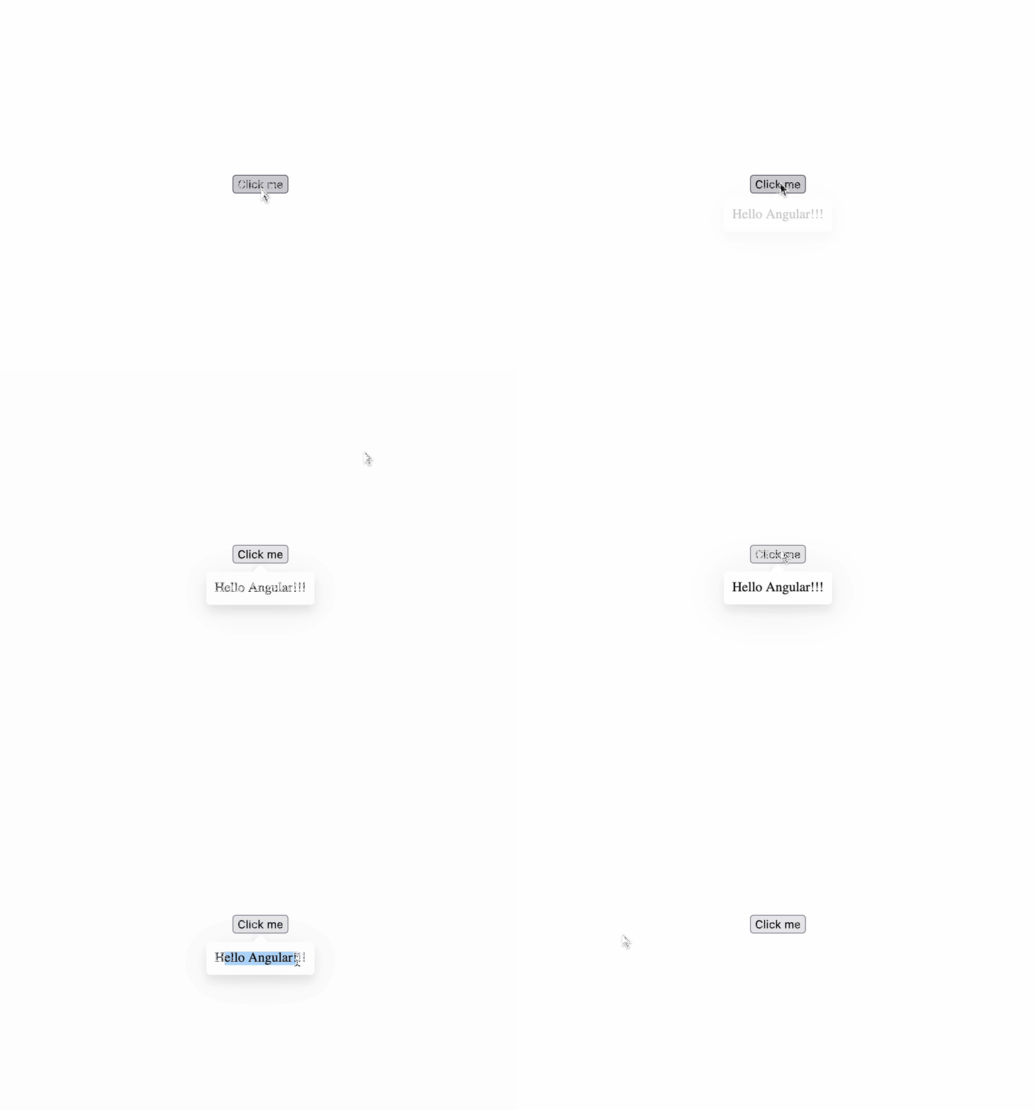
  • Light theme Example 1, light theme

  • Dark theme Example 2, dark theme


It will also reposition itself if it overflows the top or bottom edge of the viewport like so. Example 3, auto-repositioning when overflowing the bottom Example 4, auto-repositioning when overflowing the top


Real world example

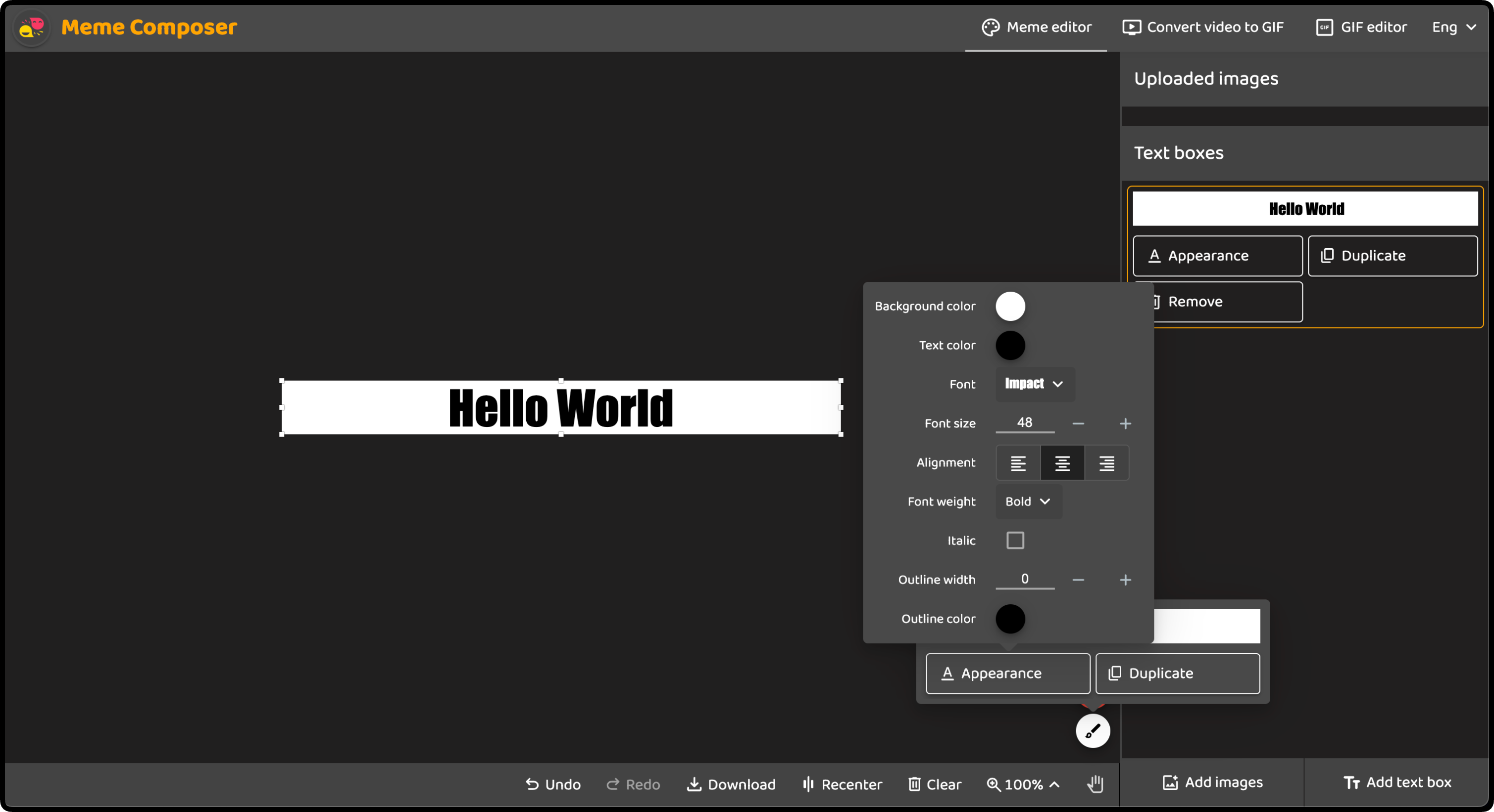
Below is a screenshot of a personal app of mine at https://memecomposer.com that uses this component. Clicking on the brush icon button popped open an anchored floating box, then clicking "Text appearance" button inside of it opened another anchored floating box that is independent of the previous one and any others.

Example 5, real world usage example