In this lab we will look at building visualizations known as density plots to estimate the probability density for a given set of data.
You will be able to:
- Calculate the PDF from given dataset containing real valued random variables
- Plot density functions and comment on the shape of the plot
- Plot density functions using seaborn
We'll import all the required libraries for you for this lab.
# Import required libraries
import numpy as np
import matplotlib.pyplot as plt
plt.style.use('ggplot')
import pandas as pd
Import the dataset 'weight-height.csv' as pandas dataframe . Calculate the mean and standard deviation for weights and heights for male and female individually.
Hint : Use your pandas dataframe subsetting skills like loc(), iloc() and groupby()
data = None
male_df =  None
female_df =  None


# Male Height mean: 69.02634590621737
# Male Height sd: 2.8633622286606517
# Male Weight mean: 187.0206206581929
# Male Weight sd: 19.781154516763813
# Female Height mean: 63.708773603424916
# Female Height sd: 2.696284015765056
# Female Weight mean: 135.8600930074687
# Female Weight sd: 19.022467805319007
Male Height mean: 69.02634590621737
Male Height sd: 2.8633622286606517
Male Weight mean: 187.0206206581929
Male Weight sd: 19.781154516763813
Female Height mean: 63.708773603424916
Female Height sd: 2.696284015765056
Female Weight mean: 135.8600930074687
Female Weight sd: 19.022467805319007
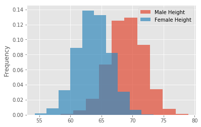
Plot overlapping normalized histograms for male and female heights - use binsize = 10, set alpha level so that overlap can be visualized
<matplotlib.legend.Legend at 0x10a5a38d0>
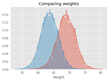
# Record your observations - are these inline with your personal observations?
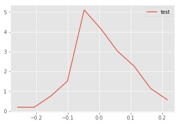
Write a function density() that takes in a random variable and calculates the density function using np.hist and interpolation. The function should return two lists carrying x and y coordinates for plotting the density functio
def density(x):

    pass


# Generate test data and test the function - uncomment to run the test
# np.random.seed(5)
# mu, sigma = 0, 0.1 # mean and standard deviation
# s = np.random.normal(mu, sigma, 100)
# x,y = density(s)
# plt.plot(x,y, label = 'test')
# plt.legend()
<matplotlib.legend.Legend at 0x10acba668>
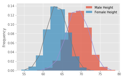
# You code here [<matplotlib.lines.Line2D at 0x10e25c9b0>]
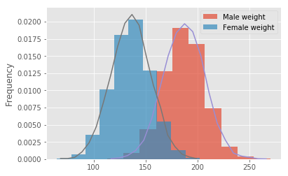
# Your code here [<matplotlib.lines.Line2D at 0x115c5fa90>]
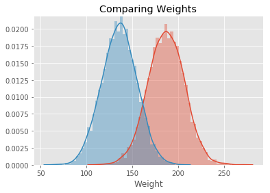
# Record your observations - are these inline with your personal observations?


# So whats the takeaway when comparing male and female heights and weights
Text(0.5,1,'Comparing weights')
Text(0.5,1,'Comparing Weights')
# Your comments on the two approaches here.
# are they similar ? what makes them different if they are ?In this lesson we saw how to build the probability density curves visually for given datasets and compare on the distribution visually by looking at the spread , center and overlap between data elements. This is a useful EDA technique and can be used to answer some initial questions before embarking on a complex analytics journey.
