In this lesson, we're going to explore how to build multi-column websites using display: flex; and display: grid;.
Flexbox is short for "The CSS3 Flexible Box Module". From MDN, here's a definiton:
Flexbox ... is a layout mode providing for the arrangement of elements on a page such that the elements behave predictably when the page layout must accommodate different screen sizes and different display devices. ... The defining aspect of the flex layout is the ability to alter its items' width and/or height to best fit in the available space on any display device.
- Up to this point we've been working with the block context --
display: block;. - Flexbox introduces a new context:
display: flex;. - Elements with
display: flex;have, largely, an external block context -- they exist in the document flow like any other kind of element. - Internally, they create a new type of context that has its own properties.
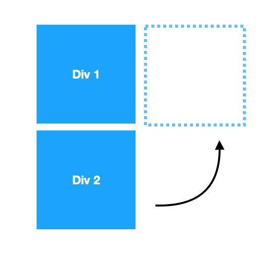
The key to understanding Flexbox is dividing elements into containers and items. The majority of the flexbox code we write will be applied to containers in order to affect the items within.
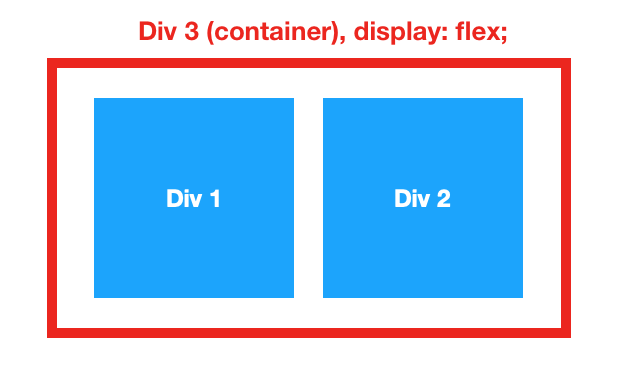
For example, at the most basic level, if we have two or more block elements stacked on top of each other, and we want them to be next to each other, we simply wrap them in a container div and apply display: flex; to that container:

Let's see this with some sample code. Imagine we have the following HTML and CSS:
  <div id="container-box">
    <div id="red" class="item-box"></div>
    <div id="orange" class="item-box"></div>
    <div id="yellow" class="item-box"></div>
    <div id="green" class="item-box"></div>
</div>#container-box {
border: 2px solid blue;
height: 400px;
width: 400px;
}
.item-box {
width: 100px;
height: 100px;
}
#red {
background-color: red;
}
#orange {
background-color: orange;
}
#yellow {
background-color: yellow;
}
#green {
background-color: green;
}This code results in four small boxes stacked within a larger box. If we want those four small boxes to reside next to one another, all we have to do is add display: flex; to the container div:
#container-box {
  border: 2px solid blue;
  height: 400px;
  width: 400px;
  display: flex;
}
Note:
display:flex;is not inherited by the container's children, so if one of the item boxes had child items, those child items would not be affected at all by the above code.
The following properties can be added to a container once it's been assigned display: flex;. You can find more options at CSS Trick's Incredible Flexbox Guide.
This establishes the main-axis, thus defining the direction flex items are placed in the flex container. Think of flex items as primarily laying out either in horizontal rows or vertical columns.

The possible values for the flex-direction property include:
flex-direction: row;- left to right (default)flex-direction: row-reverse;— right to leftflex-direction: column;— top to bottomflex-direction: column-reverse;— bottom to top
This defines the alignment along the main axis. It helps distribute extra free space leftover when either all the flex items on a line are inflexible, or are flexible but have reached their maximum size. It also exerts some control over the alignment of items when they overflow the line.

The possible values for the justify-content property include:
justify-content: flex-start;- items are packed toward the start of the flex-direction. (default)justify-content: flex-end;- items are packed toward the end of the flex-direction.justify-content: center;- items are centered along the linejustify-content: space-between;- items are evenly distributed in the line; first item is on the start line, last item on the end linejustify-content: space-around;- items are evenly distributed in the line with equal space around them.justify-content: space-evenly;- items are distributed so that the spacing between any two items (and the space to the edges) is equal.
This defines the default behavior for how flex items are laid out along the cross axis on the current line. Think of it as the justify-content version for the cross axis (perpendicular to the main-axis).

The possible values for the align-items property include:
align-items: stretch;- stretch to fill the container (still respect min-width/max-width) (default)align-items: flex-start;- items are placed at the start of the cross axis. The difference between these is subtle, and is about respecting the flex-direction rules or the writing-mode rules.align-items: flex-end;- items are placed at the end of the cross axis. The difference again is subtle and is about respecting flex-direction rules vs. writing-mode rules.align-items: center;- items are centered in the cross-axisalign-items: baseline;- items are aligned such as their baselines align
Note: For more container properties, refer to the CSS tricks guide.
Adding Flexbox properties to items is much less common than adding properties to containers, so we won't cover these in depth; however, here are a few of the tools available to you:
order- By default, flex items are laid out in their original order. The order property allows you to override that default.grow- This defines the ability for a flex item to grow if necessary. It accepts a unitless value that serves as a proportion. It dictates what amount of the available space inside the flex container the item should take up. If all items have flex-grow set to 1, the remaining space in the container will be distributed equally to all children. If one of the children has a value of 2, the remaining space would take up twice as much space as the others (or it will try to, at least).align-self- This allows the default alignment (or the one specified by align-items) to be overridden for individual flex items.
Note: For more item properties and more in-depth explanations of the above, refer to the CSS tricks guide.
mkdir a practice folder, cd into it, and touch an index.html and a style.css file. Your goal is to make the following header with flexbox:

You can use the following HTML; however, you will have to write all of the CSS yourself:
<header>
    <h1>CoolStartup</h1>
    <nav>
      <a href="#">About</a>
      <a href="#">Portfolio</a>
      <a href="#">Testimonials</a>
      <a href="#">Contact Us</a>
      <button>Sign Up</button>
    </nav>
</header>CSS Grid Layout is a powerful layout system available in CSS. You work with Grid Layout by applying CSS rules both to a parent element (which becomes the Grid Container) and to that element's children (which become Grid Items). This lesson will only cover the most fundamental CSS Grid tools. There are many more! For a deep read, check out CSS Trick's Grid Guide.
Like Flexbox, it's best to begin by focusing on the container's properties first.
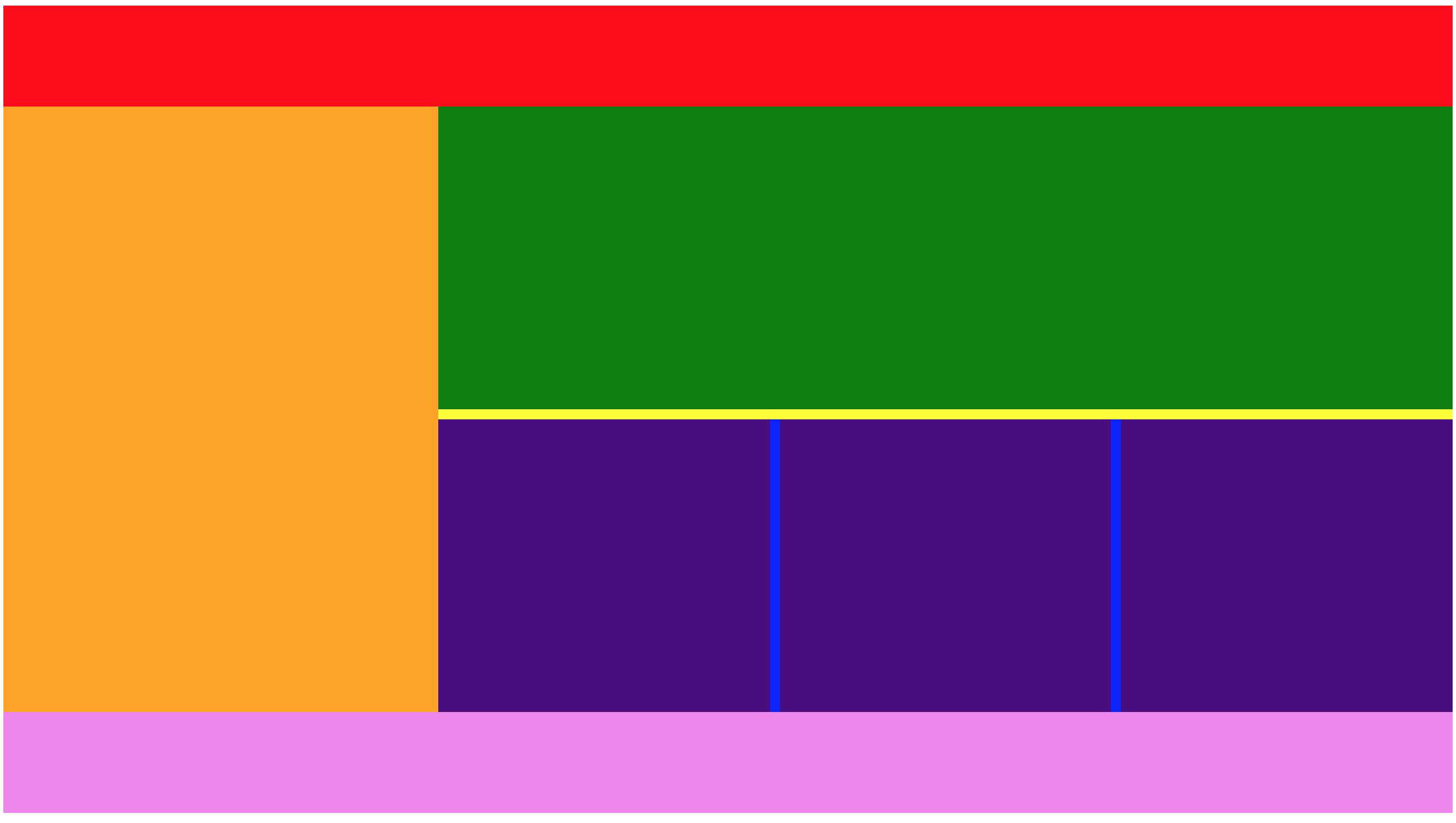
Defines the columns and rows of the grid with a space-separated list of values. The values represent the track size, and the space between them represents the grid line.
For example, this code...
.container {
  grid-template-columns: 40px 50px auto 50px 40px;
  grid-template-rows: 25% 100px auto;
}
... would produce the following grid:

Note: Items within such a container will simply fall into the grid in order, so the above grid is built to hold 15 items. If the grid container has fewer than 15 items, those items will match the grid until they run out. If the grid container has more than 15 items, those items will continue to follow the columns, but will no longer match the rows, as there are no set rules for any rows beyond the fourth.
Along with px values and % values, the fr unit allows you to set the size of a track as a fraction of the free space of the grid container. This is different than auto, which will take up as much space as the content. For example, this will set each item to one third the width of the grid container:
.container {
  grid-template-columns: 1fr 1fr 1fr;
}
The free space is calculated after any non-flexible items.
Specifies the size of the grid lines. You can think of it like setting the width of the gutters between the columns/rows. For example, the following code...
.container {
  grid-template-columns: 100px 50px 100px;
  grid-template-rows: 80px auto 80px;
  grid-column-gap: 10px;
  grid-row-gap: 15px;
}
... would produce the following layout:

Note: The grid- prefix will be removed and grid-column-gap and grid-row-gap renamed to column-gap and row-gap. The unprefixed properties are already supported in Chrome 68+, Safari 11.2 Release 50+ and Opera 54+.
Aligns grid items along the inline (row) axis (as opposed to align-items which aligns along the block (column) axis). This value applies to all grid items inside the container.
Values:
start - aligns items to be flush with the start edge of their cell

end - aligns items to be flush with the end edge of their cell

center - aligns items in the center of their cell

stretch - fills the whole width of the cell (this is the default)

Aligns grid items along the block (column) axis (as opposed to justify-items which aligns along the inline (row) axis). This value applies to all grid items inside the container.
Values:
start - aligns items to be flush with the start edge of their cell

end - aligns items to be flush with the end edge of their cell

center - aligns items in the center of their cell

stretch - fills the whole height of the cell (this is the default)

Note: float, display: inline-block, display: table-cell, vertical-align and column-* properties have no effect on a grid item.
Determines a grid item's location within the grid by referring to specific grid lines. grid-column-start/grid-row-start is the line where the item begins, and grid-column-end/grid-row-end is the line where the item ends.
Values:
- can be a number to refer to a numbered grid line, or a name to refer to a named grid line span - the item will span across the provided number of grid tracks span - the item will span across until it hits the next line with the provided name auto - indicates auto-placement, an automatic span, or a default span of one
For example:
.item-a {
  grid-column-start: 2;
  grid-column-end: five;
  grid-row-start: row1-start;
  grid-row-end: 3;
}
Would result in:

Aligns a grid item inside a cell along the inline (row) axis (as opposed to align-self which aligns along the block (column) axis). This value applies to a grid item inside a single cell.
Values:
start - aligns the grid item to be flush with the start edge of the cell

end - aligns the grid item to be flush with the end edge of the cell

center - aligns the grid item in the center of the cell

stretch - fills the whole width of the cell (this is the default)

Aligns a grid item inside a cell along the block (column) axis (as opposed to justify-self which aligns along the inline (row) axis). This value applies to the content inside a single grid item.
Values:
start - aligns the grid item to be flush with the start edge of the cell

end - aligns the grid item to be flush with the end edge of the cell

center - aligns the grid item in the center of the cell

stretch - fills the whole height of the cell (this is the default)

mkdir a practice folder, cd into it, and touch an index.html and a style.css file. Your goal is to make the following layout with CSS Grid:
You can start with the following HTML:
<body>
  <header>

  </header>
  <aside>

  </aside>
  <main>
    <article>

    </article>
    <section>
      <img src="" alt="">
      <img src="" alt="">
      <img src="" alt="">
    </section>
  </main>
  <footer>

  </footer>
</body>There is a LOT more possible with Flexbox and Grid, especially Grid. The best guides that we know of online can be found at CSS Tricks:
Note: Despite the power of Flexbox and Grid, remind yourself that many times you won't need either. Try to reserve using them only when it's necessary to avoid overcomplicating your code.