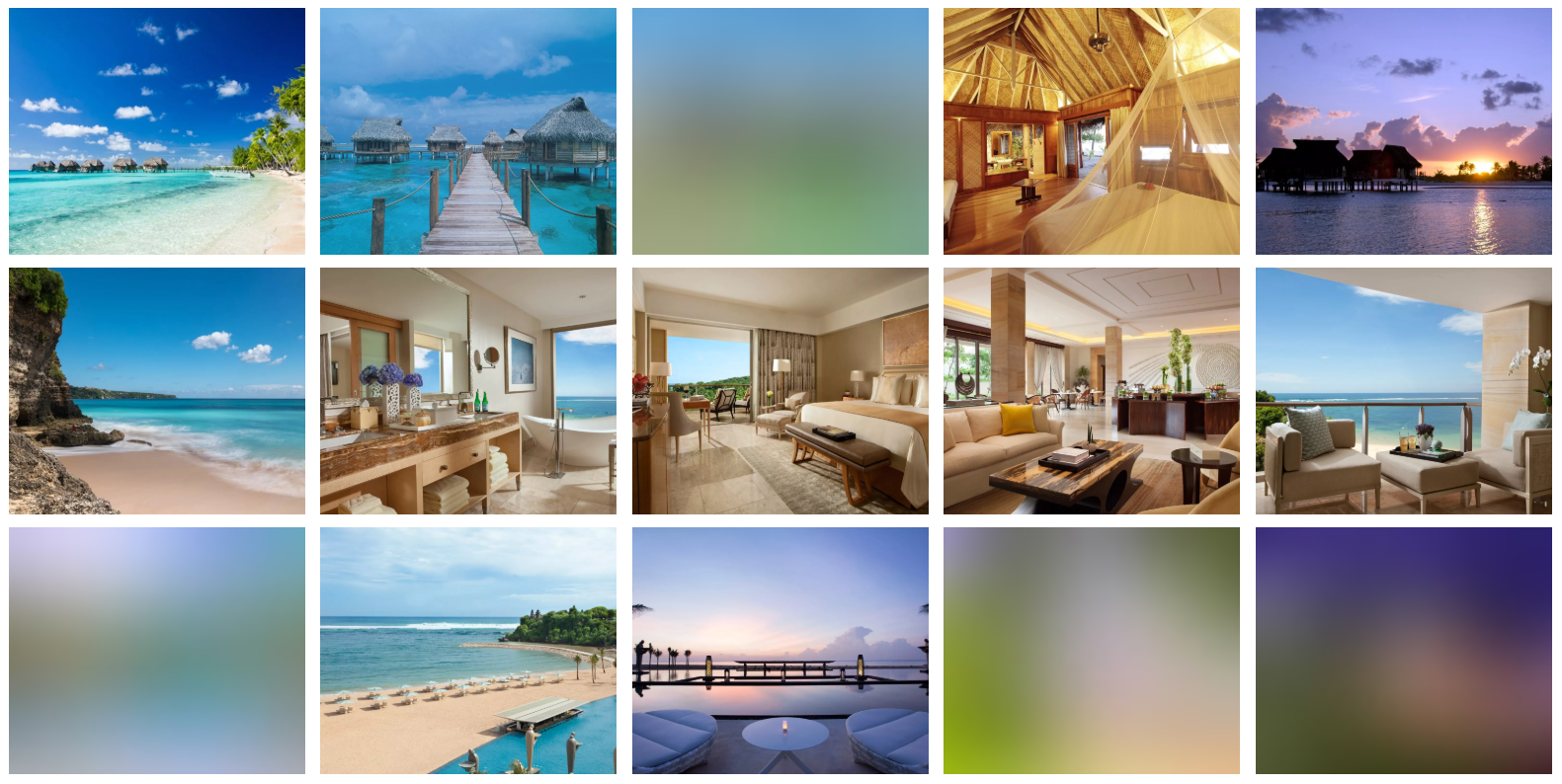
React component for lazy loading Graph CMS Images in an optimal way that is performance efficient. On initial page load, images are downloaded with low resolution and blur filter from graph cms. Once the image element is in active viewport, the blurred image is replaced with original HD image and blur effect is removed.
This is a work in progress, not ready for production yet. Your feedback would be appreciated, custom features can also be requested.
Currently, works only for image urls from graph media cms. Support for other image sources will be added as enhanced feature later on.
npm i @afiniti/image-lazy-load
- Performance efficient, reduces initial load time by loading low resolution blur images on page load
- Optimal sized images generated automatically for different devices and screen sizes.
- Preview images whilst loading in form of blurred thumbnails
- Lazy loading enabling original HD images to download only when they are in the current viewport
| Name | Type | Description |
|---|---|---|
handle |
string |
Graph cms uses handle an identifier for images which is required to fetch images. |
alt |
string |
Passed to theimg element for alternate prop |
className |
string|object |
Passed to the wrapper div of image.Object must follow react css rules |
width |
number |
Resolution need to be passed in order to display image. Defaults to 1400. |
height |
number |
Optional value in pixels if fixed height needs to be added to image elements. Defaults to null. See styling instructions below for better understanding. |
objectFitMode |
bool |
Fit image to be contained inside parent container. Defaults to false. |
isLazy |
bool |
Load images lazily, low to high resolution when active in viewport. Defaults to true |
breakpointWidths |
array |
Array of screen breakpoints for fluid image rendering and optimal sizes. Defaults to [320, 640, 1024] |
The package can be integrated inside a react component as follows:
import React from 'react';
import Picture from '@afiniti/image-lazy-load';
import '@afiniti/image-lazy-load/lib/main.css';

const Gallery = ({ data }) => {
  return (
    <div className={galleryWrapper}>
      {data.map(item => (
        <Picture
          handle={item.Picturehandle}
          className={'galleryImage'}
          objectFitMode
          width={1300}
          alt={item.postTitle}
        />
      ))}
    </div>
  );
};

export default Gallery;A classname can be passed to the Picture component that is attached to the wrapper element.
-
No height passed in className prop object: By default
padding-bottom: 56.25%set on wrapper div. -
Set custom height using className prop object: Pass
padding-bottom: 0% !importantin addition to the height in order to overwrite the default styles.
Note:
- The default styles need to be imported in addition to the component import as can be seen in above example.
- Feel free to style the image elements by overwriting the default css.
You can open issues in the Bugs and Issues section on the connected repository.
