Create waffle charts in R in a ggplot2-friendly way.
Really all credit to Bob Rudis for the work done on the original waffle package.
ggwaffle is designed to work in a very similar way to the original waffle package, while being slightly closer to the workflow of a standard ggplot graphic. Consequently, it is a little more verbose.
Currently only available through github:
# install.packages("devtools")
devtools::install_github("liamgilbey/ggwaffle")ggwaffle heavily relies on the usage of
ggplot2. Much like standard
ggplot graphs, waffle charts are created by adding layers to a base
graphic. Because of the inner mechanisms of ggplot2, some of the
necessary data transformations have to be completed outside of a
standard plot creation. The function waffle_iron has been added to
help with issue.
ggwaffle also introduces a column mapping function, aes_d. At this
stage I have no idea of how useful this is outside the context of the
package, but it seemed a nice way to specify dynamic column renaming.
aes_d is obviously coined from ggplot’s aes function and has a very
similar idea. Here we are mapping column names to feed into a function
so they can be renamed for used appropriately.
library(ggwaffle)
#> Loading required package: ggplot2
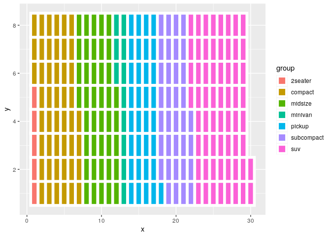
waffle_data <- waffle_iron(mpg, aes_d(group = class))

ggplot(waffle_data, aes(x, y, fill = group)) +
  geom_waffle()
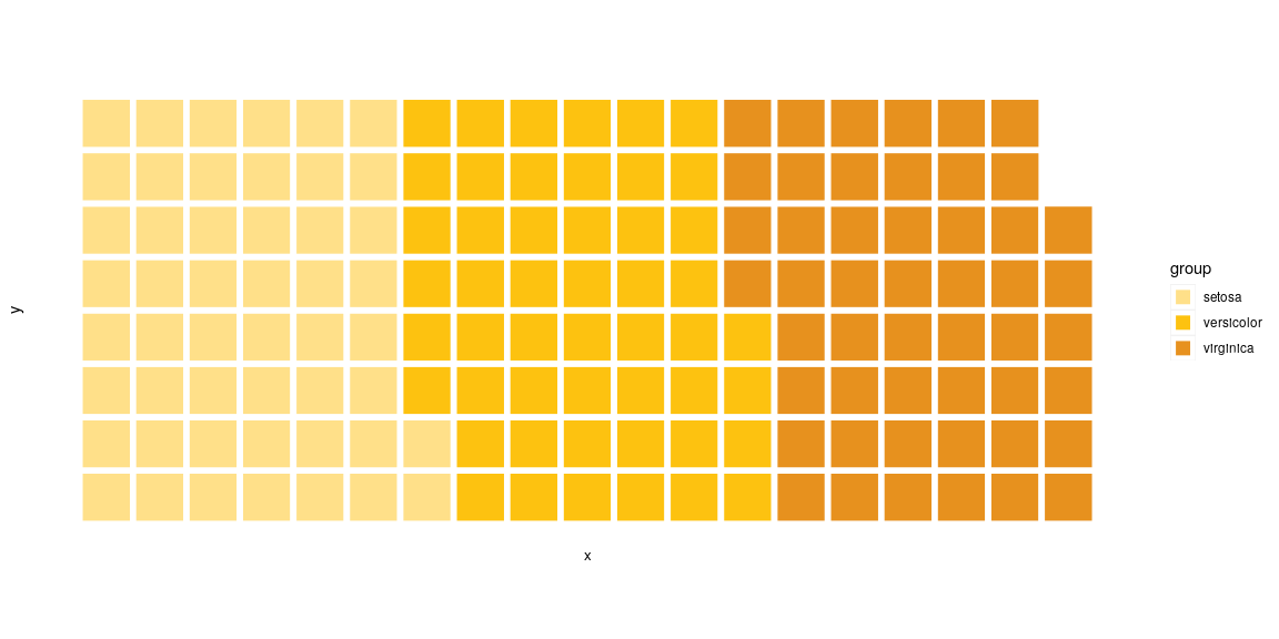
Functions have also been included to make the default graphics more
waffle-like. theme_waffle is a ggplot theme that strips back a lot of
the elements of the waffle to create a cleaner look. scale_fill_waffle
returns a discrete scale to make your charts look a lot like waffles.
Using coord_equal is recommended to make the size of the blocks even
in all dimensions.
waffle_data <- waffle_iron(iris, aes_d(group = Species))

ggplot(waffle_data, aes(x, y, fill = group)) +
  geom_waffle() +
  coord_equal() +
  scale_fill_waffle() +
  theme_waffle()
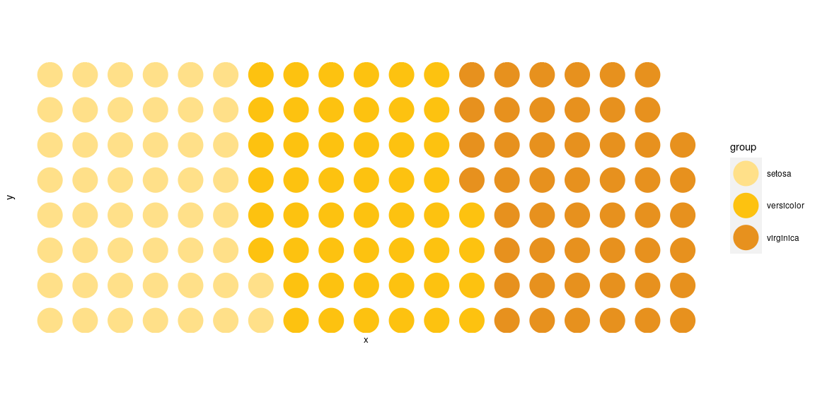
The shape of the waffle tile can also be controlled, choosing from either a regular square, or a circle tile shape.
waffle_data <- waffle_iron(iris, aes_d(group = Species))

ggplot(waffle_data, aes(x, y, colour = group)) +
  geom_waffle(tile_shape = 'circle', size = 12) +
  coord_equal() +
  scale_colour_waffle() +
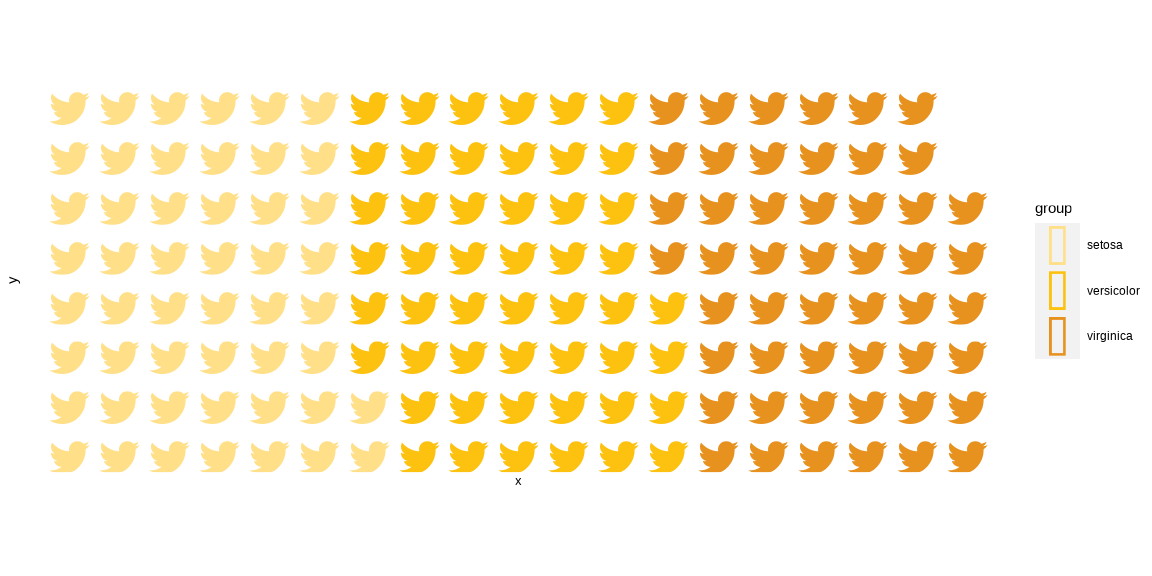
theme_waffle()The best way to implement icons into waffle charts is to use Guangchuang YU’s emojifont package.
library(emojifont)

waffle_data <- waffle_iron(iris, aes_d(group = Species))
waffle_data$label = fontawesome('fa-twitter')

ggplot(waffle_data, aes(x, y, colour = group)) +
  geom_text(aes(label=label), family='fontawesome-webfont', size=12) +
  coord_equal() +
  scale_colour_waffle() +
theme_waffle() 