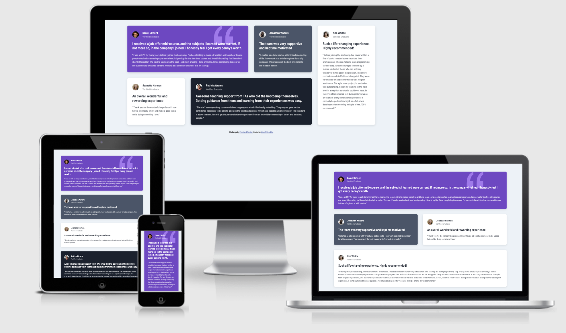
This is a solution to the Testimonials grid section challenge on Frontend Mentor. Frontend Mentor challenges help you improve your coding skills by building realistic projects.
Note: Delete this note and update the table of contents based on what sections you keep.
Users should be able to:
- View the optimal layout for the site depending on their device's screen size
- Semantic HTML5 markup
- SASS
- Mixins
- Functions
- Variables
- CSS Grid
- Mobile-first workflow
Using this challenge I practiced using CSS grid for easy responsive changes and layout switches. Alongside this I also further enhanced my learning of SASS functions.
@mixin response($breakpoint) {
    @if ($breakpoint == md) {
        @media (min-width: 800px) {
            @content;
        }
    }

    @if ($breakpoint == lg) {
        @media (min-width: 1440px) {
            @content;
        }
    }
}
.testimonial-grid {
display: grid;
margin-inline: auto;
width: 85%;
max-width: 1440px;
grid-gap: margin(xxl);
grid-auto-columns: 1fr;
grid-template-areas:
"one"
"two"
"three"
"four"
"five";
@include response(md) {
grid-template-areas:
"one one"
"two three"
"five five"
"four four";
}
@include response(lg) {
grid-template-areas:
"one one two five"
"three four four five";
margin: margin(xxl) auto;
}
}
The SASS used in this project was useful and aided in consistency as well as clean code. I plan to bring these and as well as CSS grid into future projects.
- Kevin Powell - Learn CSS grid - This helped me understand the key properties of CSS grid.
- Linkedin - Liam Mcluckie
- Frontend Mentor - @liammcluckie
