


|
|
Trusted by 2 000 000+ developers & designers. Used by companies like
 |
 |
 |
| 
| 
| 
| 
| 
| 
| 
| 
|
Tutorial for the latest Bootstrap v.5 Alpha. In this video we'll learn about the changes implemented into v.5.
>> Click here for a written tutorial
|

|
|
Start to Code 
|
Learn Bootstrap 5 | Crash Course for Beginners in 1.5H
|
Simplicity and ease of use are key features of MDB 5 UI Kit. You need only one minute to install and run it.
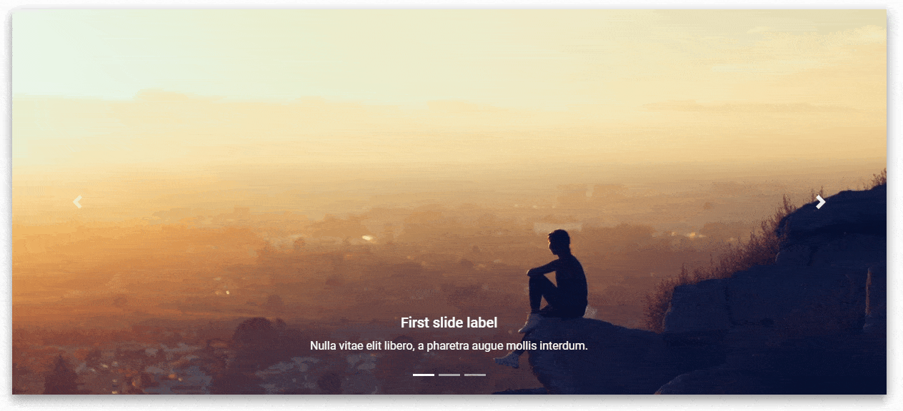
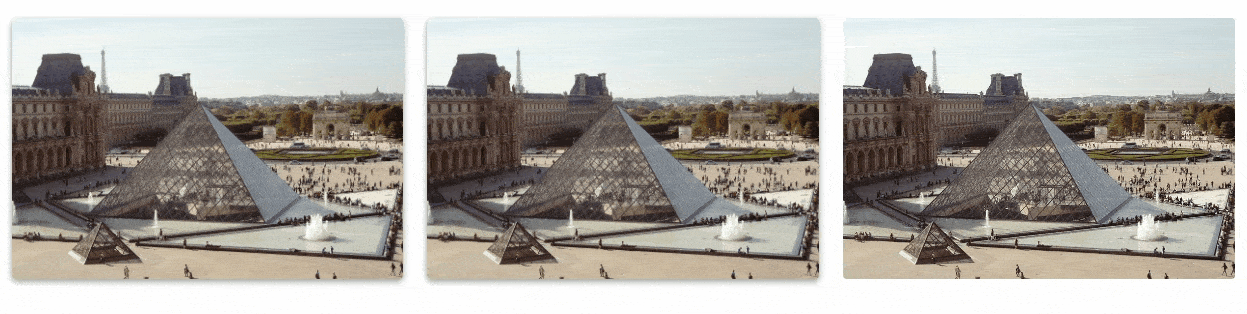
A slideshow component for cycling through elements—images or slides of text—like a carousel.
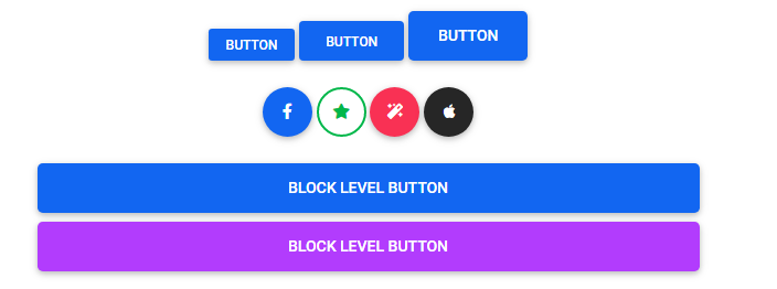
Use MDB custom button styles for actions in forms, dialogs, and more with support for multiple sizes, states, and more.


Indicate the loading state of a component or page with MDB spinners, built entirely with HTML, CSS, and no JavaScript.


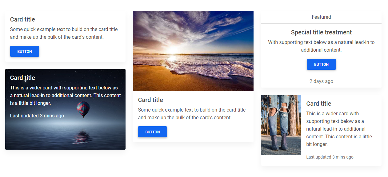
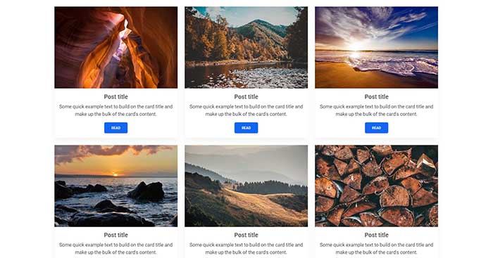
A card is a flexible and extensible content container. It includes options for headers and footers, a wide variety of content, contextual background colors, and powerful display options.
Provide valuable, actionable feedback to your users with HTML5 form validation, via browser default behaviors or custom styles and JavaScript.
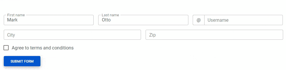
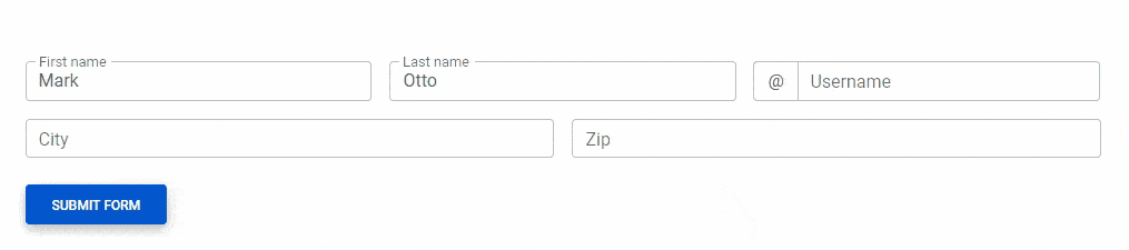
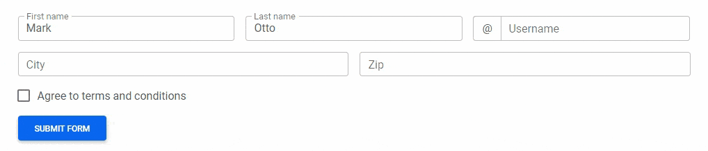
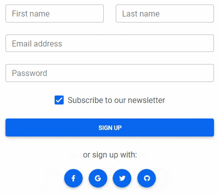
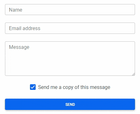
Examples and usage guidelines for form control styles, layout options, and custom components for creating a wide variety of forms.
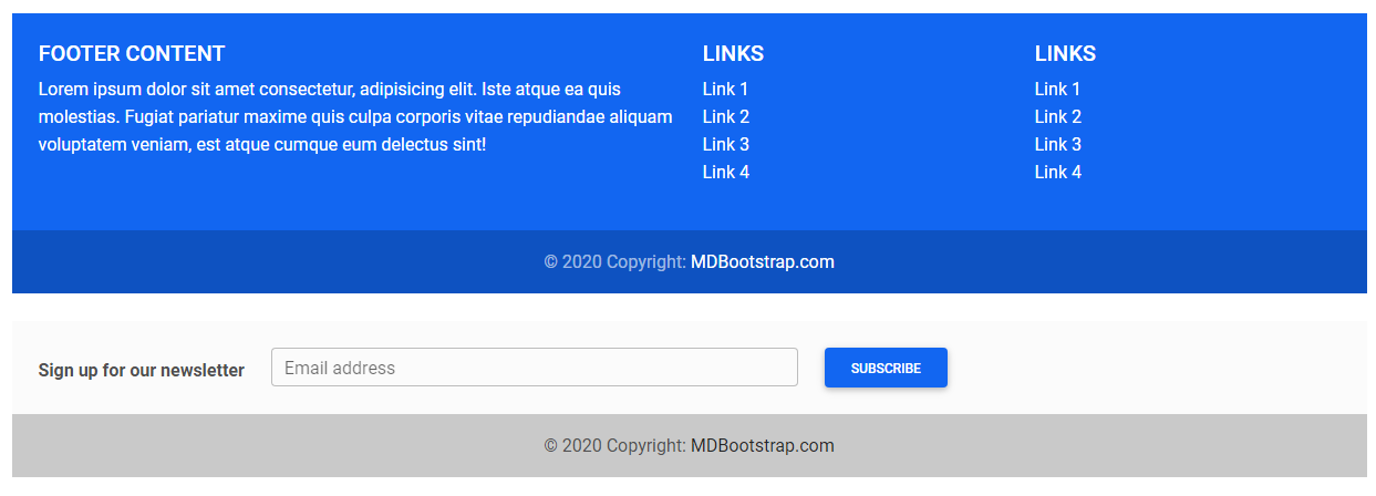
A footer is an additional navigation component. It can hold links, buttons, company info, copyrights, forms, and many other elements.
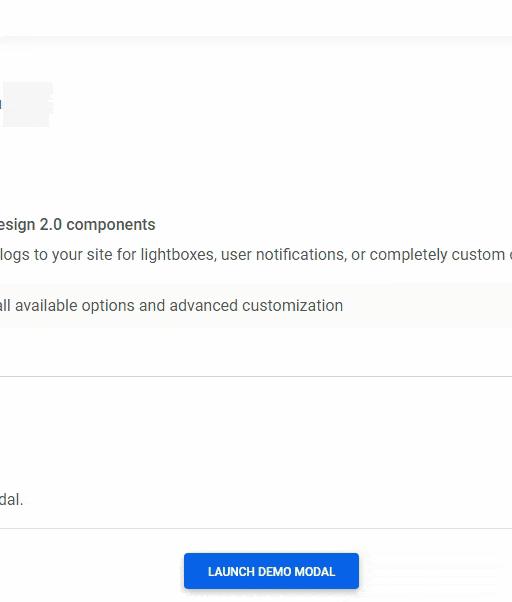
Use MDB modal plugin to add dialogs to your site for lightboxes, user notifications, or completely custom content.
MDB hover effect appears when the user positions the computer cursor over an element without activating it. Hover effects make a website more interactive.
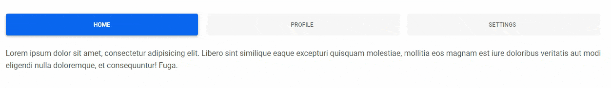
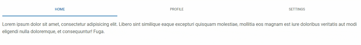
Tabs are quasi-navigation components which can highly improve website clarity and increase user experience.
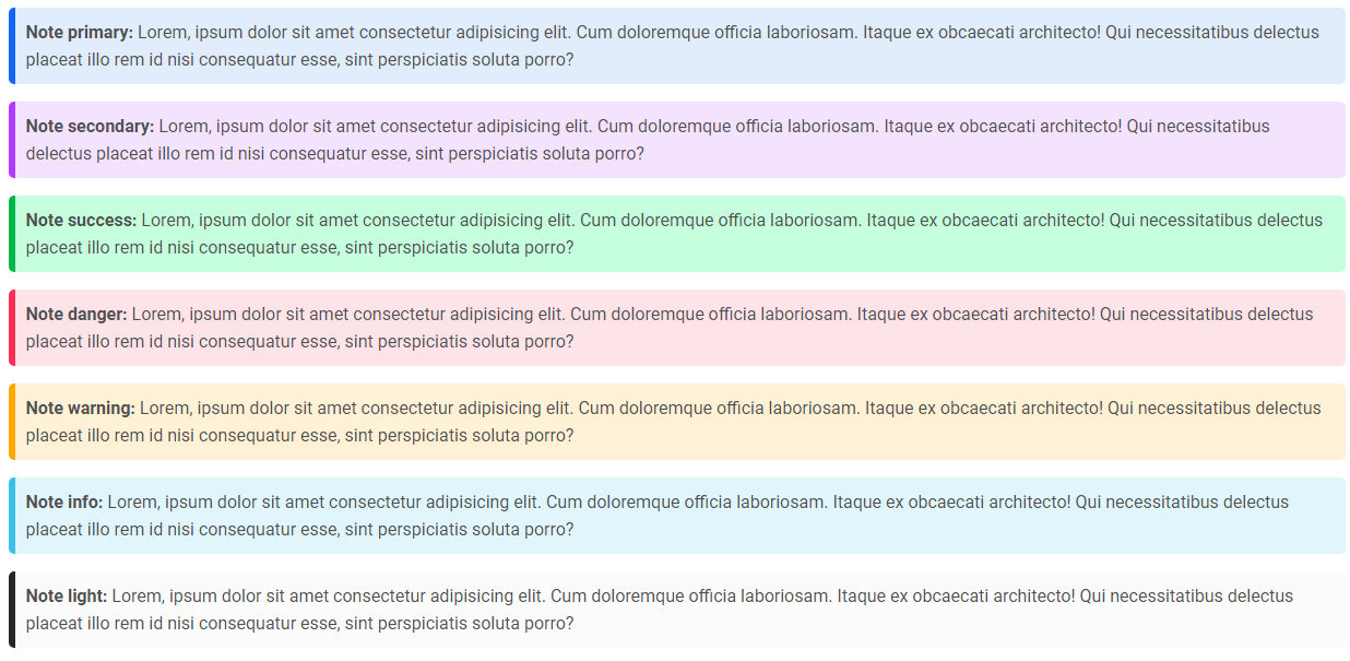
Notes are small components very helpful in inserting an additional piece of information.
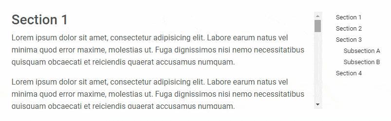
Automatically update Bootstrap navigation or list group components based on scroll position to indicate which link is currently active in the viewport.
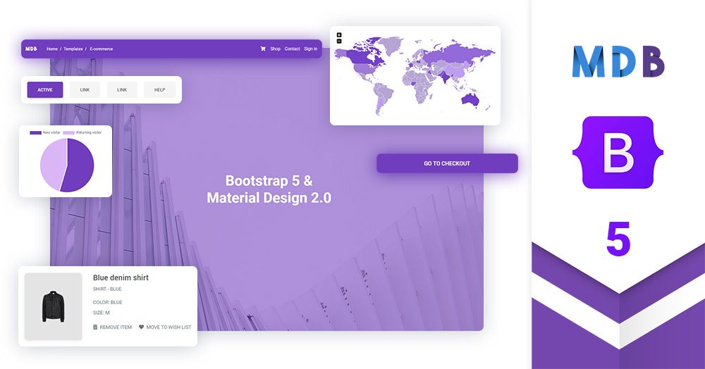
All the templates were created with MDB 5 UI KIT (Material Design for Bootstrap 5).
MDB is a free (MIT license) library, that provides extra features and significantly extends Bootstrap's capabilities.
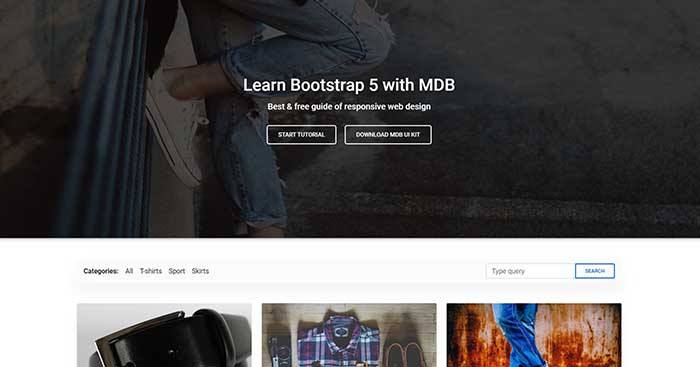
Ecommerce |

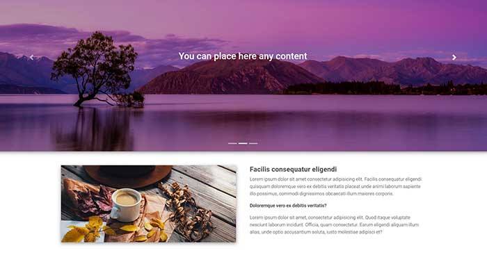
Carousel Full Cover |
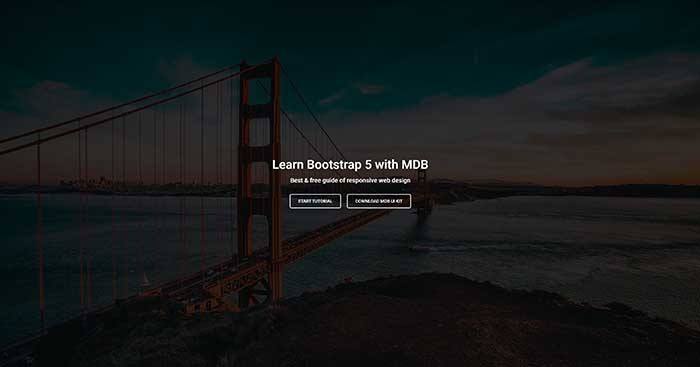
Image Full Cover |
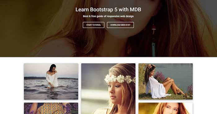
Portfolio |
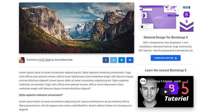
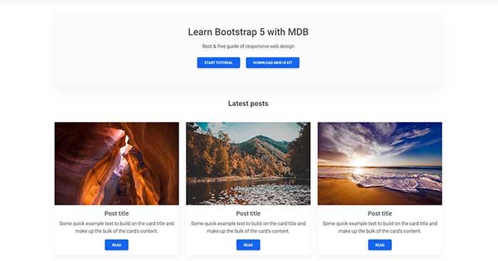
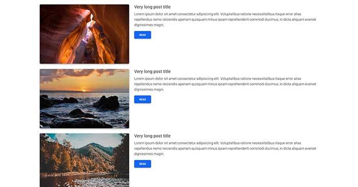
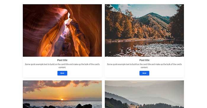
Post |
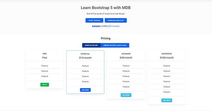
Pricing |
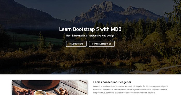
Video Full Cover |
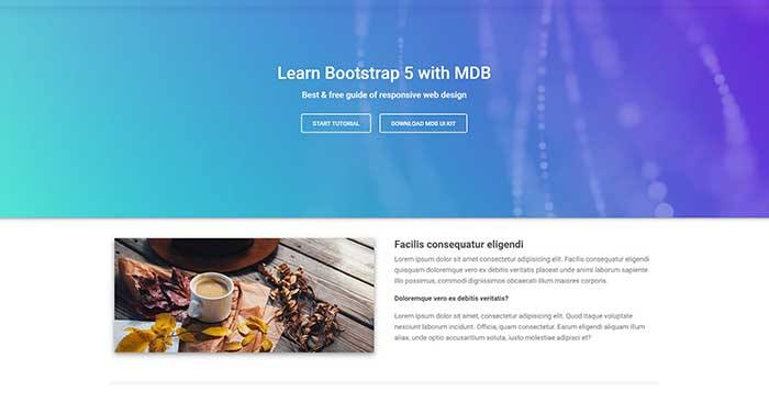
Carousel Half Cover |
Video Half Cover |
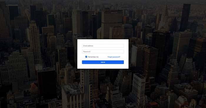
Login |
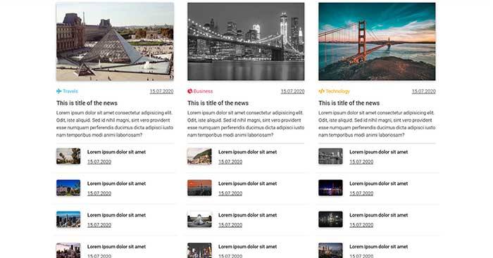
Mgazine |
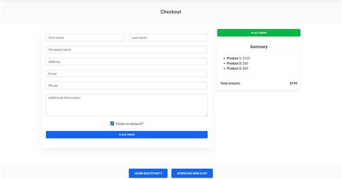
Checkout |
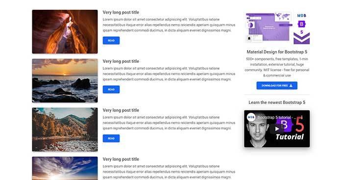
Blog |
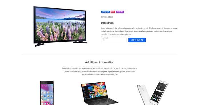
Product |
Category |
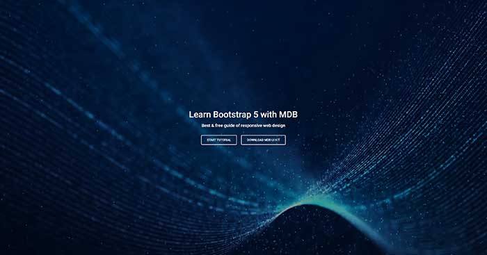
Landing Page |
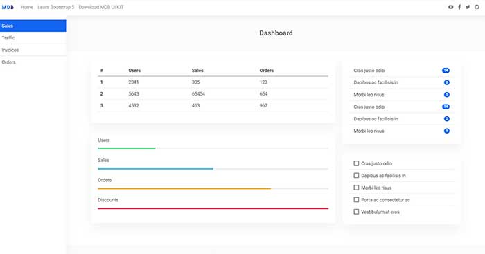
Admin |
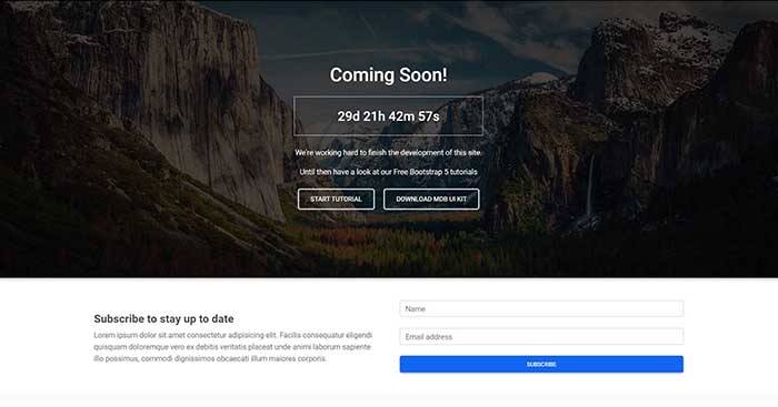
Coming Soon |
Classic Jumbotron |
One Column |
Two Columns |
Three Columns |