- author:syf20020816@outlook.com
- createDate:20230908
- updateDate:20230112
- version:0.3.3
- email:syf20020816@outlook.com
SurrealismUI is a third-party component library built entirely using Slint
you can use the following command to install cargo-generate
cargo install cargo-generateinput your project name to replace {project_name}
cargo generate --git https://github.com/Surrealism-All/surrealism-ui-template.git --name {project_name}🔧 Destination: E:\Rust\test-surrealism ...
🔧 project-name: test-surrealism ...
🔧 Generating template ...
🔧 Moving generated files into: `E:\Rust\test-surrealism`...
🔧 Initializing a fresh Git repository
✨ Done! New project created E:\Rust\test-surrealismcargo run- GoTo :https://github.com/Surrealism-All/SurrealismUI/releases
- Find the latest release and download
- unzip and add into your project
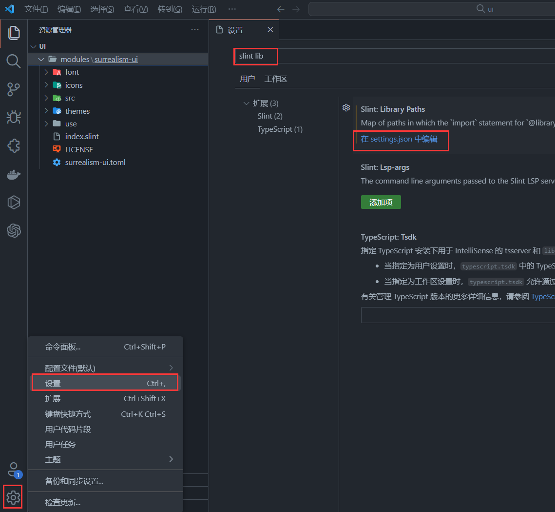
- Open VsCode and choose Settings , then search
Slint:Library Paths - Choose edit in settings.json
- Find
slint.libraryPathsand add"SurrealismUI":"parent_file_path\\surrealism-ui\\index.slint"❗
  "slint.libraryPaths": {
    "SurrealismUI":"E:\\test_try\\test-surrealism\\ui\\modules\\surrealism-ui\\index.slint"
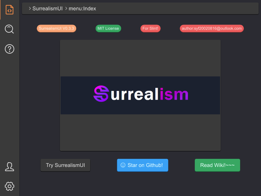
},import { SMenu,SCard,SHeader,SIcon,SButton } from "../index.slint";
import {UseIcons } from "../use/index.slint";
import { STip } from "../src/tip/index.slint";
import { STag } from "../src/tag/index.slint";
import { SAlert } from "../src/alert/index.slint";
export component App inherits Window {
height: 600px;
width: 800px;
private property <int> router-index : 0;
HorizontalLayout {
left-wrapper:=Rectangle {
z: 111;
height: 100%;
width: menu.width;
clip: false;
menu:=SMenu {
change(index,data) => {
debug(index);
}
}
}
right-wrapper:=Rectangle {
z: 100;
width: parent.width - menu.width;
background: #2b2b32;
if router-index==0:index-page:= Rectangle {
height: 100%;
width: 100%;
VerticalLayout {
HorizontalLayout {
padding: 8px;
alignment: center;
Rectangle {
height:header.height ;
width: parent.width - 16px;
header:=SHeader {
value: [{label:"SurrealismUI",value:"1"},{label:"menu:Index",value:"2"}];
}
}
}
HorizontalLayout {
padding: 24px;
alignment: space-around;
STag {
theme: Warning;
text: "SurrealismUI V0.3.3";
}
STag {
theme: Success;
text: "MIT License";
}
STag {
theme: Error;
text: "For Slint!";
}
STag {
theme: Error;
text: "author:syf20020816@outlook.com";
}
}
HorizontalLayout {
alignment: center;
SCard {
card-width: 460px;
card-height: 320px;
SIcon {
height: parent.height;
width: parent.width;
source: @image-url("../README/imgs/logo.png");
}
}
}
HorizontalLayout {
padding: 24px;
alignment: space-around;
SButton {
text: "Try SurrealismUI";
clicked => {
alert.success("Try SurrealismUI!!! Let's GO!");
}
}
SButton {
show-icon: true;
icon: UseIcons.icons.Smiling-face;
theme: Primary;
text: "Star on Github!";
}
STip {
text: "GO TO SurrealismUI WIKI?\n Click here!";
height: wiki-btn.height;
width: wiki-btn.width;
position: Bottom;
wiki-btn:=SButton {
theme: Success;
text: "Read Wiki!~~~";
clicked => {
parent.clicked();
}
}
}
}
}
}
}
}
alert:=SAlert {
result-type: Success;
text: "";
}
} default
————————————————————————————————————
| logic control layer (Rust|C++) |
————————————————————————————————————
⇕
————————————————————————————————————
| UI layer (write components) |
————————————————————————————————————
SurrealismUI
————————————————————————————————————
| logic control layer (Rust|C++) |
————————————————————————————————————
⇕
————————————————————————————————————
| UI Styles Wrapper layer | <-- What SurrealismUI do , see ①
————————————————————————————————————
| UI layer (write components) |
————————————————————————————————————
①:define a lot replaceable theme styles and binding styles use theme property , can be customized in slint file or logic control layer , means: all system components are wrapped (Customizing themes in third-party component libraries is very affordable as it acts on the UI layer. slint is like an integration of HTML and CSS, so I use this way)(By binding global singleton variables to styles, any component that uses variables can change styles simultaneously)
System support (like iced)
———————————————————————————————————— ————————————————
| logic control | --> | Theme::Light |
———————————————————————————————————— ————————————————
| UI layer | ↓
———————————————————————————————————— |————————————|
↑ ↓ ↓
import ← Light_Theme Styles Dark_Theme Styles
## Diff
Slint differs from other GUI frameworks in that the UI layer is completed through. slint, which I believe is good and brings many advantages (compatibility with different platforms, instant preview, maintainability, parallel development, etc.). But this also leads to SLIT being unable to easily customize the theme of the component. Theme customization and switching are dynamic to static processes, which require a lot of logical processing, and this is also same as (HTML+CSS+js | ts)
Built in 7 theme colors in SurrealismUI
| Theme | weakest | weaker | normal | deeper | deepest | font | opacity |
|---|---|---|---|---|---|---|---|
| Light | #F6F6F6 | #E0E0E0 | #FFFFFF | #F6F6F6 | #F5F5F5 | #212121 | #E0E0E088 |
| Primary | #88D0EC | #6CB8F7 | #3AA1F5 | #1891F3 | #0B86F1 | #e5ffff | #3AA1F588 |
| Success | #8FCEC4 | #61BF84 | #38A762 | #21964A | #118A3D | #e5fffb | #38A76288 |
| Info | #F6F6F6 | #eaeaea | #E0E0E0 | #D2D2D2 | #BDBDBD | #484848 | #E0E0E088 |
| Warning | #ffd5bd | #FCBD99 | #F9A677 | #F9955C | #F8894A | #fff4ec | #F9A67788 |
| Error | #e9a7a7 | #f48989 | #ed5e5e | #ed4e4e | #ed3b3b | #ffe5e4 | #ed4e4e88 |
| Dark | #707070 | #616161 | #3a3a3a | #242424 | #000000 | #e4e4e4 | #42424288 |
https://github.com/Surrealism-All/SurrealismUI/wiki
-
SText:It is the simplest and most common component in SurrealismUI -
SButton:SButtonis a button component that you can freely perform regular attribute operations on -
SIcon:this is a icon container , better than Image -
SInput:This is a basic input box, often used in forms, divided into two types: text and password -
SCard:A very simple universal card without any layout or restrictions , you can add anything you want to the card -
SStar:SStaris a scoring component -
SSelect:SSelectis a selector that provides three types of optional input parameter values -
STag:A small tag used to display data -
SHeader:SHeaderis a simple header component that is generated based on routing information -
STable:In fact, it is just the header of the table and needs to be used together withSTableColumnorSTableColumnFlexSTableColumn:It is table body , it covers the data of the table , It is easy for just show text in TableSTableColumnFlex:It is also a kind of table body , but this component is more flexible , you can use withSTableColumnItemtogether and define what will show in the tableSTableColumnItem:It is a component used to describe a cell in a table , It can help you define tables more easily.
-
SCollapse:SCollapseis a foldable panel. This is the outter of the Collapse, what really works isSCollapseItem. The outter only serves as a standard layout , this is a zero cost constructionSCollapseItem:SCollapseItemis a component ofSCollapse, without whichSCollapsewill not work , You can customize the components or use the default text display method in it
-
SResult:SResulthelps you easily build a quick prompt , you can build it in popup window -
SAvatar:SAvataris a avatar component that defaults to Icons.Avatar when there are no images available -
SLink:SLinkis commonly used to represent text connections or sharing -
SDivider:A divider groups sections of content to create visual rhythm and hierarchy. Use dividers along with spacing and headers to organize content in your layout. -
SPopup:A masked pop-up layer appears in the current window . And users will not be able to use the pop-up layer to cover the components under it. Clicking on the pop-up layer again will close it -
SCollection:SCollectionis an expandable box that can be zoomed in or out by clicking (internal can also be used) -
SRadio:Radiolet people select a single item -
SBadge:SBadgeis a quick way to display user status or events -
SPersona:This component is used to display simple user introduction information -
SProgress:SProgressis commonly used to display download progress or event processing progress . And you can fully control it through the progress property -
STip:A tip provides supplemental, contextual information elevated near its target component -
SLoading: This is a loading component that you can embed anywhere you want to add a loading animation -
SDialog:SDialogsare used to confirm messages or events and display text -
SMenu:SMenuis a menu bar located on the left side that you can quickly generate through the menu-data property -
SSwitch:SSwitchis a switch used for simple judgment scenarios -
SDrawer:Sometimes, the Dialogue component does not meet our needs , such as your form being too long, or if you need to temporarily display some documents, please use theSDrawer -
SAlert:SAlertis used to display important prompt information on the page -
SSwitchGroup:SSwitchGroupswitch group can contain more switch cases -
STree:STreecan be used to display directory structure, forming a parent-child relationship, and can be easily displayed -
SFile:SFilecan help users present file selectors GUI -
STab:provide tab functionality, so that users can switch between different content sections
V0.3.0版本是一个重大变更的版本,几乎所有的组件都经历了一次重构,优化了所有组件的结构,对整体项目目录进行了调整,处理了在之前版本中的不合理问题(组件名字,组件属性,方法,回调,内置方法,内置属性,内置Global等)。本次大更新更探索了类似于VNode的可能性(但目前并没有完美的方案)。将所有组件属性进行提取并使用结构体进行管理,这使得对组件样式的控制更加彻底,并使得使用rust,c++,js动态控制组件更加容易,动态生成组件这一需求也得到了解决。
在本次大型更新后,SurrealismUI中属性的写法与原生属性更加接近,这不仅减少了学习成本,更有利于使用者的理解。在后续0.3.x的版本中将会持续优化(每个版本的更新周期约2周)。此外0.3.0版本后可能不再涉及如此大范围的更新,该项目的稳定性将会持续提升。
感谢各位的阅读,如果您有任何问题,请发送邮件到syf20020816@outlook.com或在SurrealismUI仓库的讨论或issue中提出
V0.3.0 is a major change version. Almost all components have undergone a rebuiding, optimizing the structure of all components, adjusting the overall project directory, and dealing with unreasonable problems in the previous version (component name, component properties, functions, callbacks, built-in functions, built-in properties, built-in Global, ...). This big update explores the possibility of something similar to VNode (but there is no perfect solution at present). All component attributes are extracted and managed by using struct, which makes the control of component style more thorough, and makes it easier to use Rust, C + +, JS to dynamically control components, and the requirement of dynamically generating components is also solved.
After this major update, the writing of attributes in SurrealismUI is closer to the native attributes, which not only reduces the learning cost, but also is more conducive to the user's understanding. Optimization will continue in subsequent 0.3.x releases (approximately 2 weeks per release). In addition, the 0.3.0 version may no longer involve such a wide range of updates, and the stability of the project will continue to improve.
Thank you for reading, and if you have any questions, please send an email to syf20020816@outlook.com or raise them in a discussion or issue at the SurrealismUI repository
-
V0.3.4
- 中文
- 修复
SSelect组件icon、文字使用主题色变化 - 增加
STab组件提供选项卡功能,以便用户可以在不同的内容板块之间切换
- 修复
- English
- Fix changes in the theme color of the 'SSelect' component icon and text usage
- Add the 'STab' component to provide tab functionality, so that users can switch between different content sections
- 中文
-
V0.3.3
-
V0.3.2
- 中文
SSwitch和SSwitchGroup增加响应式选择(由active属性进行控制)- 优化
STip文字显示
- English
SSwitchandSSwitchGroupadd responsive selection (controlled by the active property)- Optimize text display of
STip
- 中文
-
V0.3.1
- 中文
- 补充丢失的SVG图片
- 修复组件中
PaddingType.None以及BorderType.None产生的与Rust 的Option的编译冲突 - 修复
SIcon中colorize属性导致的闪烁和None冲突 SIcon弥补方案:self.get-colorize()
- English
- add missing SVG images
- fix the
PaddingType.NoneandBorderType.Nonein the component Compilation conflict with RustOption - fix None conflict and flicker causes by colorize property in
SIcon SIConRemedial solution:self.get-colorize()
- 中文
-
V0.3.0 (Slint 1.3.2)
- 中文
- 所有组件更名
SUR为S - 默认文字采用
Arial - 重写所有组件 (
SMenu除外) - 重构
themes/index.slint(用于导出内置Schema,内置Global) - 增加use方式导出内置方法,内置结构体,内置枚举等
- 使用use方式对组件进行插槽预备
- 修改内置主题色
- 重构项目结构
- 所有组件更名
- English
- Renaming all components from
SURtoS - Default text adopts
Arial - Rewrite all components(except
SMenu) - Refactoring
themes/index. slint(used to export built-in schemas, built-in Global) - Add use mode to export built-in functions, built-in struct, built-in enum, etc
- Prepare slots for components using the use method
- Modify built-in theme colors
- Refactoring project structure
- Renaming all components from
- 中文


