Group Members: Lila Leatherman and Bran Black
Motivation: Both Lila and Bran have an interest in developing tools capable of expressing change in remotely sensed data over time. The problem of displaying shifts in SIF responses over time is a good representation of both the type of input data and change detection techniques Lila and Bran plan to work with in future research, making this project an excellent case study both students may adapt for future uses.
Project Description: We intend to create a tool capable of displaying SIF data by user-selected region over a specified time period. Special focus will be given to providing a means for users to detect changes within SIF over time, such as seasonal shifts in fluorescence or vegetative responses to drought. The shift in SIF values over the prescribed time period will be displayed as a heat map, either as a static map output or as an animation over time. Ideally, we will include various general zonal statistics of the selected area over the designated timeframe (mean, variance, average time series over the location, etc.). This analysis-heavy multi-view will be centered on using different methods of visualizing change over space and time.
Data:
Solar-induced chlorophyll fluorescence (SIF) is a relatively new remote sensing index. In contrast to traditional vegetation indices (NDVI, EVI), SIF is connected to the physiology of plant production, rather than the greenness of vegetation. SIF is also more sensitive to intra-annual variation in production related to heat and drought stress. SIF is correlated with the light use efficiency of photosynthesis (LUE; Guanter et al.2014) and with absorbed photosynthetically activeradiation (APAR; Rossini et al. 2010). Thus, SIF provides an ideal proxy for gross primary production (GPP) of an ecosystem.
SIF is measured by the NASA GOME-2 satellite at 0.5 decimal degree spatial resolution. SIF data products cover the globe, and are provided at daily and monthly temporal resolution, from 2002-present. SIF data are uploaded shortly after they are observed, and are available from NASA. All of our data will be sourced from this site. For this project, we will use monthly data to minimize processing. A focus of our data visualization will be quantifying and visualizing the impacts of a 2012 drought on North America.
For more info about SIF, check out this article from NASA's Jet Propulsion Lab.
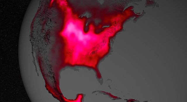
This image shows chlorophyll fluorescence over the Corn Belt in the central US in July, averaged from 2007-2011.
Interface Design:
d3heatmap: a geovizualization package capable of similar to the heatmap and heatmap.2 packages, but with expanded user interaction (zooming, highlighting, etc.).
Map-with-Latitude-Longitude : simpler user interface where data selected by points alone
contour plot: contour plot of data that may be useful in displaying difference in SIF data over time
Geoplotlib: A Python toolbox that include the capablity to produce heatmaps
myheatmap: example Mapbox geovisualization aimed at heatmapping
Notes and Potential Packages:
- Vector Field Animation : to visualize "transfer of energy." Kind of inappropriate for phenomena that occur in sessile organisms maybe? But-- a cool animation. The dynamic styles option could be used to toggle between visualizing the dynamic animation, and viewing a more static map of a selected time series.
- Use a dc time slider to change / shift the view or animation of the basemap? E.g.: time sliders
- or a range series to visualize a selected part of a time series in more detail
- lots of good dc examples here
- plus: having a time series functionality to show the value + point at a given point in a time series e.g. this
- alternate time series viewing point value at given location: this
- static heatmap plugin for leaflet: https://www.patrick-wied.at/static/heatmapjs/example-heatmap-leaflet.html
- timeline plus leaflet map overlay: http://bl.ocks.org/tnightingale/4718717
- cubism JS http://square.github.io/cubism/ - better suited for real-time data
- object constancy for multiple sets of time series data http://bl.ocks.org/nsonnad/4175202
- collection of other time series visualizations http://bl.ocks.org/adamgreenhall/1314483
- interactive streamgraph http://bl.ocks.org/WillTurman/4631136
- dc switching time intervals http://dc-js.github.io/dc.js/examples/switching-time-intervals.html
- leaflet + jquery time slider-- adds markers http://dwilhelm89.github.io/LeafletSlider/
- leaflet time dimension demos http://apps.socib.es/Leaflet.TimeDimension/examples/
Design Scheme
Color Palettes
We intend to use the following (or similar) color palette in our geovisualization:
Fonts
Concerning fonts, we have outlined a series of Google Web Font styles we will explore incorporating into our project:
Icons
For Icons we have considered the following Glyphicon Halfing options:
Multimedia
We do not currently plan to incorporate video files, although if a video proves clarifying or informative for our geovisualization we may include one. We may include and reference images from open source photo sources such as Unsplash or Pixaby.

